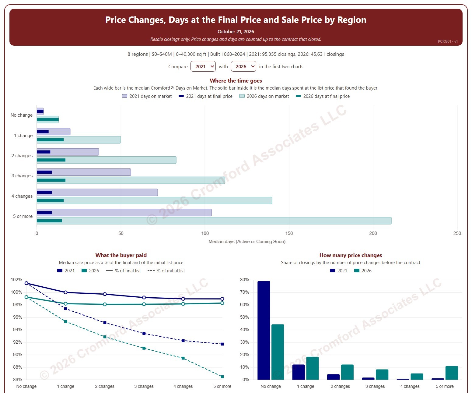
Price Changes, Days at the Final Price and Sale Price by Region

About this chart

This chart shows how many times homes changed their list price before going under contract, and what that meant for how long they took to sell and the price they sold for, by region. Each closed resale is grouped by the number of list price changes before the contract that closed, from none to five or more. Price increases and price cuts both count as a change.

The top chart compares two figures for each group. The wide bar is the median Cromford® Days on Market. The solid bar inside it is the median number of days the home spent at its final list price, the price that found the buyer. However long a home was on the market, the time it spent at the price that sold it is usually much shorter.

The top two charts compare any two years from 2020 on, picked with the selectors above them. The lower left chart shows the median sale price as a percentage of the final list price (solid line) and of the initial list price (dashed line). The lower right chart shows the share of closings in each group for the years ticked in the Year panel.

The map shades every ZIP code with its region’s figure for one year at a time, chosen with the year selector above it, so each region reads as one block. A few ZIP codes lie in two regions; they are striped in both regions’ shades and their closings count in both. Regions not ticked in the Region panel are faded. Click a ZIP code to show its region alone in the charts.

Days count while the home was Active or Coming Soon, up to the contract that closed. A contract that fell through does not reset the count. New construction is excluded. Years are by closing date, and the current year is year to date. The chart opens on 2021 and the current year in the Greater Phoenix regions, with manufactured and modular homes left out.
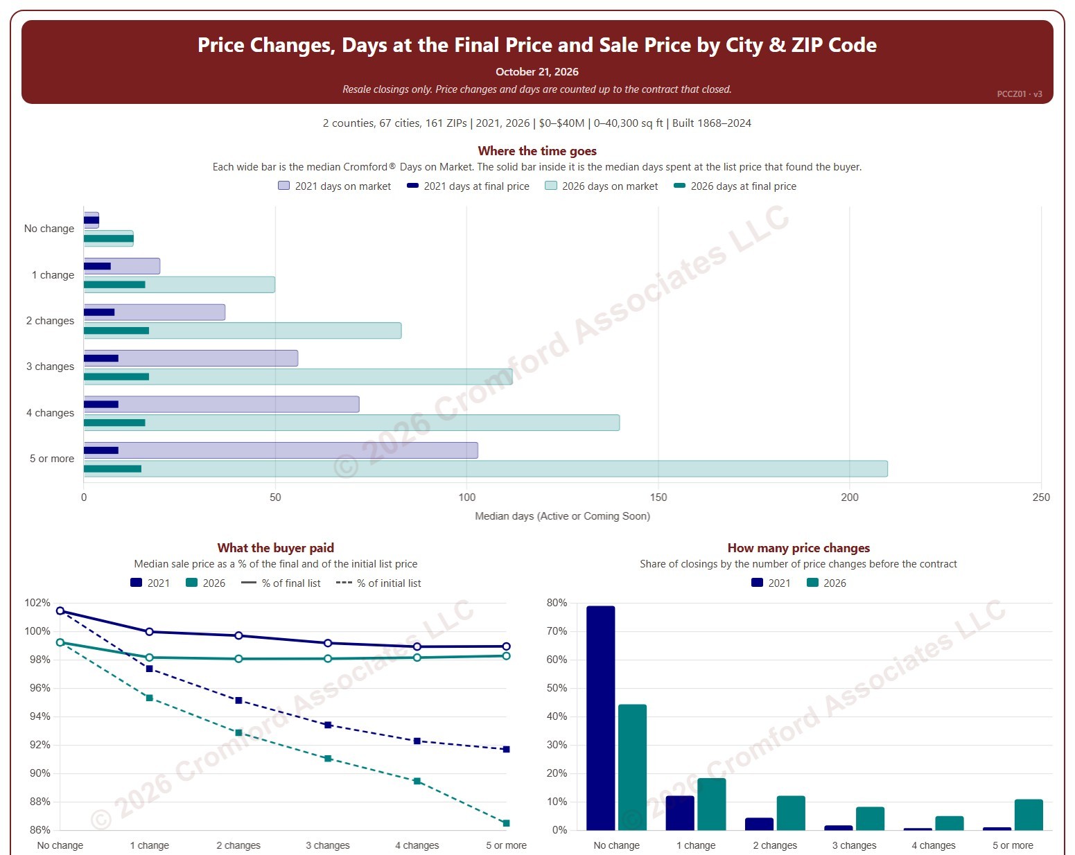
Price Changes, Days at the Final Price and Sale Price by City and ZIP Code

About this chart

This chart shows how many times homes changed their list price before going under contract, and what that meant for how long they took to sell and the price they sold for. Each closed resale is grouped by the number of list price changes before the contract that closed, from none to five or more. Price increases and price cuts both count as a change.

The top chart compares two figures for each group. The wide bar is the median Cromford® Days on Market. The solid bar inside it is the median number of days the home spent at its final list price, the price that found the buyer. However long a home was on the market, the time it spent at the price that sold it is usually much shorter.

The top two charts compare any two years from 2020 on, picked with the selectors above them. The lower left chart shows the median sale price as a percentage of the final list price (solid line) and of the initial list price (dashed line). The lower right chart shows the share of closings in each group for the years ticked in the Year panel.

The map shades each ZIP code for one year at a time, chosen with the year selector above it. ZIP codes with fewer than 20 closings are shown in gray. Click a ZIP code to show it alone in the charts.

Days count while the home was Active or Coming Soon, up to the contract that closed. A contract that fell through does not reset the count. New construction is excluded. Years are by closing date, and the current year is year to date. The chart opens on 2021 and the current year in Maricopa and Pinal counties, with manufactured and modular homes left out.
HOA Fees for High-Rise Condos

About this chart

This chart shows the monthly HOA fees stated in ARMLS listings for 35 high-rise condo buildings in Maricopa County, from 1999 to the latest listing shown at the top. The fee is the total monthly amount for every association the unit belongs to. Listings that do not give a fee are left out.

Pick a building from the Building list; the chart opens on 3rd Avenue Lofts. The Summary view has two charts. The first shows each listing as a bubble at its list date and fee, and a bigger bubble is a bigger unit. The second shows the median and average fee for each calendar year; the current year runs only to the latest listing. The tiles above give the number of listings, the median and average for the latest full year, and the latest listing.

Use Show to switch between the monthly fee and the fee per square foot, and Dollars to switch between the fees as listed and fees adjusted for inflation, restated in today’s dollars using the US Consumer Price Index. The Detailed view shows all six charts at once: the fee and the fee per square foot for every listing, and the yearly median and average of each, both as listed and adjusted for inflation.

The median is the better guide to a typical fee: one unusual unit moves the average but not the median. Hover over a bubble to see the unit, MLS number, list date, fee, size, and fee per square foot.

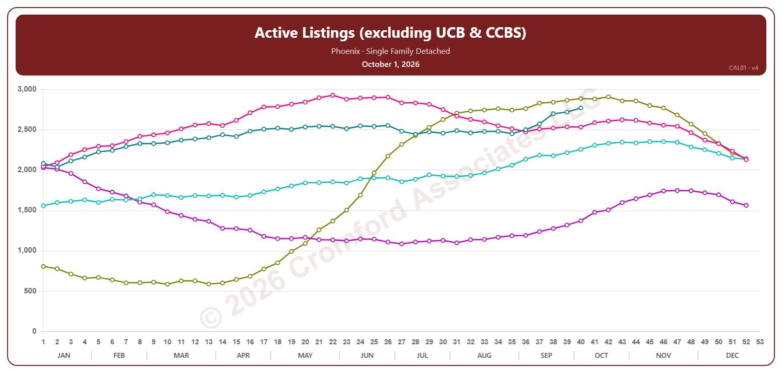
Active Listings (excluding UCB & CCBS) by City – Weekly

About this chart

This chart counts the active listings for single-family detached homes on ARMLS in one city, measured every week on Thursdays. It leaves out UCB / CCBS listings, which are under contract but still marked active.

Each year has its own line, laid out by week of the year, so you can compare this year with earlier years at the same point in the season. It opens on Phoenix and the last five years. Pick any of the 34 cities (18 major and 16 secondary) from the City list, and tick any year back to 2006 in the Year panel. Queen Creek and San Tan Valley start in 2010, and Coolidge, Florence, Waddell, and Wickenburg in 2011.

Hover over a line to see the exact figure for that week.

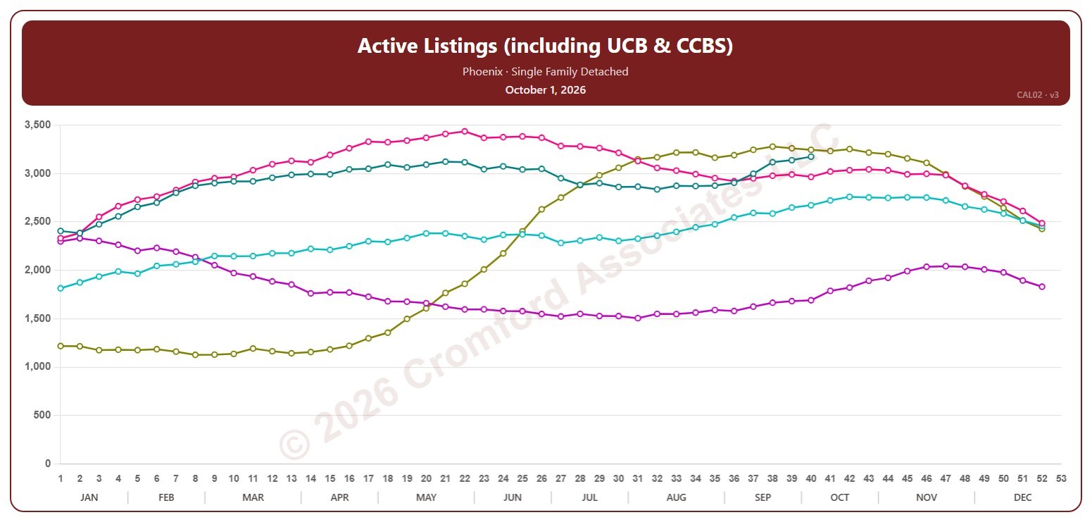
Active Listings (including UCB & CCBS) by City – Weekly

About this chart

This chart counts the active listings for single-family detached homes on ARMLS in one city, measured every week on Thursdays. It includes UCB / CCBS listings, which are under contract but still accepting back-up offers or waiting on the buyer’s sale.

Each year has its own line, laid out by week of the year, so you can compare this year with earlier years at the same point in the season. It opens on Phoenix and the last five years. Pick any of the 34 cities (18 major and 16 secondary) from the City list, and tick any year back to 2006 in the Year panel. Queen Creek and San Tan Valley start in 2010, and Coolidge, Florence, Waddell, and Wickenburg in 2011.

Hover over a line to see the exact figure for that week.

Appreciation Based on Annual Average $/SF by City – Weekly

About this chart

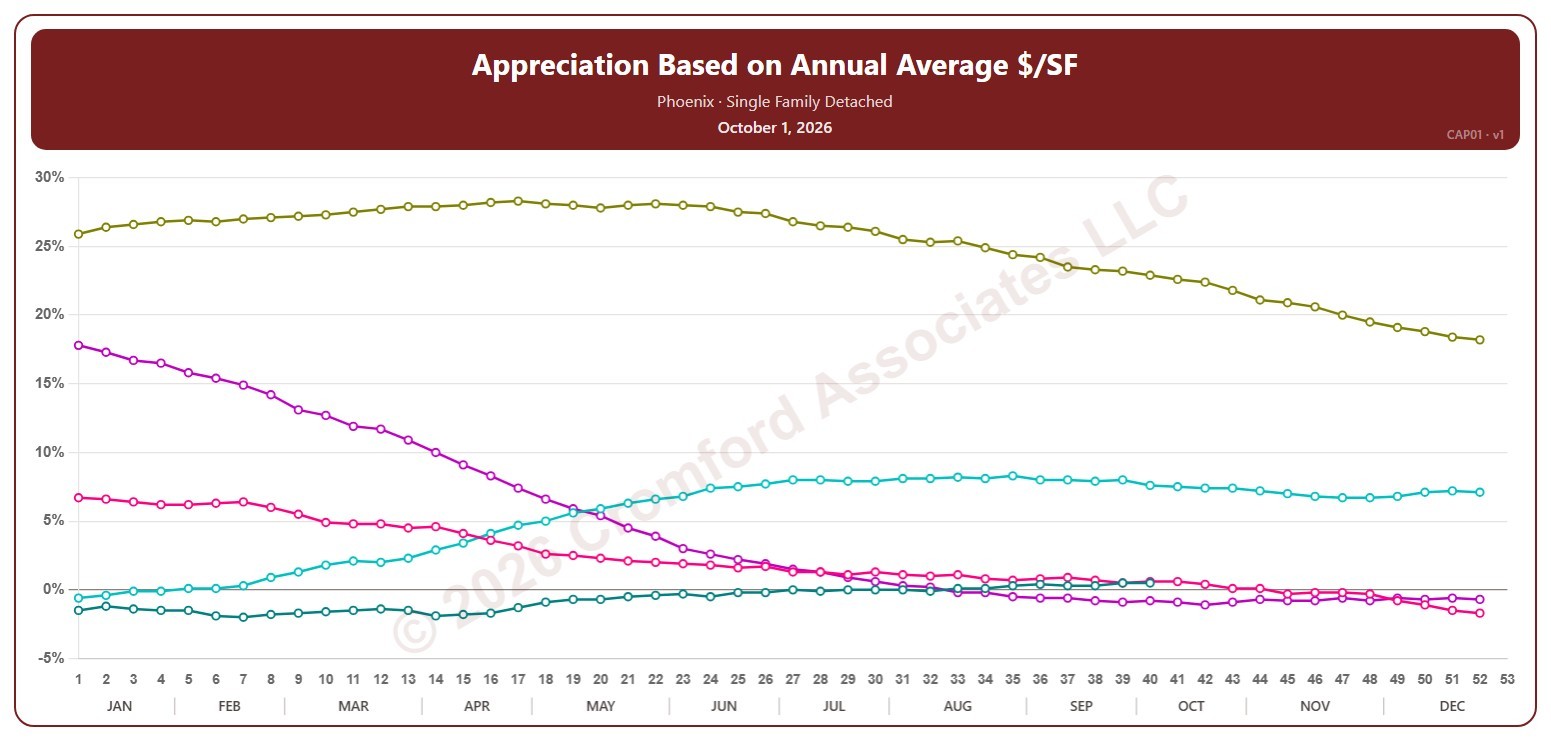
This chart shows annual appreciation for single-family detached homes in one city, measured every week on Thursdays: the change in the average sales price per square foot over the last 12 months compared with the 12 months to the same date a year earlier. Above zero, prices are higher than a year ago; below zero, they are lower.

Each year has its own line, laid out by week of the year, so you can compare this year with earlier years at the same point in the season. It opens on Phoenix and the last five years. Pick any of the 34 cities (18 major and 16 secondary) from the City list, and tick any year back to 2002 in the Year panel.

Hover over a line to see the exact figure for that week.

Cromford® Market Index by City – Weekly

About this chart

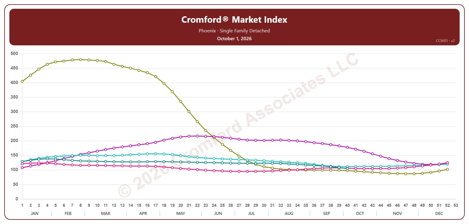
This chart shows the Cromford® Market Index for one city, measured every week on Thursdays, for single-family detached resale homes on ARMLS. A reading above 110 means the city’s market favors sellers, below 90 it favors buyers, and between 90 and 110 the market is balanced.

Each year has its own line, laid out by week of the year, so you can compare this year with earlier years at the same point in the season. It opens on Phoenix and the last five years. Pick any of the 34 cities (18 major and 16 secondary) from the City list, and tick any year back to 2001 in the Year panel. San Tan Valley starts in 2010, and Coolidge, Florence, Waddell, and Wickenburg in 2017.

Hover over a line to see the exact figure for that week.

Contract Ratio by City – Weekly

About this chart

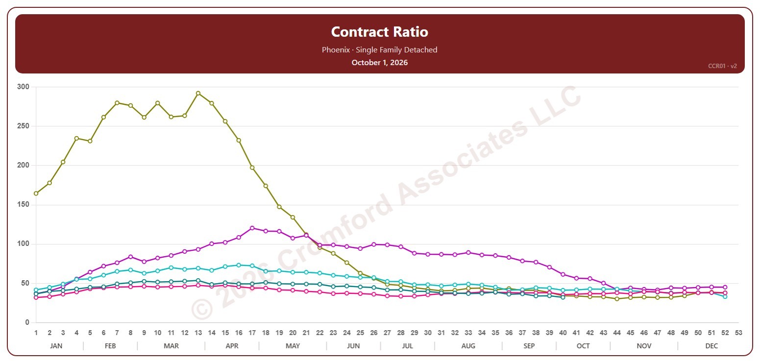
This chart shows the contract ratio for single-family detached homes on ARMLS in one city, measured every week on Thursdays. It compares the listings under contract (Pending plus UCB / CCBS) with the active listings available: the higher the ratio, the stronger buying activity is relative to supply, and in a very hot market it can go above 100.

Each year has its own line, laid out by week of the year, so you can compare this year with earlier years at the same point in the season. It opens on Phoenix and the last five years. Pick any of the 34 cities (18 major and 16 secondary) from the City list, and tick any year back to 2006 in the Year panel. Queen Creek and San Tan Valley start in 2010, and Coolidge, Florence, Waddell, and Wickenburg in 2011.

Hover over a line to see the exact figure for that week.

Days Inventory (including UCB & CCBS) by City – Weekly

About this chart

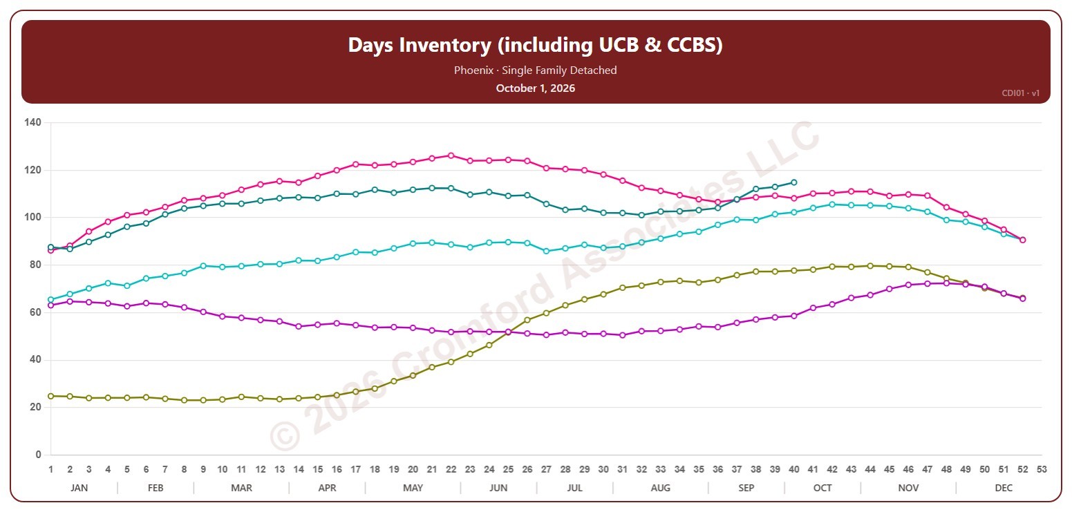
This chart shows days of inventory for single-family detached homes on ARMLS in one city, measured every week on Thursdays: how many days it would take to sell all the active listings (including UCB / CCBS) at the rate homes sold over the last 12 months, if no new listings came on. The lower the number, the tighter the supply.

Each year has its own line, laid out by week of the year, so you can compare this year with earlier years at the same point in the season. It opens on Phoenix and the last five years. Pick any of the 34 cities (18 major and 16 secondary) from the City list, and tick any year back to 2006 in the Year panel. Queen Creek and San Tan Valley start in 2010, and Coolidge, Florence, Waddell, and Wickenburg in 2011.

Hover over a line to see the exact figure for that week.

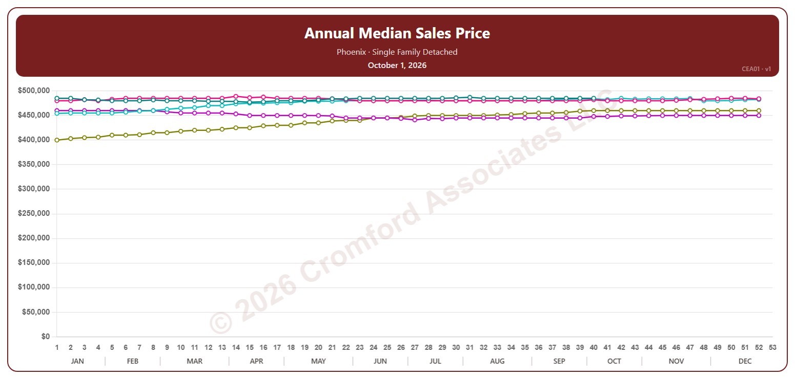
Annual Median Sales Price by City – Weekly

About this chart

This chart shows the median sales price of single-family detached homes that closed through ARMLS in one city, measured every week on Thursdays. Each point covers the closings in the 12 months up to that week; the median is the price in the middle, so half sold for more and half for less.

Each year has its own line, laid out by week of the year, so you can compare this year with earlier years at the same point in the season. It opens on Phoenix and the last five years. Pick any of the 34 cities (18 major and 16 secondary) from the City list, and tick any year back to 2001 in the Year panel.

Hover over a line to see the exact figure for that week.