About this chart
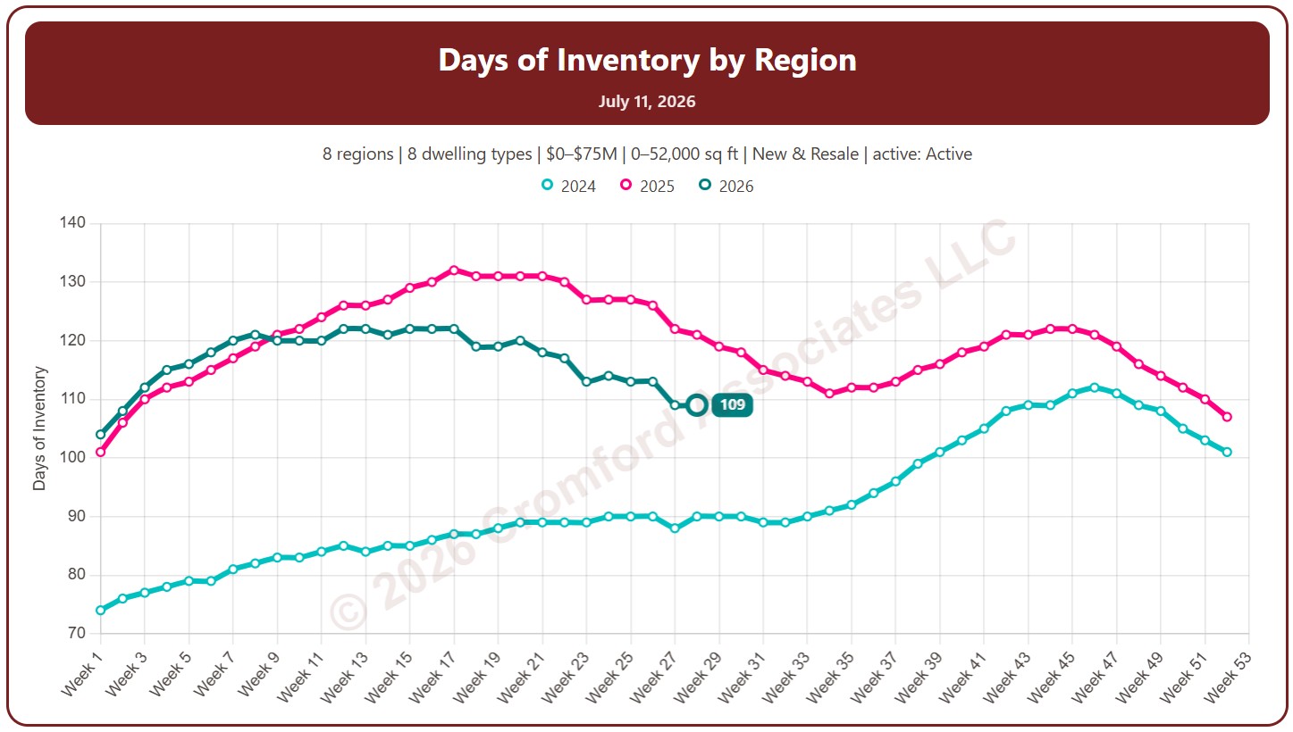
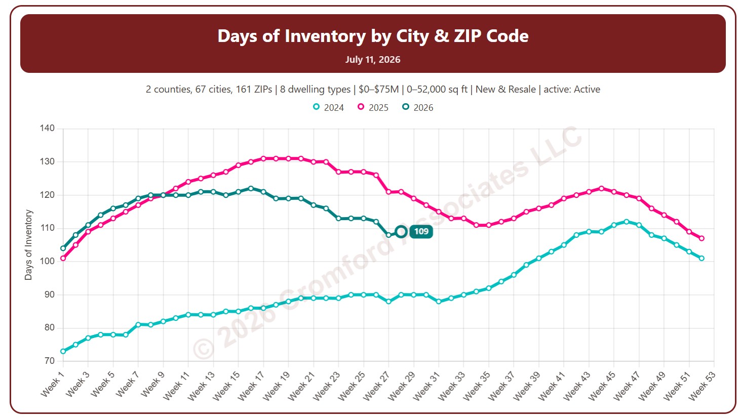
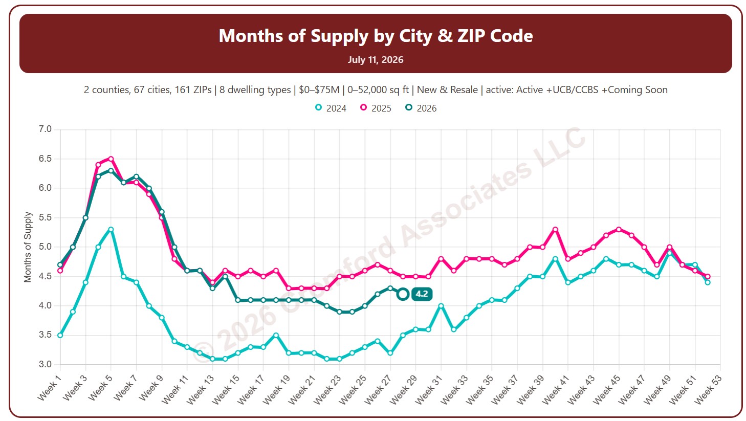
This chart shows months of supply, measured every week: how many months it would take to sell all the active listings at the current monthly pace of closings, if no new listings came on. The lower the number, the tighter the supply; a rising number means supply is building up relative to sales.
By default it counts Active listings only; tick Include UCB/CCBS or Include Coming Soon to add them.
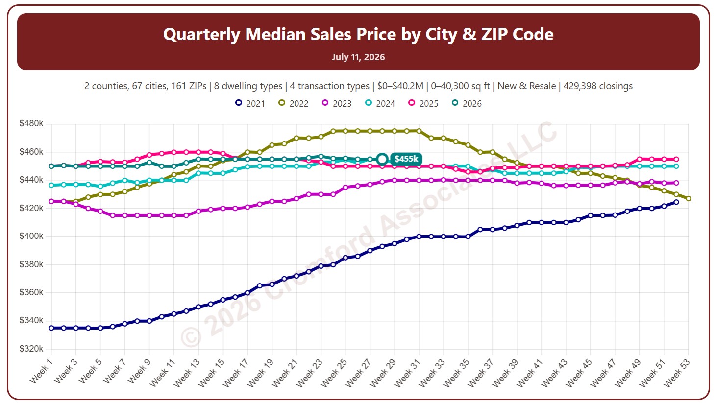
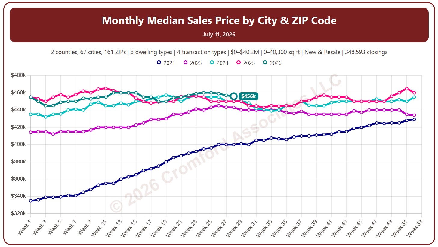
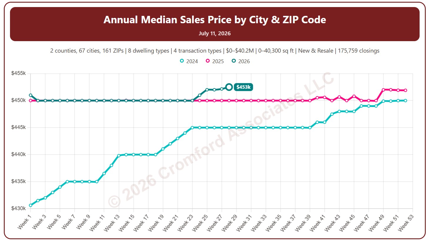
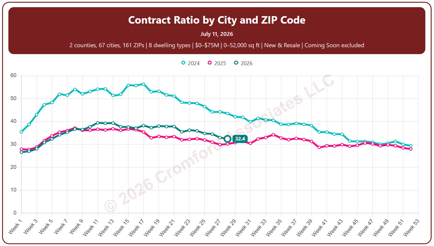
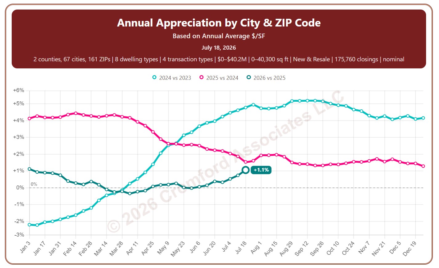
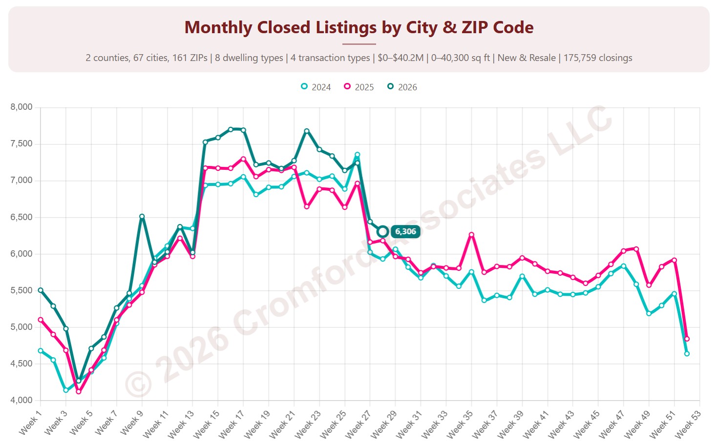
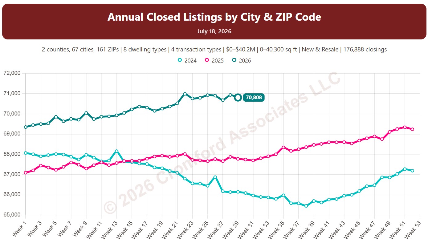
Each year has its own line, laid out by week of the year, so you can compare this year with earlier years at the same point in the season. It opens on the last three years; tick any year back to 2011 in the Year panel.
It opens on Maricopa and Pinal Counties with every city and ZIP code included. Use the County, City, and ZIP panels to focus on any area, from a whole county down to a single ZIP code. Narrow it with the Dwelling Type, Transaction Type, and Build Type boxes and the price, home size, and year built sliders.
Hover over a line to see the exact figure for that week.