Year-over-Year Percent Change in List Price per Square Foot – Active Listings

About this chart

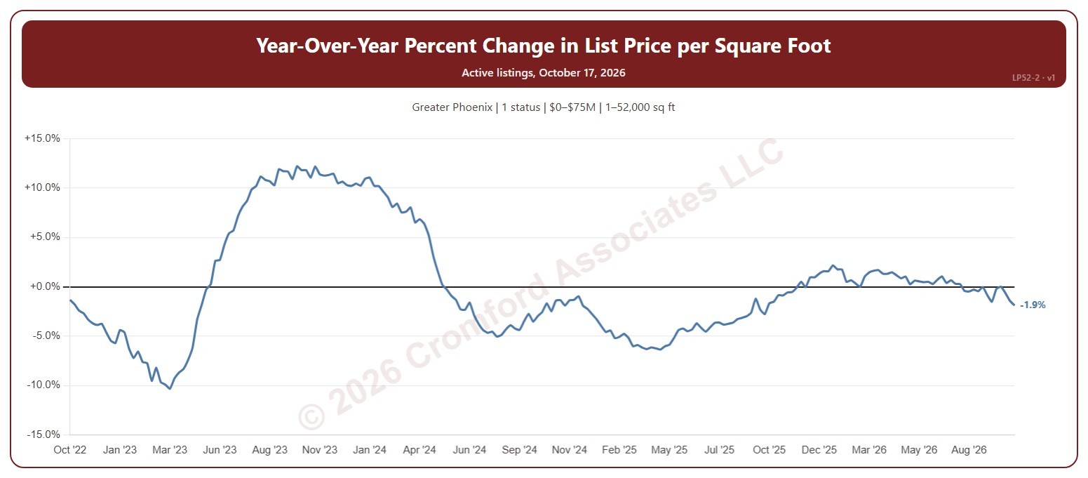
This chart shows how the average asking price per square foot of the homes for sale compares with the same Saturday a year earlier, as a percentage. The average is the total asking price of the active listings divided by their total square feet, taken every Saturday, so larger homes count for more.

It opens on the last 4 years; choose a longer period in the Period box, back to 2012. The chart is updated every day.

It opens on the Greater Phoenix area and on Active listings; tick UCB / CCBS or Coming Soon in the Status box to add them. Tick or untick counties, cities, and ZIP codes to change the area, including counties beyond Greater Phoenix. Narrow it further with the Dwelling Type, Transaction Type, and New / Resale boxes and the list price, home size, year built, and days on market sliders.

Hover over the line to see the change and the two prices per square foot it compares, each with its Saturday.
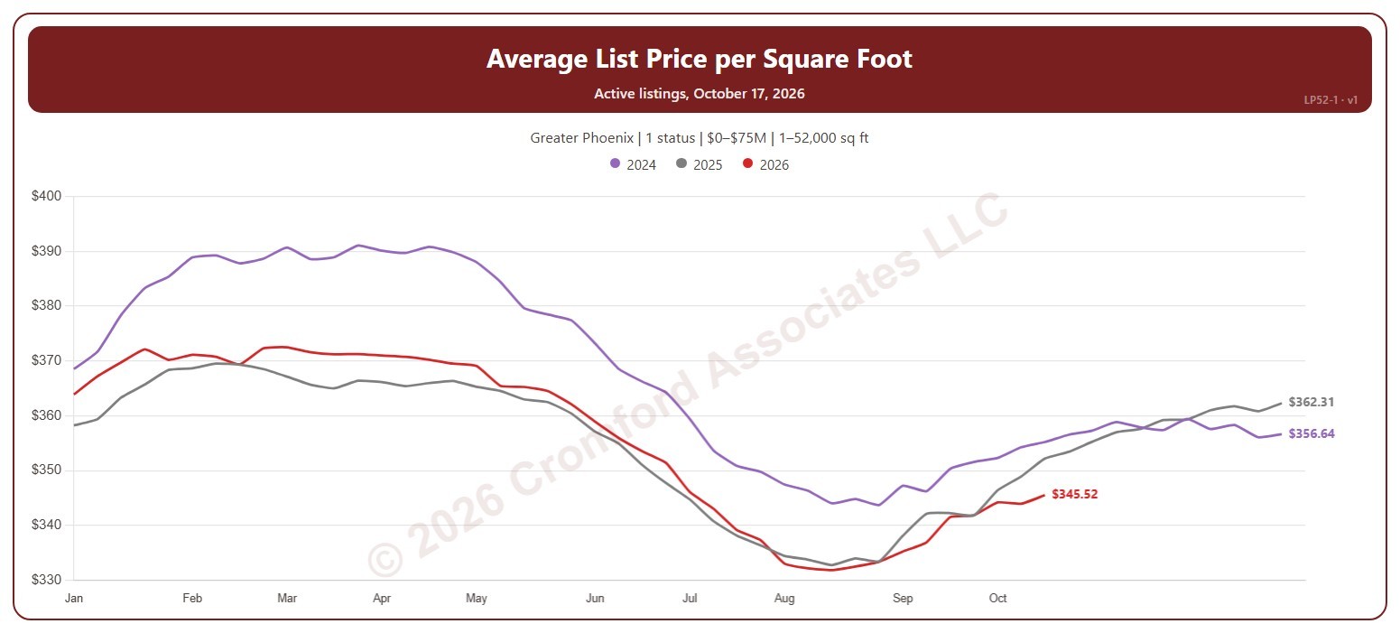
Average List Price per Square Foot – Active Listings

About this chart

This chart shows the average asking price per square foot of the homes for sale, a line per year through the weeks of the year, so this year can be read against earlier years. The average is the total asking price of the active listings divided by their total square feet, taken every Saturday, so larger homes count for more.

It opens on the latest 3 years; tick other years in the Year box to go back as far as 2011. Click a ticked year again to fade it, and once more to remove it. The chart is updated every day.

It opens on the Greater Phoenix area and on Active listings; tick UCB / CCBS or Coming Soon in the Status box to add them. Tick or untick counties, cities, and ZIP codes to change the area, including counties beyond Greater Phoenix. Narrow it further with the Dwelling Type, Transaction Type, and New / Resale boxes and the list price, home size, year built, and days on market sliders.

Hover over the chart to see each year’s figure for that week and its Saturday.

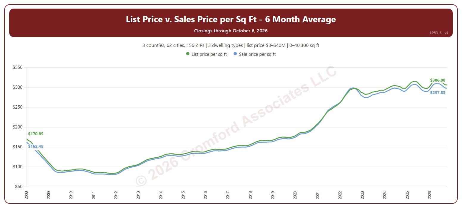
List Price and Sales Price per Square Foot – 6 Month Average

About this chart

This chart shows two lines for the homes that closed through ARMLS: the list price per square foot and the sale price per square foot, over the 6 months ending with each month. The gap between them shows how far below (or above) their asking price homes are selling. Averaging over six months smooths out the month-to-month swings while still reacting faster than a 12-month average.

It opens on the years since 2008; tick any year back to 2000 in the Year panel. The newest month is the month so far.

It opens on the Greater Phoenix area: the counties, cities, and ZIP codes that make it up are ticked to start with. Tick or untick any of them to change the area, including counties beyond Greater Phoenix. Narrow it further with the Dwelling Type (condo, mobile, single family), Transaction Type, and New / Resale boxes and the list price, home size, and year built sliders.

Hover over the chart to see the figures for that month.

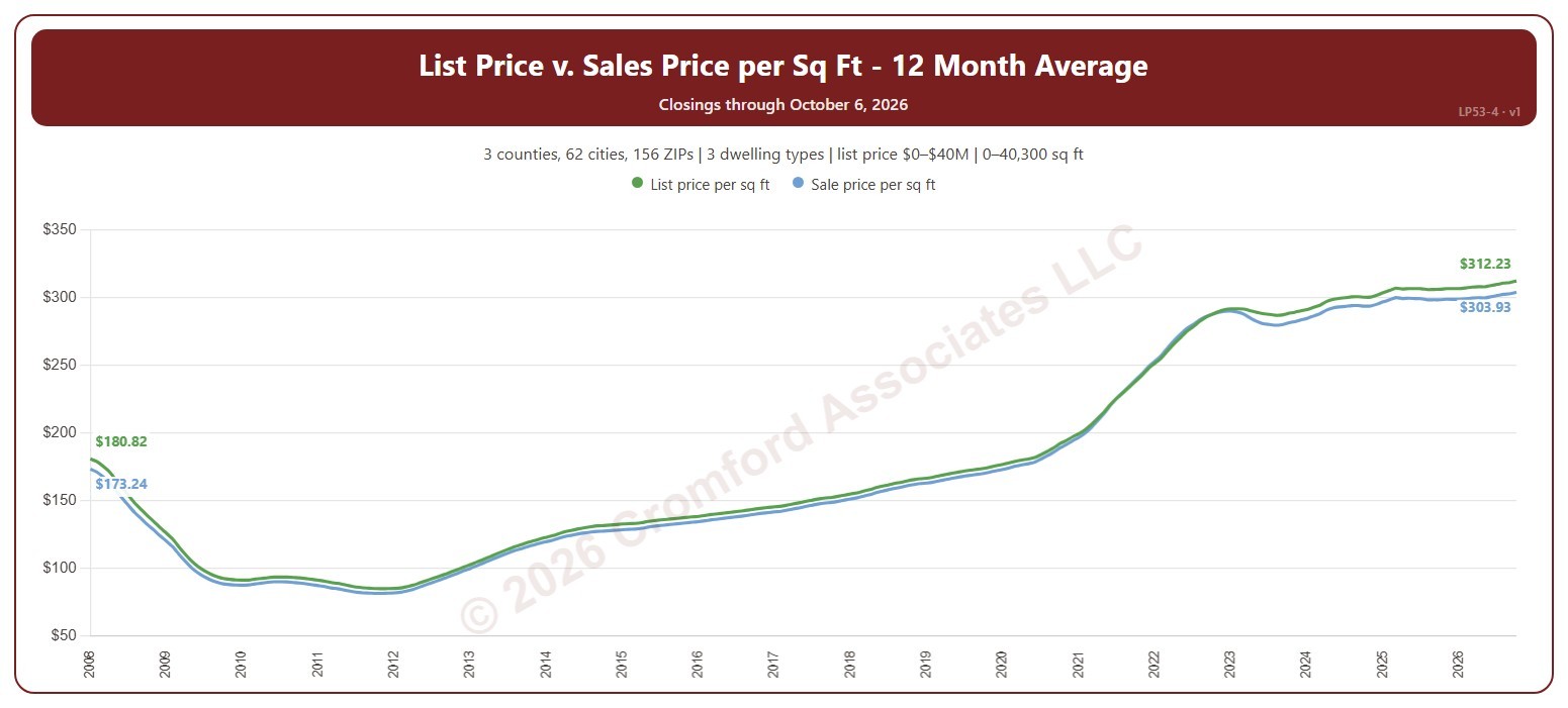
List Price vs. Sale Price per Square Foot – 12 Month Average

About this chart

This chart shows two lines for the homes that closed through ARMLS: the list price per square foot and the sale price per square foot, over the 12 months ending with each month. The gap between them shows how far below (or above) their asking price homes are selling. Averaging over a year smooths out the seasonal swings.

It opens on the years since 2008; tick any year back to 2000 in the Year panel. The newest month is the month so far.

It opens on the Greater Phoenix area: the counties, cities, and ZIP codes that make it up are ticked to start with. Tick or untick any of them to change the area, including counties beyond Greater Phoenix. Narrow it further with the Dwelling Type (condo, mobile, single family), Transaction Type, and New / Resale boxes and the list price, home size, and year built sliders.

Hover over the chart to see the figures for that month.

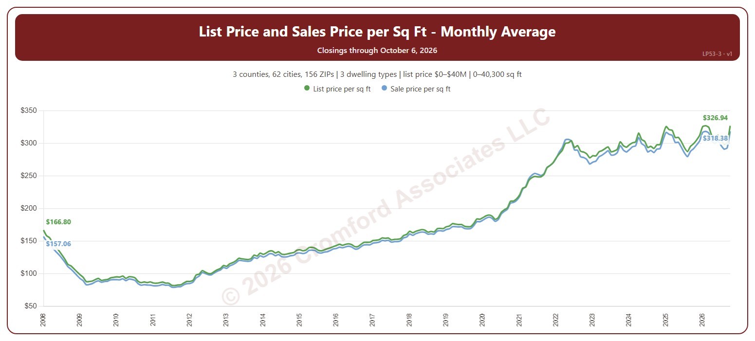
List Price and Sales Price per Square Foot

About this chart

This chart shows two lines for the homes that closed through ARMLS: the list price per square foot and the sale price per square foot, each calendar month. The gap between them shows how far below (or above) their asking price homes are selling.

It opens on the years since 2008; tick any year back to 2000 in the Year panel. The newest month is the month so far.

It opens on the Greater Phoenix area: the counties, cities, and ZIP codes that make it up are ticked to start with. Tick or untick any of them to change the area, including counties beyond Greater Phoenix. Narrow it further with the Dwelling Type (condo, mobile, single family), Transaction Type, and New / Resale boxes and the list price, home size, and year built sliders.

Hover over the chart to see the figures for that month.

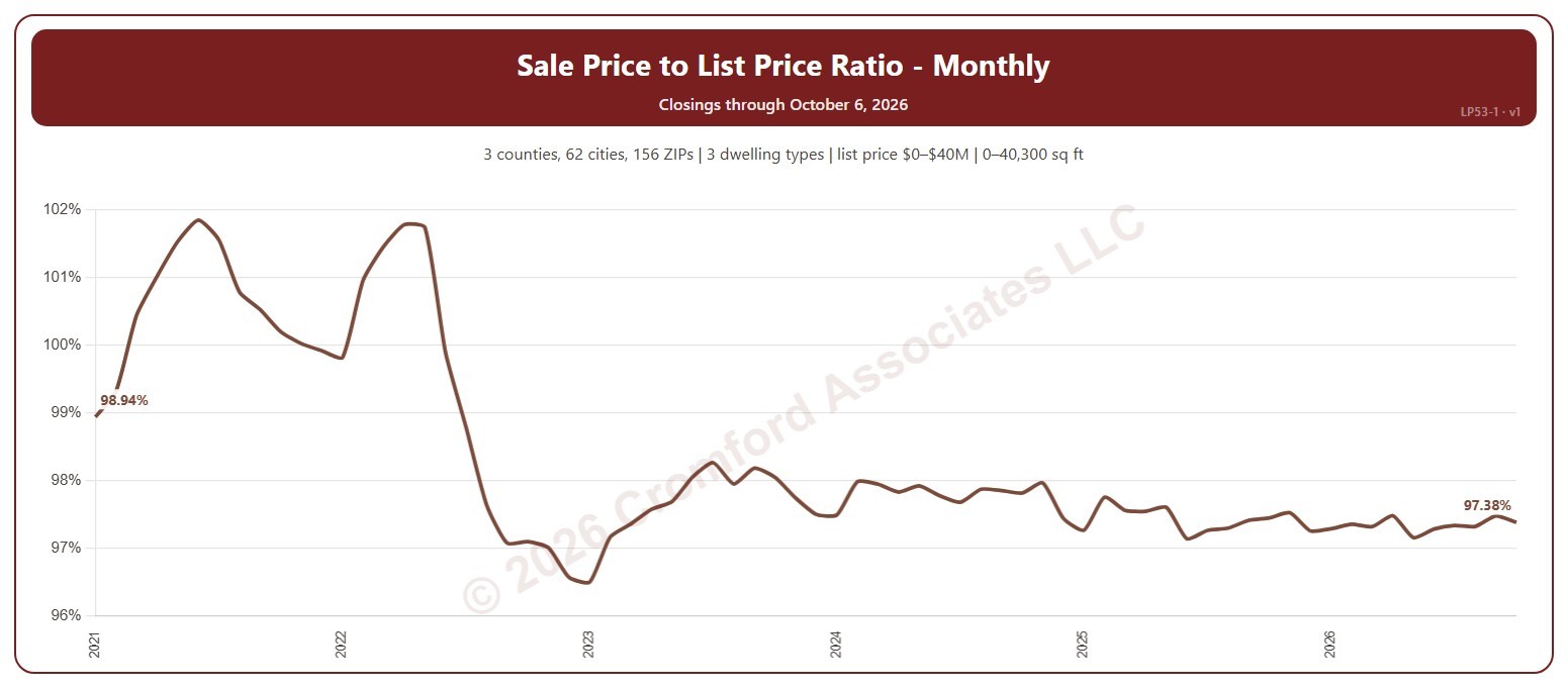
Sales Price to List Price Ratio – Monthly

About this chart

This chart shows the sale price to list price ratio of the homes that closed through ARMLS each calendar month: the total of the sale prices as a percentage of the total of the final list prices. Above 100%, homes are selling for more than their asking price on average; below 100%, buyers are negotiating prices down.

It opens on the years since 2021; tick any year back to 2000 in the Year panel. The newest month is the month so far.

It opens on the Greater Phoenix area: the counties, cities, and ZIP codes that make it up are ticked to start with. Tick or untick any of them to change the area, including counties beyond Greater Phoenix. Narrow it further with the Dwelling Type (condo, mobile, single family), Transaction Type, and New / Resale boxes and the list price, home size, and year built sliders.

Hover over the chart to see the figures for that month.

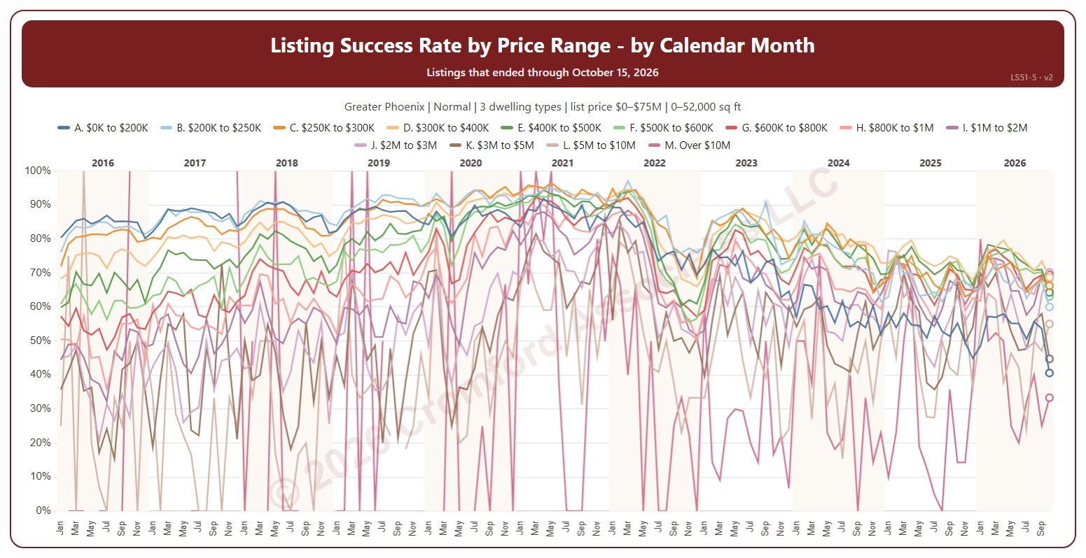
Listing Success Rate by Price Range

About this chart

This chart shows the listing success rate each month for each list price range, a line per range. The listing success rate is the share of listings that closed, out of all the listings that ended: closed, expired, or cancelled. Each listing counts once, in the month (or window) its listing ended: the closing date for a closing, the expiration for an expired listing, the cancellation for a cancelled one. The highest price ranges have few listings, so their lines swing widely.

It opens on January 2016 to date; drag the handles of the date slider under the chart to choose the months shown, as far back as January 2004. The newest month is the month so far, shown as a hollow point. The chart is updated every day. Click a price range in the legend to hide or show its line.

It opens on the Greater Phoenix area: the counties, cities, and ZIP codes that make it up are ticked to start with. Tick or untick any of them to change the area, including counties beyond Greater Phoenix. It opens on normal sales; tick other transaction types to add them. Narrow it further with the Dwelling Type and New / Resale boxes and the list price, home size, and year built sliders.

Hover over the chart to see each range’s rate that month and how many listings closed out of all that ended.

Listing Success Rate by Transaction Type

About this chart

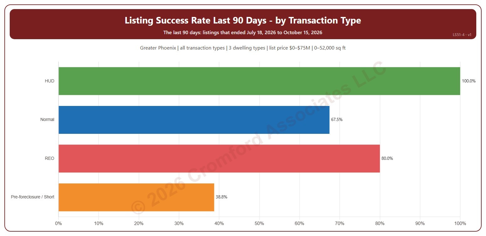
This chart shows the listing success rate over the last 90 days for each transaction type: normal sales, REO, pre-foreclosure / short sales, and HUD. The listing success rate is the share of listings that closed, out of all the listings that ended: closed, expired, or cancelled. Each listing counts once, in the month (or window) its listing ended: the closing date for a closing, the expiration for an expired listing, the cancellation for a cancelled one.

It covers the 90 days of listings that ended up to the newest one; the heading shows the exact dates. The chart is updated every day.

It opens on the Greater Phoenix area: the counties, cities, and ZIP codes that make it up are ticked to start with. Tick or untick any of them to change the area, including counties beyond Greater Phoenix. It opens on all four transaction types; untick any to leave them out. Narrow it further with the Dwelling Type and New / Resale boxes and the list price, home size, and year built sliders.

Hover over a bar to see the rate, the listings that closed, and those that expired or were cancelled.

Listing Success by Price Range

About this chart

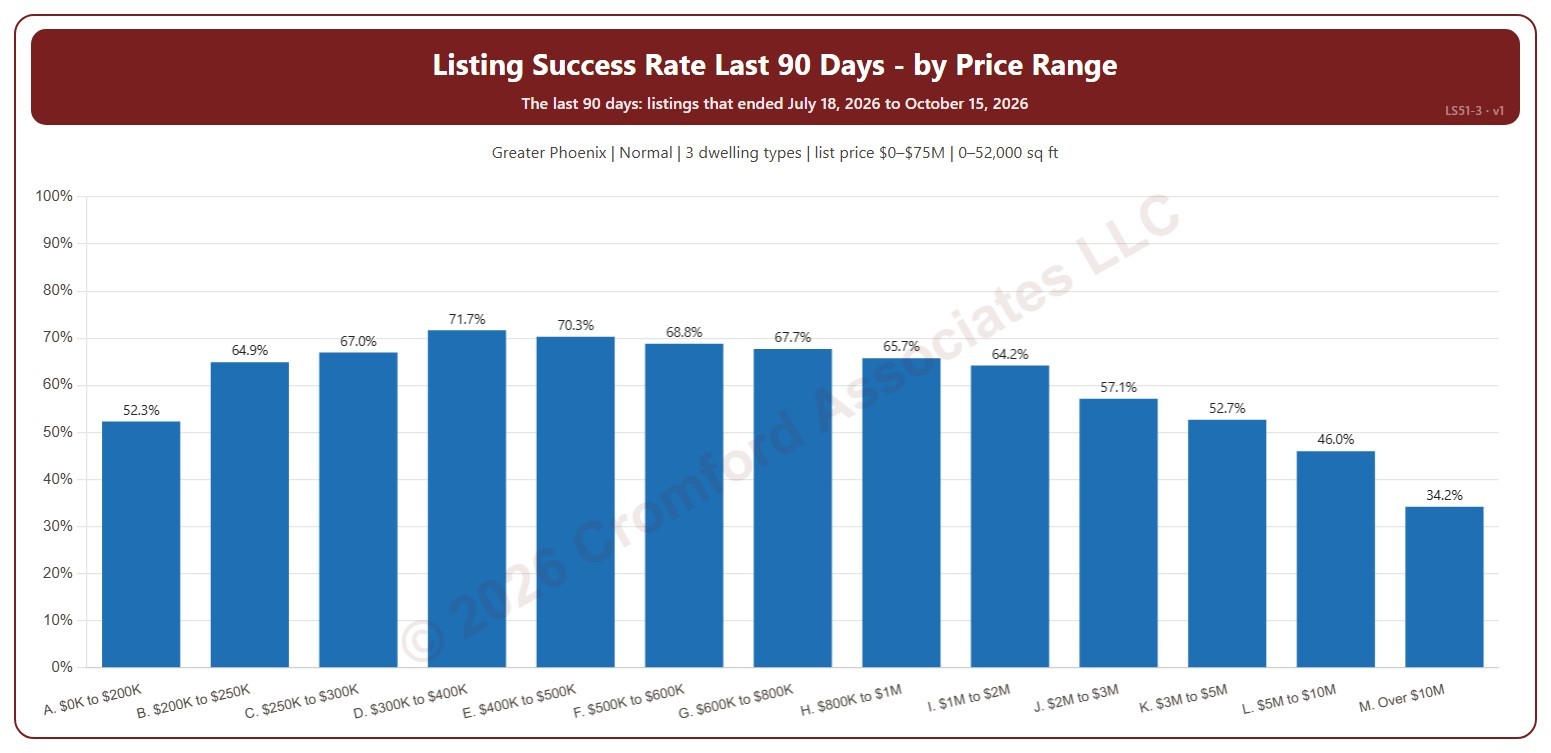
This chart shows the listing success rate over the last 90 days in each list price range, from $200K and under to over $10M. The listing success rate is the share of listings that closed, out of all the listings that ended: closed, expired, or cancelled. Each listing counts once, in the month (or window) its listing ended: the closing date for a closing, the expiration for an expired listing, the cancellation for a cancelled one.

It covers the 90 days of listings that ended up to the newest one; the heading shows the exact dates. The chart is updated every day.

It opens on the Greater Phoenix area: the counties, cities, and ZIP codes that make it up are ticked to start with. Tick or untick any of them to change the area, including counties beyond Greater Phoenix. It opens on normal sales; tick other transaction types to add them. Narrow it further with the Dwelling Type and New / Resale boxes and the list price, home size, and year built sliders.

Hover over a bar to see the rate, the listings that closed, and those that expired or were cancelled.

Listing Success Rate Ranked by City

About this chart

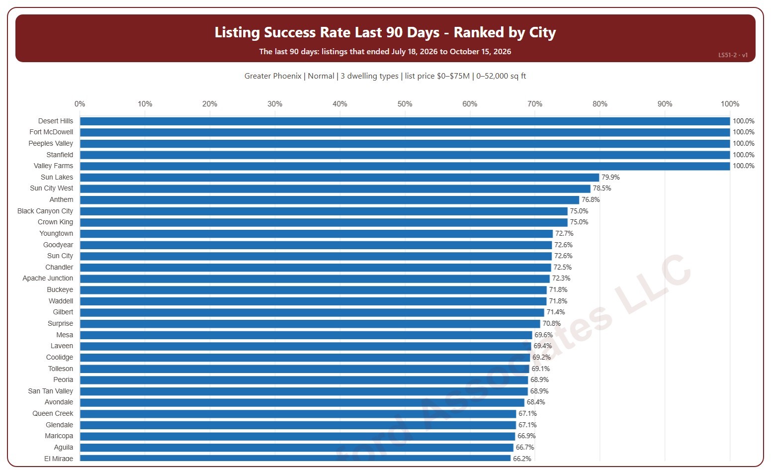
This chart ranks cities by their listing success rate over the last 90 days, highest first. The listing success rate is the share of listings that closed, out of all the listings that ended: closed, expired, or cancelled. Each listing counts once, in the month (or window) its listing ended: the closing date for a closing, the expiration for an expired listing, the cancellation for a cancelled one. A city with only a few listings can show 0% or 100%.

It covers the 90 days of listings that ended up to the newest one; the heading shows the exact dates. The chart is updated every day. Scroll inside the chart to see every city; a printed copy runs over as many pages as it needs.

It opens on the Greater Phoenix area: the counties, cities, and ZIP codes that make it up are ticked to start with. Tick or untick any of them to change the area, including counties beyond Greater Phoenix. It opens on normal sales; tick other transaction types to add them. Narrow it further with the Dwelling Type and New / Resale boxes and the list price, home size, and year built sliders.

Hover over a bar to see the rate, the listings that closed, and those that expired or were cancelled.