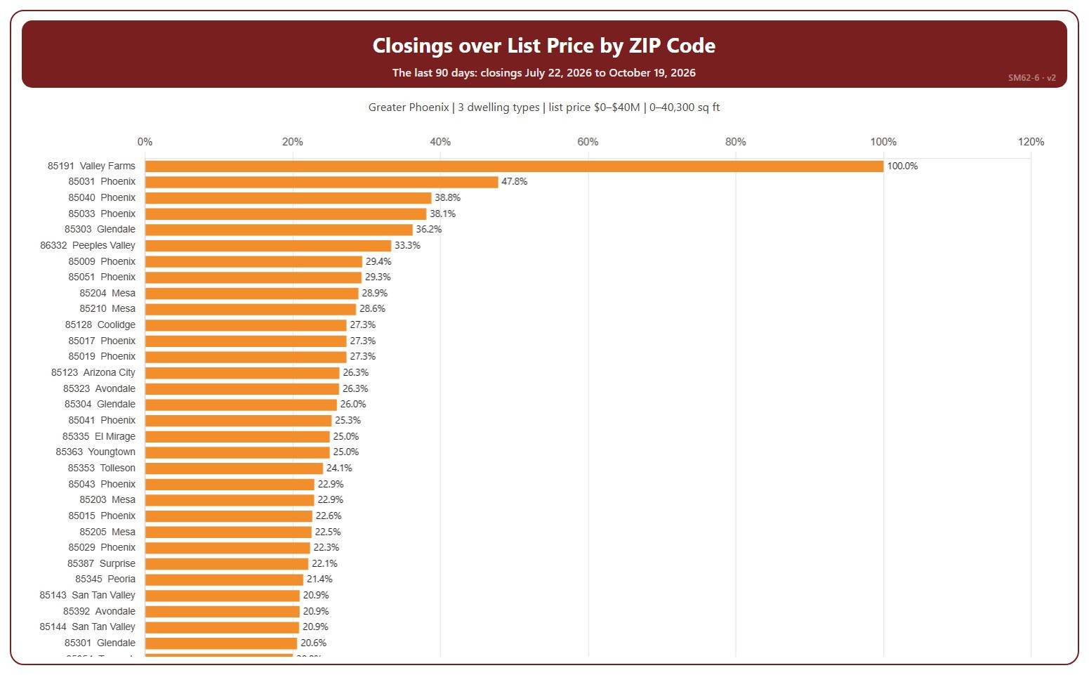
Closings over List Price by ZIP Code

About this chart

This chart ranks ZIP codes by the percentage of their closings that closed over list price in the last 90 days, highest first. Each ZIP code is shown with the city most of its closings are in. A home closed over list price when its sale price was higher than its list price on its ARMLS listing; the amount over is the sale price minus the list price. A ZIP code with only a few closings can show 0% or 100%.

It covers the 90 days of closings up to the newest one; the heading shows the exact dates. Scroll inside the chart to see every ZIP code; a printed copy runs over as many pages as it needs. The chart is updated every day.

It opens on the Greater Phoenix area: the counties, cities, and ZIP codes that make it up are ticked to start with. Tick or untick any of them to change the area, including counties beyond Greater Phoenix. Narrow it further with the Dwelling Type, Transaction Type, and New / Resale boxes and the list price, home size, and year built sliders.

Hover over a bar to see the percentage, the number over list price, and all closings in that ZIP code.
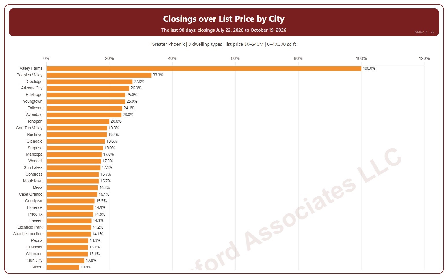
Closings over List Price by City

About this chart

This chart ranks cities by the percentage of their closings that closed over list price in the last 90 days, highest first. A home closed over list price when its sale price was higher than its list price on its ARMLS listing; the amount over is the sale price minus the list price. A city with only a few closings can show 0% or 100%.

It covers the 90 days of closings up to the newest one; the heading shows the exact dates. Scroll inside the chart to see every city; a printed copy runs over as many pages as it needs. The chart is updated every day.

It opens on the Greater Phoenix area: the counties, cities, and ZIP codes that make it up are ticked to start with. Tick or untick any of them to change the area, including counties beyond Greater Phoenix. Narrow it further with the Dwelling Type, Transaction Type, and New / Resale boxes and the list price, home size, and year built sliders.

Hover over a bar to see the percentage, the number over list price, and all closings in that city.

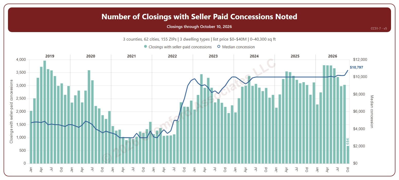
Number of Closings with Seller Paid Concessions Noted

About this chart

This chart shows the number of closings each month that had a seller-paid concession noted (the bars) and the median dollar amount of those concessions (the line, on the right-hand scale). A seller-paid concession is money the seller agrees to pay toward the buyer’s closing costs or other expenses, as noted on the ARMLS listing when it closes.

It opens on 2019 to date; tick other years in the Year panel to go back as far as 2008. The newest month is the month so far.

It opens on the Greater Phoenix area: the counties, cities, and ZIP codes that make it up are ticked to start with. Tick or untick any of them to change the area, including counties beyond Greater Phoenix. Narrow it further with the Dwelling Type, Transaction Type, and New / Resale boxes and the list price, home size, and year built sliders.

Hover over the chart to see the figures for that month.

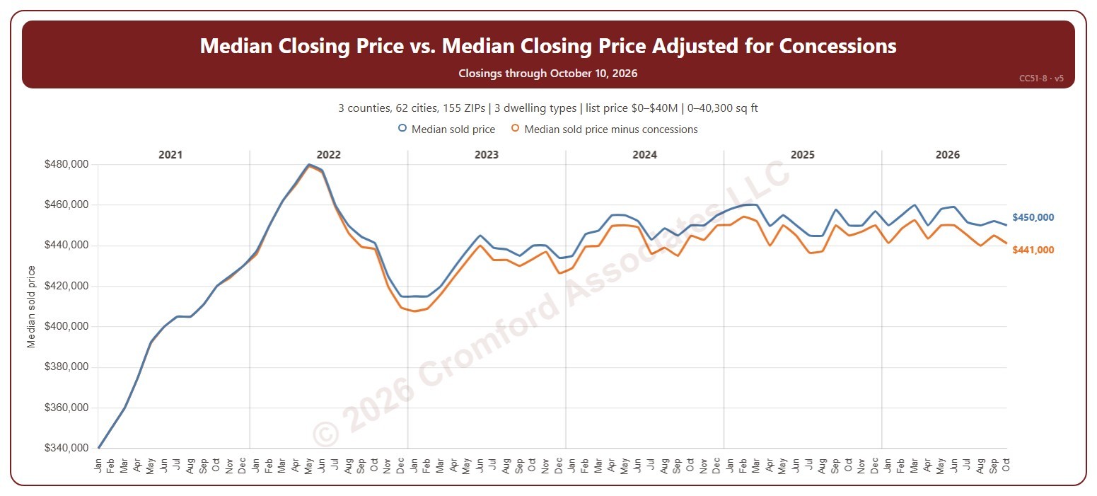
Median Closing Price vs. Median Closing Price Adjusted for Concessions

About this chart

This chart compares the median sale price each month with the median sale price after taking off any seller-paid concession. A closing with no concession counts at its full price. The gap between the two lines shows how much concessions reduce what sellers really receive.

It opens on 2021 to date; tick other years in the Year panel to go back as far as 2008. The newest month is the month so far.

It opens on the Greater Phoenix area: the counties, cities, and ZIP codes that make it up are ticked to start with. Tick or untick any of them to change the area, including counties beyond Greater Phoenix. Narrow it further with the Dwelling Type, Transaction Type, and New / Resale boxes and the list price, home size, and year built sliders.

Hover over the chart to see the figures for that month.

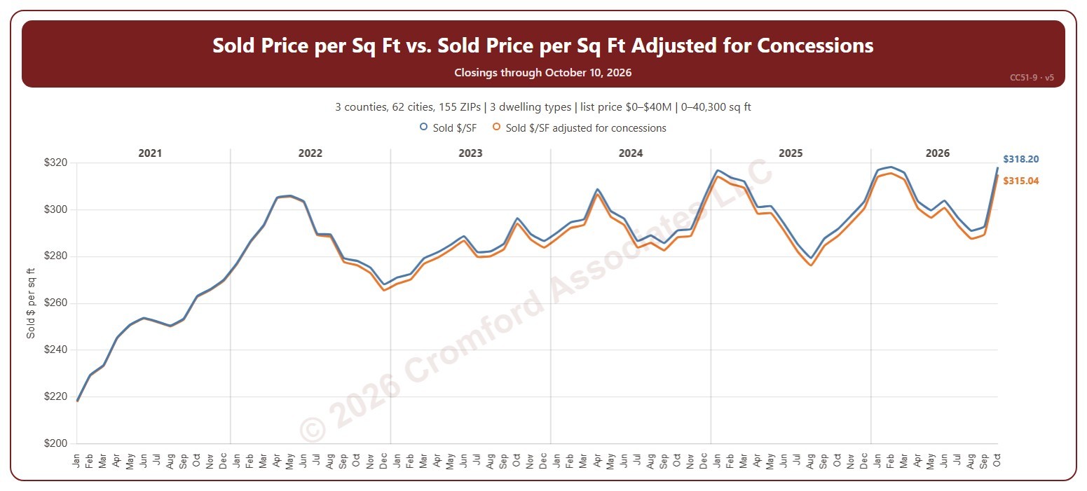
Sold Price per Sq Ft vs. Sold Price per Sq Ft Adjusted for Concessions

About this chart

This chart compares the sale price per square foot each month with the sale price per square foot after taking off any seller-paid concession. A closing with no concession counts at its full price.

It opens on 2021 to date; tick other years in the Year panel to go back as far as 2008. The newest month is the month so far.

It opens on the Greater Phoenix area: the counties, cities, and ZIP codes that make it up are ticked to start with. Tick or untick any of them to change the area, including counties beyond Greater Phoenix. Narrow it further with the Dwelling Type, Transaction Type, and New / Resale boxes and the list price, home size, and year built sliders.

Hover over the chart to see the figures for that month.

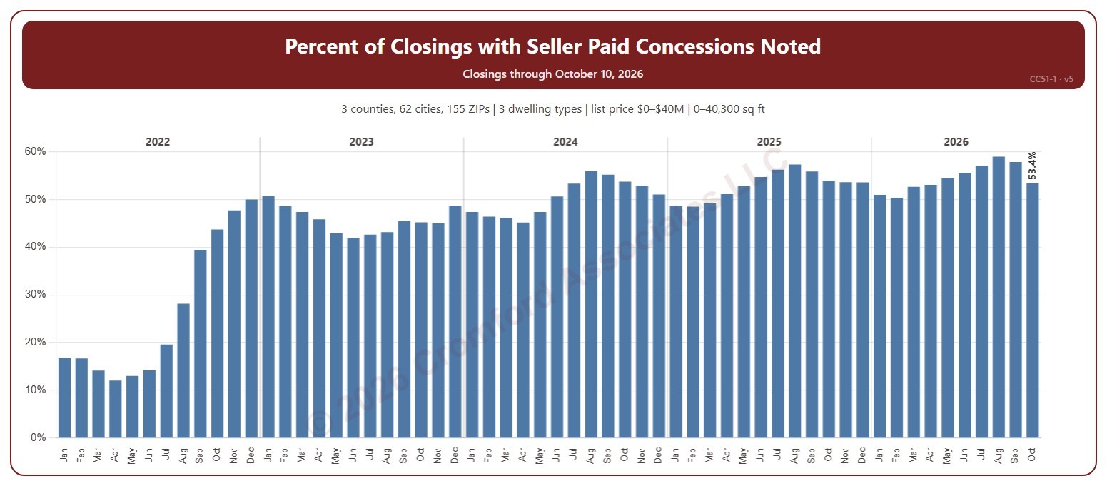
Percent of Closings with Seller Paid Concessions Noted

About this chart

This chart shows the percentage of closings each month that had a seller-paid concession noted. A seller-paid concession is money the seller agrees to pay toward the buyer’s closing costs or other expenses, as noted on the ARMLS listing when it closes.

It opens on 2022 to date; tick other years in the Year panel to go back as far as 2008. The newest month is the month so far.

It opens on the Greater Phoenix area: the counties, cities, and ZIP codes that make it up are ticked to start with. Tick or untick any of them to change the area, including counties beyond Greater Phoenix. Narrow it further with the Dwelling Type, Transaction Type, and New / Resale boxes and the list price, home size, and year built sliders.

Hover over the chart to see the figures for that month. The tooltip gives the number of closings with a concession and the total.

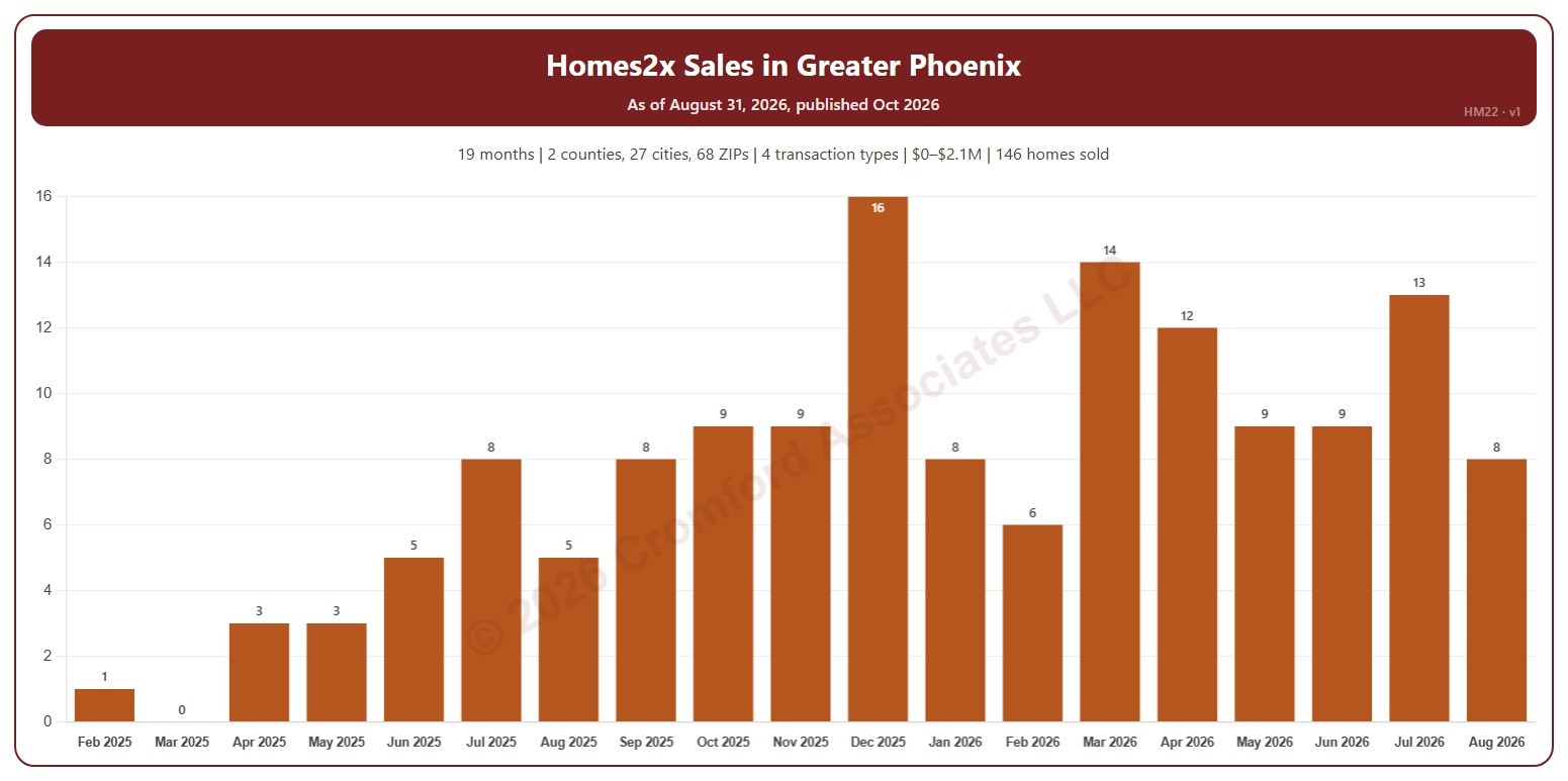
Homes2x Sales in Greater Phoenix

About this chart

This chart counts the homes Homes2x sold each calendar month since February 2025, from residential deeds recorded by Maricopa and Pinal Counties. Homes2x is an iBuyer: it buys homes directly from owners and resells them. HM21 shows the homes it bought, so the two together show whether it is building up or running down its inventory.

It opens on Maricopa and Pinal Counties with everything included. Narrow it with the County, City, and ZIP panels, the Transaction Type, Property Type, and 55+ Communities boxes, and the sale price slider. Untick years in the Year panel to drop them from the chart.

The records run to the end of last month and are updated monthly. Hover over a bar to see the exact figure for that month.

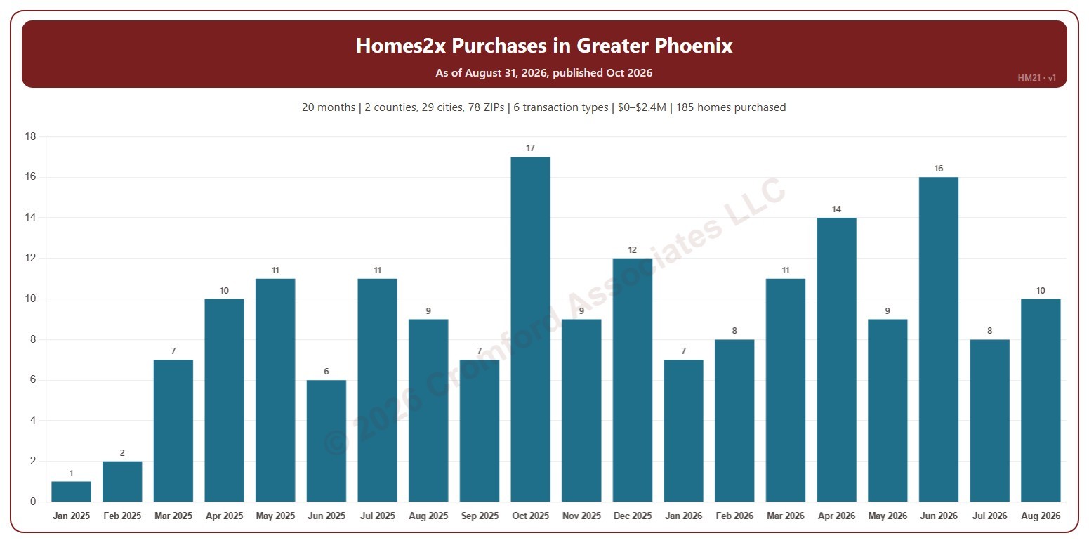
Homes2x Purchases in Greater Phoenix

About this chart

This chart counts the homes Homes2x bought each calendar month since January 2025, from residential deeds recorded by Maricopa and Pinal Counties. Homes2x is an iBuyer: it buys homes directly from owners and resells them. HM22 shows the homes it sold, so the two together show whether it is building up or running down its inventory.

It opens on Maricopa and Pinal Counties with everything included. Narrow it with the County, City, and ZIP panels, the Transaction Type, Property Type, and 55+ Communities boxes, and the sale price slider. Untick years in the Year panel to drop them from the chart.

The records run to the end of last month and are updated monthly. Hover over a bar to see the exact figure for that month.

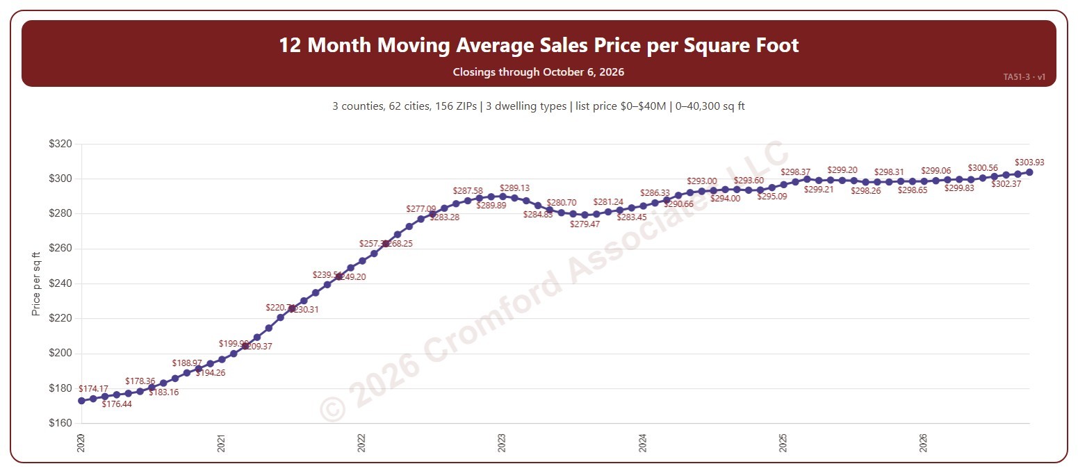
12 Month Moving Average Sales Price per Square Foot

About this chart

This chart shows the average sales price per square foot of the homes that closed through ARMLS over the 12 months ending with each calendar month: a 12-month moving average, across all the square feet sold. Price per square foot lets you compare homes of different sizes. The 12-month average smooths out the seasonal swings.

It opens on the years since 2020; tick any year back to 2000 in the Year panel. The newest month is the month so far.

It opens on the Greater Phoenix area: the counties, cities, and ZIP codes that make it up are ticked to start with. Tick or untick any of them to change the area, including counties beyond Greater Phoenix. Narrow it further with the Dwelling Type (condo, mobile, single family), Transaction Type, and New / Resale boxes and the list price, home size, and year built sliders.

Hover over the chart to see the figures for that month.

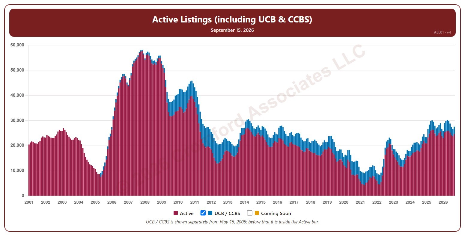
Active Listings (including UCB & CCBS) – Long Term

About this chart

This chart shows the number of active listings, for the whole ARMLS market, all areas and all dwelling types, as one bar per month since January 2001. Each bar is the reading on the 15th of the month, stacked to show Active listings and UCB / CCBS listings (under contract but still marked active). Rising inventory gives buyers more choice; falling inventory favors sellers.

Untick UCB / CCBS to show Active listings alone, or tick Coming Soon to add homes about to go active.

Hover over a bar to see the exact figure for that month.