Cromford® Price Index – Rest of Arizona

About this chart

The Cromford® Price Index as a level for the Arizona regions outside Greater Phoenix, one region at a time, measured from recorded home sales (county deeds) rather than MLS closings. Recorded sales include homes sold without an agent and towns the MLS barely covers, such as Winslow, Page and Williams, and in most regions there are several times as many of them.

Every region is set to 100 on January 1, 2020, the same base date as the Greater Phoenix chart, so a reading of 120 means prices for comparable homes are 20% higher than on January 1, 2020. In Rim Country the county records only identify the kind of sale from 2021, so its earlier sales count only where they also went through the MLS; too few of those were recorded in the first half of 2020, so its line has a gap there.

Each point covers the homes recorded in the 3 months up to that week, measured every week. Recorded sales reach us some time after the sale, so the newest point is two to three months old. Only normal sales of homes count: foreclosures, sales of several parcels together and, where the records say so, sales between related parties are left out. Unlike the median sales price, the index is not moved by changes in which homes happen to sell. It counts resales only, every dwelling type together.

Median, the default, follows the typical home; Value-weighted lets dearer homes count for more. The Inflation option shows the index in today’s dollars. Tucson, Copper Corridor, Western Arizona, Graham / Greenlee and Yuma are not included. Greater Phoenix is on the Cromford® Price Index by Region. Hover over the line to see the figure for that week and the number of sales behind it.

Cromford® Price Index by Region

About this chart

The Cromford® Price Index shown as a level rather than a yearly change: January 1, 2020 = 100, so a reading of 150 means prices for comparable homes are 50% higher than at January 1, 2020, and 90 means 10% lower. Each point covers the homes that closed in the 3 months up to that week, measured every week back to 2001.

Unlike the median sales price or the median price per square foot, the index is not moved by changes in which homes happen to sell. It counts resales only: a new home’s first sale is left out, so every period compares the same kind of sale.

Two ways to read it. Median, the default, follows the typical home: every home counts the same. Value-weighted lets dearer homes count for more, as the S&P CoreLogic Case-Shiller index does, so it shows what happened to the total value of the homes sold. The two part when cheaper and dearer homes move differently, as they have since 2022.

Sales offers All sales or Normal sales only. Normal sales only leaves out REO, short and HUD sales, which made up most resales in 2009 to 2011 and sold well below other homes, so the choice matters mainly for those years.

It covers the eight Greater Phoenix regions; the rest of Arizona has its own chart, the Cromford® Price Index – Rest of Arizona. To keep every figure reliable, a point is shown only where at least 100 homes closed in its 3 months and in the 3 months to January 1, 2020, and the Region and Dwelling Type lists offer only the regions and home types that reached 100 closings in every 3-month span of the last two years; smaller home types are grouped as Other types. The Inflation option shows the index in today’s dollars, using national or Phoenix inflation. Hover over the line to see the figure for that week and the number of sales behind it.

Cromford® Price Index by City and ZIP Code – Rolling 3 Months

About this chart

The Cromford® Price Index measures how much home prices have changed compared with the same point a year earlier, for comparable homes, measured every week. On this chart each point covers the homes that closed in the 3 months up to that week, the same span the S&P CoreLogic Case-Shiller index uses, so it shows a change in direction sooner than the 12-month version (PICZ01) but moves around more. Above zero, prices are higher than a year ago; below zero, they are lower.

Unlike the median sales price or the median price per square foot, the index is not moved by changes in which homes happen to sell. A quarter in which more large homes sell, or more small ones, does not show up as a rise or fall in prices.

Each year has its own line, laid out by week of the year, so you can compare this year with earlier years at the same point in the season. It opens on the last three years; tick any year back to 2002 in the Year panel.

It opens on Maricopa and Pinal Counties with every city and ZIP code included. Use the County, City, and ZIP panels to focus on any area, from a whole county down to a single ZIP code. Narrow it with the Dwelling Type and Transaction Type boxes and the sales price, home size, and year built sliders. It counts resales only: a new home’s first sale is left out, so every year compares the same kind of sale. The Inflation (CPI) option compares prices in today’s dollars, using national or Phoenix inflation.

Where fewer than 30 homes closed in either 3-month span for the area and filters chosen, no point is shown, because too few sales cannot give a reliable figure. Hover over a line to see the exact figure for that week and the number of sales behind it.

Cromford® Price Index by City and ZIP Code

About this chart

The Cromford® Price Index measures how much home prices have changed compared with the same point a year earlier, for comparable homes, measured every week. Each point covers the homes that closed in the 12 months up to that week. Above zero, prices are higher than a year ago; below zero, they are lower.

Unlike the median sales price or the median price per square foot, the index is not moved by changes in which homes happen to sell. A year in which more large homes sell, or more small ones, does not show up as a rise or fall in prices.

Each year has its own line, laid out by week of the year, so you can compare this year with earlier years at the same point in the season. It opens on the last three years; tick any year back to 2002 in the Year panel.

It opens on Maricopa and Pinal Counties with every city and ZIP code included. Use the County, City, and ZIP panels to focus on any area, from a whole county down to a single ZIP code. Narrow it with the Dwelling Type and Transaction Type boxes and the sales price, home size, and year built sliders. It counts resales only: a new home’s first sale is left out, so every year compares the same kind of sale. The Inflation (CPI) option compares prices in today’s dollars, using national or Phoenix inflation.

Where fewer than 30 homes closed in either year for the area and filters chosen, no point is shown, because too few sales cannot give a reliable figure. Hover over a line to see the exact figure for that week and the number of sales behind it.

Quarterly Median Sales Price per Square Foot by Region

About this chart

This chart shows the median sales price per square foot of homes that closed through ARMLS, measured every week. Each point covers the homes that closed in the three months up to that week. Price per square foot lets you compare homes of different sizes; the median is the figure in the middle, so a few unusual sales move it less than an average.

Each year has its own line, laid out by week of the year, so you can compare this year with earlier years at the same point in the season. It opens on the last three years; tick any year back to 2001 in the Year panel.

It opens on the eight Greater Phoenix regions. Use the Region panel to focus on one region or compare a combination of them. Narrow it with the Dwelling Type, Transaction Type, and New / Resale boxes and the sales price, home size, and year built sliders. The Inflation (CPI) option restates prices in today’s dollars using national or Phoenix inflation.

Hover over a line to see the exact figure for that week.

Quarterly Median Sales Price per Square Foot by City and ZIP Code

About this chart

This chart shows the median sales price per square foot of homes that closed through ARMLS, measured every week. Each point covers the homes that closed in the three months up to that week. Price per square foot lets you compare homes of different sizes; the median is the figure in the middle, so a few unusual sales move it less than an average.

Each year has its own line, laid out by week of the year, so you can compare this year with earlier years at the same point in the season. It opens on the last three years; tick any year back to 2001 in the Year panel.

It opens on Maricopa and Pinal Counties with every city and ZIP code included. Use the County, City, and ZIP panels to focus on any area, from a whole county down to a single ZIP code. Narrow it with the Dwelling Type, Transaction Type, and New / Resale boxes and the sales price, home size, and year built sliders. The Inflation (CPI) option restates prices in today’s dollars using national or Phoenix inflation.

Hover over a line to see the exact figure for that week.

Median Sales Price Map by Region

About this chart

This map colors each region by the median sales price of its closings over the time frame chosen, in 14 price ranges. Every ZIP code in a region takes the region’s color, so each region reads as one block, with its boundary drawn over it. A ZIP code in two regions is striped in both regions’ colors. The median sales price is the middle sale price of the homes that closed on ARMLS in the period: half sold for more and half for less. New homes are included. EM52-6 shows the same map by ZIP code.

It opens on the last 3 months to the newest closing, zoomed to the Greater Phoenix regions; use the Time Frame buttons over the map for the last day, week, month, 3 months, year, or 5 years. Click a price range in the legend to hide or show it. The map is updated every day.

It opens on the eight Greater Phoenix regions, every ZIP code in them. Use the Region boxes to pick any of the 19 regions: the eight Greater Phoenix regions and the eleven Rest of Arizona regions, from Tucson to the White Mountains. A ZIP code in two regions counts in both. Other areas (unticked to start with) adds the ZIP codes that are in no region. Some Rest of Arizona regions have few closings on ARMLS, so their medians can swing. Changing the County, City, or ZIP boxes limits the map to the areas ticked there as well. Narrow it further with the Dwelling Type, Transaction Type, and New / Resale boxes and the list price, home size, and year built sliders. Tick a Rest of Arizona region and zoom out to see it.

Hover over a ZIP code to light up its region and see the region’s median, its number of closings, and its price range.

Contract Fall-Throughs per Week

About this chart

This chart shows the number of contracts that fell through each week, a line per year. Weeks run Sunday to Saturday and week 1 of each year starts on 1 January, so the first and last weeks of a year can be short. A fall-through is an accepted contract (UCB, CCBS, or Pending) that ended without the home closing: the listing came back on the market, was taken temporarily off it, or was cancelled or expired while under contract. Each one is counted on the day it happened, so a home whose contract fell through twice counts twice.

It opens on the latest 3 years; tick other years in the Year box to go back as far as 2014. Click a ticked year again to fade it, and once more to remove it. Use the Month box to count only some months of the year. Only complete weeks are shown, so the newest point is the week that ended on the last Saturday. The chart is updated every week.

It opens on the Greater Phoenix area: the counties, cities, and ZIP codes that make it up are ticked to start with. Tick or untick any of them to change the area, including counties beyond Greater Phoenix. Narrow it further with the Dwelling Type, Transaction Type, and New / Resale boxes and the list price, home size, and year built sliders. The list price is the price when the contract was accepted.

Hover over the chart to see each year’s count for that week. Contracts that ended in a cancellation or expiration are also counted on the cancelled (CL52) and expired (EL51) listing charts. For the share of contracts that fall through, see FTRG01 and FTCZ01.

Year-to-Date Contract Fall-Throughs

About this chart

This chart shows the running total of contract fall-throughs from 1 January to the end of each week of the year, a line per year, so this year’s pace can be read against earlier years. Weeks run Sunday to Saturday and week 1 of each year starts on 1 January, so the first and last weeks of a year can be short. A fall-through is an accepted contract (UCB, CCBS, or Pending) that ended without the home closing: the listing came back on the market, was taken temporarily off it, or was cancelled or expired while under contract. Each one is counted on the day it happened, so a home whose contract fell through twice counts twice.

It opens on the latest 5 years; tick other years in the Year box to go back as far as 2014, and use the Month box to count only some months. Use Zoom to latest to see the newest complete week and four weeks either side, with every year’s total at that week. The chart is updated every week.

It opens on the Greater Phoenix area: the counties, cities, and ZIP codes that make it up are ticked to start with. Tick or untick any of them to change the area, including counties beyond Greater Phoenix. Narrow it further with the Dwelling Type, Transaction Type, and New / Resale boxes and the list price, home size, and year built sliders. The list price is the price when the contract was accepted.

Hover over the chart to see each year’s total at that week. Contracts that ended in a cancellation or expiration are also counted on the cancelled (CL52) and expired (EL51) listing charts. For the share of contracts that fall through, see FTRG01 and FTCZ01.

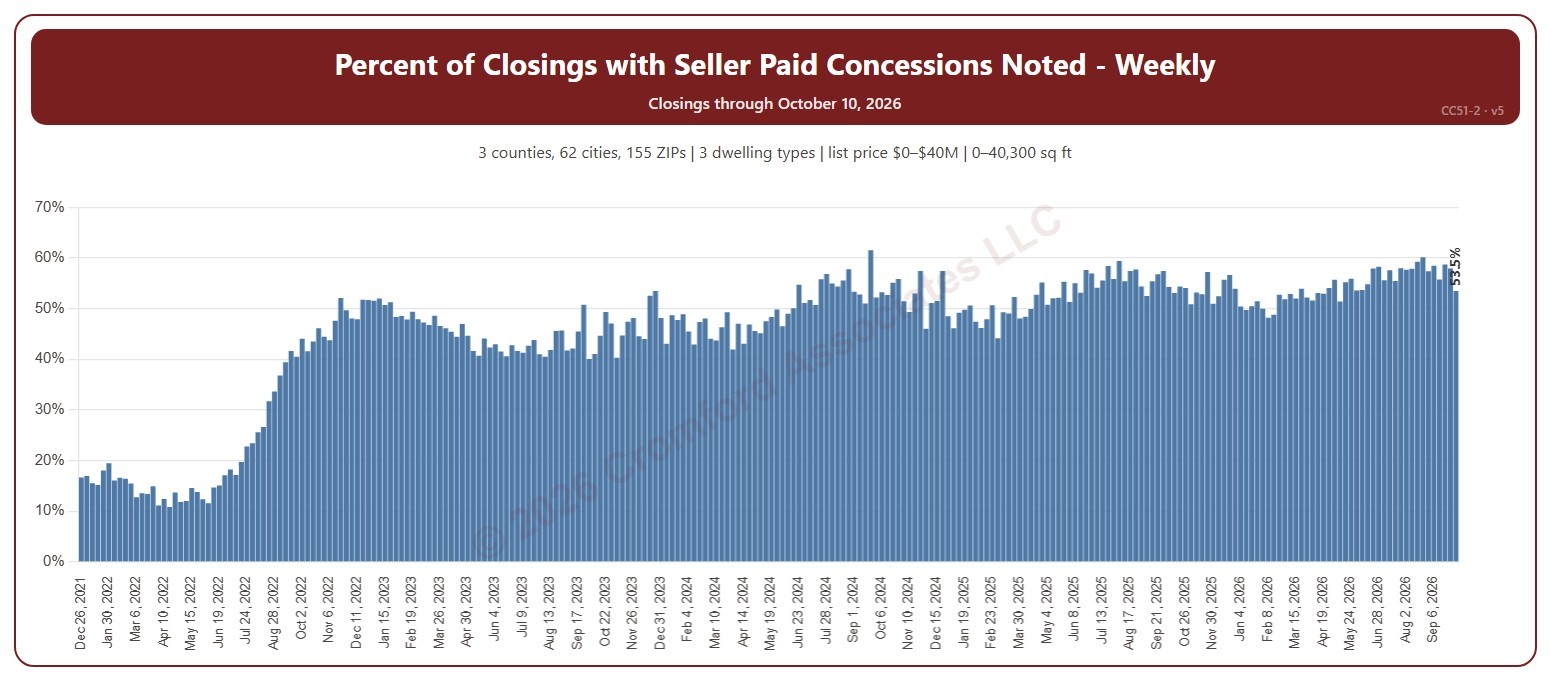
Percent of Closings with Seller Paid Concessions Noted – Weekly

About this chart

This chart shows the percentage of closings each week that had a seller-paid concession noted. Weeks run Sunday to Saturday. A seller-paid concession is money the seller agrees to pay toward the buyer’s closing costs or other expenses, as noted on the ARMLS listing when it closes.

It opens on 2022 to date; tick other years in the Year panel to go back as far as 2008. The newest week is the week so far.

It opens on the Greater Phoenix area: the counties, cities, and ZIP codes that make it up are ticked to start with. Tick or untick any of them to change the area, including counties beyond Greater Phoenix. Narrow it further with the Dwelling Type, Transaction Type, and New / Resale boxes and the list price, home size, and year built sliders.

Hover over the chart to see the figures for that week.