Price Changes, Days at the Final Price and Sale Price by Region

About this chart

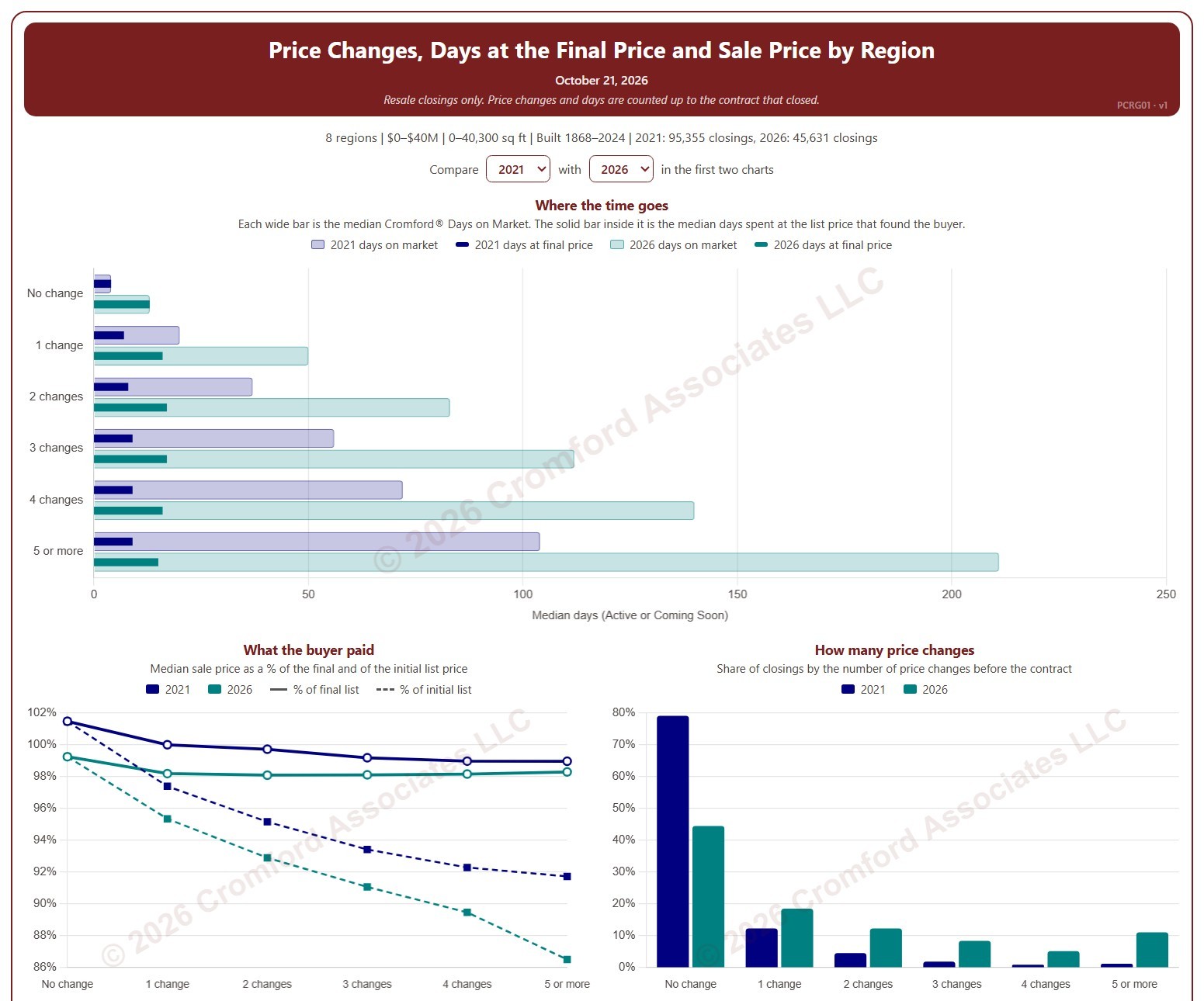
This chart shows how many times homes changed their list price before going under contract, and what that meant for how long they took to sell and the price they sold for, by region. Each closed resale is grouped by the number of list price changes before the contract that closed, from none to five or more. Price increases and price cuts both count as a change.

The top chart compares two figures for each group. The wide bar is the median Cromford® Days on Market. The solid bar inside it is the median number of days the home spent at its final list price, the price that found the buyer. However long a home was on the market, the time it spent at the price that sold it is usually much shorter.

The top two charts compare any two years from 2020 on, picked with the selectors above them. The lower left chart shows the median sale price as a percentage of the final list price (solid line) and of the initial list price (dashed line). The lower right chart shows the share of closings in each group for the years ticked in the Year panel.

The map shades every ZIP code with its region’s figure for one year at a time, chosen with the year selector above it, so each region reads as one block. A few ZIP codes lie in two regions; they are striped in both regions’ shades and their closings count in both. Regions not ticked in the Region panel are faded. Click a ZIP code to show its region alone in the charts.

Days count while the home was Active or Coming Soon, up to the contract that closed. A contract that fell through does not reset the count. New construction is excluded. Years are by closing date, and the current year is year to date. The chart opens on 2021 and the current year in the Greater Phoenix regions, with manufactured and modular homes left out.
Price Changes, Days at the Final Price and Sale Price by City and ZIP Code

About this chart

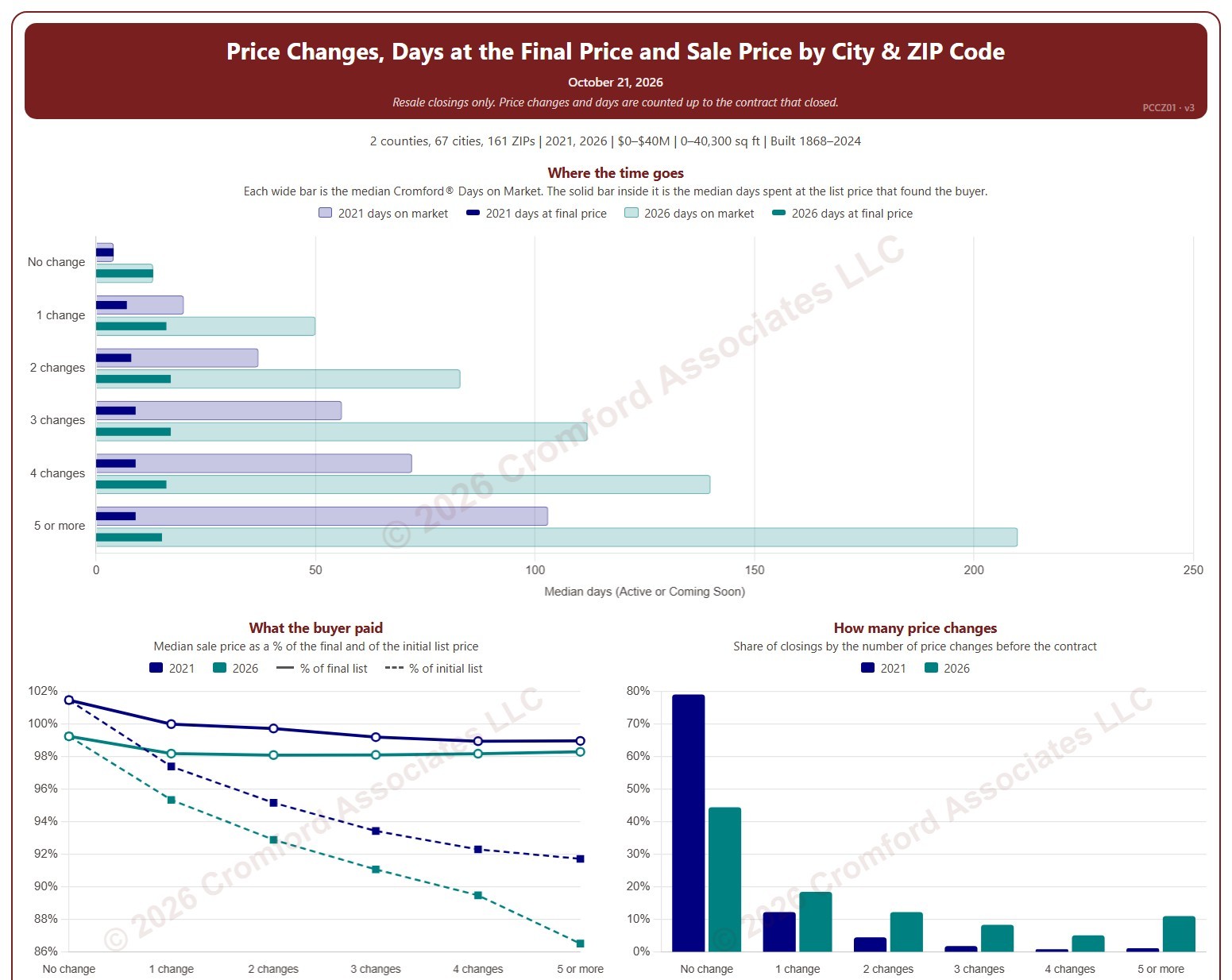
This chart shows how many times homes changed their list price before going under contract, and what that meant for how long they took to sell and the price they sold for. Each closed resale is grouped by the number of list price changes before the contract that closed, from none to five or more. Price increases and price cuts both count as a change.

The top chart compares two figures for each group. The wide bar is the median Cromford® Days on Market. The solid bar inside it is the median number of days the home spent at its final list price, the price that found the buyer. However long a home was on the market, the time it spent at the price that sold it is usually much shorter.

The top two charts compare any two years from 2020 on, picked with the selectors above them. The lower left chart shows the median sale price as a percentage of the final list price (solid line) and of the initial list price (dashed line). The lower right chart shows the share of closings in each group for the years ticked in the Year panel.

The map shades each ZIP code for one year at a time, chosen with the year selector above it. ZIP codes with fewer than 20 closings are shown in gray. Click a ZIP code to show it alone in the charts.

Days count while the home was Active or Coming Soon, up to the contract that closed. A contract that fell through does not reset the count. New construction is excluded. Years are by closing date, and the current year is year to date. The chart opens on 2021 and the current year in Maricopa and Pinal counties, with manufactured and modular homes left out.
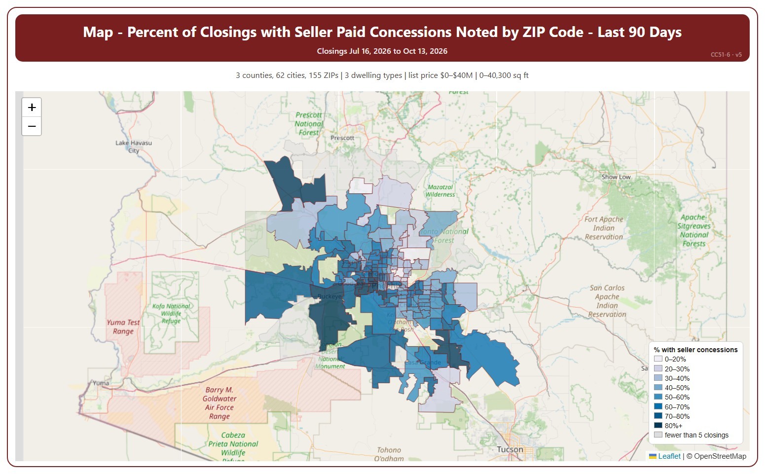
Map – Percent of Closings with Seller Paid Concessions Noted by ZIP Code

About this chart

This map shades each ZIP code by the percentage of recent closings that had a seller-paid concession noted, darker for a higher share. A seller-paid concession is money the seller agrees to pay toward the buyer’s closing costs or other expenses, as noted on the ARMLS listing when it closes.

It opens on the last 90 days. Use the Period panel to switch between the last 30 and the last 90 days. The heading shows the exact dates covered. The chart is updated every day. ZIP codes with fewer than 5 closings in the period are shown in grey without a percentage.

It opens on the Greater Phoenix area: the counties, cities, and ZIP codes that make it up are ticked to start with. Tick or untick any of them to change the area, including counties beyond Greater Phoenix. Narrow it further with the Dwelling Type, Transaction Type, and New / Resale boxes and the list price, home size, and year built sliders.

Hover over a ZIP code to see its figures.

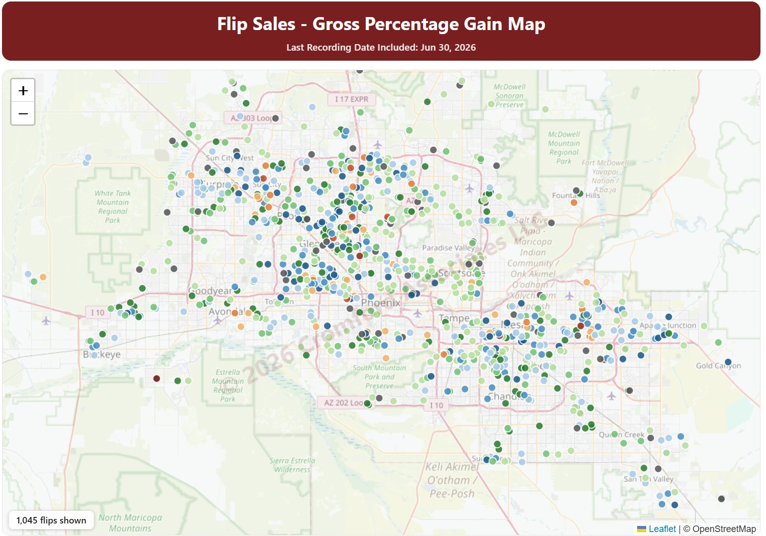
Flip Sales – Gross Percentage Gain Map

About this chart

This map shows fix-and-flip resales in Maricopa and Pinal Counties: homes bought, usually renovated, and resold by an investor. Each dot is one flip, colored by the gross percentage gain between the purchase price and the resale price.

Purchases by Opendoor and OfferPad are left out by default; tick them under Buyers to include them. Use the County, City, and ZIP Code panels and the Property Type, hold days, profit, and sales price filters to narrow the flips shown.

The Last Month, Last 3 Months, Last 6 Months, and Full range buttons, and the arrows, set the dates covered.

Property Value Estimate

About this chart

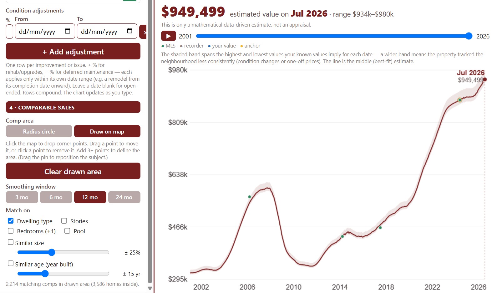
This tool estimates what a home is worth on any date, starting from a value you know on a known date, such as its last sale price, and moving it with the price trend of similar homes sold nearby. It is a data-driven estimate, not an appraisal.

Find the property by address, confirm its details (you know them better than the county does), and choose the estimate basis: a single sale or a blend of its sales. Set the area the comparable sales come from with the radius circle or by drawing on the map.

Add adjustments for upgrades or deferred maintenance, each over its own dates, and the chart updates as you type.

Annual Median Sales Price ZIP Code Map

About this chart

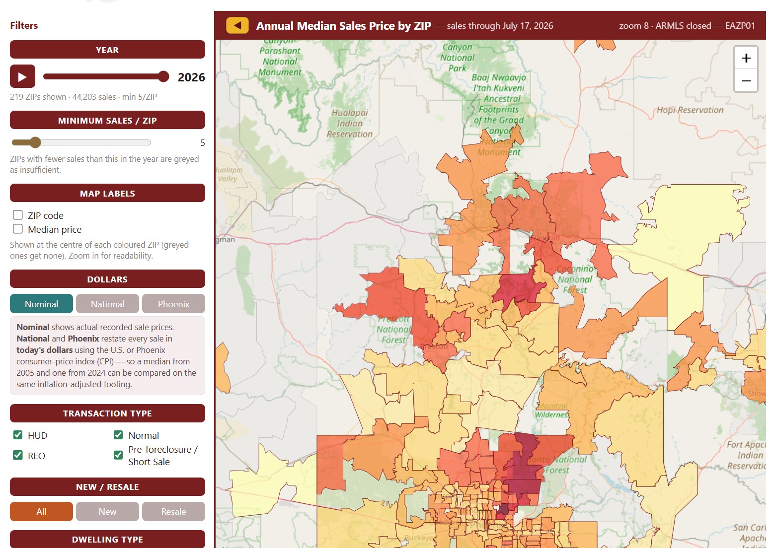
This map colors each ZIP code by the median sales price of the homes that closed through ARMLS in one calendar year, from under $200K to $3M and over. It opens on the current year, which covers the sales recorded so far; move the Year slider, or press play, to step through every year back to 2001.

ZIP codes with fewer sales than the Minimum Sales / ZIP setting (5 to start with) are grayed out as having too little data. Map Labels shows the ZIP code or its median price on the map; zoom in to read them. Dollars switches between actual sale prices and prices restated in today’s dollars using national or Phoenix inflation.

Narrow the sales counted with the Transaction Type and Dwelling Type boxes, the All / New / Resale buttons, and the price and square foot sliders.

Active Listings Map

About this chart

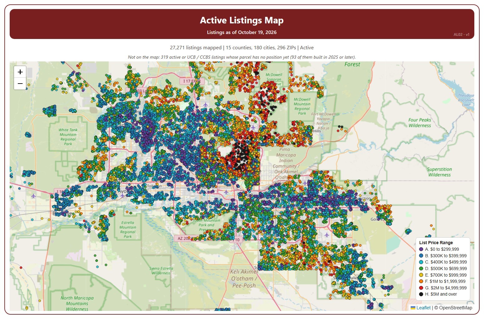
This map shows every home listed for sale or coming soon on ARMLS across Arizona today, one dot per listing, coloured by its list price range, from A (under $300,000) to H ($5 million and over).

It opens on Active and Coming Soon listings in every county; tick UCB / CCBS in the Status box to add listings under contract with a contingency. Tick or untick counties, cities, and ZIP codes to change the area, and use the Price Range boxes to show or hide a range. The map is updated every day.

Narrow it further with the Dwelling Type, Transaction Type, and New / Resale boxes and the list price, home size, year built, and days on market sliders. A listing whose parcel has no map position yet is not shown; the note above the map says how many.

Hover over a dot to see the address, list price, status, dwelling and transaction type, size, year built, days on market, and listing office.

Contract Ratio Heat Map

About this chart

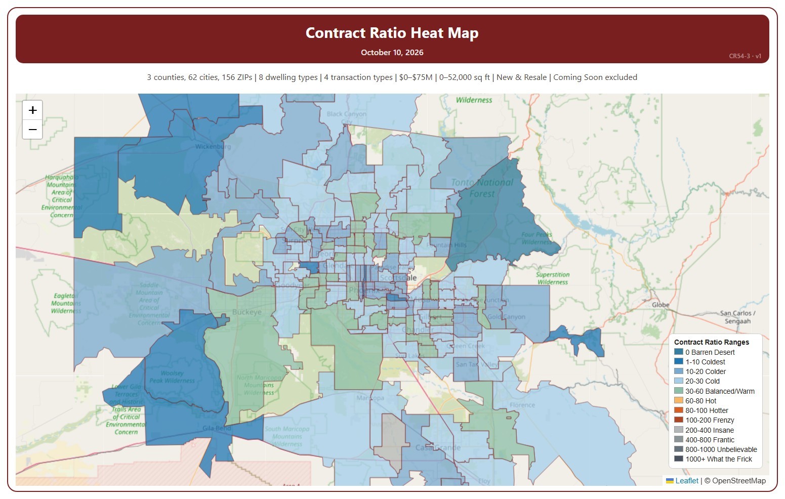
This map shades each ZIP code by its Contract Ratio on one Saturday: the number of listings under contract (pending, plus UCB and CCBS) for every 100 active listings, measured on Saturdays. The ranges run from 0 Barren Desert (nothing under contract) to 1000+. Click a range in the legend to show only that range, click more ranges to add them, and click Show all ranges to see every range again.

It opens on the latest Saturday. Use the controls under the map to step a week at a time, pick any Saturday back to January 2011, or drag the slider. Press play to step through the weeks as a slide show at the speed you choose. ZIP codes with no active listings that week are left unshaded. The map is updated every week.

It opens on the Greater Phoenix area: the counties, cities, and ZIP codes that make it up are ticked to start with. Tick or untick any of them to change the area, including counties beyond Greater Phoenix. Narrow it further with the Dwelling Type, Transaction Type, and New / Resale boxes and the list price and home size sliders. Tick Count Coming Soon as Active to add Coming Soon listings to the active count.

Hover over a ZIP code to see its ratio, its range, and the numbers of listings under contract and active.

Median Sales Price Map

About this chart

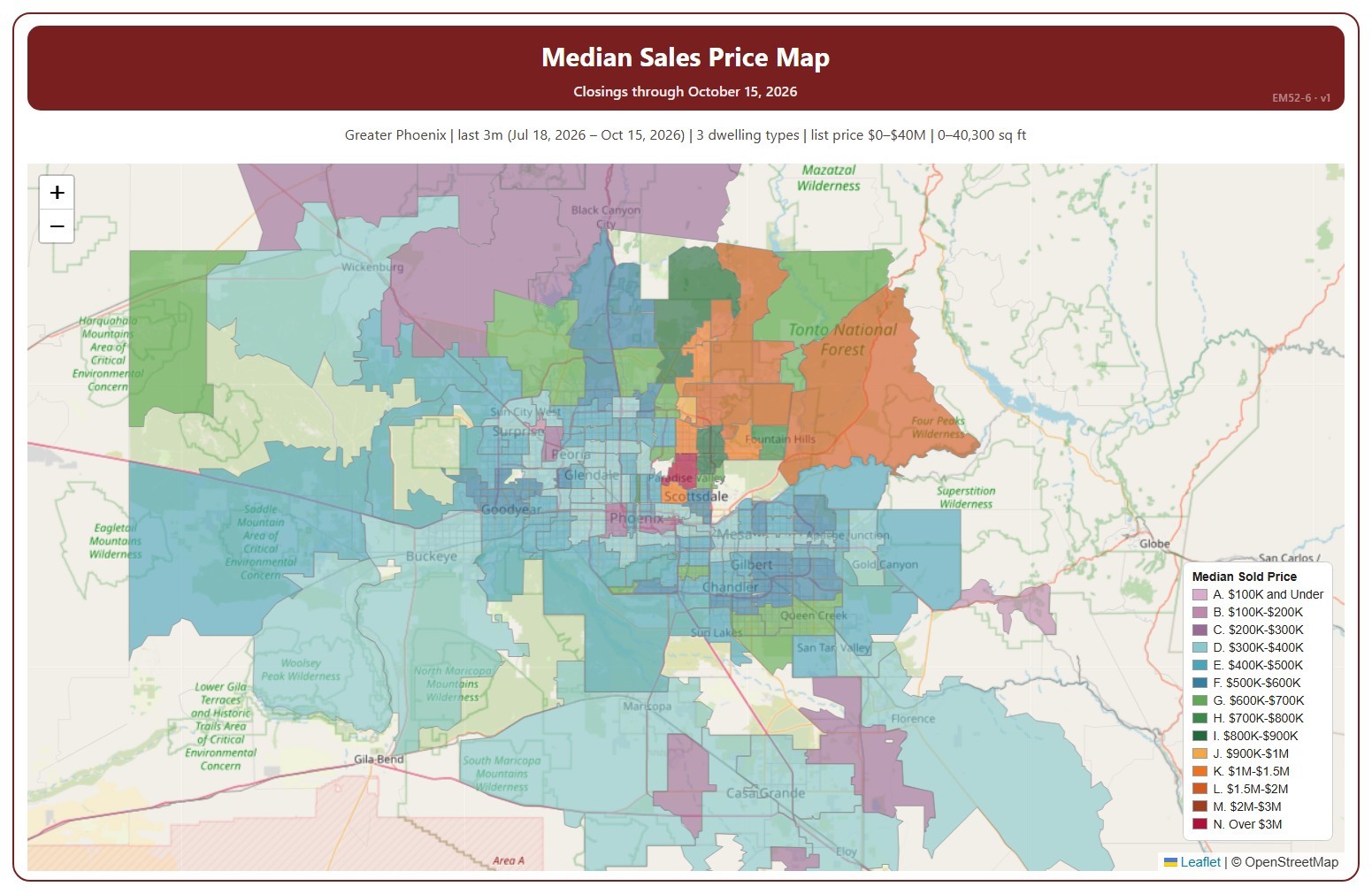
This map colors each ZIP code by the median sales price of its closings over the time frame chosen, in 14 price ranges. The median sales price is the middle sale price of the homes that closed on ARMLS in the period: half sold for more and half for less. New homes are included.

It opens on the last 3 months to the newest closing; use the Time Frame buttons over the map for the last day, week, month, 3 months, year, or 5 years. Click a price range in the legend to hide or show it. Every ZIP code with a closing is colored, so a ZIP code with only one or two closings can show an unusual median; the number of closings is in its tooltip. The map is updated every day.

It opens on the Greater Phoenix area: the counties, cities, and ZIP codes that make it up are ticked to start with. Tick or untick any of them to change the area, including counties beyond Greater Phoenix. Narrow it further with the Dwelling Type, Transaction Type, and New / Resale boxes and the list price, home size, and year built sliders.

Hover over a ZIP code to see its median, its number of closings, and its price range.

Average Sales Price History Map

About this chart

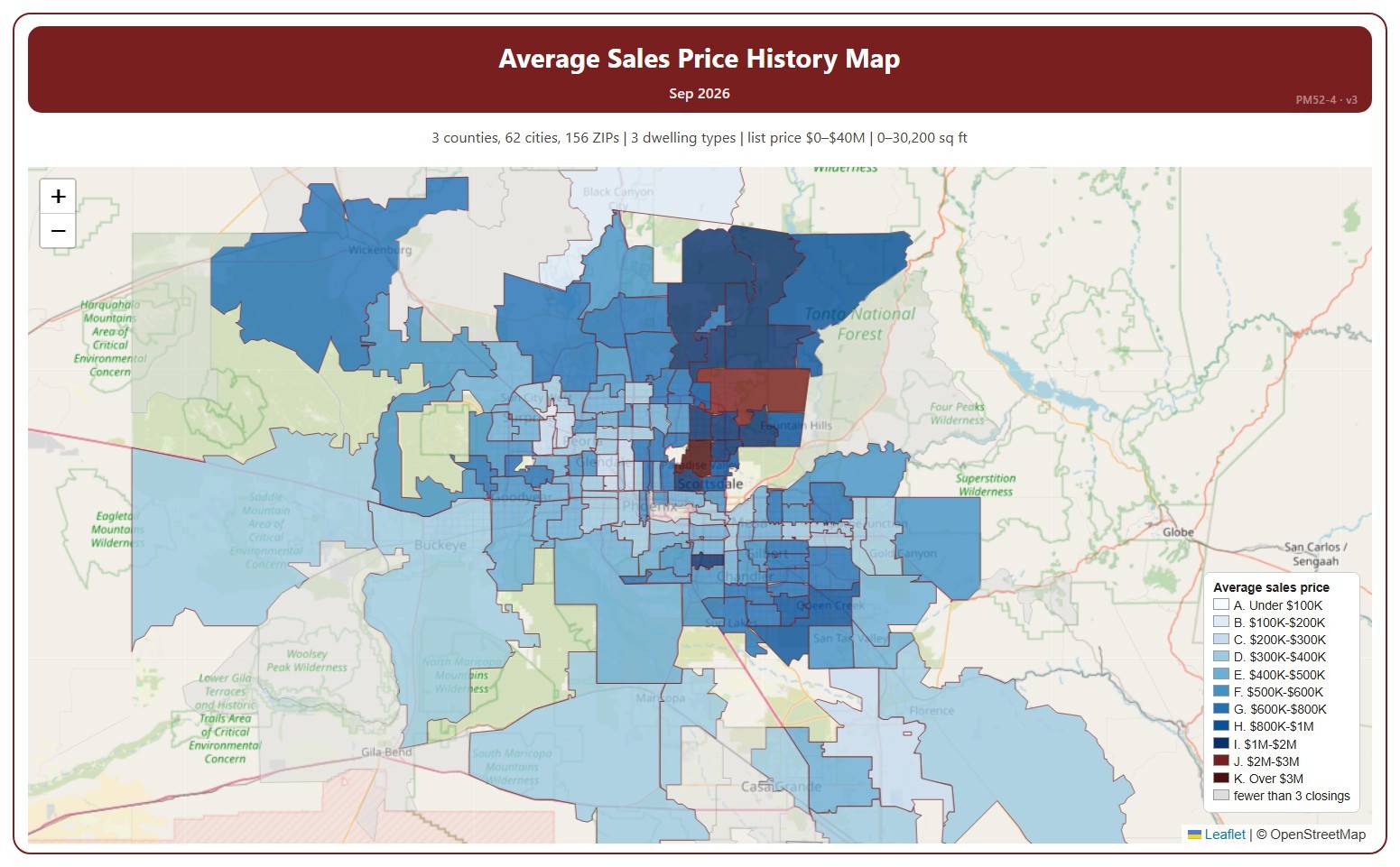
This map shades each ZIP code by the average sale price of the homes that closed in one month, in price ranges from under $100K to over $3M.

It opens on the latest complete month. Use the Month panel, or its arrows, to step back through earlier months as far as 2008. ZIP codes with fewer than 3 closings in the month are shown in grey.

It opens on the Greater Phoenix area: the counties, cities, and ZIP codes that make it up are ticked to start with. Tick or untick any of them to change the area, including counties beyond Greater Phoenix. Narrow it further with the Dwelling Type, Transaction Type, and New / Resale boxes and the list price, home size, and year built sliders.

Hover over a ZIP code to see its average price and number of closings.