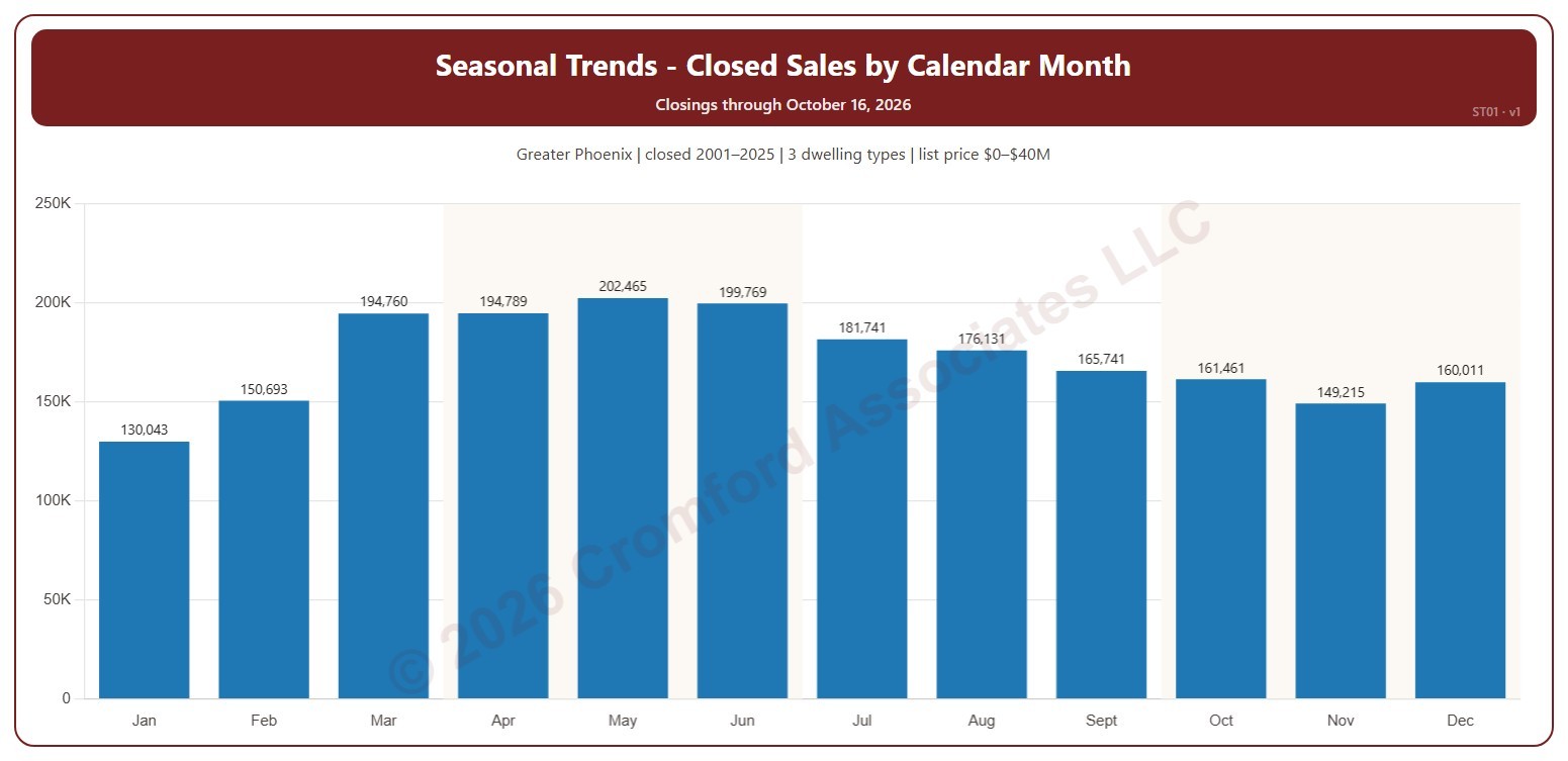
Seasonal Trends – Closed Sales by Calendar Month

About this chart

This chart shows the seasonal pattern of home sales: the number of homes that closed on ARMLS in each calendar month, January to December, added up over the years ticked. Each month’s share of the year is in its tooltip.

It opens on 2001 to the last complete year; tick or untick years in the Year box. The current year has only some of its months, so ticking it adds to the early months only. The chart is updated every day.

It opens on the Greater Phoenix area: the counties, cities, and ZIP codes that make it up are ticked to start with. Tick or untick any of them to change the area, including counties beyond Greater Phoenix. Narrow it further with the Dwelling Type, Transaction Type, and New / Resale boxes and the list price, home size, and year built sliders.

Hover over a bar to see the month’s closings, the average a year, and its share of the year.
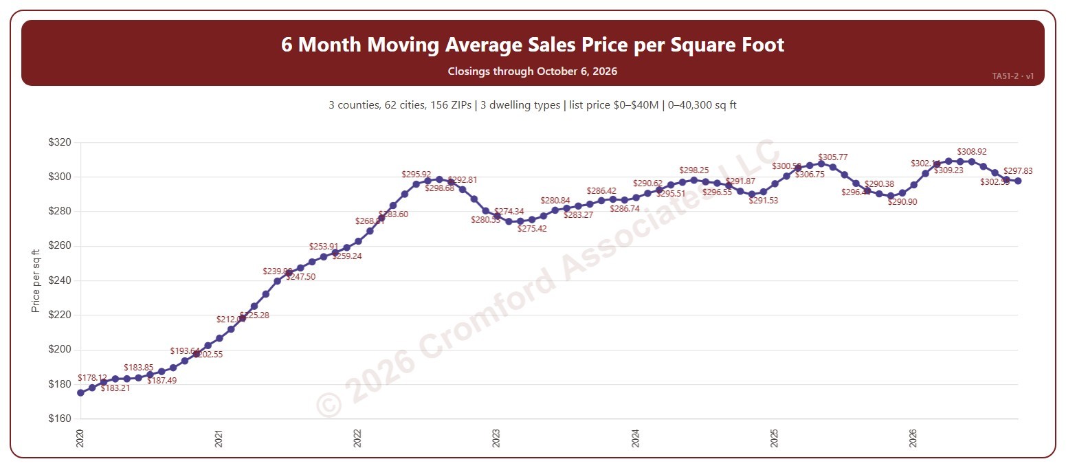
6 Month Moving Average Sales Price per Square Foot

About this chart

This chart shows the average sales price per square foot of the homes that closed through ARMLS over the 6 months ending with each calendar month: a 6-month moving average, across all the square feet sold. Price per square foot lets you compare homes of different sizes. The 6-month average balances responsiveness against noise.

It opens on the years since 2020; tick any year back to 2000 in the Year panel. The newest month is the month so far.

It opens on the Greater Phoenix area: the counties, cities, and ZIP codes that make it up are ticked to start with. Tick or untick any of them to change the area, including counties beyond Greater Phoenix. Narrow it further with the Dwelling Type (condo, mobile, single family), Transaction Type, and New / Resale boxes and the list price, home size, and year built sliders.

Hover over the chart to see the figures for that month.

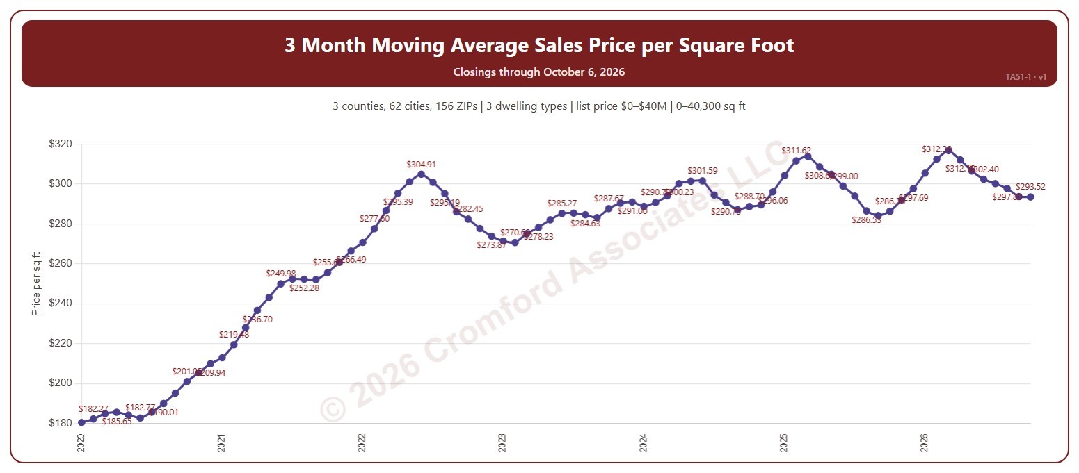
3 Month Moving Average Sales Price per Square Foot

About this chart

This chart shows the average sales price per square foot of the homes that closed through ARMLS over the 3 months ending with each calendar month: a 3-month moving average, across all the square feet sold. Price per square foot lets you compare homes of different sizes. The 3-month average reacts quickly to changes in price.

It opens on the years since 2020; tick any year back to 2000 in the Year panel. The newest month is the month so far.

It opens on the Greater Phoenix area: the counties, cities, and ZIP codes that make it up are ticked to start with. Tick or untick any of them to change the area, including counties beyond Greater Phoenix. Narrow it further with the Dwelling Type (condo, mobile, single family), Transaction Type, and New / Resale boxes and the list price, home size, and year built sliders.

Hover over the chart to see the figures for that month.

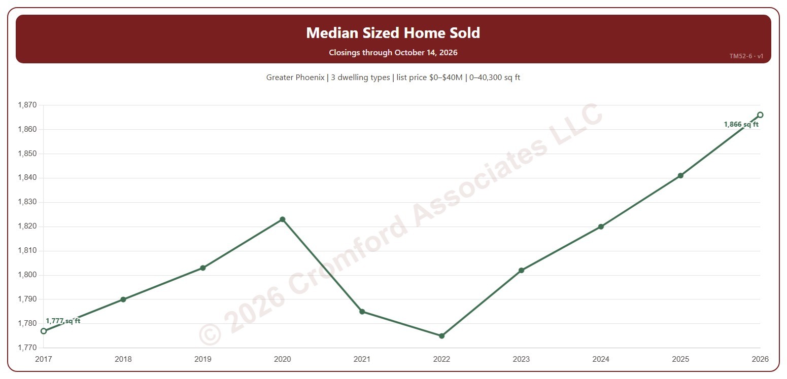
Median-Sized Home Sold

About this chart

This chart shows the median size, in square feet, of the homes that closed on ARMLS each year: half were larger and half smaller. The newest year is the year so far.

It opens on January 2017 to date; drag the handles of the date slider under the chart to choose the years shown, as far back as 2000. The chart is updated every day.

It opens on the Greater Phoenix area: the counties, cities, and ZIP codes that make it up are ticked to start with. Tick or untick any of them to change the area, including counties beyond Greater Phoenix. Narrow it further with the Dwelling Type, Transaction Type, and New / Resale boxes and the list price, home size, and year built sliders.

Hover over the line to see the median size and the number of closings that year.

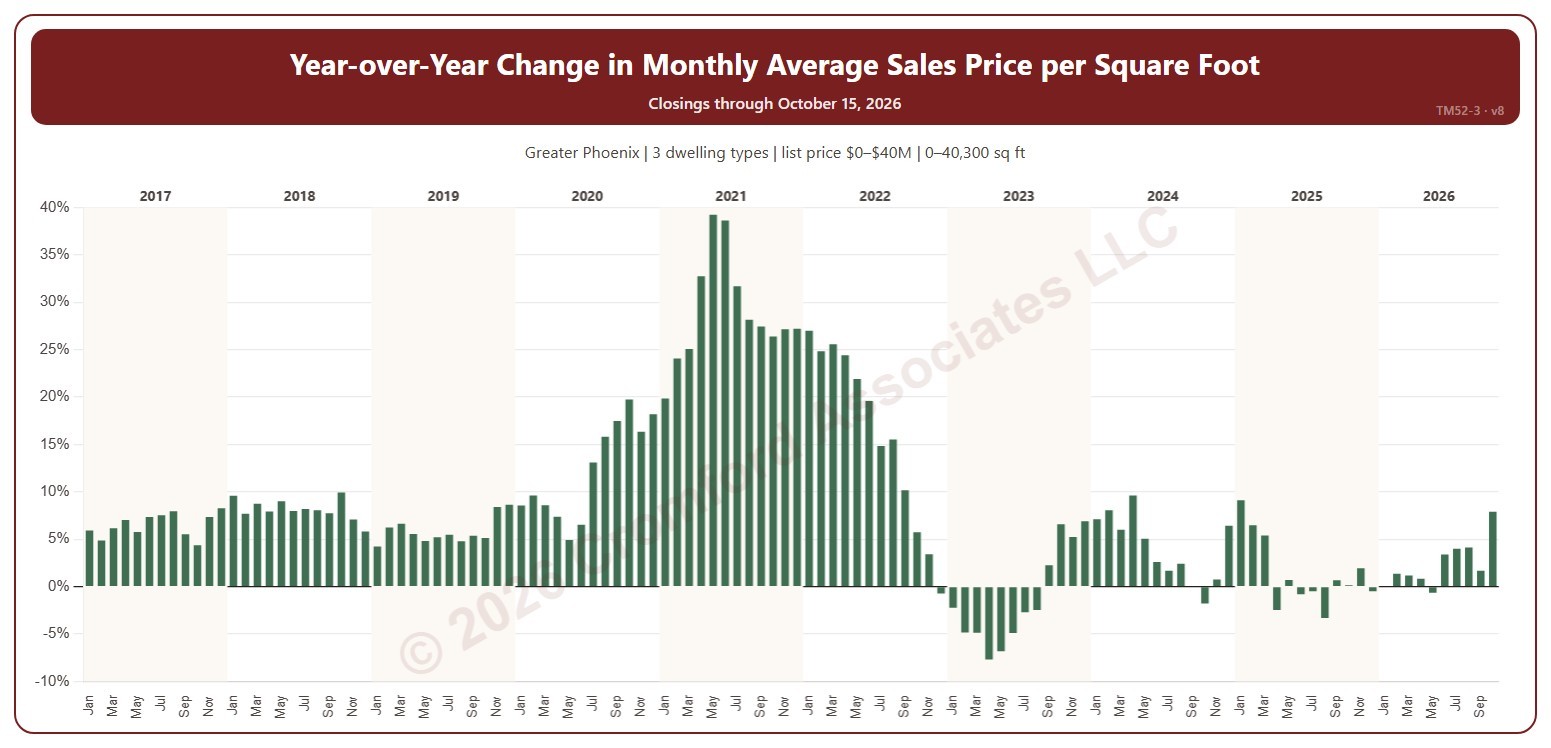
Year-over-Year Change: Monthly Average Sales Price per Square Foot

About this chart

This chart shows the year-over-year change in the average sales price per square foot: each month compared with the same month a year earlier, as a percentage. Sales price per square foot is the total of the sale prices divided by the total of the homes’ square footage, over the homes that closed on ARMLS in the period.

It opens on January 2017 to date; drag the handles of the date slider under the chart to choose the months shown, as far back as January 2001. The chart is updated every day.

It opens on the Greater Phoenix area: the counties, cities, and ZIP codes that make it up are ticked to start with. Tick or untick any of them to change the area, including counties beyond Greater Phoenix. Narrow it further with the Dwelling Type, Transaction Type, and New / Resale boxes and the list price, home size, and year built sliders.

Hover over a bar to see the change and both months’ figures.

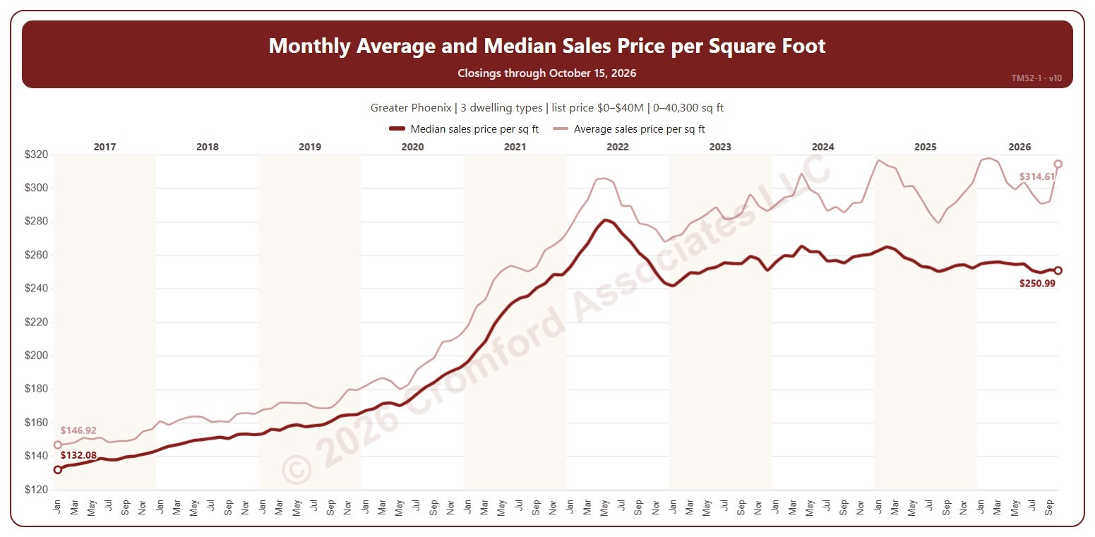
Monthly Average and Median Sales Price per Square Foot – Long Term

About this chart

This chart shows the average sales price per square foot of the homes that closed each month. Sales price per square foot is the total of the sale prices divided by the total of the homes’ square footage, over the homes that closed on ARMLS in the period.

It opens on January 2017 to date; drag the handles of the date slider under the chart to choose the months shown, as far back as January 2000. The chart is updated every day. The newest month is the month so far.

It opens on the Greater Phoenix area: the counties, cities, and ZIP codes that make it up are ticked to start with. Tick or untick any of them to change the area, including counties beyond Greater Phoenix. Narrow it further with the Dwelling Type, Transaction Type, and New / Resale boxes and the list price, home size, and year built sliders.

Hover over the line to see the figure and the number of closings for that month.

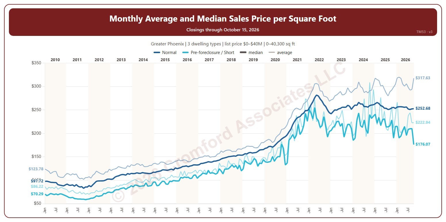
Monthly Average and Median Sales Price per Square Foot

About this chart

This chart shows the average sales price per square foot of the homes that closed on ARMLS each month, a line per transaction type: the total of the sale prices divided by the total of the homes’ square footage. It opens on normal sales and pre-foreclosure / short sales; tick REO or HUD in the Transaction Type box to add their lines.

It opens on January 2010 to date; drag the handles of the date slider under the chart to choose the months shown, as far back as January 2000. The newest month is the month so far. A transaction type with only a few closings in a month can swing widely. The chart is updated every day.

It opens on the Greater Phoenix area: the counties, cities, and ZIP codes that make it up are ticked to start with. Tick or untick any of them to change the area, including counties beyond Greater Phoenix. Narrow it further with the Dwelling Type and New / Resale boxes and the list price, home size, and year built sliders.

Hover over the chart to see each line’s figure and number of closings that month.

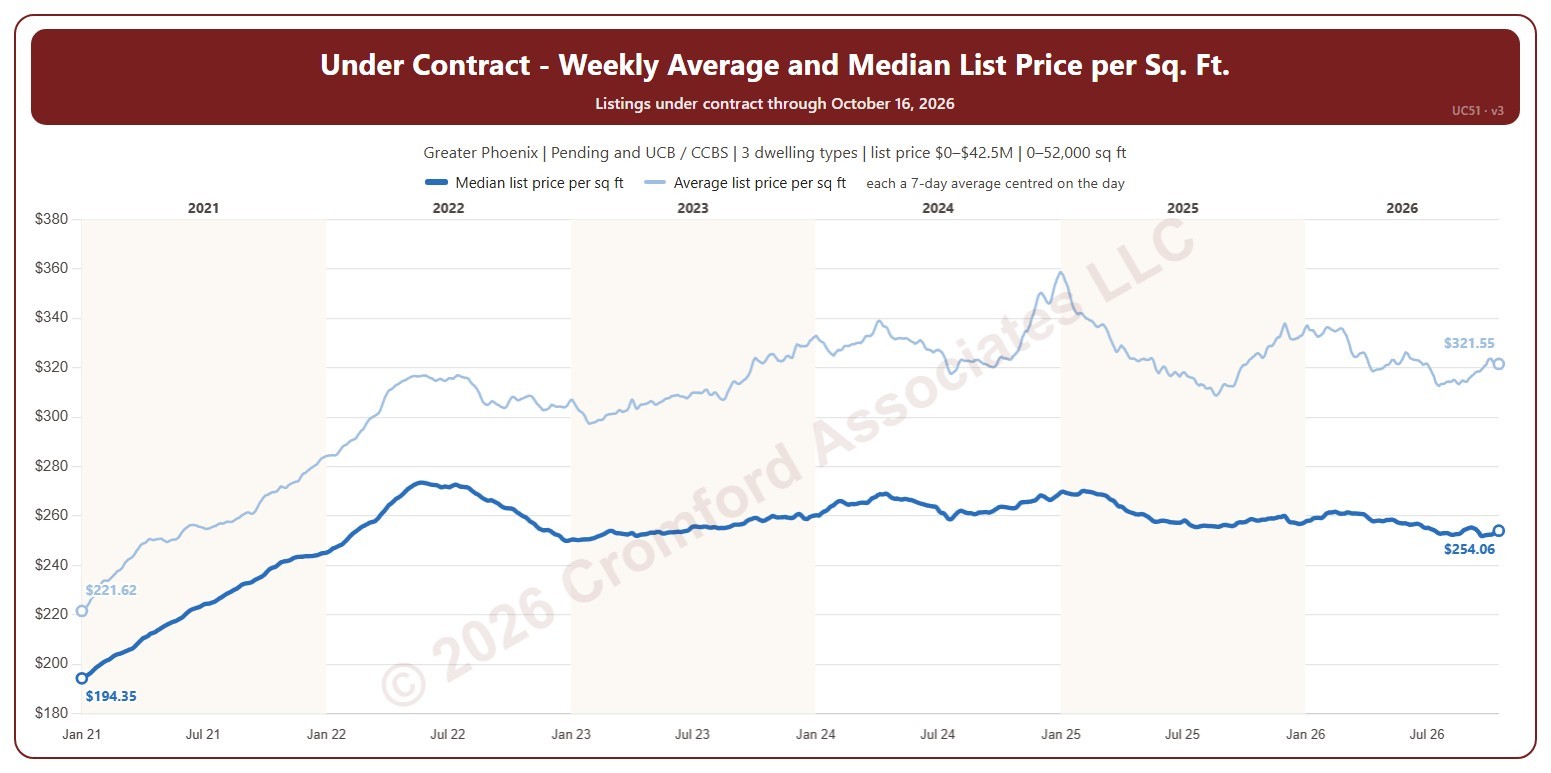
Listings Under Contract Average Price per Square Foot

About this chart

This chart follows the list prices of the homes under contract on ARMLS (pending, plus UCB and CCBS), day by day, as dollars per square foot. The blue line is the average: each day, the average list price of those listings divided by their average size. The orange line is the median: each day, every listing’s own list price per square foot, and the middle of those figures, which one unusual listing cannot pull up or down as it can the average. Each line is the average of seven days centred on the day: three days before, the day, and three days after.

It opens on January 2021 to date; drag the handles of the date slider under the chart to choose the days shown, as far back as January 2011. The newest three days average fewer than seven days until the later days arrive, so they can still move. The chart is updated every day.

It opens on the Greater Phoenix area: the counties, cities, and ZIP codes that make it up are ticked to start with. Tick or untick any of them to change the area, including counties beyond Greater Phoenix. Use the Status boxes to show pending listings, UCB and CCBS listings, or both. Narrow it further with the Dwelling Type, Transaction Type, and New / Resale boxes and the list price, home size, and year built sliders.

Hover over the chart to see both lines’ figures for that day, that day’s own figures, and the number of listings under contract.

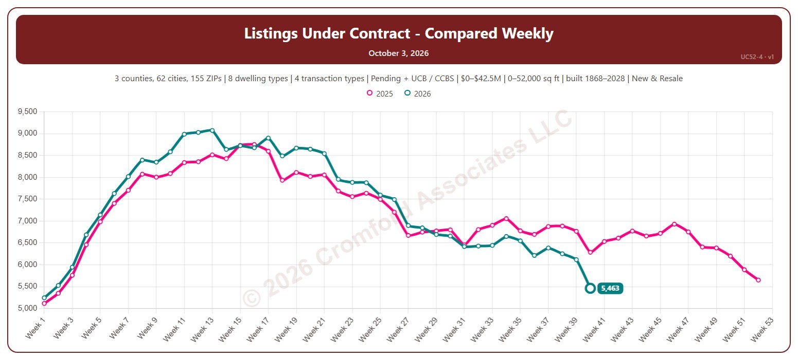
Listings Under Contract Compared Weekly

About this chart

This chart counts the listings under contract on ARMLS each week (on Saturdays), with one line per year laid out by week of the year, so you can compare this year with earlier years at the same point in the season.

Both Pending and UCB / CCBS listings are counted to start with; untick either under Listing Status to leave it out. It opens on the last two years; tick any year back to 2011 in the Year panel.

It opens on the Greater Phoenix area: the counties, cities, and ZIP codes that make it up are ticked to start with. Tick or untick any of them to change the area, including counties beyond Greater Phoenix. Narrow it further with the Dwelling Type, Transaction Type, and New / Resale boxes and the list price, home size, and year built sliders.

Hover over the chart to see the figures for that week.

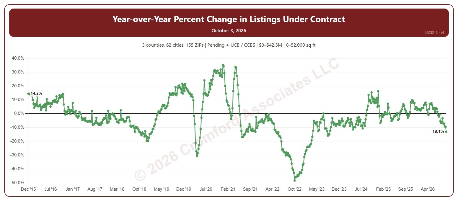
YOY Change in Listings Under Contract

About this chart

This chart shows the year-over-year change in listings under contract: the number under contract on ARMLS each Saturday compared with the same week a year earlier, as a percentage. Above zero, buying activity is running ahead of a year ago; below zero, behind.

Both Pending and UCB / CCBS listings are counted to start with; untick either under Listing Status to leave it out. It opens on the weeks since December 2015; use the Period panel to choose a different span or particular years.

It opens on the Greater Phoenix area: the counties, cities, and ZIP codes that make it up are ticked to start with. Tick or untick any of them to change the area, including counties beyond Greater Phoenix. Narrow it further with the Dwelling Type, Transaction Type, and New / Resale boxes and the list price, home size, and year built sliders.

Hover over the chart to see the figures for that week.