
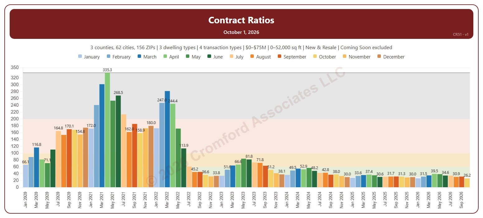
About this chart
This chart shows the Contract Ratio for each month: the number of listings under contract (pending, plus UCB and CCBS) for every 100 active listings, measured on the first day of the month. Each bar is one month, colored by month. The shaded bands mark a Cool market (below 30), Warm (30 to 60), Hot (60 to 100), Frenzy! (100 to 200), and Insanity!! (above 200), and the line marks the highest month shown.
It opens on January 2020 to date. Drag the handles of the date slider under the chart to choose the months shown, as far back as April 2010. Click a month in the legend to hide or show it. A new month appears once its first-day figures are in.
It opens on the Greater Phoenix area: the counties, cities, and ZIP codes that make it up are ticked to start with. Tick or untick any of them to change the area, including counties beyond Greater Phoenix. Narrow it further with the Dwelling Type, Transaction Type, and New / Resale boxes and the list price and home size sliders. Tick Count Coming Soon as Active to add Coming Soon listings to the active count.
Hover over a bar to see the ratio and the numbers of listings under contract and active that day.