Market Dashboard

About this chart

This dashboard summarizes the current state of the residential market for all areas and types covered by ARMLS. It is measured daily and shows where the market stands today; for longer-term trends, use the individual charts in the Analysis section.

Use Select Type of Data to switch between 14 views: Sale Price / Sq Ft, Cromford® Index, Inventory, Active Listings, Under Contract, Expired Listings, Canceled Listings, List Price / Sq Ft, Closed Listings, Dollar Volume, Days on Market, Success Rate, Square Feet, and Sale Price $.

Each tile compares a recent figure with an earlier one and is colored to show whether the change is good for sellers, bad for sellers, or neither. The chart beneath the tiles shows the last 13 months, month by month. Hover over it to see each figure.
Average List Price per Square Foot by Region

About this chart

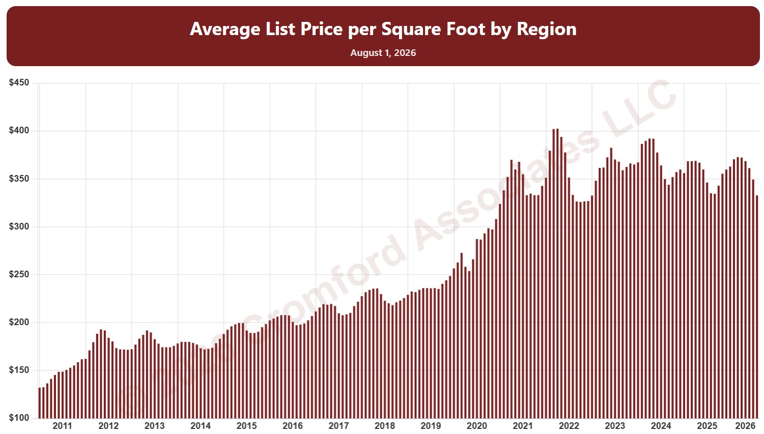
This chart shows the average list price per square foot of homes listed on ARMLS, measured on the 1st of every month since January 2011, as one bar per month. It shows what sellers are asking.

By default it covers Active listings. Tick Coming Soon, Pending, UCB / CCBS, or Temp Off Market in the List Status panel to look at those listings instead or as well.

It opens with every region included. Use the Region panel to focus on one region or compare a combination of them. Narrow it with the Dwelling Type, Transaction Type, List Status, and New / Resale boxes and the list price, home size, and year built sliders. The Inflation (CPI) option restates prices in today’s dollars using national or Phoenix inflation. Use the date slider, or Full range, to choose the stretch of history shown.

Hover over a bar to see the exact figure for that month.

Listings Under Contract by Region

About this chart

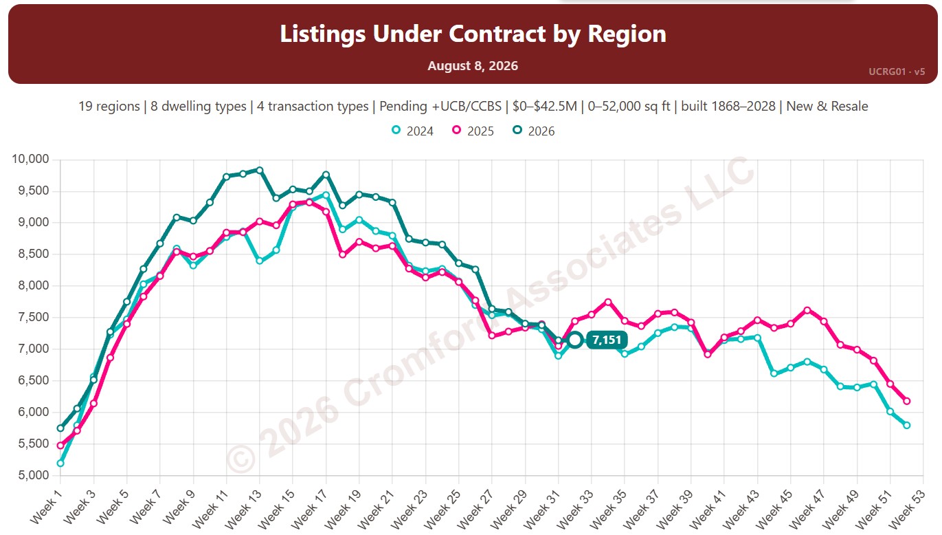
This chart counts the listings under contract on ARMLS, measured every week (on Saturdays): Pending listings plus UCB / CCBS listings (under contract but still marked active). Untick Include UCB/CCBS to count Pending listings only.

Listings under contract show how much buying activity is under way: these are the homes heading for closing.

Each year has its own line, laid out by week of the year, so you can compare this year with earlier years at the same point in the season. It opens on the last three years; tick any year back to 2011 in the Year panel.

It opens with every region included. Use the Region panel to focus on one region or compare a combination of them. Narrow it with the Dwelling Type, Transaction Type, and New / Resale boxes and the list price, home size, and year built sliders.

Hover over a line to see the exact figure for that week.

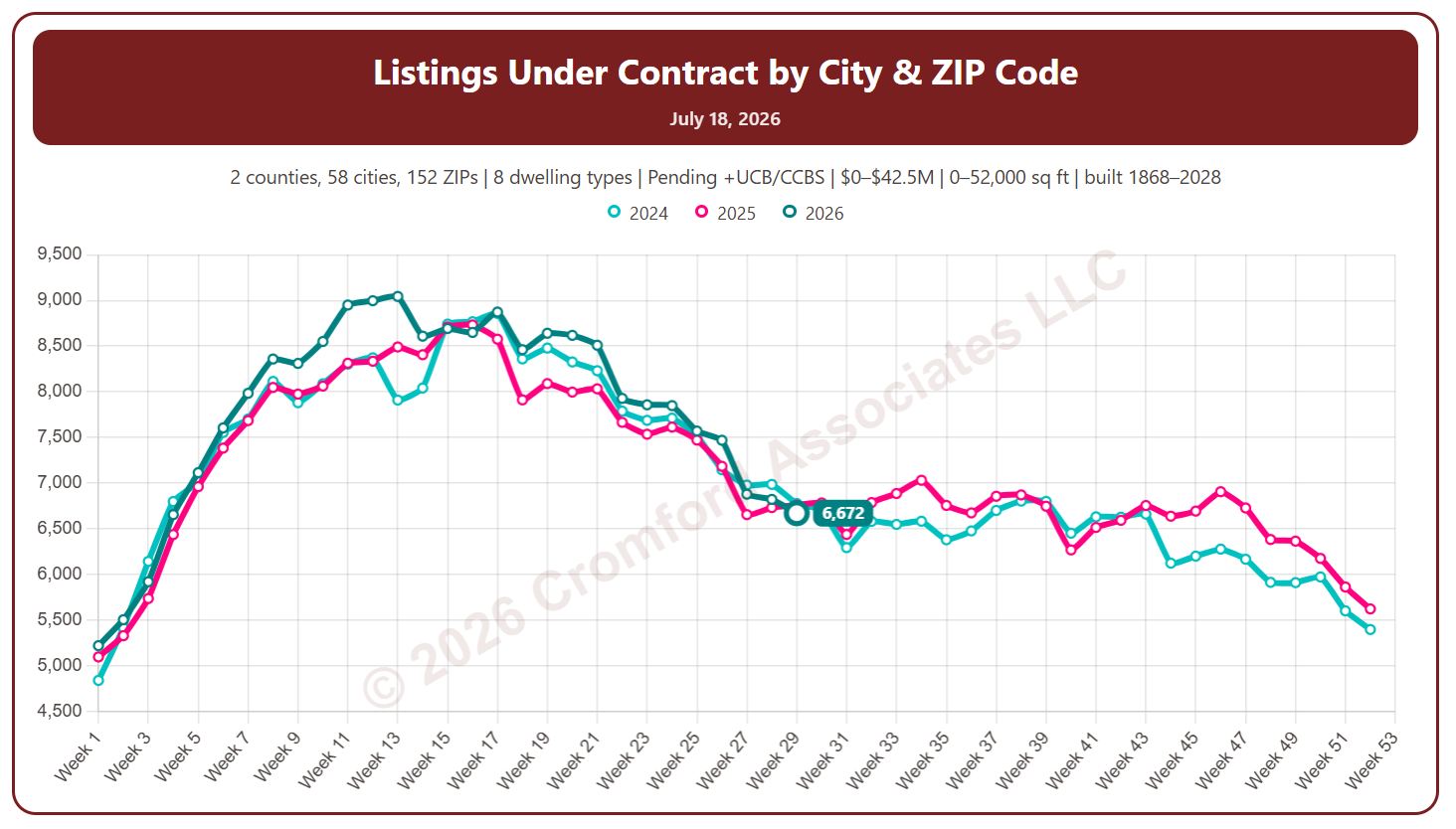
Listings Under Contract by City and ZIP Code

About this chart

This chart counts the listings under contract on ARMLS, measured every week (on Saturdays): Pending listings plus UCB / CCBS listings (under contract but still marked active). Untick Include UCB/CCBS to count Pending listings only.

Listings under contract show how much buying activity is under way: these are the homes heading for closing.

Each year has its own line, laid out by week of the year, so you can compare this year with earlier years at the same point in the season. It opens on the last three years; tick any year back to 2011 in the Year panel.

It opens on Maricopa and Pinal Counties with every city and ZIP code included. Use the County, City, and ZIP panels to focus on any area, from a whole county down to a single ZIP code. Narrow it with the Dwelling Type, Transaction Type, and New / Resale boxes and the list price, home size, and year built sliders.

Hover over a line to see the exact figure for that week.

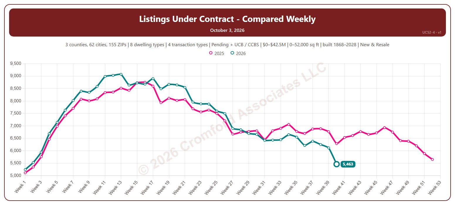
Listings Under Contract Compared Weekly

About this chart

This chart counts the listings under contract on ARMLS each week (on Saturdays), with one line per year laid out by week of the year, so you can compare this year with earlier years at the same point in the season.

Both Pending and UCB / CCBS listings are counted to start with; untick either under Listing Status to leave it out. It opens on the last two years; tick any year back to 2011 in the Year panel.

It opens on the Greater Phoenix area: the counties, cities, and ZIP codes that make it up are ticked to start with. Tick or untick any of them to change the area, including counties beyond Greater Phoenix. Narrow it further with the Dwelling Type, Transaction Type, and New / Resale boxes and the list price, home size, and year built sliders.

Hover over the chart to see the figures for that week.

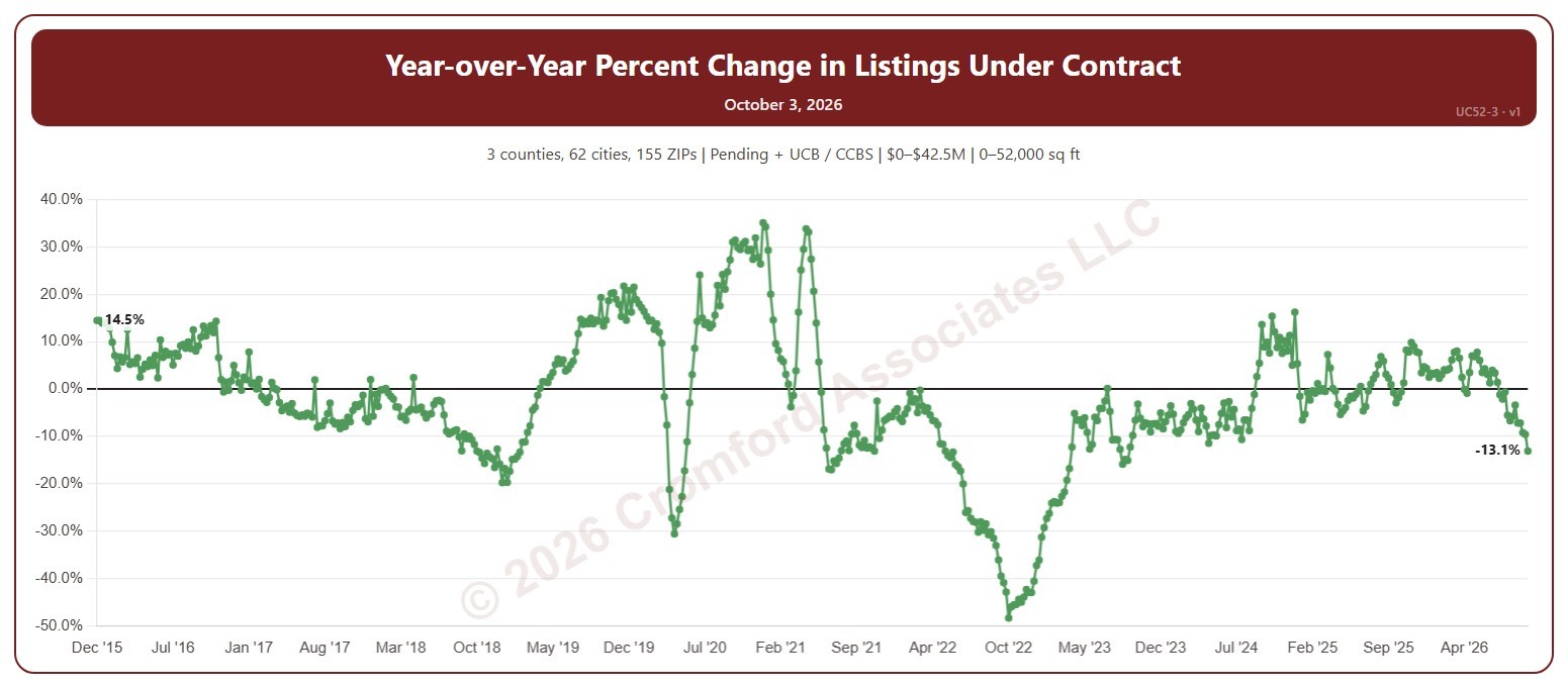
YOY Change in Listings Under Contract

About this chart

This chart shows the year-over-year change in listings under contract: the number under contract on ARMLS each Saturday compared with the same week a year earlier, as a percentage. Above zero, buying activity is running ahead of a year ago; below zero, behind.

Both Pending and UCB / CCBS listings are counted to start with; untick either under Listing Status to leave it out. It opens on the weeks since December 2015; use the Period panel to choose a different span or particular years.

It opens on the Greater Phoenix area: the counties, cities, and ZIP codes that make it up are ticked to start with. Tick or untick any of them to change the area, including counties beyond Greater Phoenix. Narrow it further with the Dwelling Type, Transaction Type, and New / Resale boxes and the list price, home size, and year built sliders.

Hover over the chart to see the figures for that week.

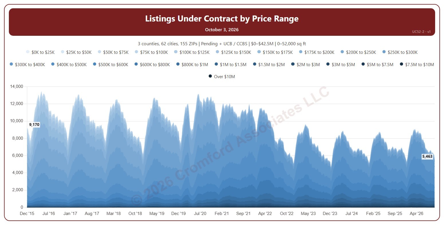
Listings Under Contract by Price Range

About this chart

This chart counts the listings under contract on ARMLS each week (on Saturdays), stacked by list price in 22 bands up to over $10M. It shows which price ranges buyers are committing to and how that is changing.

Both Pending and UCB / CCBS listings are counted to start with; untick either under Listing Status to leave it out. It opens on the weeks since December 2015; use the Period panel to choose a different span or particular years.

It opens on the Greater Phoenix area: the counties, cities, and ZIP codes that make it up are ticked to start with. Tick or untick any of them to change the area, including counties beyond Greater Phoenix. Narrow it further with the Dwelling Type, Transaction Type, and New / Resale boxes and the list price, home size, and year built sliders.

Hover over the chart to see the figures for that week.

Listings Under Contract

About this chart

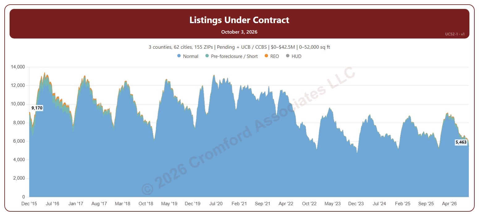
This chart counts the listings under contract on ARMLS each week (on Saturdays), stacked by transaction type: normal sales, pre-foreclosure / short sales, REOs, and HUD homes. Listings under contract are Pending listings plus UCB / CCBS listings, and show how much buying activity is under way.

Both Pending and UCB / CCBS listings are counted to start with; untick either under Listing Status to leave it out. It opens on the weeks since December 2015; use the Period panel to choose a different span or particular years.

It opens on the Greater Phoenix area: the counties, cities, and ZIP codes that make it up are ticked to start with. Tick or untick any of them to change the area, including counties beyond Greater Phoenix. Narrow it further with the Dwelling Type, Transaction Type, and New / Resale boxes and the list price, home size, and year built sliders.

Hover over the chart to see the figures for that week.