New Home Closings by Price Range

About this chart

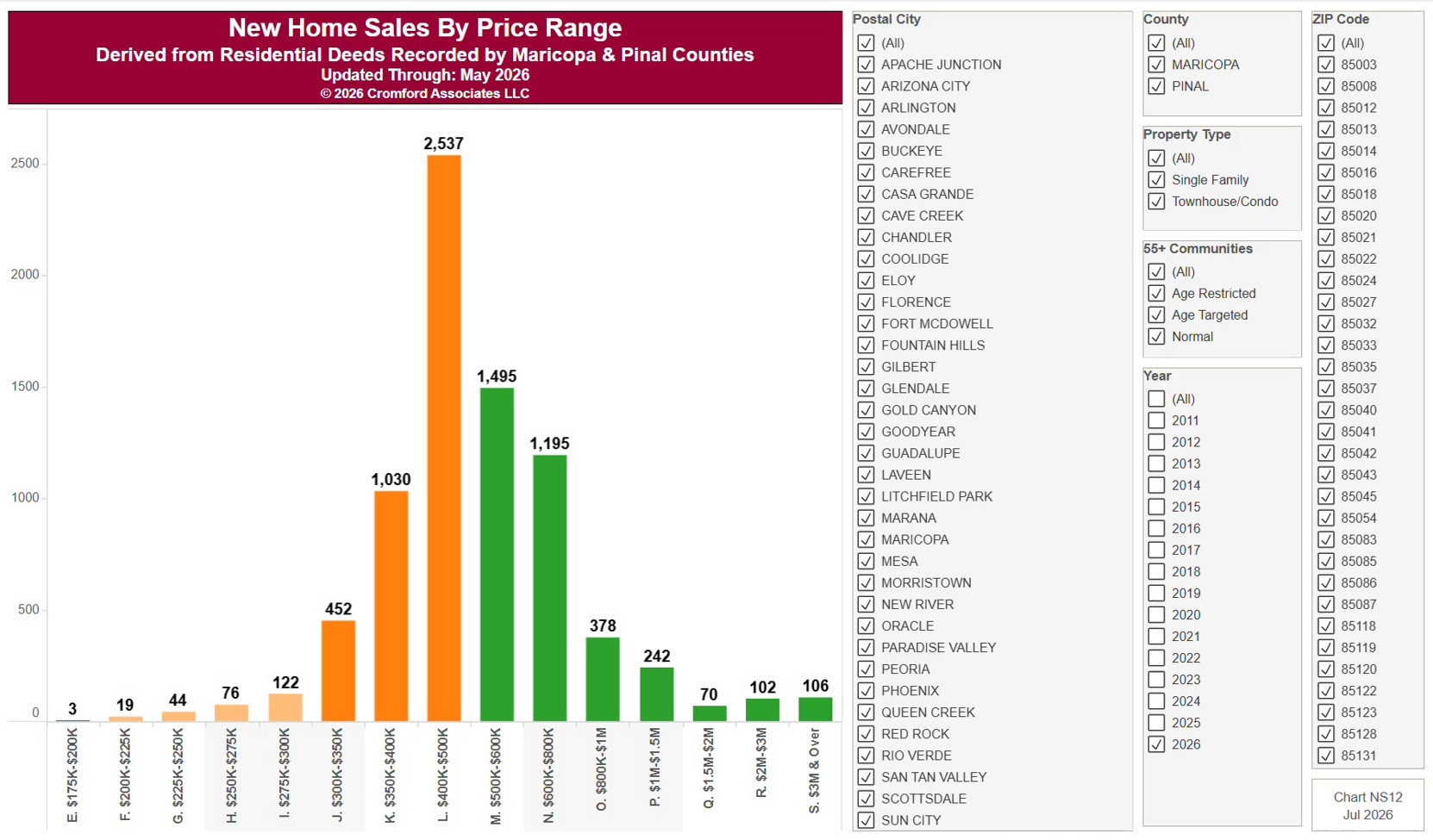
This chart counts new home closings in each price band, from below $100K up to $3M and over, from residential deeds recorded by Maricopa and Pinal Counties. It opens on the current year (January to the latest month recorded); tick more years in the Year panel to include them. To a builder a sale is the contract signature, months before the deed records, so we count closings.

It opens on Maricopa and Pinal Counties with everything included. Narrow it with the County, City, and ZIP panels and the Property Type and 55+ Communities boxes.

Hover over a bar to see the count for that price band.
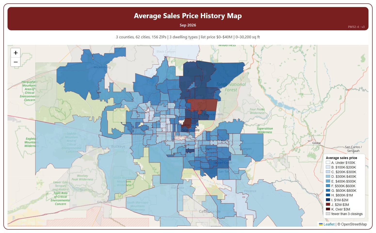
Average Sales Price History Map

About this chart

This map shades each ZIP code by the average sale price of the homes that closed in one month, in price ranges from under $100K to over $3M.

It opens on the latest complete month. Use the Month panel, or its arrows, to step back through earlier months as far as 2008. ZIP codes with fewer than 3 closings in the month are shown in grey.

It opens on the Greater Phoenix area: the counties, cities, and ZIP codes that make it up are ticked to start with. Tick or untick any of them to change the area, including counties beyond Greater Phoenix. Narrow it further with the Dwelling Type, Transaction Type, and New / Resale boxes and the list price, home size, and year built sliders.

Hover over a ZIP code to see its average price and number of closings.

Sales per Year by Price Range

About this chart

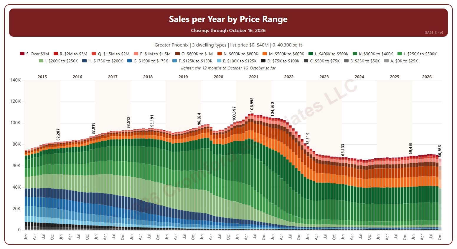
This chart shows the annual sales rate, each bar split into 19 list price ranges. Each bar is the number of homes that closed on ARMLS in the 12 months ending that month: the annual sales rate, which moves smoothly because each month adds one month and drops the one a year before.

It opens on January 2015 to date; drag the handles of the date slider under the chart to choose the months shown, as far back as December 2000. The newest bar covers the 12 months to the latest closing, part-way through the month, so it reads low and is drawn lighter. The chart is updated every day. Click a price range in the legend to hide or show it.

It opens on the Greater Phoenix area: the counties, cities, and ZIP codes that make it up are ticked to start with. Tick or untick any of them to change the area, including counties beyond Greater Phoenix. Narrow it further with the Dwelling Type, Transaction Type, and New / Resale boxes and the list price, home size, and year built sliders.

Hover over a bar to see each price range and the total for the 12 months.

Sales per Month by Price Range

About this chart

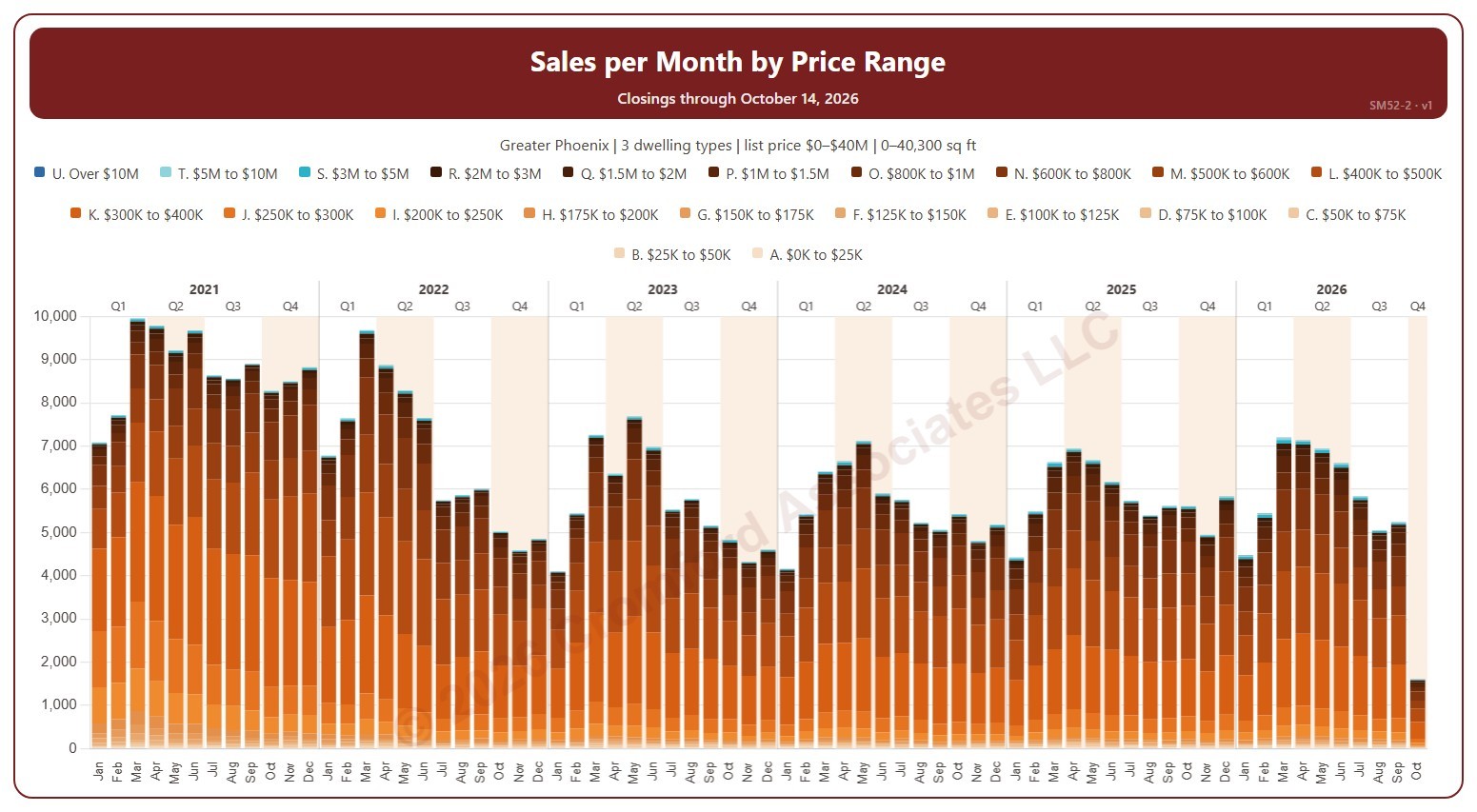
This chart shows the number of homes that closed each month on ARMLS, each bar split into 21 list price ranges, from $25K and under to over $10M.

It opens on January 2021 to date. Drag the handles of the date slider under the chart to choose the months shown, as far back as January 2000. Click a price range in the legend to hide or show it, and use the Month panel to keep only certain months of the year. The newest month is the month so far. The chart is updated every day.

It opens on the Greater Phoenix area: the counties, cities, and ZIP codes that make it up are ticked to start with. Tick or untick any of them to change the area, including counties beyond Greater Phoenix. Narrow it further with the Dwelling Type, Transaction Type, and New / Resale boxes and the list price, home size, and year built sliders.

Hover over a bar to see each price range and the total for that month.

Listings Under Contract by Price Range

About this chart

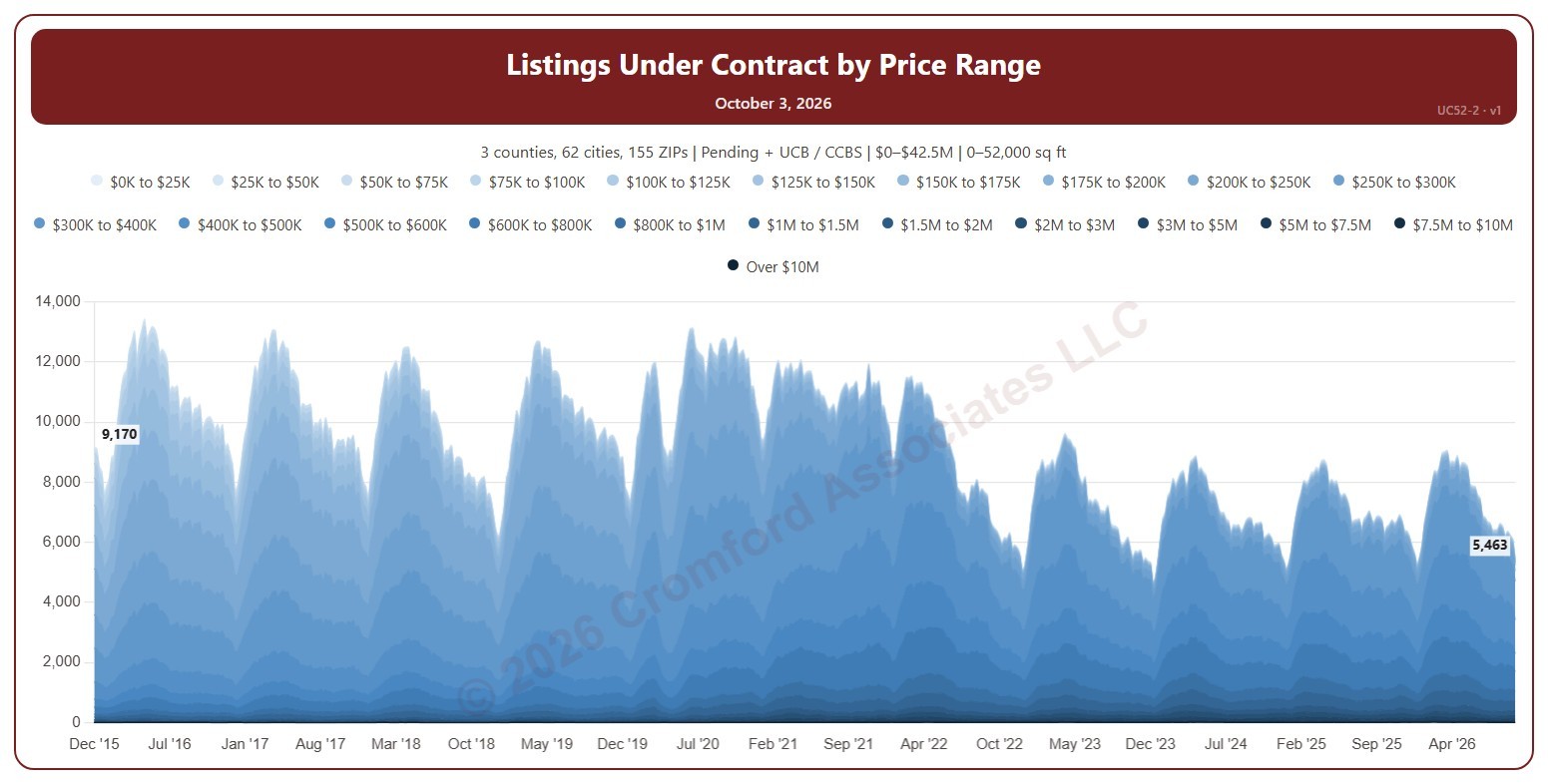
This chart counts the listings under contract on ARMLS each week (on Saturdays), stacked by list price in 22 bands up to over $10M. It shows which price ranges buyers are committing to and how that is changing.

Both Pending and UCB / CCBS listings are counted to start with; untick either under Listing Status to leave it out. It opens on the weeks since December 2015; use the Period panel to choose a different span or particular years.

It opens on the Greater Phoenix area: the counties, cities, and ZIP codes that make it up are ticked to start with. Tick or untick any of them to change the area, including counties beyond Greater Phoenix. Narrow it further with the Dwelling Type, Transaction Type, and New / Resale boxes and the list price, home size, and year built sliders.

Hover over the chart to see the figures for that week.