Sales per Month by ZIP Code – Monthly

About this chart

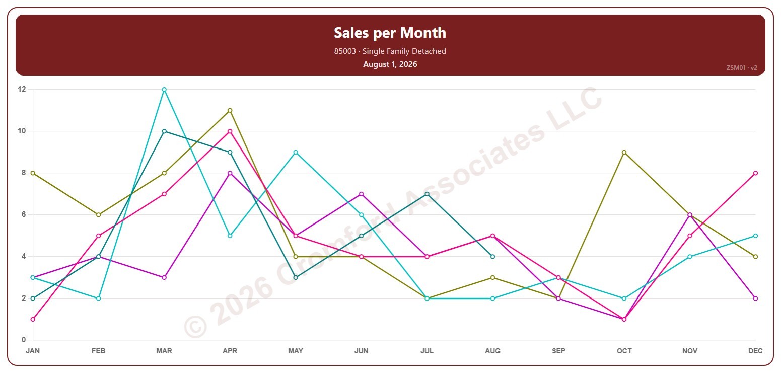
This chart counts the single-family detached homes that closed through ARMLS in one ZIP code each month. Each point covers the closings in that calendar month, so the point at August covers August 1 to 31; the newest point is the last month that has finished.

Each year has its own line, laid out by month, so you can compare this year with earlier years at the same point in the season. Pick any of 149 ZIP codes from the ZIP Code list (it opens on 85003); the last three years are ticked to start with, and you can tick any year back to 2001.

Hover over a line to see the exact figure for that month.
Sales per Year by ZIP Code – Monthly

About this chart

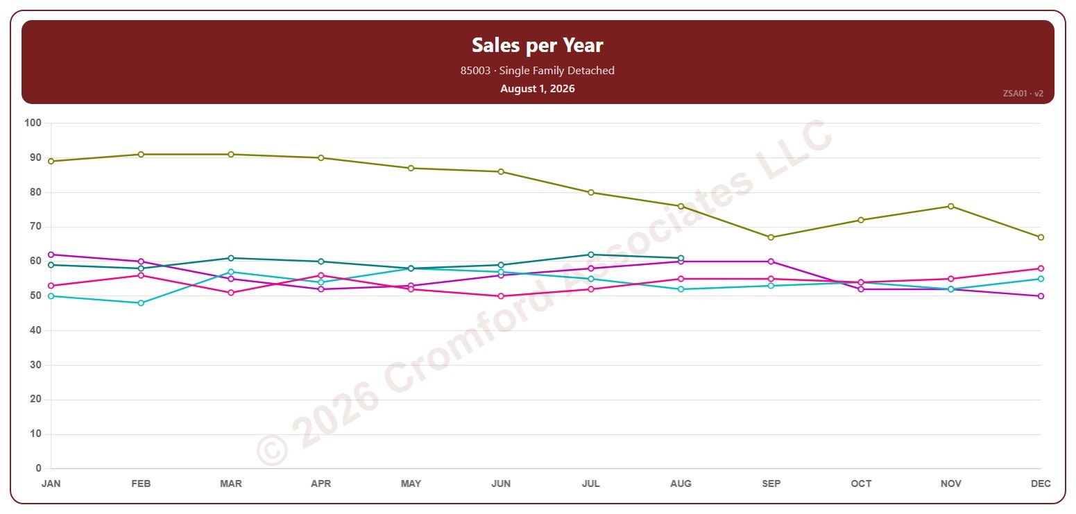
This chart counts the single-family detached homes that closed through ARMLS in one ZIP code over 12 months. Each point covers the 12 months ending with the month it sits at, so the point at August covers September 1 of the year before to August 31; the newest point is the last month that has finished.

Each year has its own line, laid out by month, so you can compare this year with earlier years at the same point in the season. Pick any of 149 ZIP codes from the ZIP Code list (it opens on 85003); the last three years are ticked to start with, and you can tick any year back to 2001.

Hover over a line to see the exact figure for that month.
Pending Listings by ZIP Code – Monthly

About this chart

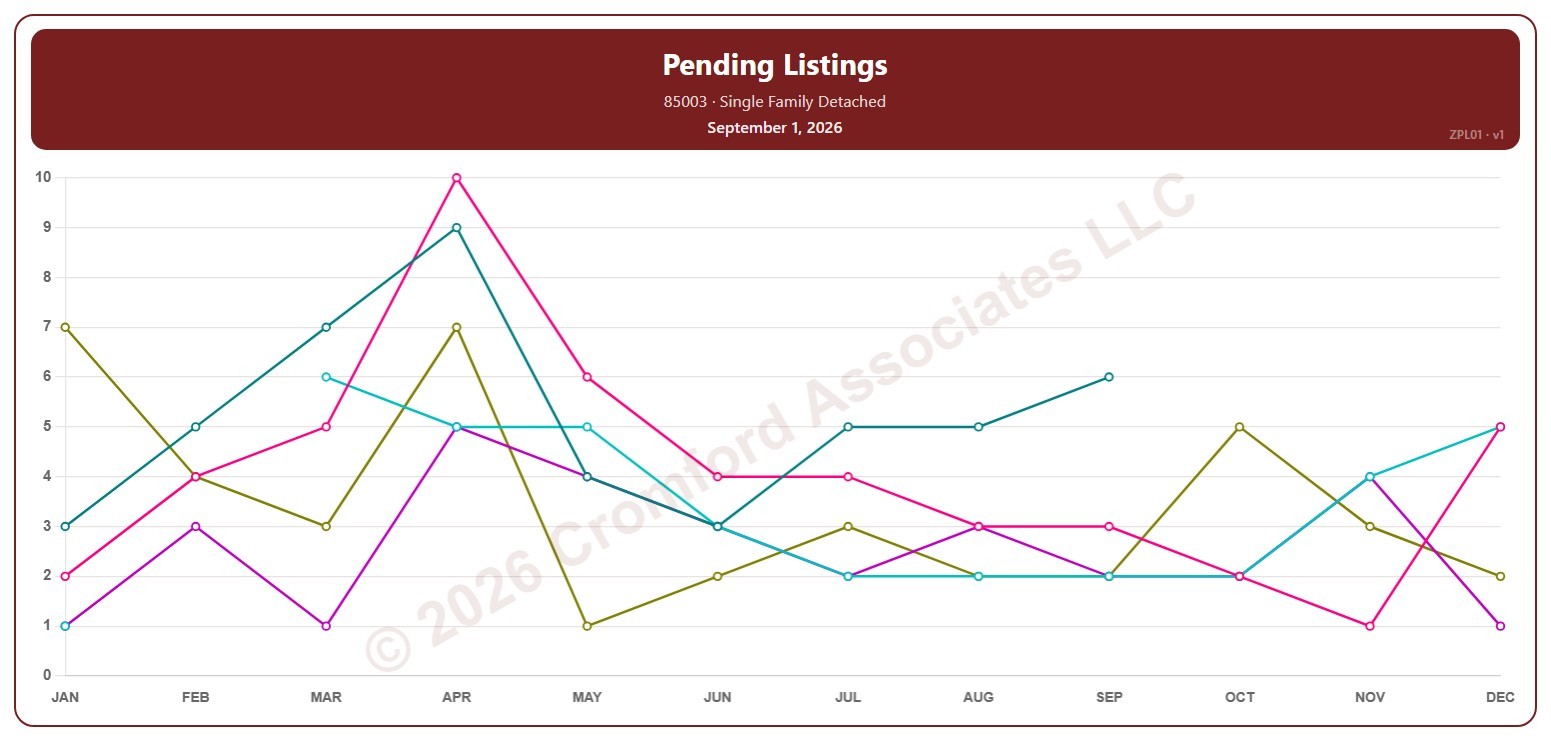
This chart counts the Pending listings for single-family detached homes on ARMLS in one ZIP code: homes under contract that have not yet closed. Each point is the reading on the 1st of the month.

Each year has its own line, laid out by month, so you can compare this year with earlier years at the same point in the season. Pick any of 149 ZIP codes from the ZIP Code list (it opens on 85003); the last three years are ticked to start with, and you can tick any year back to 2005.

Hover over a line to see the exact figure for that month.

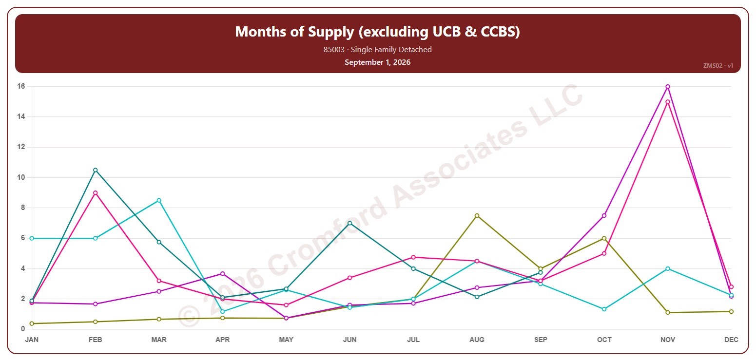
Months of Supply (excluding UCB & CCBS) by ZIP Code – Monthly

About this chart

This chart shows months of supply for single-family detached homes on ARMLS in one ZIP code: how many months it would take to sell all the active listings (not counting UCB / CCBS) at the rate homes sold over the last month, if no new listings came on. Each point is the reading on the 1st of the month. The lower the number, the tighter the supply.

Each year has its own line, laid out by month, so you can compare this year with earlier years at the same point in the season. Pick any of 149 ZIP codes from the ZIP Code list (it opens on 85003); the last three years are ticked to start with, and you can tick any year back to 2006.

Hover over a line to see the exact figure for that month.

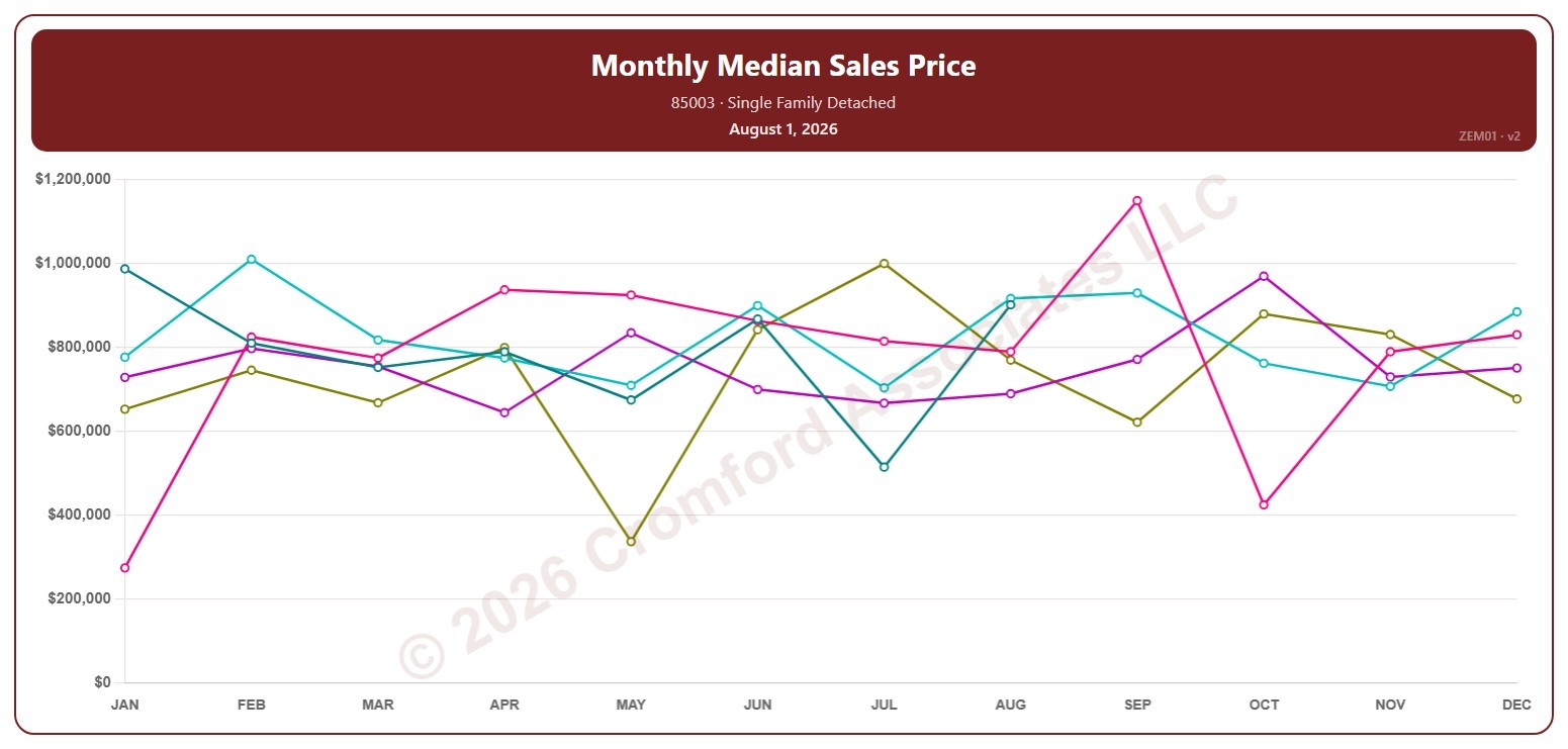
Monthly Median Sales Price by ZIP Code – Monthly

About this chart

This chart shows the median sales price of single-family detached homes that closed through ARMLS in one ZIP code, month by month. Each point covers the closings in that calendar month, so the point at August covers August 1 to 31; the newest point is the last month that has finished. The median is the price in the middle: half sold for more and half for less.

Each year has its own line, laid out by month, so you can compare this year with earlier years at the same point in the season. Pick any of 149 ZIP codes from the ZIP Code list (it opens on 85003); the last three years are ticked to start with, and you can tick any year back to 2001.

Hover over a line to see the exact figure for that month.
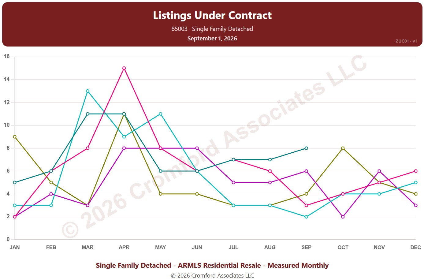
Listings Under Contract by ZIP Code – Monthly

About this chart

This chart counts the listings under contract for single-family detached homes on ARMLS in one ZIP code: Pending listings plus UCB / CCBS listings. Each point is the reading on the 1st of the month. It shows how much buying activity is under way.

Each year has its own line, laid out by month, so you can compare this year with earlier years at the same point in the season. Pick any of 149 ZIP codes from the ZIP Code list (it opens on 85003); the last three years are ticked to start with, and you can tick any year back to 2011.

Hover over a line to see the exact figure for that month.
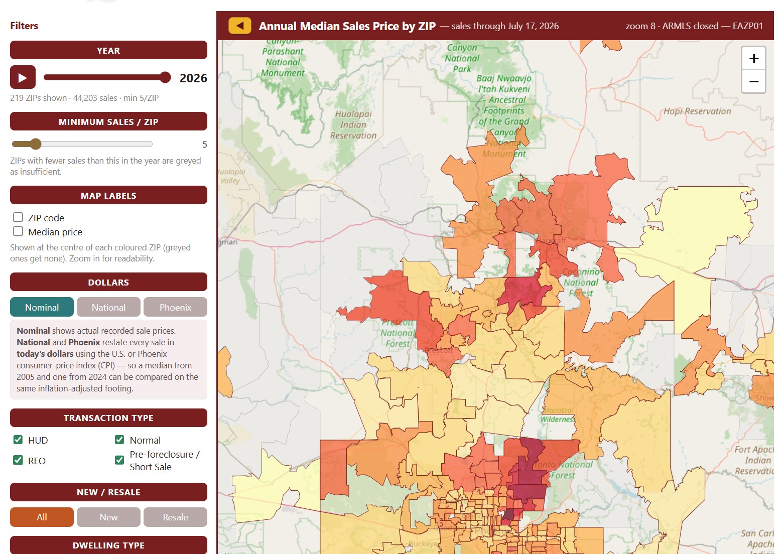
Annual Median Sales Price ZIP Code Map

About this chart

This map colors each ZIP code by the median sales price of the homes that closed through ARMLS in one calendar year, from under $200K to $3M and over. It opens on the current year, which covers the sales recorded so far; move the Year slider, or press play, to step through every year back to 2001.

ZIP codes with fewer sales than the Minimum Sales / ZIP setting (5 to start with) are grayed out as having too little data. Map Labels shows the ZIP code or its median price on the map; zoom in to read them. Dollars switches between actual sale prices and prices restated in today’s dollars using national or Phoenix inflation.

Narrow the sales counted with the Transaction Type and Dwelling Type boxes, the All / New / Resale buttons, and the price and square foot sliders.

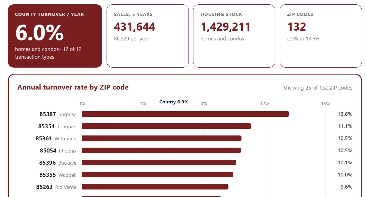
Turnover by ZIP Code

About this chart

This chart ranks Maricopa County ZIP codes by turnover: the share of each ZIP code’s homes that change hands in a typical year, averaged over the last five years. High turnover marks an active market where homes come up for sale often; low turnover means owners tend to stay put.

It opens on the top 25 ZIP codes. Show switches to the top 50 or all ZIP codes, Sort ranks them by turnover, sales volume, housing stock, or ZIP code, and All, Homes, and Condos choose the property type. The transaction type boxes narrow the sales counted.

Chart and Table switch between the ranked bars and the same figures as a table.

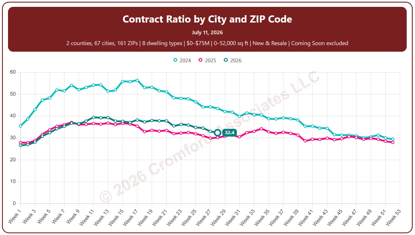
Contract Ratio by City and ZIP Code

About this chart

This chart shows the contract ratio, measured every week (on Saturdays). It compares the listings under contract with the active listings available. The higher the ratio, the stronger buying activity is relative to supply: a rising ratio is good news for sellers, a falling one for buyers.

Coming Soon listings are left out by default; tick Count Coming Soon as Active to include them.

Each year has its own line, laid out by week of the year, so you can compare this year with earlier years at the same point in the season. It opens on the last three years; tick any year back to 2011 in the Year panel.

It opens on Maricopa and Pinal Counties with every city and ZIP code included. Use the County, City, and ZIP panels to focus on any area, from a whole county down to a single ZIP code. Narrow it with the Dwelling Type and New / Resale boxes and the list price and home size sliders.

Hover over a line to see the exact figure for that week.

Percentage Flash Sales by ZIP Code

About this chart

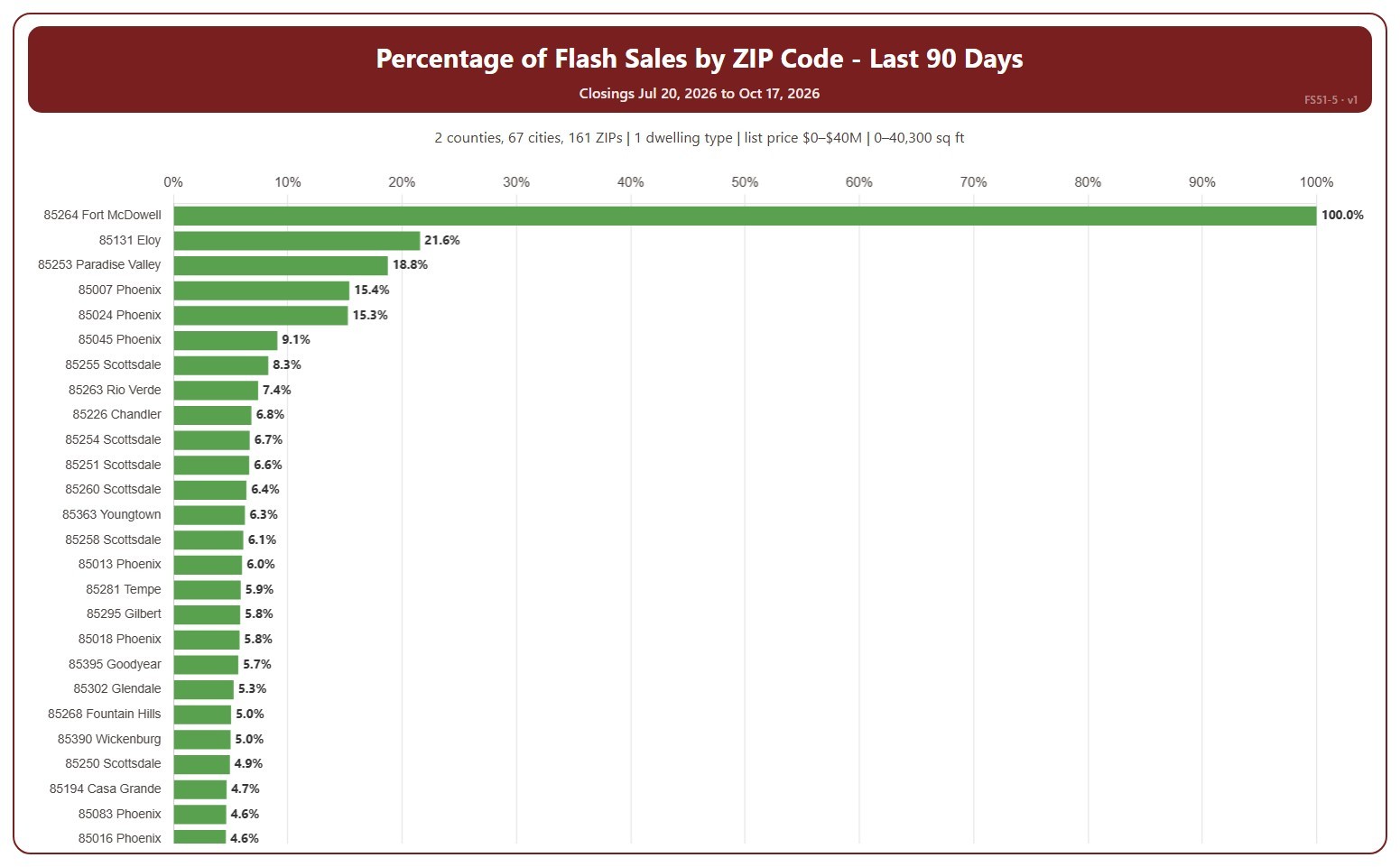
This chart shows flash sales as a percentage of all closings in each ZIP code, highest first. A ZIP code with only a few closings can show 0% or 100%. A flash sale is a closing that spent 1 day or less in the MLS (0 or 1 days on market, cumulative), usually a home that sold as soon as it was listed or was listed only to record a sale already agreed.

It covers the last 90 days to today; choose the last 30 days in the Period box instead. The chart is updated every day.

It opens on Maricopa and Pinal counties and single-family detached homes, as the original chart did. Use the County, City, and ZIP Code boxes to change the area, and narrow it further with the Dwelling Type and New / Resale boxes and the list price, home size, and year built sliders.

Hover over a bar to see the flash sales and all closings in the ZIP code.