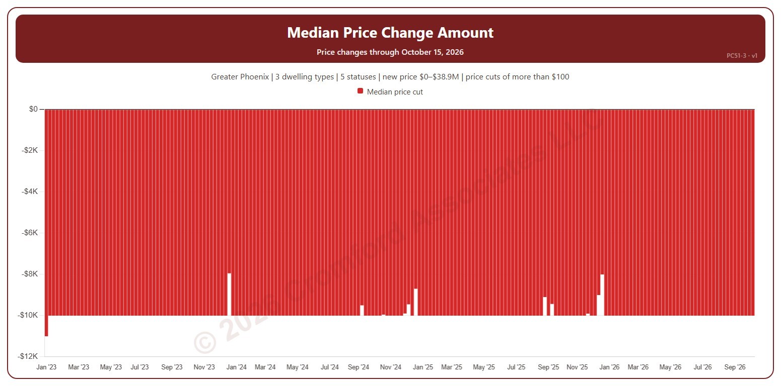
Median Price Change Amount

About this chart

This chart shows the median amount of the list price changes each week: the middle change when they are lined up from smallest to largest. Price cuts show below zero. It counts changes to a listing’s list price on ARMLS, using the new price for the price filter. A change counts only when it is more than the amount in the Price Change panel ($100 to start with). Use the Price Change panel to show price cuts (the opening view), price increases, or both.

Weeks run Sunday to Saturday. It opens on January three years back to date; drag the handles of the date slider under the chart to choose the weeks shown, as far back as January 2013. The newest week is the week so far. The chart is updated every week.

It opens on the Greater Phoenix area: the counties, cities, and ZIP codes that make it up are ticked to start with. Tick or untick any of them to change the area, including counties beyond Greater Phoenix. Narrow it further with the Dwelling Type, List Status, Transaction Type, and New / Resale boxes and the new list price, home size, and year built sliders.

Hover over a bar to see the median change.
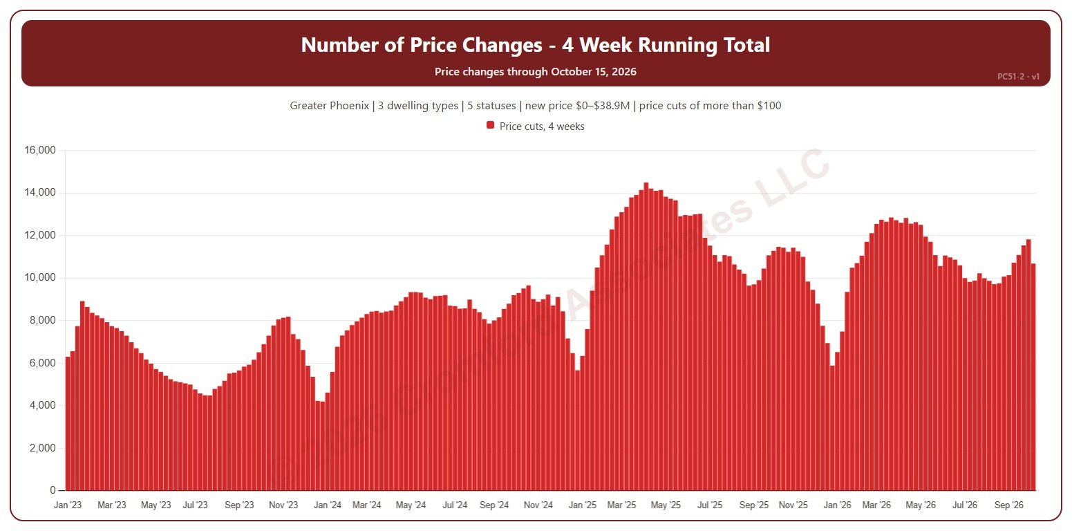
Number of Price Changes – 4 Week Running Total

About this chart

This chart shows the number of list price changes in the four weeks ending each week, which smooths out week-to-week swings. It counts changes to a listing’s list price on ARMLS, using the new price for the price filter. A change counts only when it is more than the amount in the Price Change panel ($100 to start with). Use the Price Change panel to show price cuts (the opening view), price increases, or both.

Weeks run Sunday to Saturday. It opens on January three years back to date; drag the handles of the date slider under the chart to choose the weeks shown, as far back as January 2013. The newest week is the week so far. The chart is updated every week.

It opens on the Greater Phoenix area: the counties, cities, and ZIP codes that make it up are ticked to start with. Tick or untick any of them to change the area, including counties beyond Greater Phoenix. Narrow it further with the Dwelling Type, List Status, Transaction Type, and New / Resale boxes and the new list price, home size, and year built sliders.

Hover over a bar to see the four-week total.

Number of Price Changes per Week

About this chart

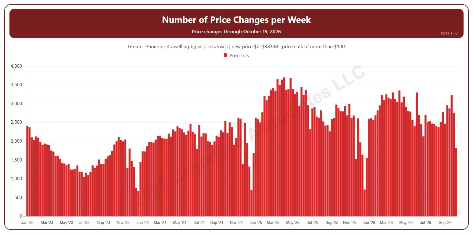
This chart shows the number of list price changes each week. It counts changes to a listing’s list price on ARMLS, using the new price for the price filter. A change counts only when it is more than the amount in the Price Change panel ($100 to start with). Use the Price Change panel to show price cuts (the opening view), price increases, or both.

Weeks run Sunday to Saturday. It opens on January three years back to date; drag the handles of the date slider under the chart to choose the weeks shown, as far back as January 2013. The newest week is the week so far. The chart is updated every week.

It opens on the Greater Phoenix area: the counties, cities, and ZIP codes that make it up are ticked to start with. Tick or untick any of them to change the area, including counties beyond Greater Phoenix. Narrow it further with the Dwelling Type, List Status, Transaction Type, and New / Resale boxes and the new list price, home size, and year built sliders.

Hover over a bar to see the week’s dates and the count.

Year-over-Year Percentage Change in Monthly Average Sales Price

About this chart

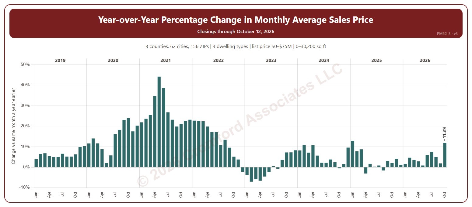
This chart shows the year-over-year change in the average sale price: each month compared with the same month a year earlier, as a percentage. Above zero, prices are higher than a year ago; below zero, lower.

It opens on January 2019 to date; drag the handles of the date slider under the chart to choose the months shown. It goes back to January 2009. The list price slider runs up to $75 million. The newest month is the month so far.

It opens on the Greater Phoenix area: the counties, cities, and ZIP codes that make it up are ticked to start with. Tick or untick any of them to change the area, including counties beyond Greater Phoenix. Narrow it further with the Dwelling Type, Transaction Type, and New / Resale boxes and the list price, home size, and year built sliders.

Hover over a bar to see both months’ average prices and the number of closings.

Monthly Average Sales Price

About this chart

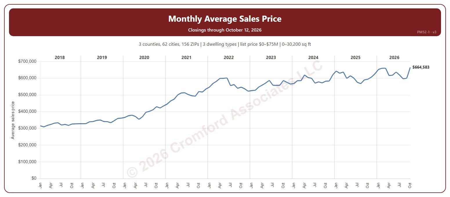
This chart shows the average sale price of the homes that closed each month on ARMLS.

It opens on January 2018 to date; drag the handles of the date slider under the chart to choose the months shown. It goes back to January 2008. The list price slider runs up to $75 million. The newest month is the month so far.

It opens on the Greater Phoenix area: the counties, cities, and ZIP codes that make it up are ticked to start with. Tick or untick any of them to change the area, including counties beyond Greater Phoenix. Narrow it further with the Dwelling Type, Transaction Type, and New / Resale boxes and the list price, home size, and year built sliders.

Hover over the chart to see the figures for that month.

Sales per Year by Price Range

About this chart

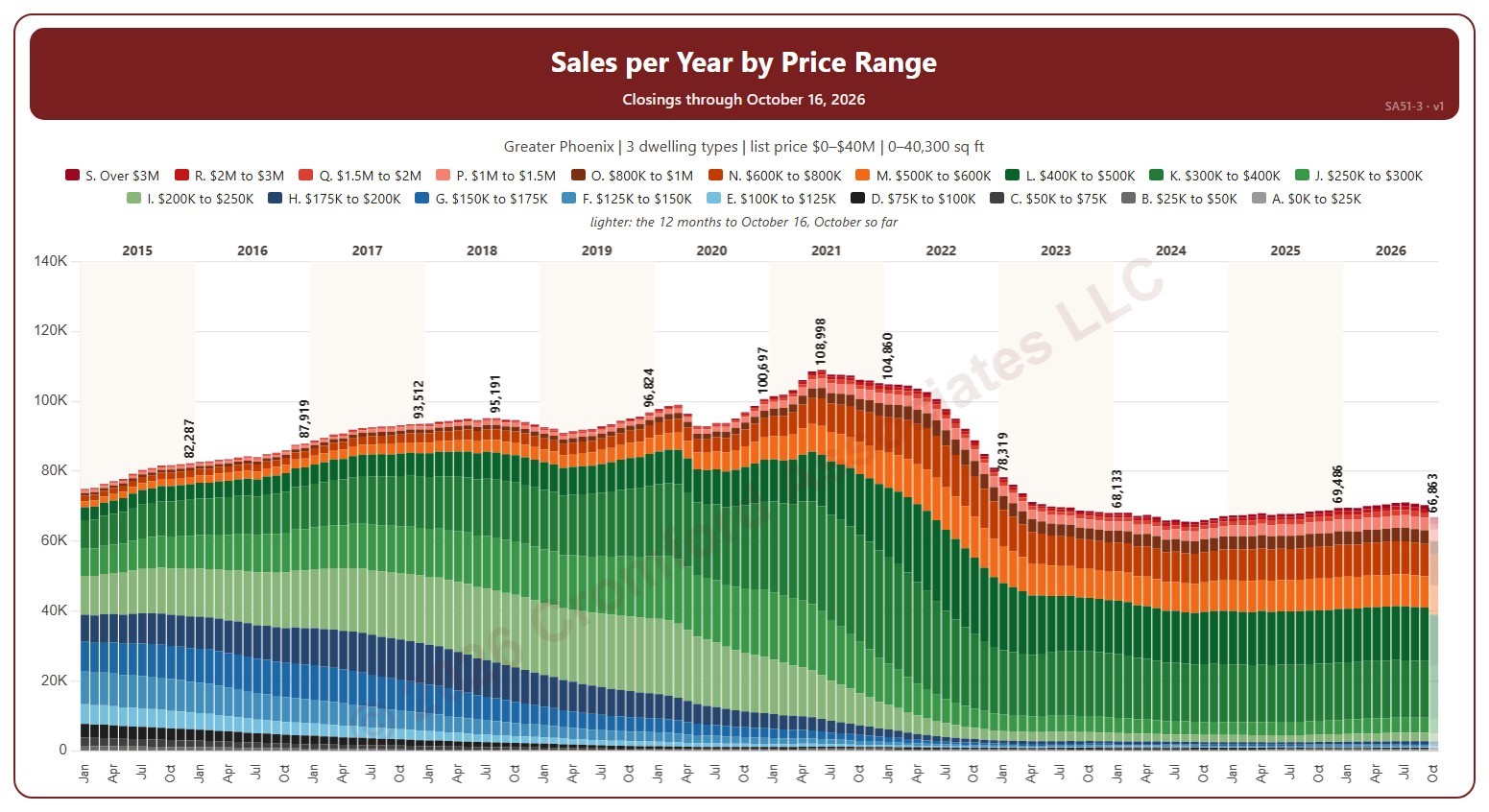
This chart shows the annual sales rate, each bar split into 19 list price ranges. Each bar is the number of homes that closed on ARMLS in the 12 months ending that month: the annual sales rate, which moves smoothly because each month adds one month and drops the one a year before.

It opens on January 2015 to date; drag the handles of the date slider under the chart to choose the months shown, as far back as December 2000. The newest bar covers the 12 months to the latest closing, part-way through the month, so it reads low and is drawn lighter. The chart is updated every day. Click a price range in the legend to hide or show it.

It opens on the Greater Phoenix area: the counties, cities, and ZIP codes that make it up are ticked to start with. Tick or untick any of them to change the area, including counties beyond Greater Phoenix. Narrow it further with the Dwelling Type, Transaction Type, and New / Resale boxes and the list price, home size, and year built sliders.

Hover over a bar to see each price range and the total for the 12 months.

Annual Sales Rate

About this chart

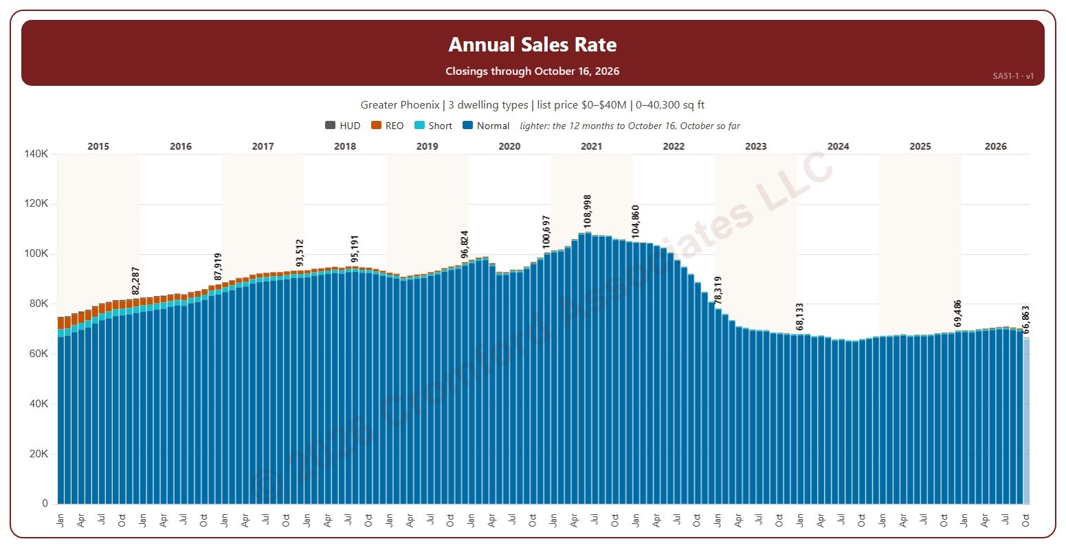
This chart shows the annual sales rate, each bar split by transaction type (normal, short sale, lender-owned, HUD). Each bar is the number of homes that closed on ARMLS in the 12 months ending that month: the annual sales rate, which moves smoothly because each month adds one month and drops the one a year before.

It opens on January 2015 to date; drag the handles of the date slider under the chart to choose the months shown, as far back as December 2000. The newest bar covers the 12 months to the latest closing, part-way through the month, so it reads low and is drawn lighter. The chart is updated every day.

It opens on the Greater Phoenix area: the counties, cities, and ZIP codes that make it up are ticked to start with. Tick or untick any of them to change the area, including counties beyond Greater Phoenix. Narrow it further with the Dwelling Type, Transaction Type, and New / Resale boxes and the list price, home size, and year built sliders.

Hover over a bar to see each transaction type and the total for the 12 months.

Sales per Week

About this chart

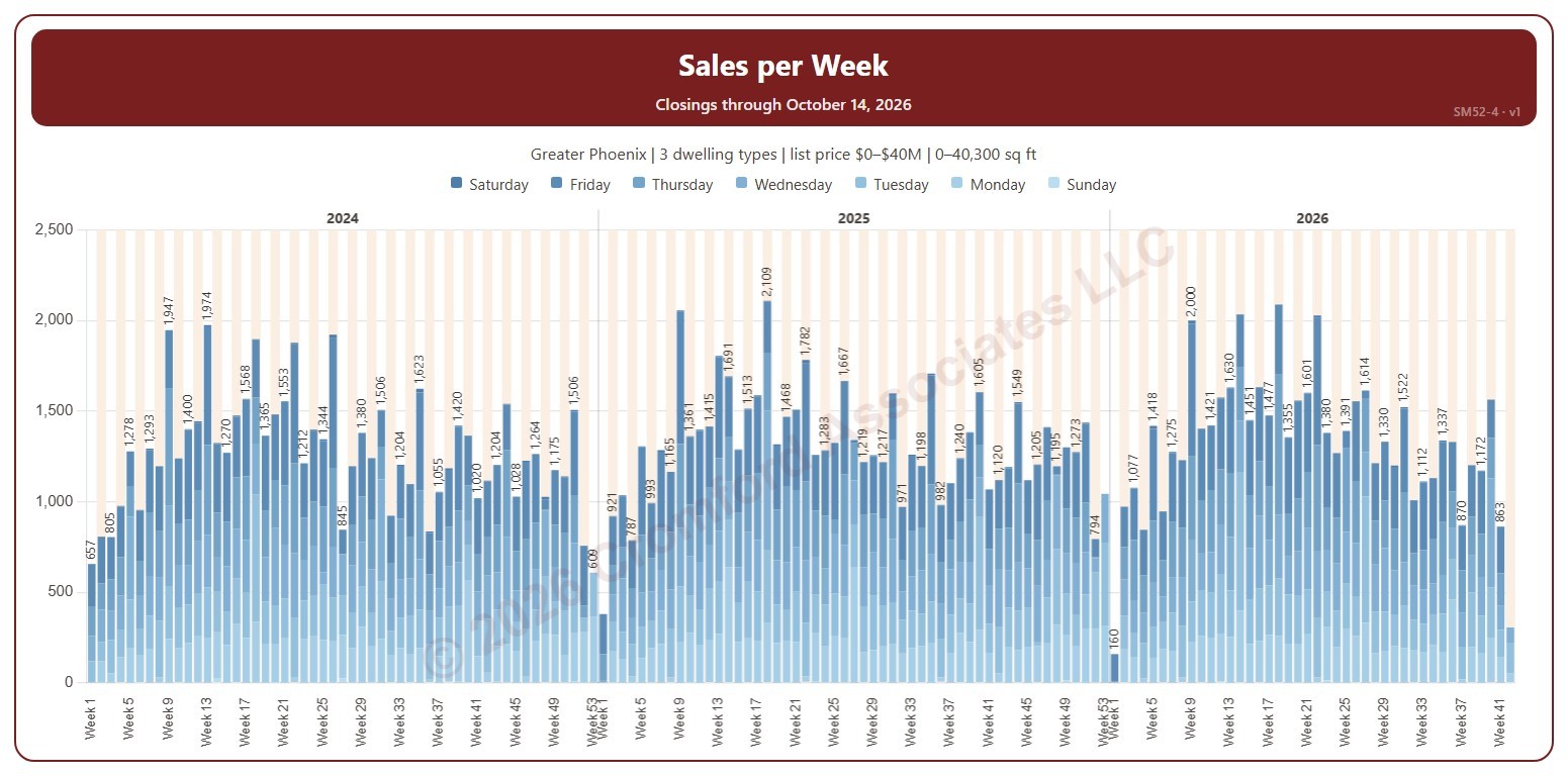
This chart shows the number of homes that closed each week on ARMLS, each bar split by the day of the week, with the week’s total above it. Weeks run Sunday to Saturday, and week 1 of each year starts on 1 January, so the first and last weeks of a year can be short.

It opens on the first week of 2024 to date. Drag the handles of the date slider under the chart to choose the weeks shown, as far back as 2000. Use the Week panel to pick one week number and see that week in each year. The newest week is the week so far. The chart is updated every day.

It opens on the Greater Phoenix area: the counties, cities, and ZIP codes that make it up are ticked to start with. Tick or untick any of them to change the area, including counties beyond Greater Phoenix. Narrow it further with the Dwelling Type, Transaction Type, and New / Resale boxes and the list price, home size, and year built sliders.

Hover over a bar to see the week’s dates, each day, and the total.

Year-over-Year Percentage Change in Monthly Sales Volume

About this chart

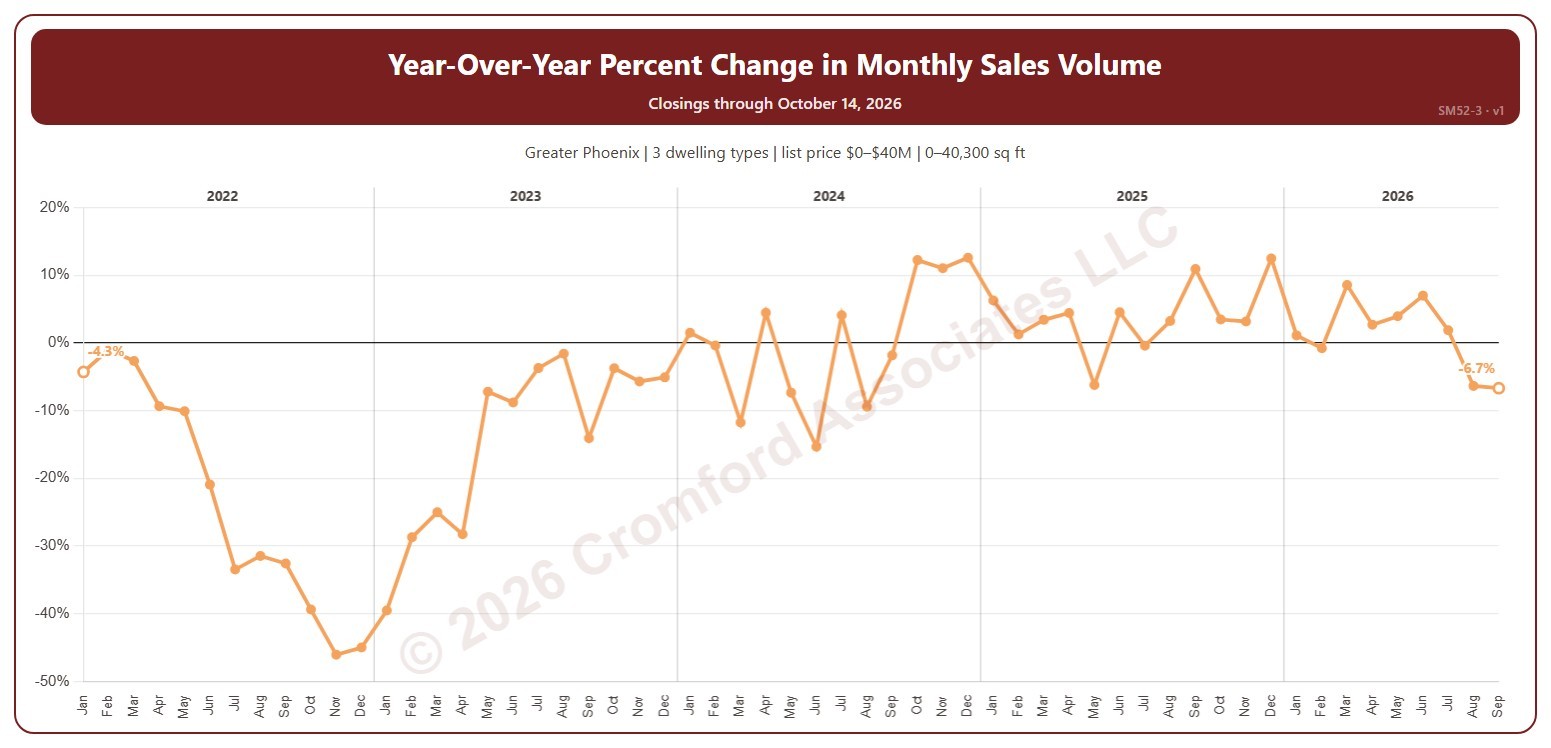
This chart shows the year-over-year change in the number of homes that closed: each month compared with the same month a year earlier, as a percentage. Above zero, more homes closed than a year ago; below zero, fewer.

It opens on January 2022 to date. Drag the handles of the date slider under the chart to choose the months shown, as far back as January 2001. The line ends at the latest complete month, so a month still in progress is never compared with a whole month. The chart is updated every day.

It opens on the Greater Phoenix area: the counties, cities, and ZIP codes that make it up are ticked to start with. Tick or untick any of them to change the area, including counties beyond Greater Phoenix. Narrow it further with the Dwelling Type, Transaction Type, and New / Resale boxes and the list price, home size, and year built sliders.

Hover over the line to see the change and both months’ closings.

Sales per Month by Price Range

About this chart

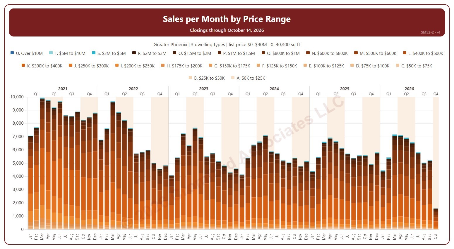
This chart shows the number of homes that closed each month on ARMLS, each bar split into 21 list price ranges, from $25K and under to over $10M.

It opens on January 2021 to date. Drag the handles of the date slider under the chart to choose the months shown, as far back as January 2000. Click a price range in the legend to hide or show it, and use the Month panel to keep only certain months of the year. The newest month is the month so far. The chart is updated every day.

It opens on the Greater Phoenix area: the counties, cities, and ZIP codes that make it up are ticked to start with. Tick or untick any of them to change the area, including counties beyond Greater Phoenix. Narrow it further with the Dwelling Type, Transaction Type, and New / Resale boxes and the list price, home size, and year built sliders.

Hover over a bar to see each price range and the total for that month.