About this chart
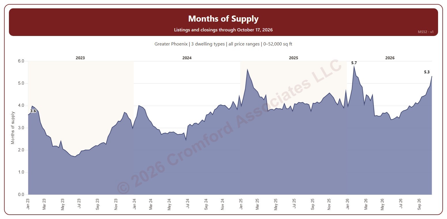
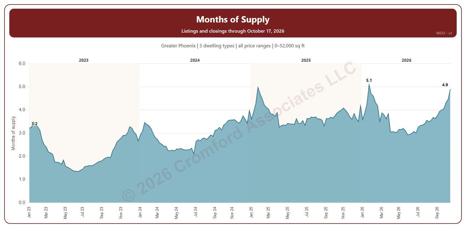
This chart shows months of supply each Saturday: the active listings on ARMLS that day divided by the homes that closed in the month up to the day before, so it says how many months the listings for sale would last at the current pace of sales. Listings under contract that are still taking backup offers (UCB / CCBS) are not counted as supply.
It opens on January three years back to date; drag the handles of the date slider under the chart to choose the weeks shown, as far back as January 2011. The chart is updated every day.
It opens on the Greater Phoenix area: the counties, cities, and ZIP codes that make it up are ticked to start with. Tick or untick any of them to change the area, including counties beyond Greater Phoenix. Narrow it further with the Price Range boxes, the Dwelling Type, Transaction Type, and New / Resale boxes, and the home size and year built sliders; the listings and the closings are narrowed the same way (a listing by its list price that day, a closing by its list price).
Hover over the chart to see the week’s months of supply, the active listings, and the closings in its month.