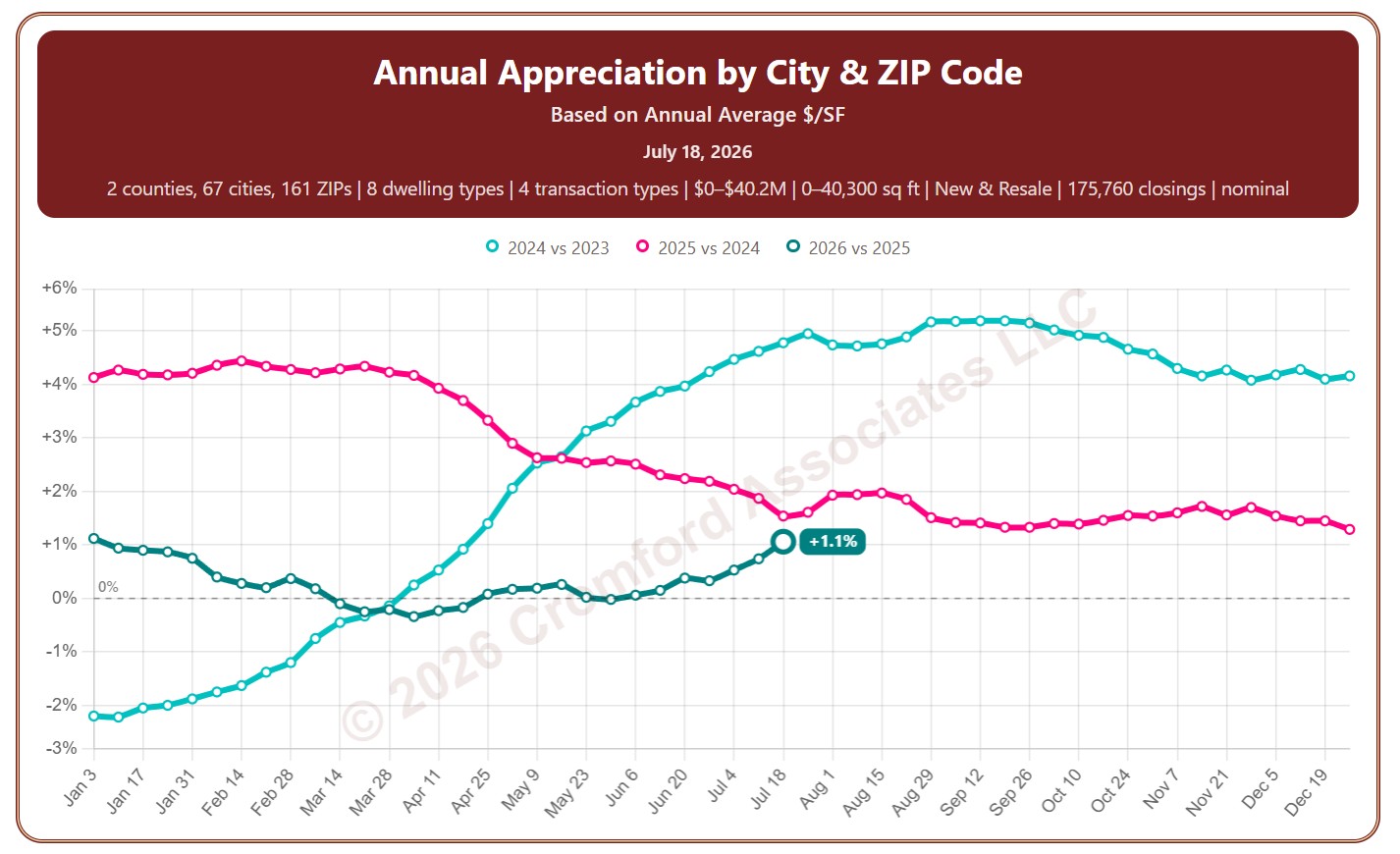
Annual Appreciation by City and ZIP Code – Based on Annual Average Price per Square Foot

About this chart

This chart shows annual appreciation: how much prices have changed compared with the same point a year earlier, measured every week. The price compared is the average price per square foot over the last 12 months (Based on Annual Average $/SF). Above zero, prices are higher than a year ago; below zero, they are lower.

Each year has its own line, laid out by week of the year, so you can compare this year with earlier years at the same point in the season. It opens on the last three years; tick any year back to 2002 in the Year panel.

It opens on Maricopa and Pinal Counties with every city and ZIP code included. Use the County, City, and ZIP panels to focus on any area, from a whole county down to a single ZIP code. Narrow it with the Dwelling Type, Transaction Type, and New / Resale boxes and the sales price, home size, and year built sliders. The Inflation (CPI) option compares prices in today’s dollars, using national or Phoenix inflation, so you can see appreciation after inflation.

Hover over a line to see the exact figure for that week.
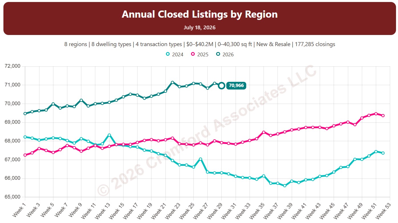
Annual Closed Listing Counts by Region

About this chart

This chart counts the homes that closed through ARMLS, measured every week. Each point is the number of closings in the 12 months up to that week, which smooths out the seasonal swings.

Each year has its own line, laid out by week of the year, so you can compare this year with earlier years at the same point in the season. It opens on the last three years; tick any year back to 2001 in the Year panel.

It opens with every region included. Use the Region panel to focus on one region or compare a combination of them. Narrow it with the Dwelling Type, Transaction Type, and New / Resale boxes and the sales price, home size, and year built sliders.

Hover over a line to see the exact figure for that week.
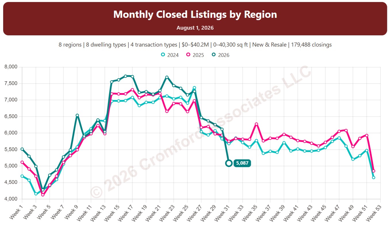
Monthly Closed Listing Counts by Region

About this chart

This chart counts the homes that closed through ARMLS, measured every week. Each point is the number of closings in the month up to that week.

Each year has its own line, laid out by week of the year, so you can compare this year with earlier years at the same point in the season. It opens on the last three years; tick any year back to 2001 in the Year panel.

It opens with every region included. Use the Region panel to focus on one region or compare a combination of them. Narrow it with the Dwelling Type, Transaction Type, and New / Resale boxes and the sales price, home size, and year built sliders.

Hover over a line to see the exact figure for that week.
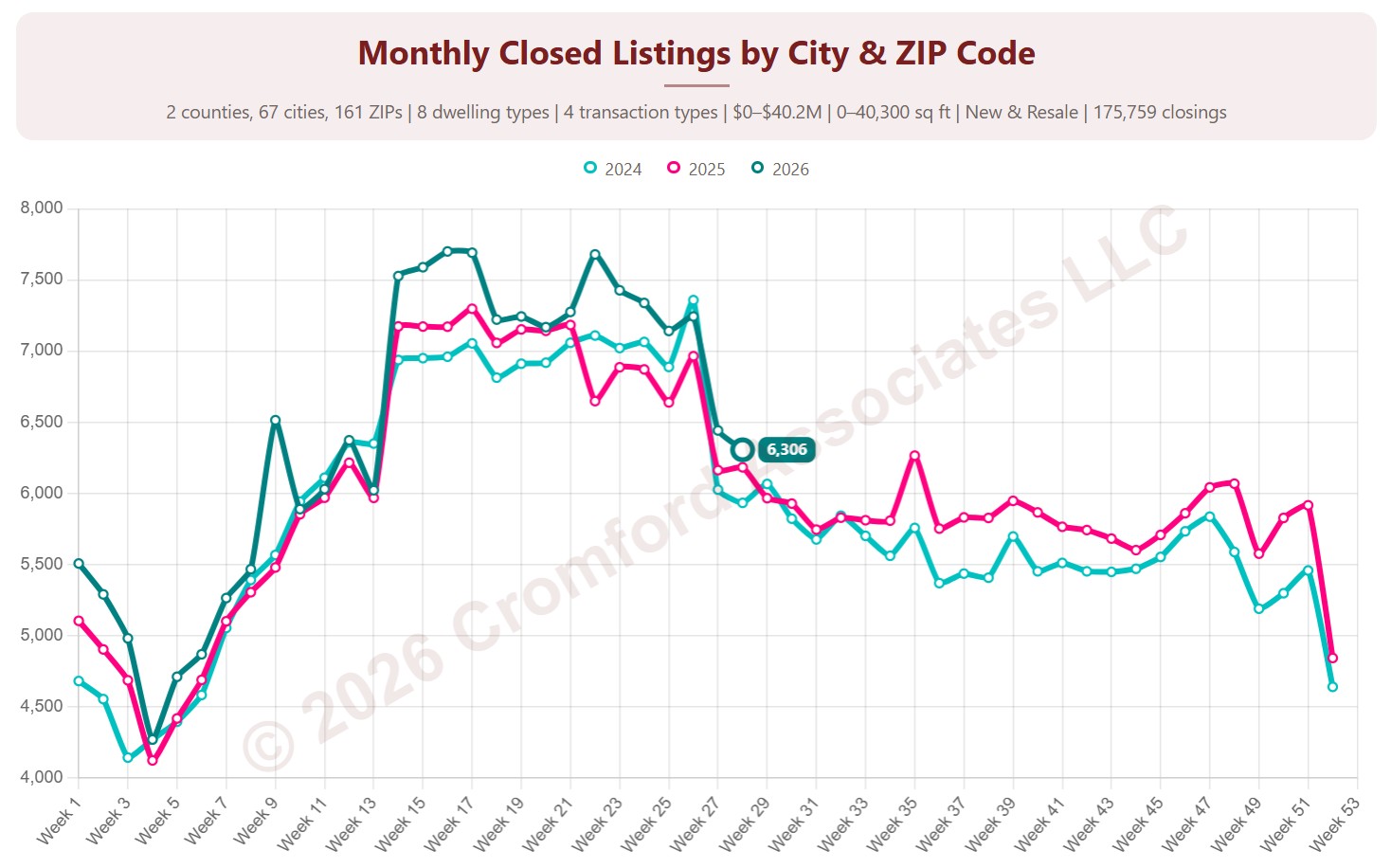
Monthly Closed Listing Counts by City & ZIP Code

About this chart

This chart counts the homes that closed through ARMLS, measured every week. Each point is the number of closings in the month up to that week.

Each year has its own line, laid out by week of the year, so you can compare this year with earlier years at the same point in the season. It opens on the last three years; tick any year back to 2001 in the Year panel.

It opens on Maricopa and Pinal Counties with every city and ZIP code included. Use the County, City, and ZIP panels to focus on any area, from a whole county down to a single ZIP code. Narrow it with the Dwelling Type, Transaction Type, and New / Resale boxes and the sales price, home size, and year built sliders.

Hover over a line to see the exact figure for that week.
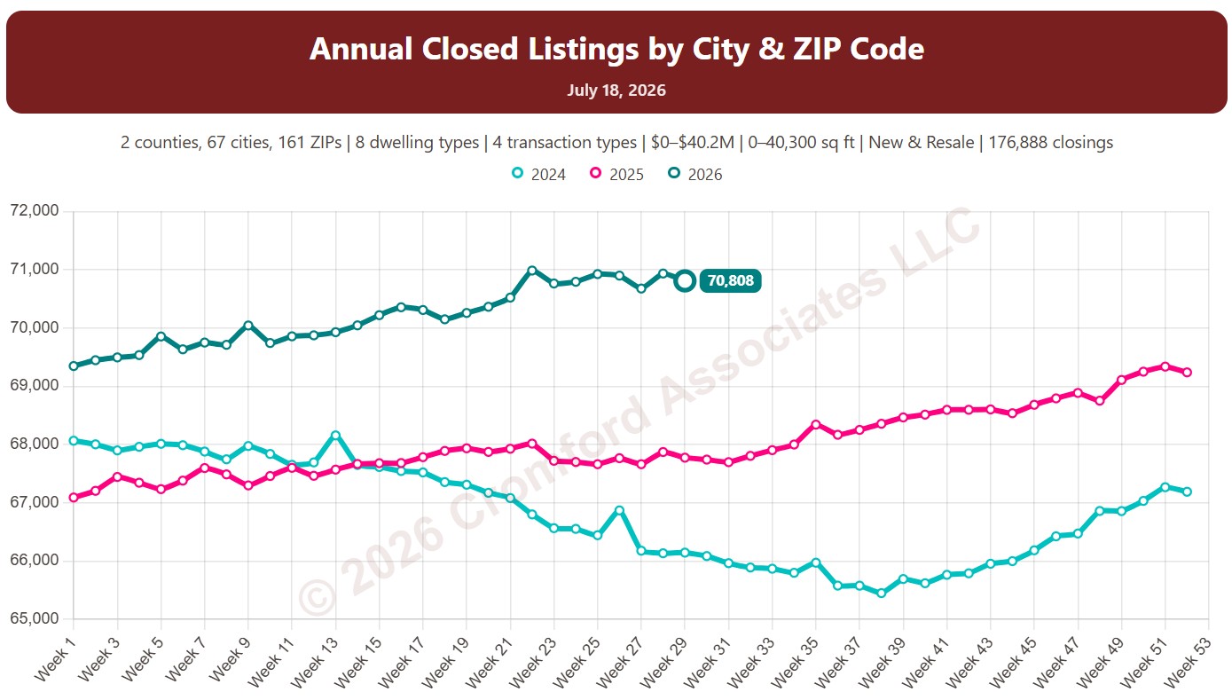
Annual Closed Listing Counts by City & ZIP Code

About this chart

This chart counts the homes that closed through ARMLS, measured every week. Each point is the number of closings in the 12 months up to that week, which smooths out the seasonal swings.

Each year has its own line, laid out by week of the year, so you can compare this year with earlier years at the same point in the season. It opens on the last three years; tick any year back to 2001 in the Year panel.

It opens on Maricopa and Pinal Counties with every city and ZIP code included. Use the County, City, and ZIP panels to focus on any area, from a whole county down to a single ZIP code. Narrow it with the Dwelling Type, Transaction Type, and New / Resale boxes and the sales price, home size, and year built sliders.

Hover over a line to see the exact figure for that week.
Annual Average Sales Price per Square Foot by City & ZIP Code

About this chart

This chart shows the average sales price per square foot of homes that closed through ARMLS, measured every week. Each point covers the homes that closed in the 12 months up to that week. Price per square foot lets you compare homes of different sizes; this is the true average across all the square feet sold.

Each year has its own line, laid out by week of the year, so you can compare this year with earlier years at the same point in the season. It opens on the last three years; tick any year back to 2001 in the Year panel.

It opens on Maricopa and Pinal Counties with every city and ZIP code included. Use the County, City, and ZIP panels to focus on any area, from a whole county down to a single ZIP code. Narrow it with the Dwelling Type, Transaction Type, and New / Resale boxes and the sales price, home size, and year built sliders. The Inflation (CPI) option restates prices in today’s dollars using national or Phoenix inflation.

Hover over a line to see the exact figure for that week.
Quarterly Average Sales Price per Square Foot by City & ZIP Code

About this chart

This chart shows the average sales price per square foot of homes that closed through ARMLS, measured every week. Each point covers the homes that closed in the three months up to that week. Price per square foot lets you compare homes of different sizes; this is the true average across all the square feet sold.

Each year has its own line, laid out by week of the year, so you can compare this year with earlier years at the same point in the season. It opens on the last three years; tick any year back to 2001 in the Year panel.

It opens on Maricopa and Pinal Counties with every city and ZIP code included. Use the County, City, and ZIP panels to focus on any area, from a whole county down to a single ZIP code. Narrow it with the Dwelling Type, Transaction Type, and New / Resale boxes and the sales price, home size, and year built sliders. The Inflation (CPI) option restates prices in today’s dollars using national or Phoenix inflation.

Hover over a line to see the exact figure for that week.
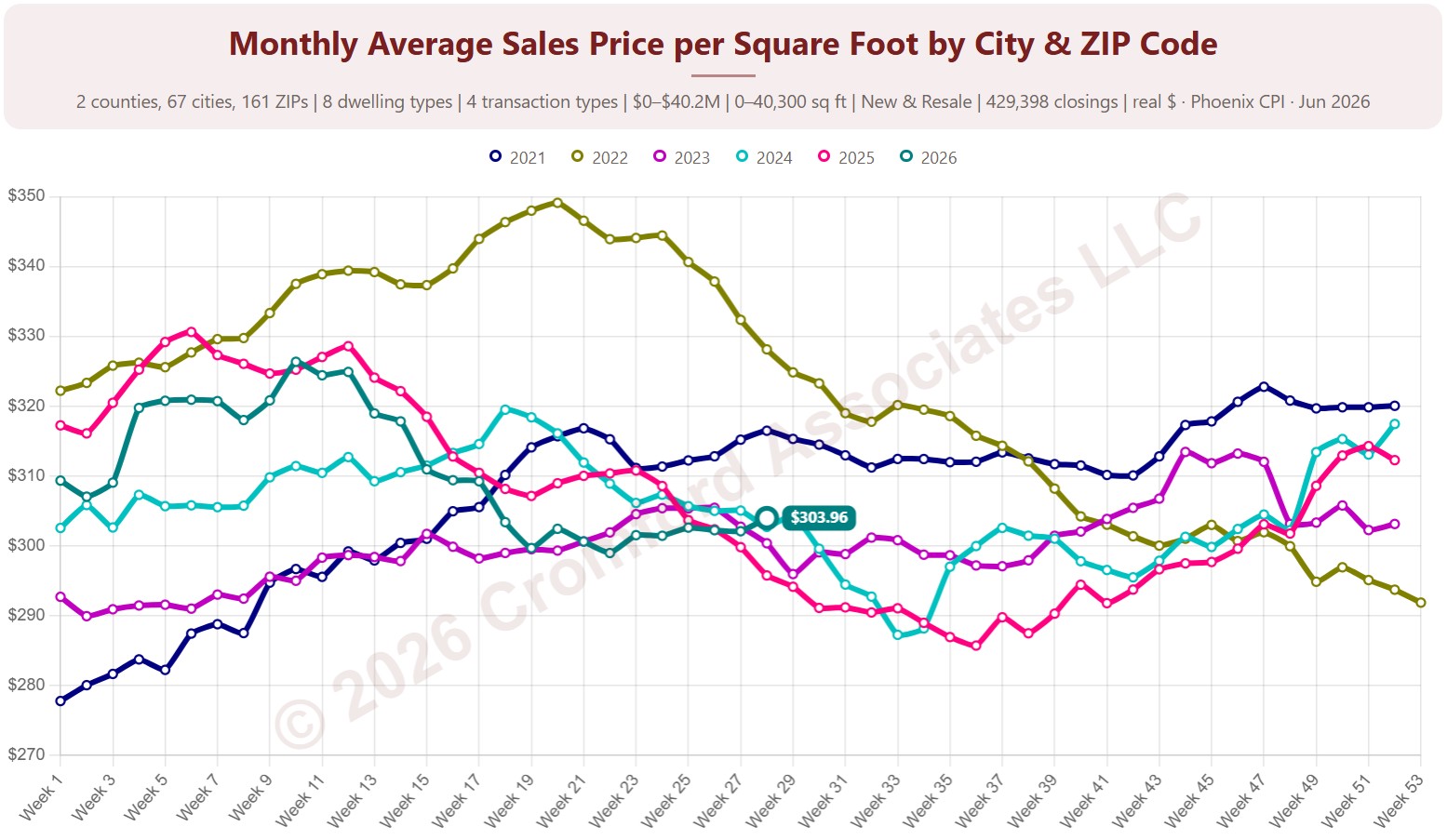
Monthly Average Sales Price per Square Foot by City & ZIP Code

About this chart

This chart shows the average sales price per square foot of homes that closed through ARMLS, measured every week. Each point covers the homes that closed in the month up to that week. Price per square foot lets you compare homes of different sizes; this is the true average across all the square feet sold.

Each year has its own line, laid out by week of the year, so you can compare this year with earlier years at the same point in the season. It opens on the last three years; tick any year back to 2001 in the Year panel.

It opens on Maricopa and Pinal Counties with every city and ZIP code included. Use the County, City, and ZIP panels to focus on any area, from a whole county down to a single ZIP code. Narrow it with the Dwelling Type, Transaction Type, and New / Resale boxes and the sales price, home size, and year built sliders. The Inflation (CPI) option restates prices in today’s dollars using national or Phoenix inflation.

Hover over a line to see the exact figure for that week.
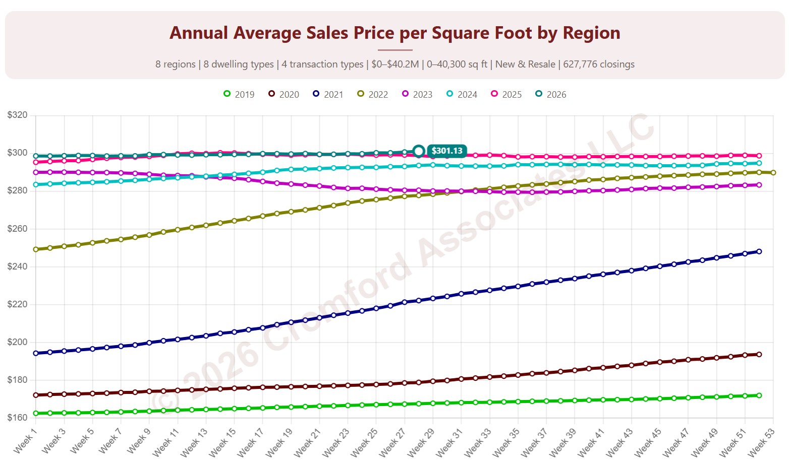
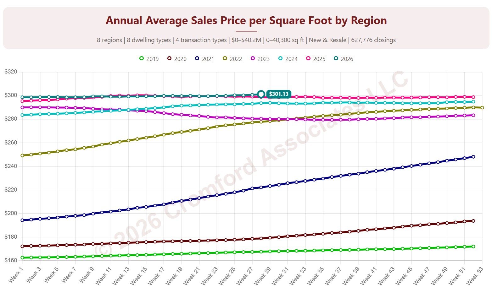
Annual Average Sales Price per Square Foot by Region

About this chart

This chart shows the average sales price per square foot of homes that closed through ARMLS, measured every week. Each point covers the homes that closed in the 12 months up to that week. Price per square foot lets you compare homes of different sizes; this is the true average across all the square feet sold.

Each year has its own line, laid out by week of the year, so you can compare this year with earlier years at the same point in the season. It opens on the last three years; tick any year back to 2001 in the Year panel.

It opens with every region included. Use the Region panel to focus on one region or compare a combination of them. Narrow it with the Dwelling Type, Transaction Type, and New / Resale boxes and the sales price, home size, and year built sliders. The Inflation (CPI) option restates prices in today’s dollars using national or Phoenix inflation.

Hover over a line to see the exact figure for that week.

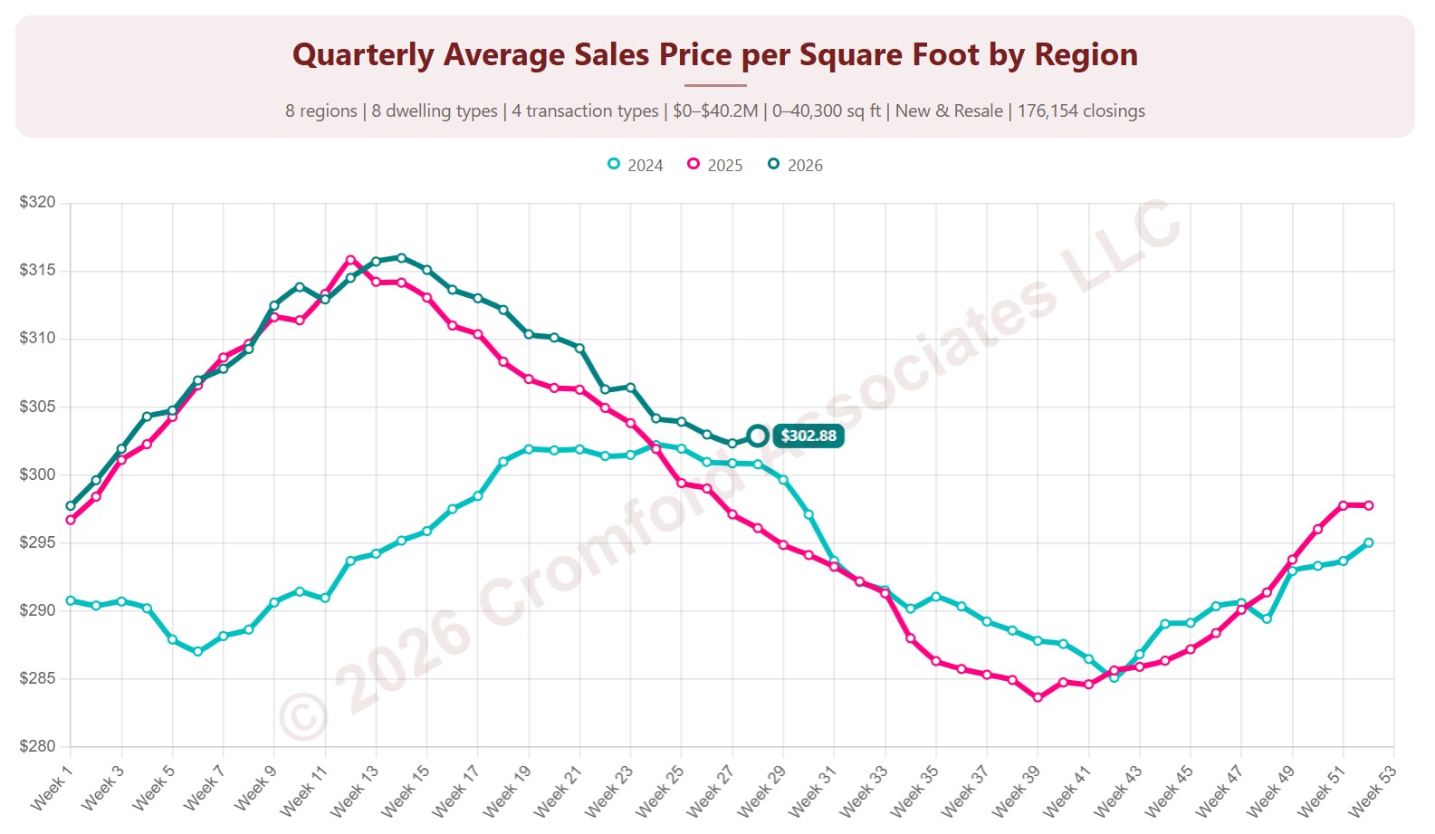
Quarterly Average Price per Square Foot by Region

About this chart

This chart shows the average sales price per square foot of homes that closed through ARMLS, measured every week. Each point covers the homes that closed in the three months up to that week. Price per square foot lets you compare homes of different sizes; this is the true average across all the square feet sold.

Each year has its own line, laid out by week of the year, so you can compare this year with earlier years at the same point in the season. It opens on the last three years; tick any year back to 2001 in the Year panel.

It opens with every region included. Use the Region panel to focus on one region or compare a combination of them. Narrow it with the Dwelling Type, Transaction Type, and New / Resale boxes and the sales price, home size, and year built sliders. The Inflation (CPI) option restates prices in today’s dollars using national or Phoenix inflation.

Hover over a line to see the exact figure for that week.