Monthly Average Sales Price per Square Foot by Region

About this chart

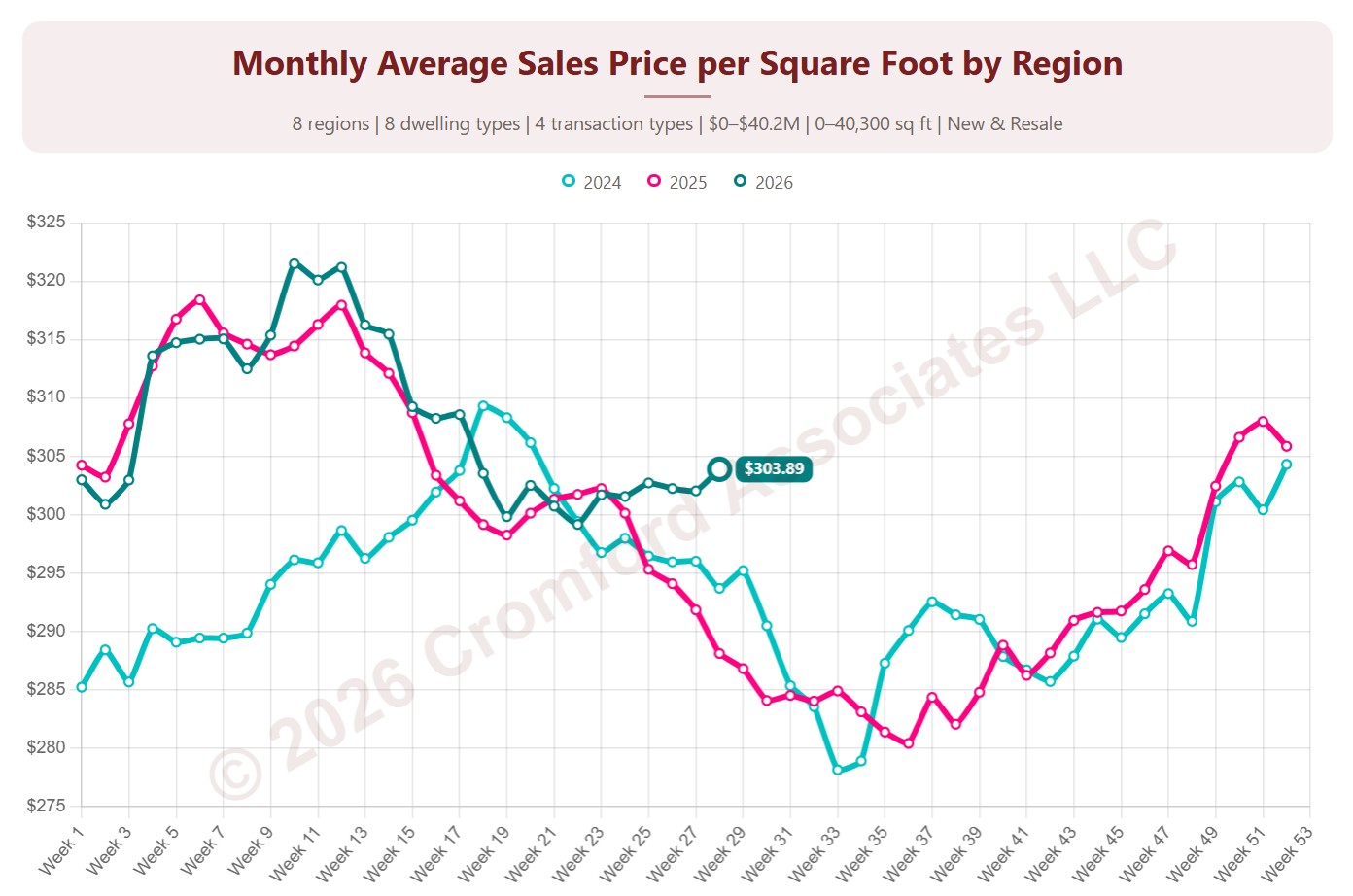
This chart shows the average sales price per square foot of homes that closed through ARMLS, measured every week. Each point covers the homes that closed in the month up to that week. Price per square foot lets you compare homes of different sizes; this is the true average across all the square feet sold.

Each year has its own line, laid out by week of the year, so you can compare this year with earlier years at the same point in the season. It opens on the last three years; tick any year back to 2001 in the Year panel.

It opens with every region included. Use the Region panel to focus on one region or compare a combination of them. Narrow it with the Dwelling Type, Transaction Type, and New / Resale boxes and the sales price, home size, and year built sliders. The Inflation (CPI) option restates prices in today’s dollars using national or Phoenix inflation.

Hover over a line to see the exact figure for that week.
Contract Ratio by Region

About this chart

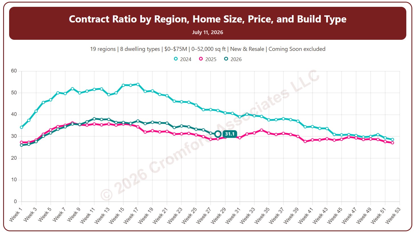
This chart shows the contract ratio, measured every week (on Saturdays). It compares the listings under contract with the active listings available. The higher the ratio, the stronger buying activity is relative to supply: a rising ratio is good news for sellers, a falling one for buyers.

Coming Soon listings are left out by default; tick Count Coming Soon as Active to include them.

Each year has its own line, laid out by week of the year, so you can compare this year with earlier years at the same point in the season. It opens on the last three years; tick any year back to 2011 in the Year panel.

It opens with every region included. Use the Region panel to focus on one region or compare a combination of them. Narrow it with the Dwelling Type and New / Resale boxes and the list price and home size sliders.

Hover over a line to see the exact figure for that week.
Active Listings by Region

About this chart

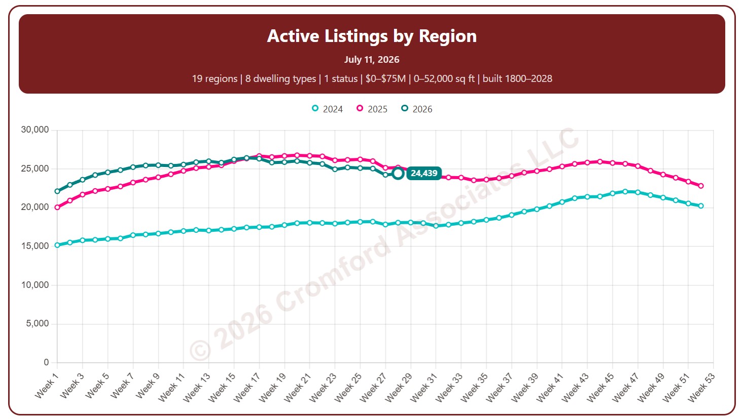
This chart counts the homes listed for sale on ARMLS, measured every week (on Saturdays).

By default it counts Active listings. Tick Coming Soon, UCB / CCBS (under contract but still accepting back-up offers), or Temp Off Market in the List Status panel to include them.

Each year has its own line, laid out by week of the year, so you can compare this year with earlier years at the same point in the season. It opens on the last three years; tick any year back to 2011 in the Year panel.

It opens with every region included. Use the Region panel to focus on one region or compare a combination of them. Narrow it with the Dwelling Type, List Status, Transaction Type, and New / Resale boxes and the list price, home size, year built, and days on market sliders.

Rising inventory gives buyers more choice and more negotiating power; falling inventory favors sellers. Hover over a line to see the exact figure for that week.
Notes:

  • This chart excludes listings for homes that are located outside Arizona

Active Listings by City and ZIP Code

About this chart

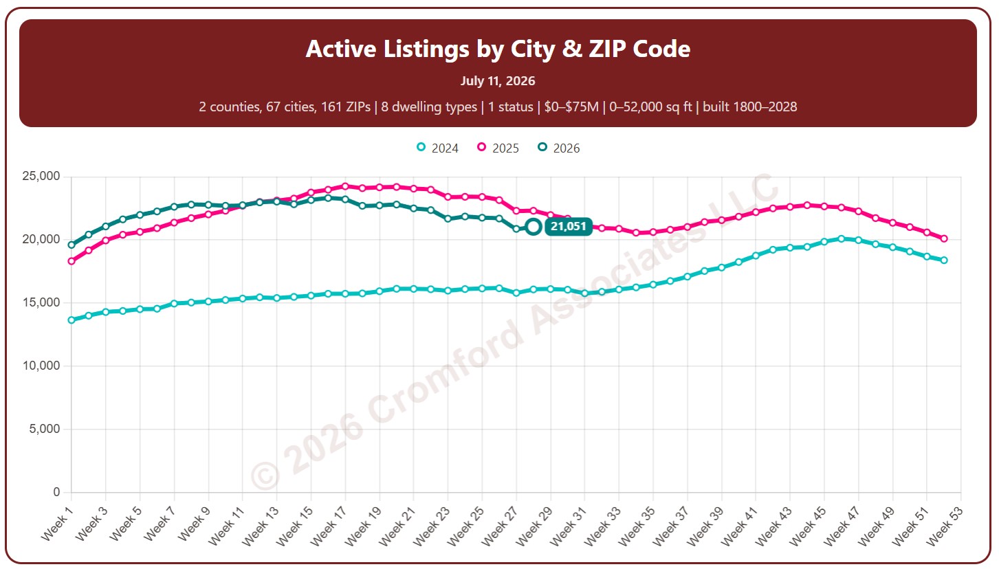
This chart counts the homes listed for sale on ARMLS, measured every week (on Saturdays).

By default it counts Active listings. Tick Coming Soon, UCB / CCBS (under contract but still accepting back-up offers), or Temp Off Market in the List Status panel to include them.

Each year has its own line, laid out by week of the year, so you can compare this year with earlier years at the same point in the season. It opens on the last three years; tick any year back to 2011 in the Year panel.

It opens on Maricopa and Pinal Counties with every city and ZIP code included. Use the County, City, and ZIP panels to focus on any area, from a whole county down to a single ZIP code. Narrow it with the Dwelling Type, List Status, Transaction Type, and New / Resale boxes and the list price, home size, year built, and days on market sliders.

Rising inventory gives buyers more choice and more negotiating power; falling inventory favors sellers. Hover over a line to see the exact figure for that week.
Active Listing Weekly Counts – Compared by Year

About this chart

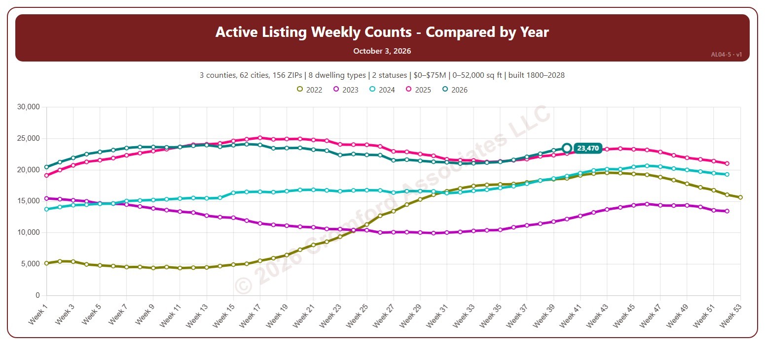
This chart counts the homes listed for sale on ARMLS each week (on Saturdays), with one line per year laid out by week of the year, so you can compare this year with earlier years at the same point in the season.

By default it counts Active and Coming Soon listings; tick UCB / CCBS (under contract but still accepting back-up offers) or Temp Off Market in the List Status panel to include them. It opens on the last five years; tick any year back to 2011 in the Year panel.

It opens on the Greater Phoenix area: the counties, cities, and ZIP codes that make it up are ticked to start with. Tick or untick any of them to change the area, including counties beyond Greater Phoenix. Narrow it further with the Dwelling Type, List Status, Transaction Type, and New / Resale boxes and the list price, home size, year built, and days on market sliders.

Hover over the chart to see the figures for that week.

Year-to-Date Cancelled Listings

About this chart

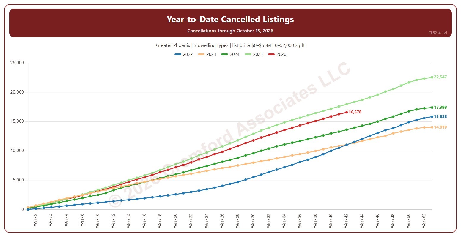
This chart shows the running total of cancelled listings from 1 January to the end of each week of the year, a line per year, so this year’s pace can be read against earlier years. Weeks run Sunday to Saturday and week 1 of each year starts on 1 January, so the first and last weeks of a year can be short. A cancelled listing is one the seller took off the market before it sold, counted on the date it was cancelled.

It opens on the latest 5 years; tick other years in the Year box to go back as far as 2001, and use the Month box to count only some months. Use Zoom to latest to see the newest week and four weeks either side, with every year’s total at that week. The chart is updated every day.

It opens on the Greater Phoenix area: the counties, cities, and ZIP codes that make it up are ticked to start with. Tick or untick any of them to change the area, including counties beyond Greater Phoenix. Narrow it further with the Dwelling Type, Transaction Type, and New / Resale boxes and the list price, home size, and year built sliders.

Hover over the chart to see each year’s total at that week.

Listings Cancelled Weekly

About this chart

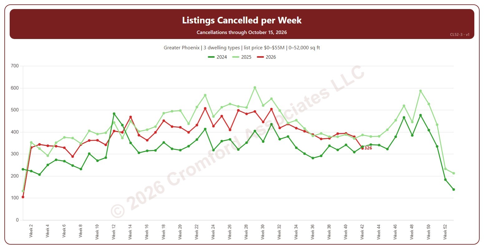
This chart shows the number of listings cancelled each week, a line per year. Weeks run Sunday to Saturday and week 1 of each year starts on 1 January, so the first and last weeks of a year can be short. A cancelled listing is one the seller took off the market before it sold, counted on the date it was cancelled.

It opens on the latest 3 years; tick other years in the Year box to go back as far as 2001. Click a ticked year again to fade it, and once more to remove it. Use the Month box to count only some months of the year. The newest week is the week so far. The chart is updated every day.

It opens on the Greater Phoenix area: the counties, cities, and ZIP codes that make it up are ticked to start with. Tick or untick any of them to change the area, including counties beyond Greater Phoenix. Narrow it further with the Dwelling Type, Transaction Type, and New / Resale boxes and the list price, home size, and year built sliders.

Hover over the chart to see each year’s count for that week.

Median Cumulative Days on Market for Closed Listings

About this chart

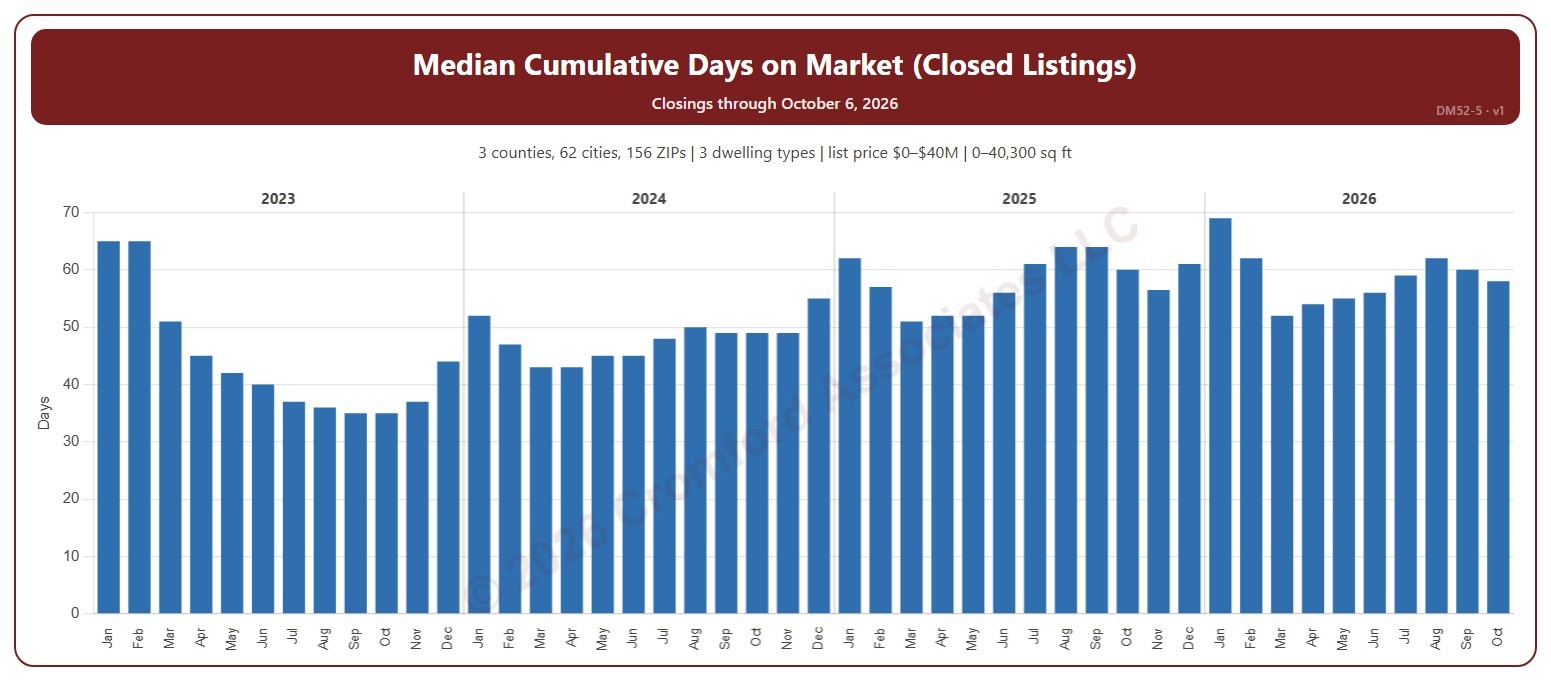
This chart shows the median cumulative days on market of the homes that closed through ARMLS, one bar per calendar month of closing: half took longer to sell and half less. Cumulative days on market is ARMLS’s own count of the days a home was on the market. The median is less affected than the average by a few homes that sat on the market for a very long time.

It opens on the last four years; tick any year back to 2000 in the Year panel. The newest month is the month so far.

It opens on the Greater Phoenix area: the counties, cities, and ZIP codes that make it up are ticked to start with. Tick or untick any of them to change the area, including counties beyond Greater Phoenix. Narrow it further with the Dwelling Type (condo, mobile, single family), Transaction Type, and New / Resale boxes and the list price, home size, and year built sliders.

Hover over the chart to see the figures for that month.

Weekly Cumulative Days on Market for Closed Listings

About this chart

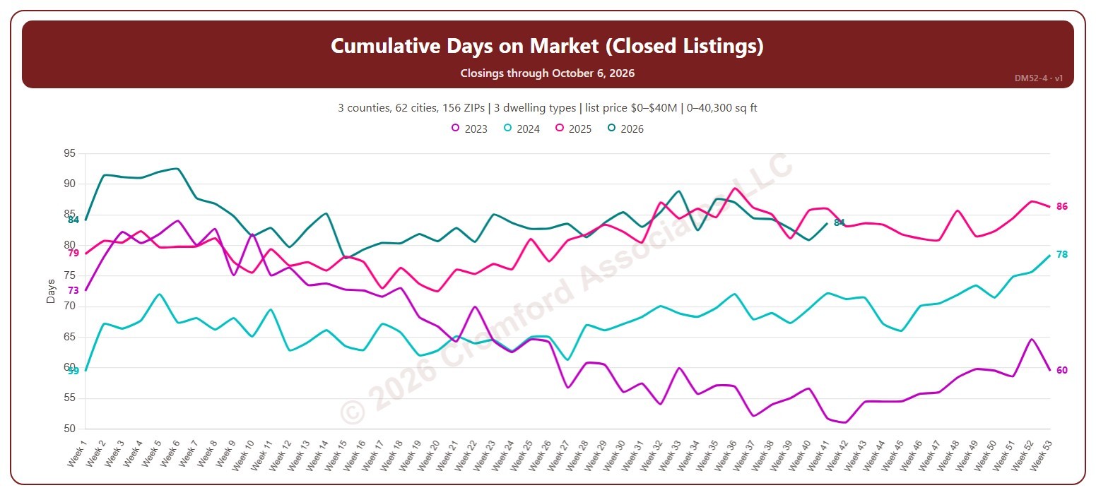
This chart shows the average cumulative days on market of the homes that closed through ARMLS, by week of closing, with one line per year so you can compare the same point in the season. Cumulative days on market is ARMLS’s own count of the days a home was on the market. Weeks start on Sunday, with week 1 being the week that includes January 1.

It opens on the last four years; tick any year back to 2000 in the Year panel. The newest week is the week so far.

It opens on the Greater Phoenix area: the counties, cities, and ZIP codes that make it up are ticked to start with. Tick or untick any of them to change the area, including counties beyond Greater Phoenix. Narrow it further with the Dwelling Type (condo, mobile, single family), Transaction Type, and New / Resale boxes and the list price, home size, and year built sliders.

Hover over the chart to see the figures for that week.

Year-over-Year Change in Average Days on Market for Closed Listings

About this chart

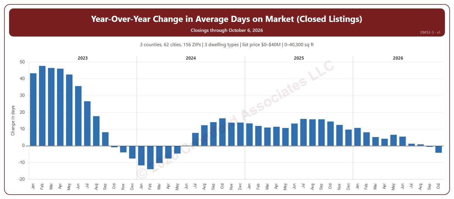
This chart shows the year-over-year change in the average cumulative days on market of the homes that closed through ARMLS: each month’s average compared with the same month a year earlier, in days. Cumulative days on market is ARMLS’s own count of the days a home was on the market. Above zero, homes are taking longer to sell than a year ago; below zero, they are selling faster.

It opens on the last four years; tick any year back to 2000 in the Year panel. The newest month is the month so far.

It opens on the Greater Phoenix area: the counties, cities, and ZIP codes that make it up are ticked to start with. Tick or untick any of them to change the area, including counties beyond Greater Phoenix. Narrow it further with the Dwelling Type (condo, mobile, single family), Transaction Type, and New / Resale boxes and the list price, home size, and year built sliders.

Hover over the chart to see the figures for that month.