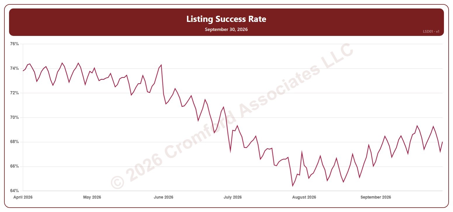
Listing Success Rate – Last 6 Months

About this chart

This chart shows the listing success rate: the share of listings that ended in a sale rather than being canceled or expiring, over a month, for the whole ARMLS market, all areas and all dwelling types, every day over the last six months. Each point covers the listings that ended (sold, canceled, or expired) in the month up to that day. A higher rate means more listings are ending in a sale.

Hover over the line to see the exact figure for that day.
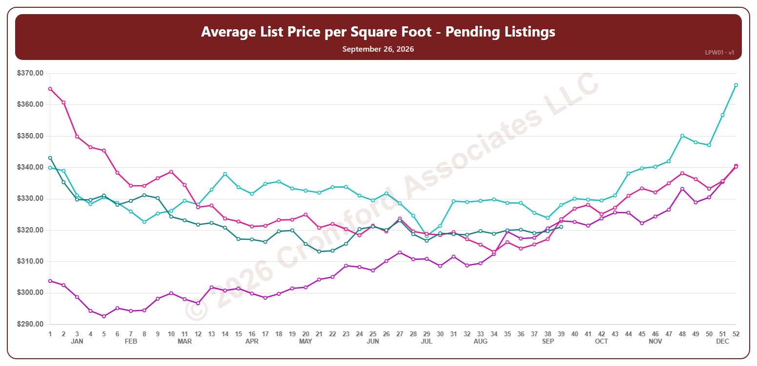
Average List Price per Square Foot – Pending Listings – Weekly

About this chart

This chart shows the average list price per square foot of Pending listings, for the whole ARMLS market, all areas and all dwelling types, counted every Saturday. It shows what sellers are asking, as the true average across all the square feet listed.

Each year has its own line, laid out by week of the year (each Saturday), so you can compare this year with earlier years at the same point in the season. It opens on the last four years; tick any year back to 2006 in the Year panel.

Hover over a line to see the exact figure for that week.

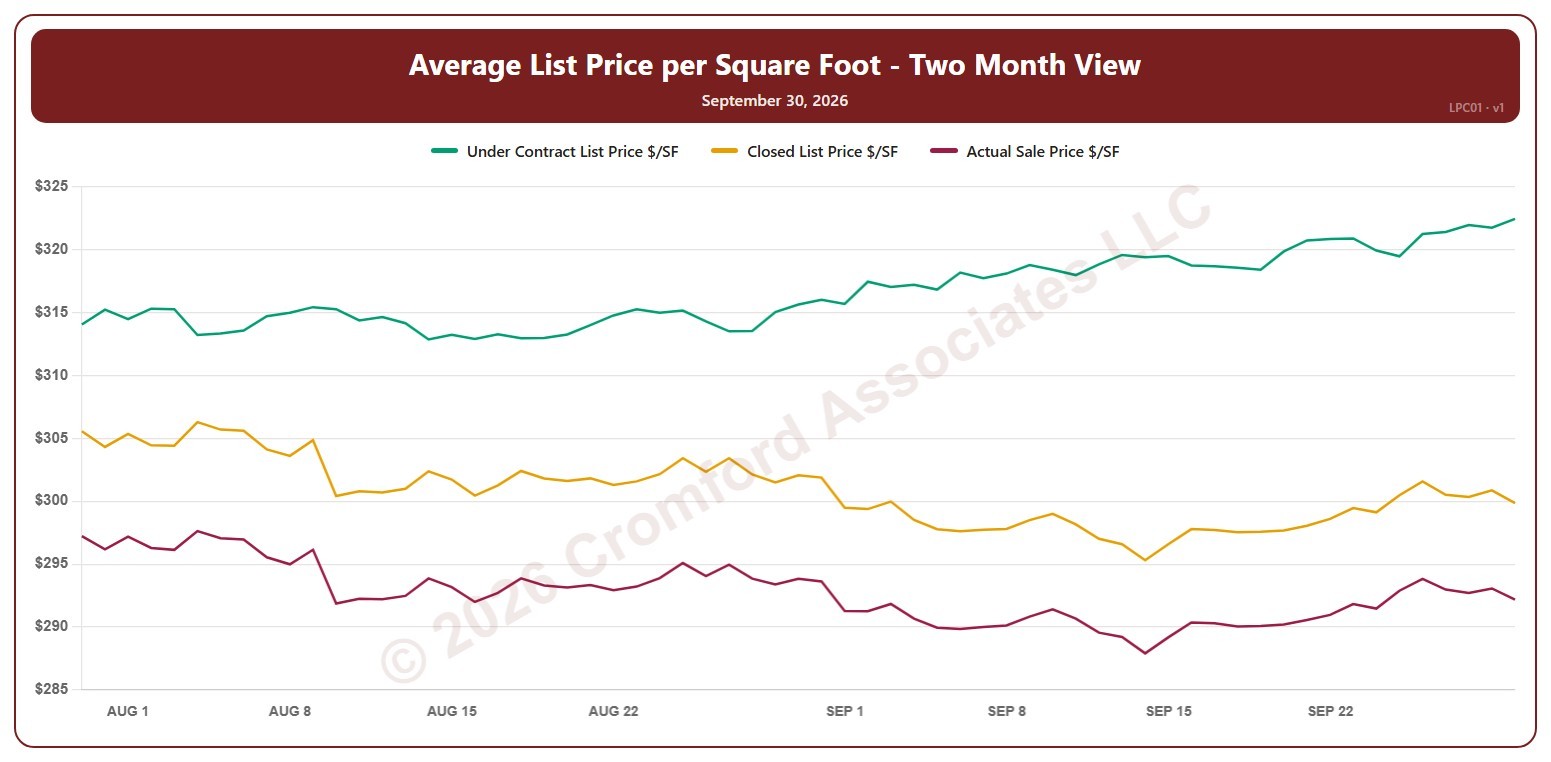
Average List Price per Square Foot – Two Month View – Daily

About this chart

This chart shows three average prices per square foot for the whole ARMLS market, all areas and all dwelling types, every day over the last two months: the list price of listings under contract, the final list price of the homes that closed in the month up to that day, and the price those homes actually sold for. The gap between the lines shows how far buyers are paying above or below the asking price.

Click the buttons above the chart to show or hide each line. Hover over the chart to see each figure for that day.

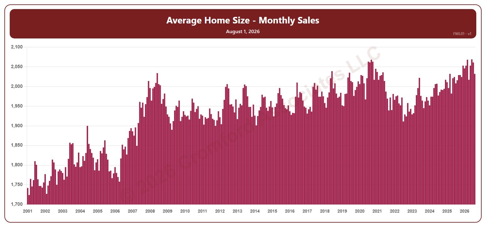
Average Home Size – Monthly Sales – Long Term

About this chart

This chart shows the average size, in square feet, of the homes that closed in a month, for the whole ARMLS market, all areas and all dwelling types, as one bar per month since January 2001. Each bar covers the closings in that calendar month.

Hover over a bar to see the exact figure for that month.

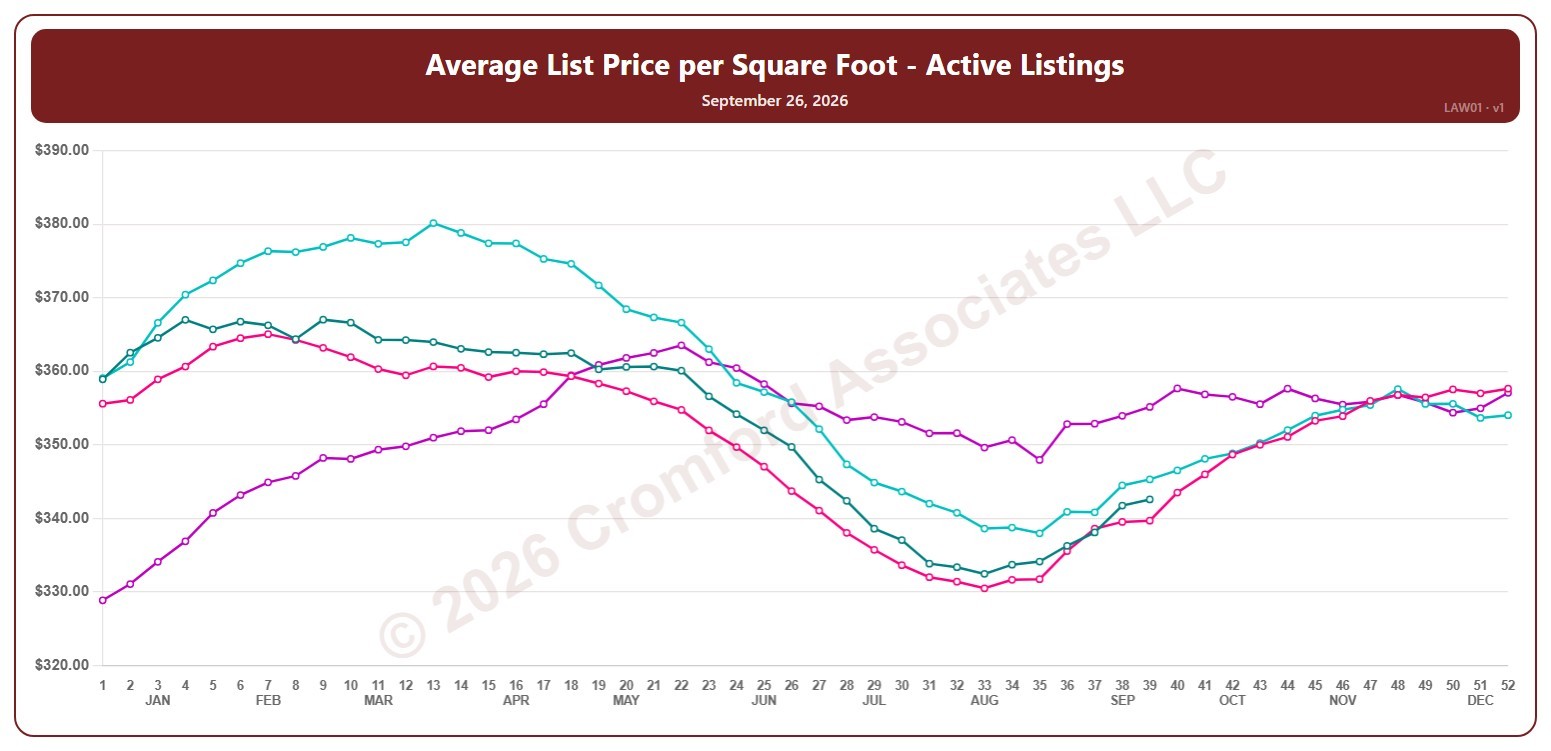
Average List Price per Square Foot – Active Listings – Weekly

About this chart

This chart shows the average list price per square foot of active listings, including UCB / CCBS, for the whole ARMLS market, all areas and all dwelling types, counted every Saturday. It shows what sellers are asking, as the true average across all the square feet listed.

Each year has its own line, laid out by week of the year (each Saturday), so you can compare this year with earlier years at the same point in the season. It opens on the last four years; tick any year back to 2006 in the Year panel.

Hover over a line to see the exact figure for that week.

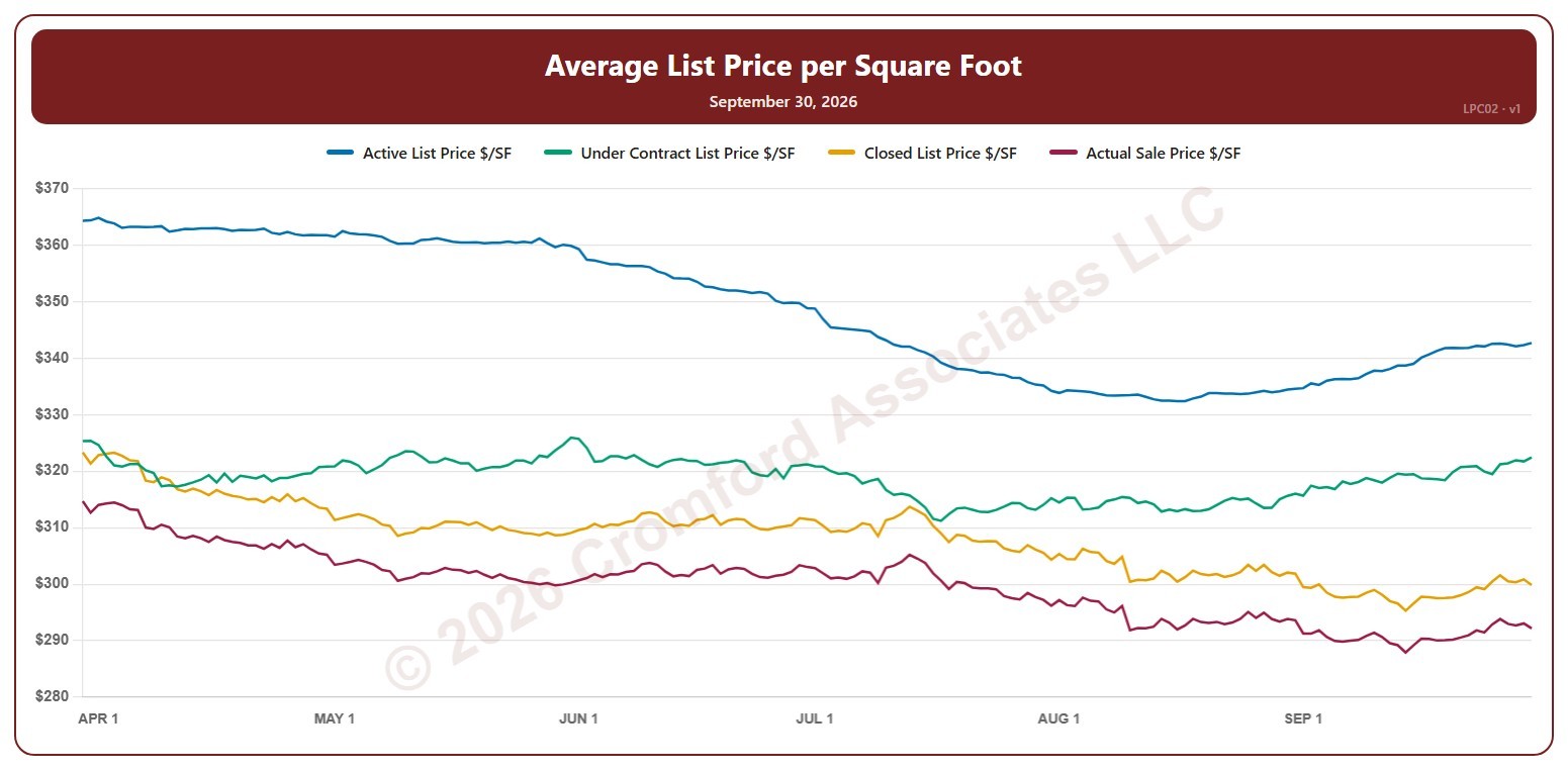
Average List Price per Square Foot – Last 6 Months

About this chart

This chart shows four average prices per square foot for the whole ARMLS market, all areas and all dwelling types, every day over the last six months: the list price of active listings, the list price of listings under contract, the final list price of the homes that closed in the month up to that day, and the price those homes actually sold for. Reading them together shows the path from what sellers ask to what buyers pay.

Click the buttons above the chart to show or hide each line. Hover over the chart to see each figure for that day.

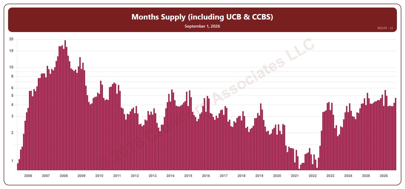
Months Supply (including UCB & CCBS) – Long Term

About this chart

This chart shows months of supply, for the whole ARMLS market, all areas and all dwelling types, as one bar per month since June 2005, each the reading on the 1st of the month: how many months it would take to sell all the active listings (including UCB / CCBS) at the rate homes sold over the last month, if no new listings came on. The lower the number, the tighter the supply and the better for sellers. The value axis is logarithmic, so equal steps up the axis are equal percentage changes; this keeps both the extreme years and today readable.

Hover over a bar to see the exact figure for that month.

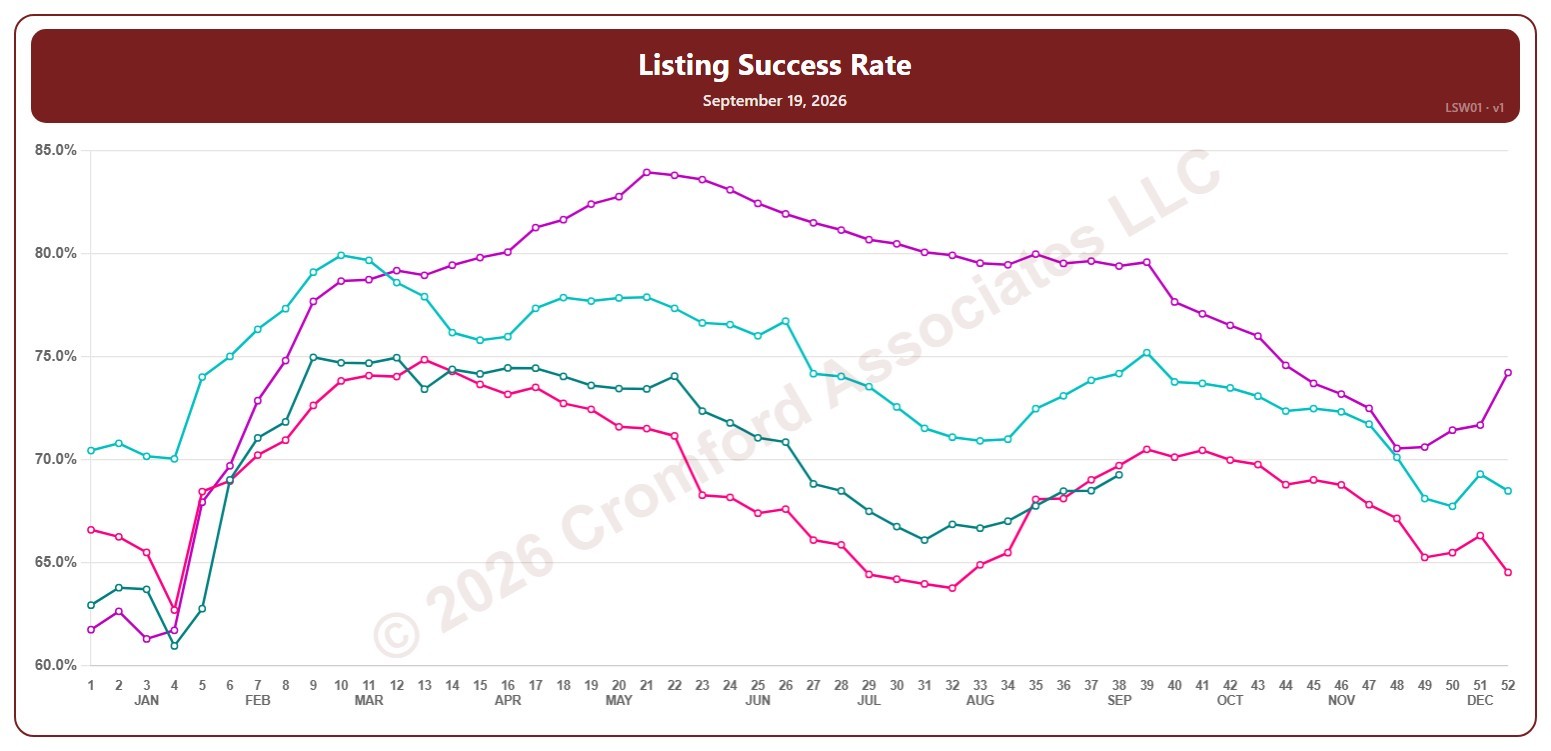
Listing Success Rate – Weekly

About this chart

This chart shows the listing success rate: the share of listings that ended in a sale rather than being canceled or expiring, over a month, for the whole ARMLS market, all areas and all dwelling types, measured every week. Each point covers the listings that ended (sold, canceled, or expired) in the month up to that Saturday. A higher rate means more listings are ending in a sale.

Each year has its own line, laid out by week of the year (each Saturday), so you can compare this year with earlier years at the same point in the season. It opens on the last four years; tick any year back to 2002 in the Year panel.

Hover over a line to see the exact figure for that week.

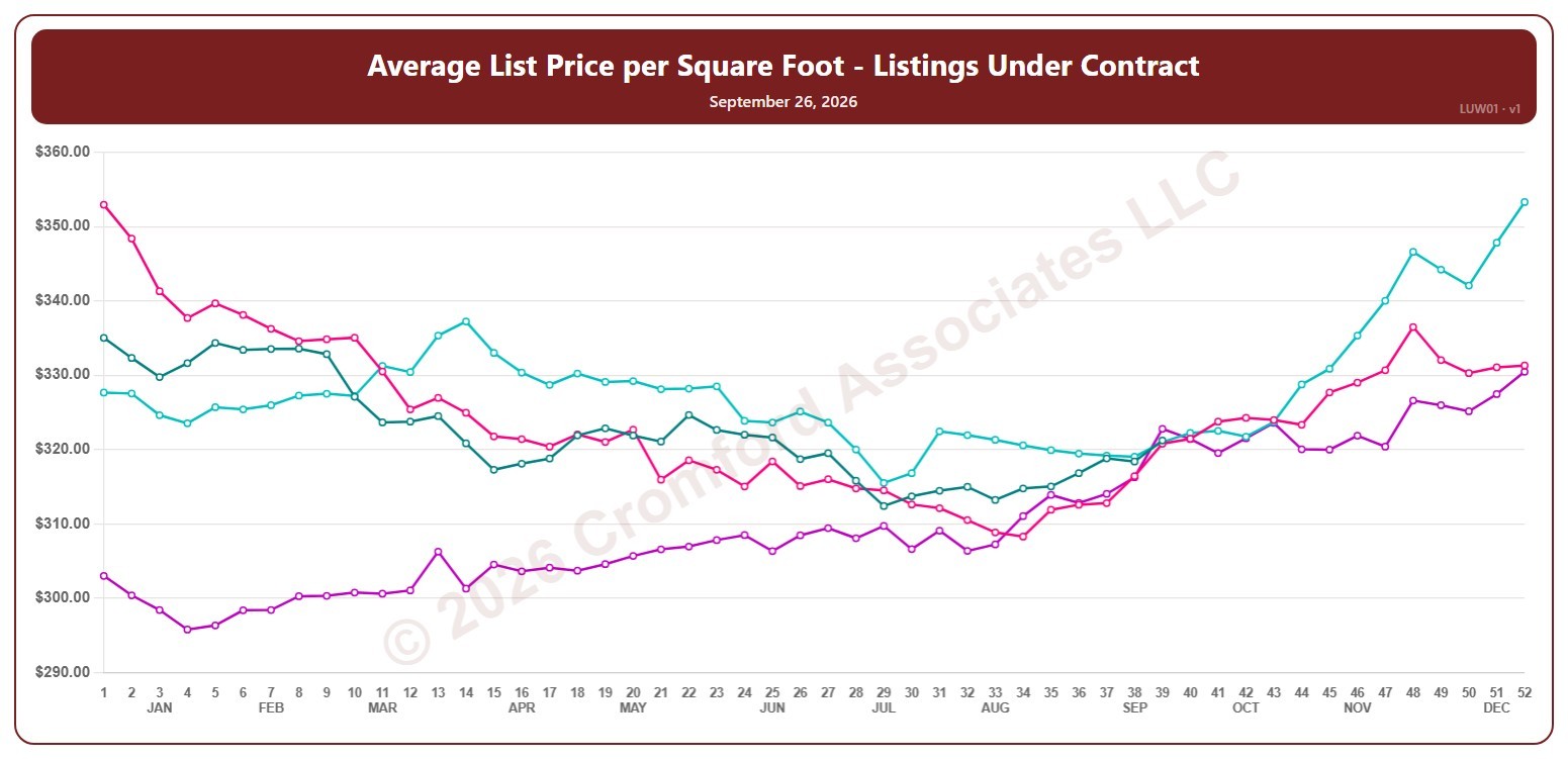
Average List Price per Square Foot – Listings Under Contract – Weekly

About this chart

This chart shows the average list price per square foot of listings under contract (Pending plus UCB / CCBS), for the whole ARMLS market, all areas and all dwelling types, counted every Saturday. It shows what sellers are asking, as the true average across all the square feet listed.

Each year has its own line, laid out by week of the year (each Saturday), so you can compare this year with earlier years at the same point in the season. It opens on the last four years; tick any year back to 2006 in the Year panel.

Hover over a line to see the exact figure for that week.

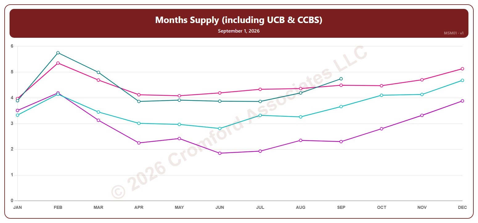
Months Supply (including UCB & CCBS) – Monthly

About this chart

This chart shows months of supply, for the whole ARMLS market, all areas and all dwelling types, read on the 1st of each month: how many months it would take to sell all the active listings (including UCB / CCBS) at the rate homes sold over the last month, if no new listings came on. The lower the number, the tighter the supply and the better for sellers.

Each year has its own line, laid out by month, so you can compare this year with earlier years at the same point in the season. It opens on the last four years; tick any year back to 2005 in the Year panel.

Hover over a line to see the exact figure for that month.