About this chart
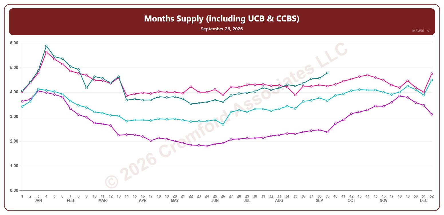
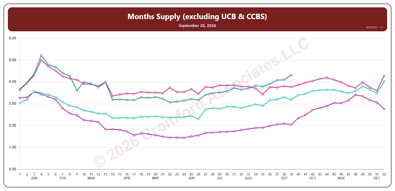
This chart shows months of supply, for the whole ARMLS market, all areas and all dwelling types, counted every Saturday: how many months it would take to sell all the active listings (not counting UCB / CCBS) at the rate homes sold over the last month, if no new listings came on. The lower the number, the tighter the supply and the better for sellers.
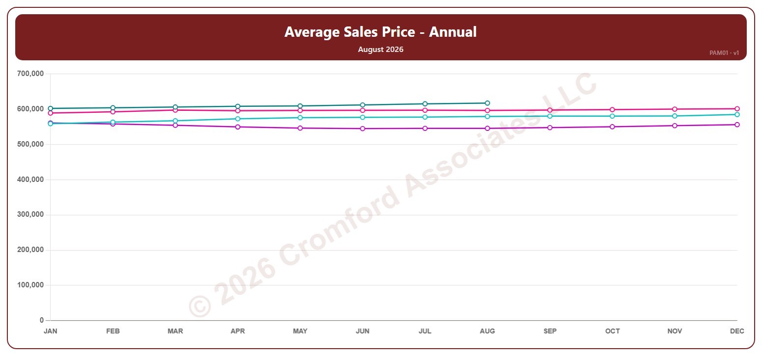
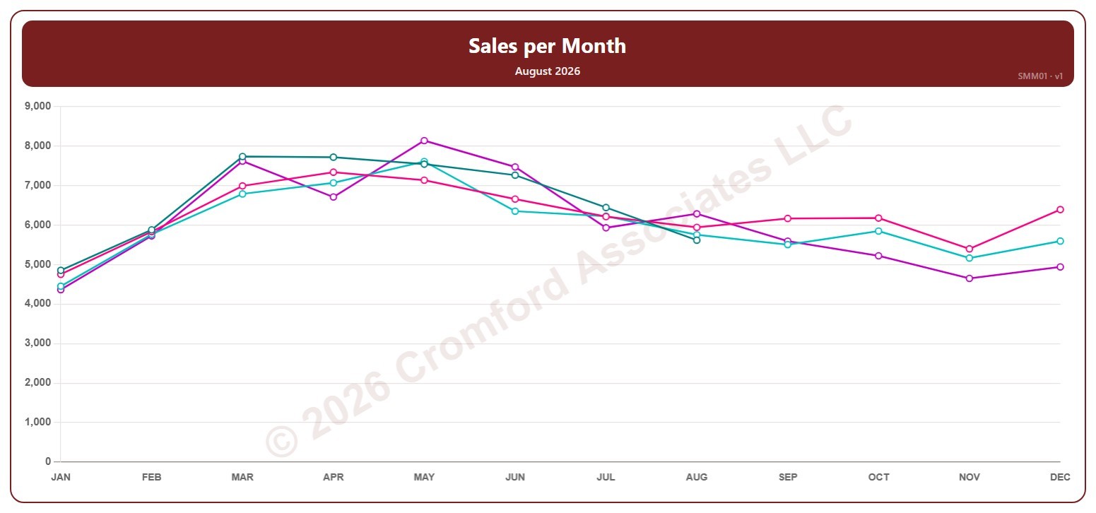
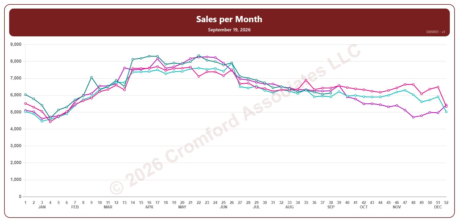
Each year has its own line, laid out by week of the year (each Saturday), so you can compare this year with earlier years at the same point in the season. It opens on the last four years; tick any year back to 2005 in the Year panel.
Hover over a line to see the exact figure for that week.