Monthly Average Sales Price per Square Foot by ZIP Code – Monthly

About this chart

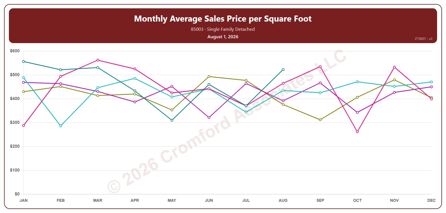
This chart shows the average sales price per square foot of single-family detached homes that closed through ARMLS in one ZIP code, month by month. Each point covers the closings in that calendar month, so the point at August covers August 1 to 31; the newest point is the last month that has finished. Price per square foot lets you compare homes of different sizes.

Each year has its own line, laid out by month, so you can compare this year with earlier years at the same point in the season. Pick any of 149 ZIP codes from the ZIP Code list (it opens on 85003); the last three years are ticked to start with, and you can tick any year back to 2001.

Hover over a line to see the exact figure for that month.
Listings Under Contract by ZIP Code – Monthly

About this chart

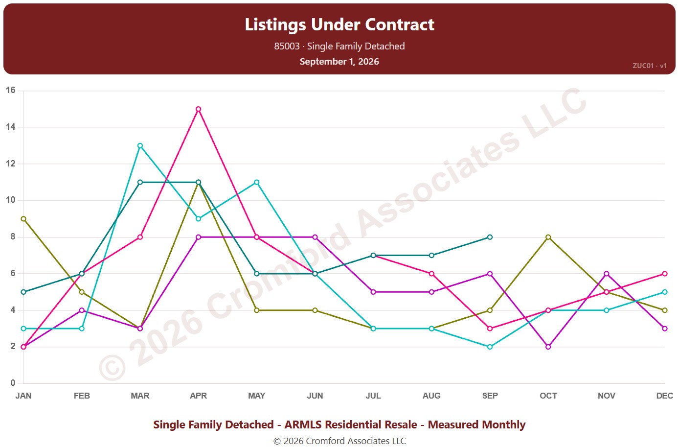
This chart counts the listings under contract for single-family detached homes on ARMLS in one ZIP code: Pending listings plus UCB / CCBS listings. Each point is the reading on the 1st of the month. It shows how much buying activity is under way.

Each year has its own line, laid out by month, so you can compare this year with earlier years at the same point in the season. Pick any of 149 ZIP codes from the ZIP Code list (it opens on 85003); the last three years are ticked to start with, and you can tick any year back to 2011.

Hover over a line to see the exact figure for that month.
Median List Price per Square Foot by City – Listings Under Contract

About this chart

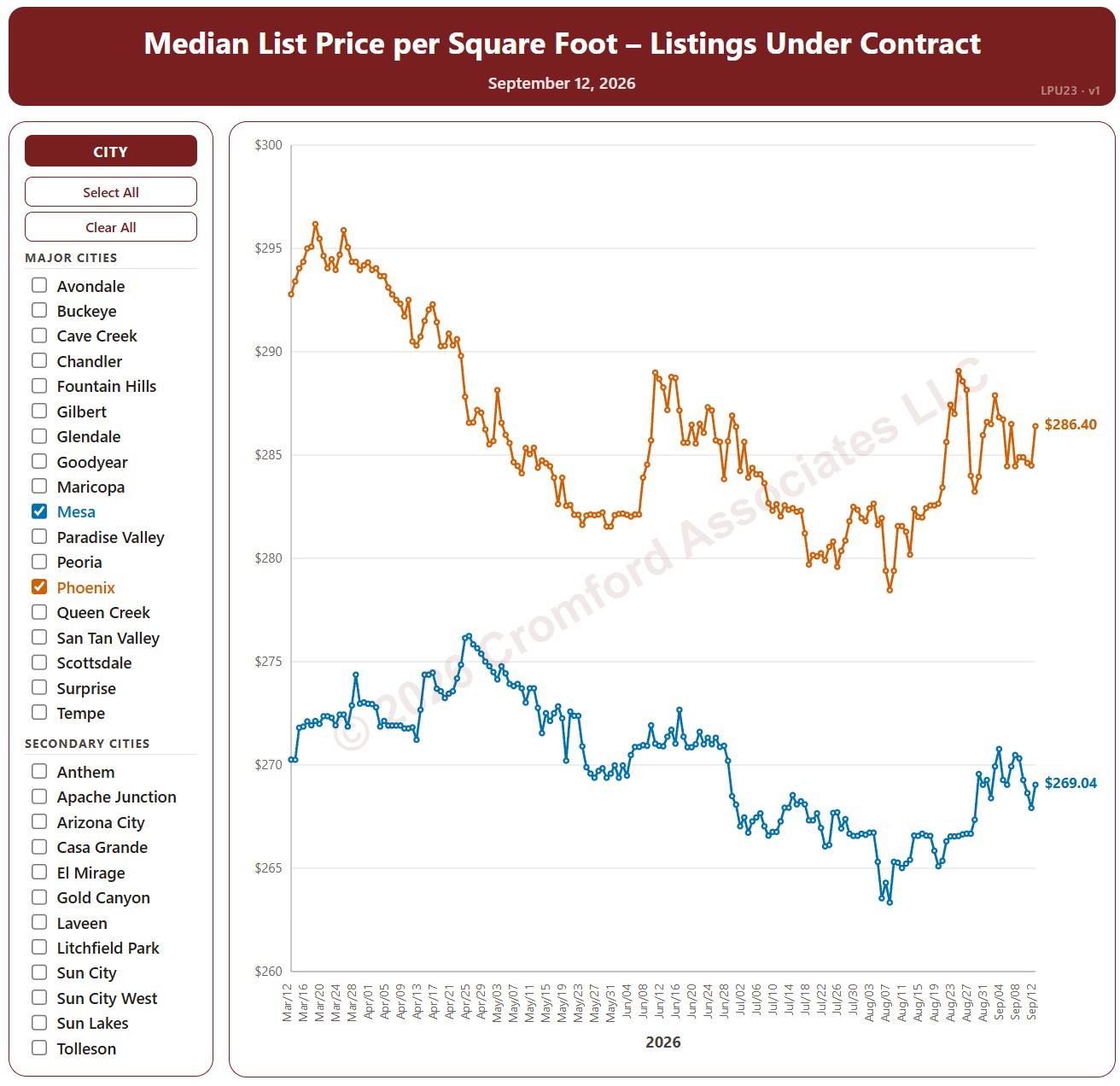
This chart compares the median list price per square foot of listings under contract (Pending plus UCB / CCBS) across 34 cities in and around Greater Phoenix, every day over the last six months, for single-family detached homes on ARMLS. It shows the asking prices of the homes buyers have agreed to buy.

The 18 major cities are drawn as solid lines and the 16 secondary cities as dashed lines. It opens on Mesa and Phoenix; use the city check boxes, or Select All and Clear All, to choose which cities are shown.

Hover over a line to see the exact figure for that day.

Monthly Median Sale Price per Square Foot by City

About this chart

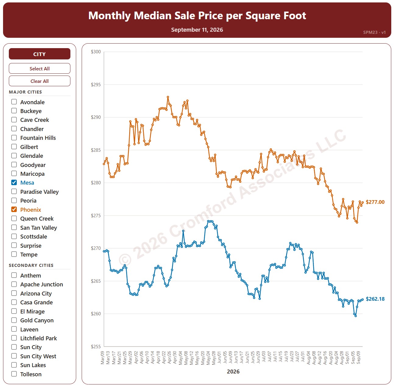
This chart compares the median sales price per square foot across 34 cities in and around Greater Phoenix, every day over the last six months, for single-family detached homes that closed through ARMLS. Each point covers the closings in the month up to that day.

The 18 major cities are drawn as solid lines and the 16 secondary cities as dashed lines. It opens on Mesa and Phoenix; use the city check boxes, or Select All and Clear All, to choose which cities are shown.

Hover over a line to see the exact figure for that day.

Median List Price per Square Foot by City – Active Listings

About this chart

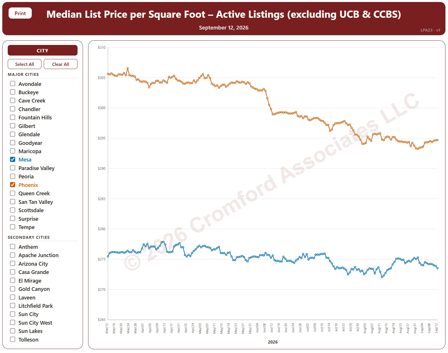
This chart compares the median list price per square foot of active listings (not counting UCB / CCBS) across 34 cities in and around Greater Phoenix, every day over the last six months, for single-family detached homes on ARMLS. It shows what sellers are asking.

The 18 major cities are drawn as solid lines and the 16 secondary cities as dashed lines. It opens on Mesa and Phoenix; use the city check boxes, or Select All and Clear All, to choose which cities are shown.

Hover over a line to see the exact figure for that day.

Annual Appreciation by City – Based on Annual Median $/SF

About this chart

This chart compares annual appreciation across 34 cities in and around Greater Phoenix over the last 24 months, measured every week, for single-family detached resale homes on ARMLS. Appreciation here is the change in the median sales price per square foot over the last 12 months compared with a year earlier. Above zero, prices are higher than a year ago; below zero, they are lower.

The 18 major cities are drawn as solid lines and the 16 secondary cities as dashed lines. It opens on Mesa and Phoenix; use the city check boxes, or Select All and Clear All, to choose which cities are shown.

Hover over a line to see the exact figure for that week.

Cromford® Supply Index by City

About this chart

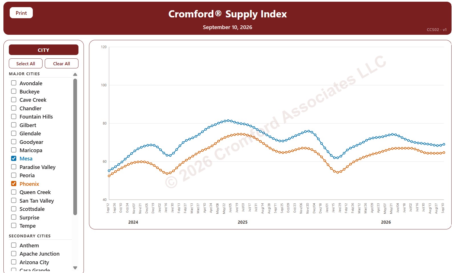
This chart tracks the Cromford® Supply Index for 34 cities in and around Greater Phoenix over the last 24 months, one point per week (each Thursday), for single-family detached resale homes listed on ARMLS. Above 100 means more supply than usual, below 100 less supply than usual, and 100 means supply is close to normal. Low supply favors sellers; high supply favors buyers.

The 18 major cities are drawn as solid lines and the 16 secondary cities as dashed lines. It opens on Mesa and Phoenix; use the city check boxes, or Select All and Clear All, to choose which cities are shown.

Hover over a line to see the exact figure for that week.

Cromford® Demand Index by City

About this chart

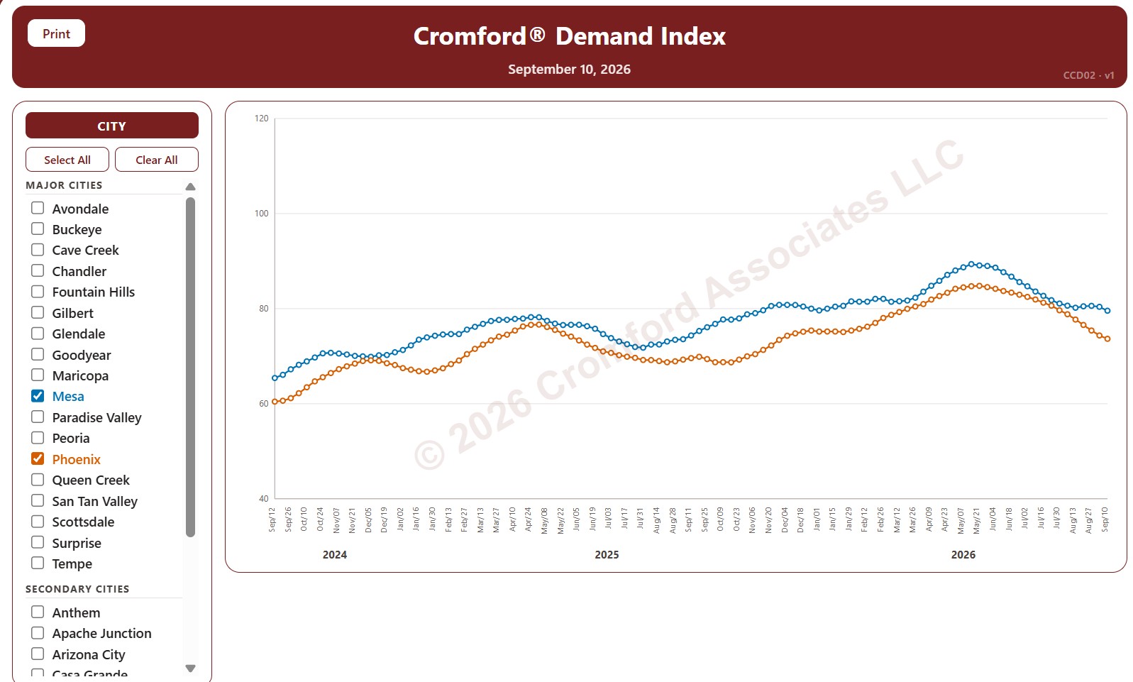
This chart tracks the Cromford® Demand Index for 34 cities in and around Greater Phoenix over the last 24 months, one point per week (each Thursday), for single-family detached resale homes listed on ARMLS. Above 100 means more demand than usual, below 100 less demand than usual, and 100 means demand is close to normal.

The 18 major cities are drawn as solid lines and the 16 secondary cities as dashed lines. It opens on Mesa and Phoenix; use the city check boxes, or Select All and Clear All, to choose which cities are shown.

Hover over a line to see the exact figure for that week.

Cromford® Market Index by City

About this chart

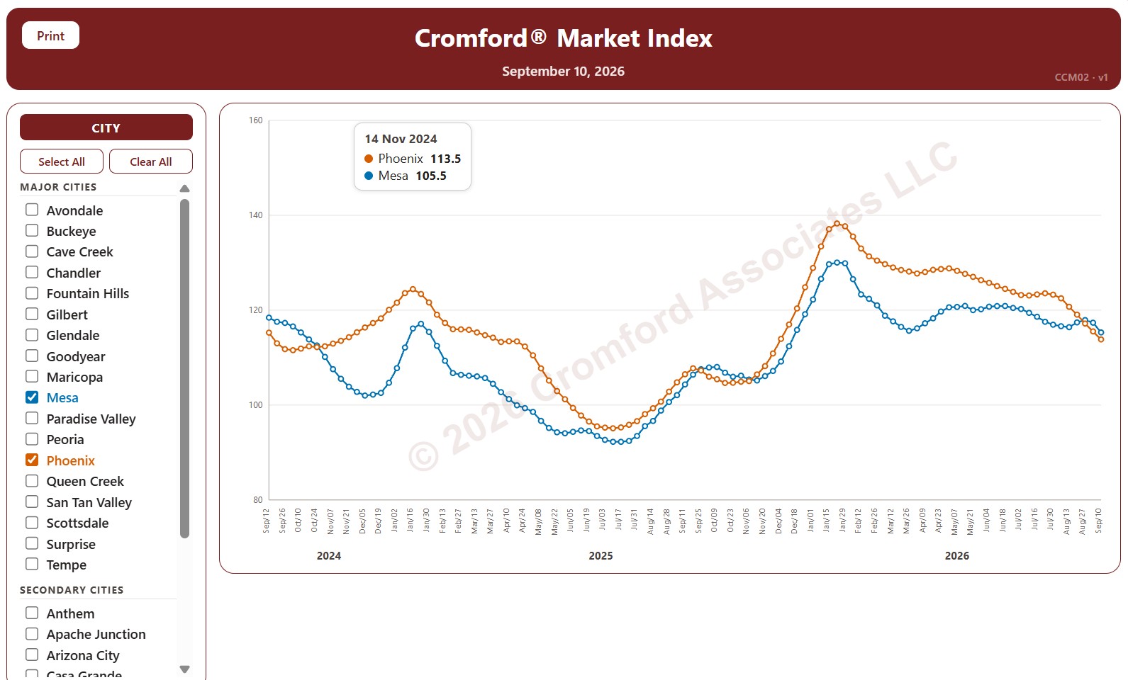
This chart tracks the Cromford® Market Index for 34 cities in and around Greater Phoenix over the last 24 months, one point per week (each Thursday). It covers single-family detached resale homes listed on ARMLS. The 18 major cities are drawn as solid lines and the 16 secondary cities as dashed lines.

A reading above 110 means the city’s market favors sellers, below 90 it favors buyers, and between 90 and 110 the market is balanced. The index looks ahead, so the direction of a line shows which way the balance between buyers and sellers is moving.

Use the city check boxes, or Select All and Clear All, to choose which cities are shown. Hover over a line to see the exact reading for that week.

Market Dashboard

About this chart

This dashboard summarizes the current state of the residential market for all areas and types covered by ARMLS. It is measured daily and shows where the market stands today; for longer-term trends, use the individual charts in the Analysis section.

Use Select Type of Data to switch between 14 views: Sale Price / Sq Ft, Cromford® Index, Inventory, Active Listings, Under Contract, Expired Listings, Canceled Listings, List Price / Sq Ft, Closed Listings, Dollar Volume, Days on Market, Success Rate, Square Feet, and Sale Price $.

Each tile compares a recent figure with an earlier one and is colored to show whether the change is good for sellers, bad for sellers, or neither. The chart beneath the tiles shows the last 13 months, month by month. Hover over it to see each figure.