About this chart
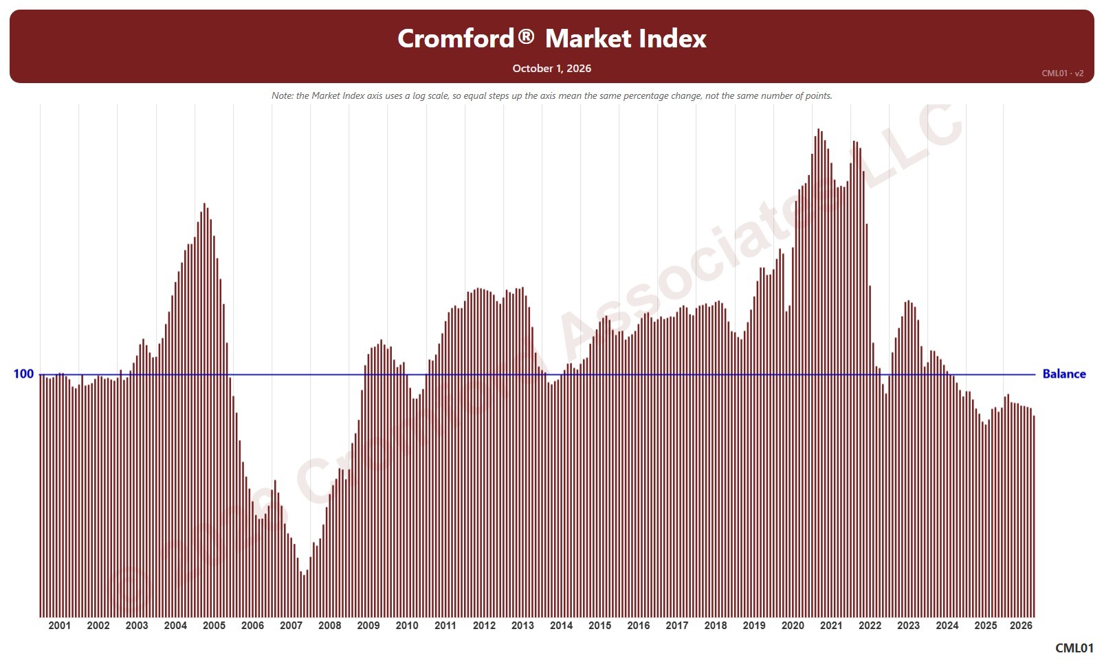
This chart shows the contract ratio for the whole ARMLS market, all areas and all dwelling types, as one bar per month since November 2005, each the reading on the 1st of the month. It compares the listings under contract (Pending plus UCB / CCBS) with the active listings available: the higher the ratio, the stronger buying activity is relative to supply. The value axis is logarithmic, so equal steps up the axis are equal percentage changes; this keeps both the extreme years and today readable.
Hover over a bar to see the exact figure for that month.