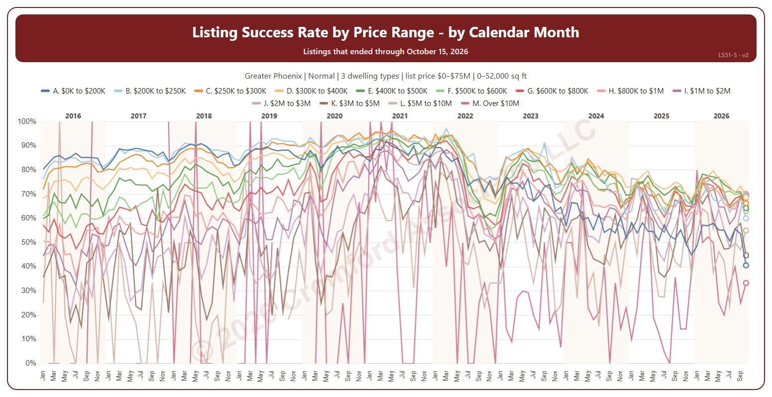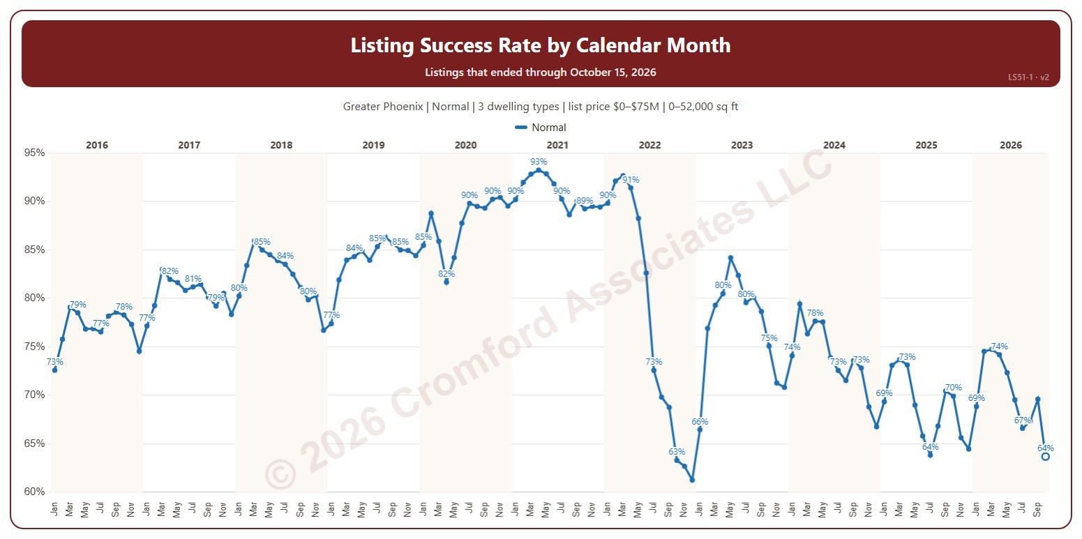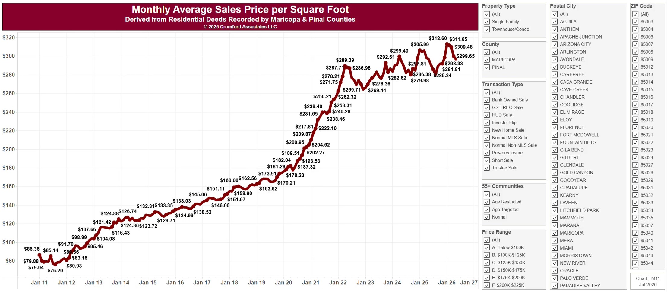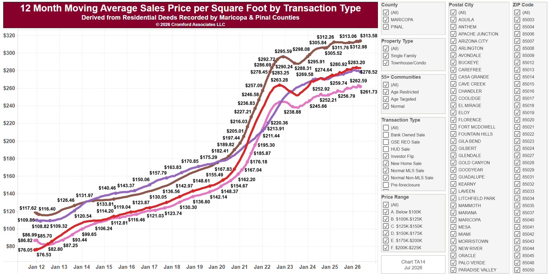
About this chart
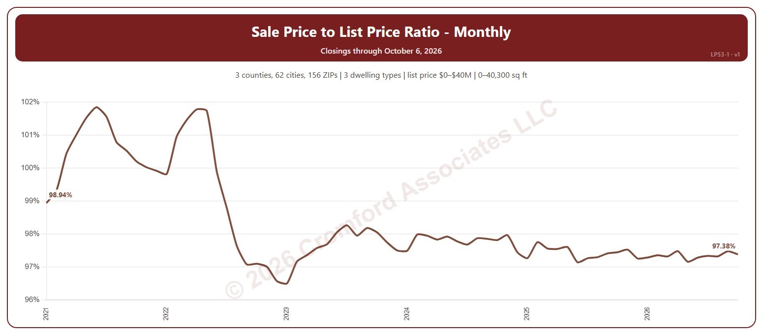
This chart shows the sale price to list price ratio of the homes that closed through ARMLS each calendar month: the total of the sale prices as a percentage of the total of the final list prices. Above 100%, homes are selling for more than their asking price on average; below 100%, buyers are negotiating prices down.
It opens on the years since 2021; tick any year back to 2000 in the Year panel. The newest month is the month so far.
It opens on the Greater Phoenix area: the counties, cities, and ZIP codes that make it up are ticked to start with. Tick or untick any of them to change the area, including counties beyond Greater Phoenix. Narrow it further with the Dwelling Type (condo, mobile, single family), Transaction Type, and New / Resale boxes and the list price, home size, and year built sliders.
Hover over the chart to see the figures for that month.