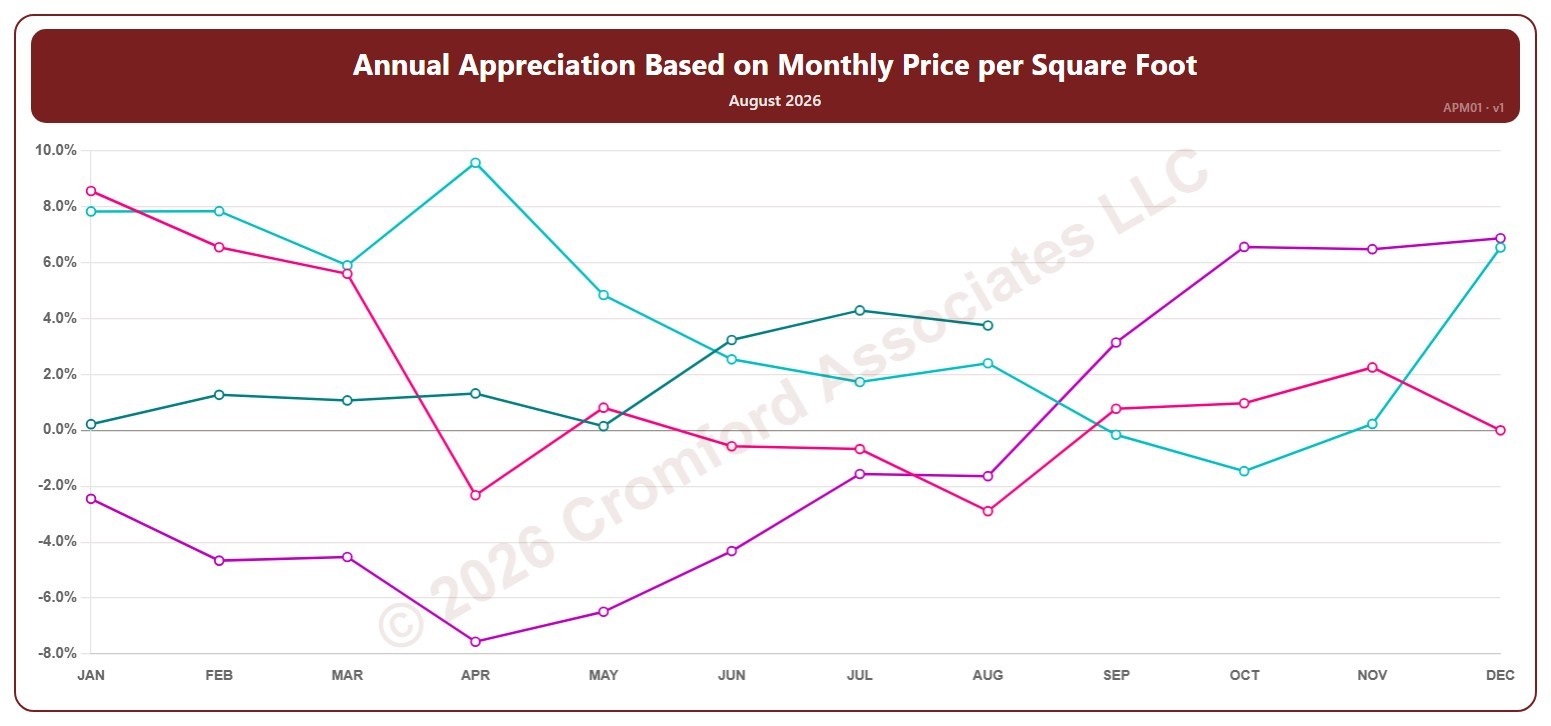
Annual Appreciation Based on Monthly Price per Square Foot – Monthly

About this chart

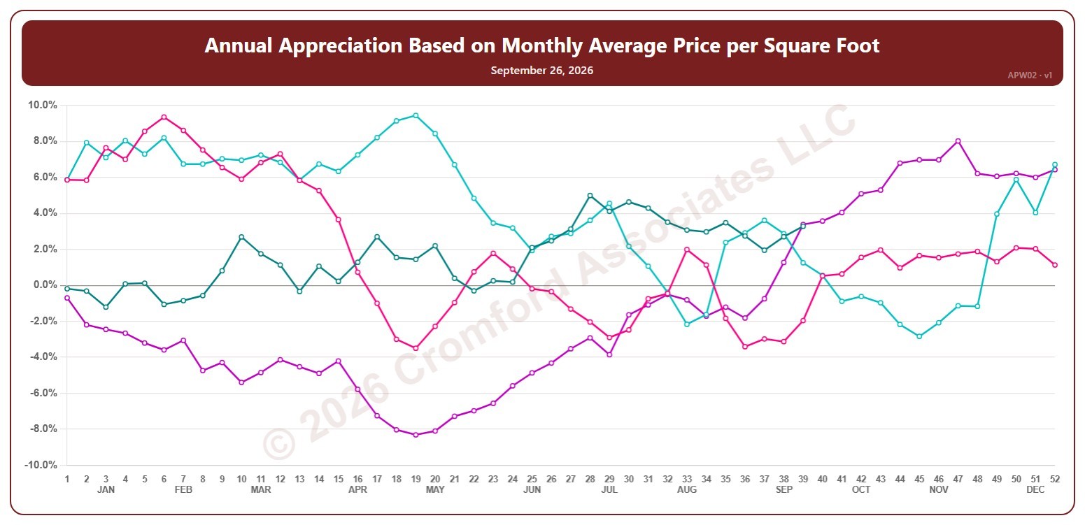
This chart shows annual appreciation, for the whole ARMLS market, all areas and all dwelling types, measured monthly: the change in a month’s average sales price per square foot compared with the same month a year earlier. Above zero, prices are higher than a year ago; below zero, they are lower.

Each year has its own line, laid out by month, so you can compare this year with earlier years at the same point in the season. It opens on the last four years; tick any year back to 2001 in the Year panel.

Hover over a line to see the exact figure for that month.
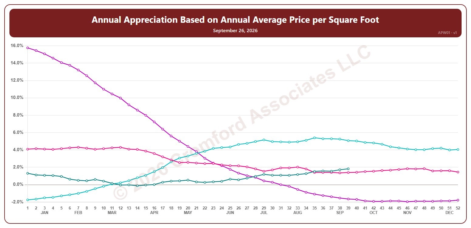
Annual Appreciation Based on Annual Average Price per Square Foot – Weekly

About this chart

This chart shows annual appreciation, for the whole ARMLS market, all areas and all dwelling types, measured every week: the change in the average sales price per square foot of the homes that closed over the last 12 months, compared with the 12 months to the same date a year earlier. Above zero, prices are higher than a year ago; below zero, they are lower.

Each year has its own line, laid out by week of the year (each Saturday), so you can compare this year with earlier years at the same point in the season. It opens on the last four years; tick any year back to 2002 in the Year panel.

Hover over a line to see the exact figure for that week.

Annual Appreciation Based on Monthly Average Price per Square Foot – Weekly

About this chart

This chart shows annual appreciation, for the whole ARMLS market, all areas and all dwelling types, measured every week: the change in the average sales price per square foot of the homes that closed in the last month, compared with the month to the same date a year earlier. It reacts faster than the 12-month version but is noisier. Above zero, prices are higher than a year ago; below zero, they are lower.

Each year has its own line, laid out by week of the year (each Saturday), so you can compare this year with earlier years at the same point in the season. It opens on the last four years; tick any year back to 2002 in the Year panel.

Hover over a line to see the exact figure for that week.

Active Listings (excluding UCB & CCBS) by City – Weekly

About this chart

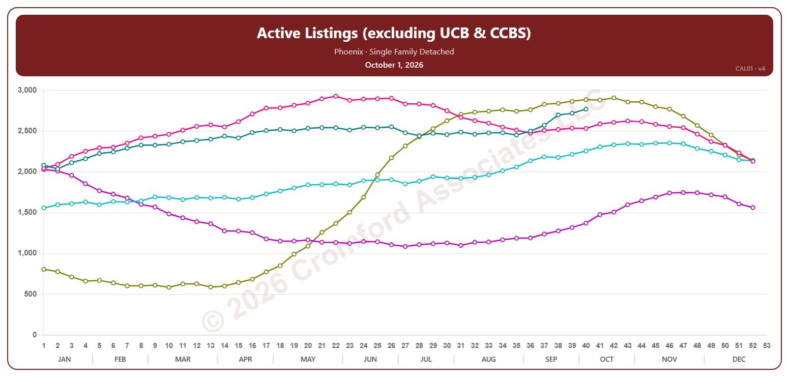
This chart counts the active listings for single-family detached homes on ARMLS in one city, measured every week on Thursdays. It leaves out UCB / CCBS listings, which are under contract but still marked active.

Each year has its own line, laid out by week of the year, so you can compare this year with earlier years at the same point in the season. It opens on Phoenix and the last five years. Pick any of the 34 cities (18 major and 16 secondary) from the City list, and tick any year back to 2006 in the Year panel. Queen Creek and San Tan Valley start in 2010, and Coolidge, Florence, Waddell, and Wickenburg in 2011.

Hover over a line to see the exact figure for that week.

Active Listings (including UCB & CCBS) by City – Weekly

About this chart

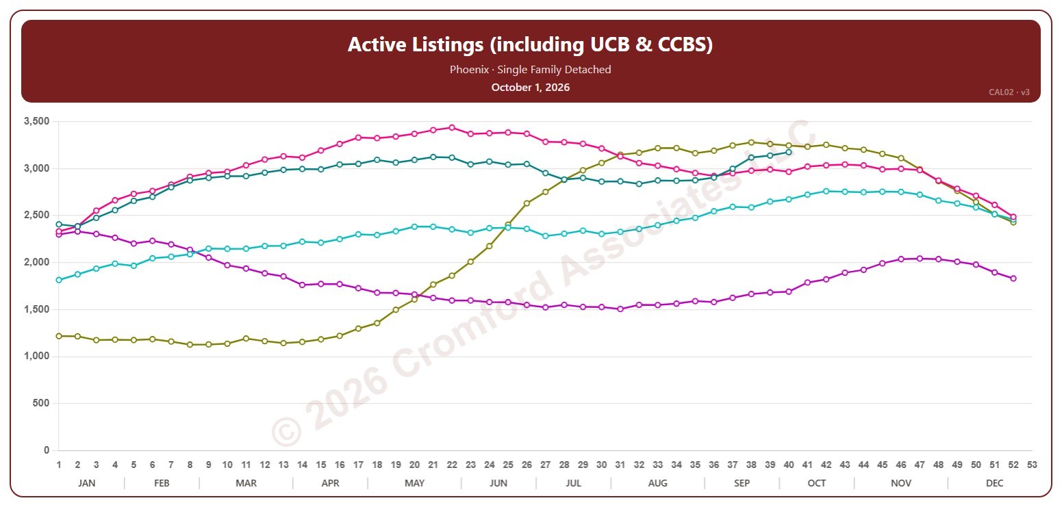
This chart counts the active listings for single-family detached homes on ARMLS in one city, measured every week on Thursdays. It includes UCB / CCBS listings, which are under contract but still accepting back-up offers or waiting on the buyer’s sale.

Each year has its own line, laid out by week of the year, so you can compare this year with earlier years at the same point in the season. It opens on Phoenix and the last five years. Pick any of the 34 cities (18 major and 16 secondary) from the City list, and tick any year back to 2006 in the Year panel. Queen Creek and San Tan Valley start in 2010, and Coolidge, Florence, Waddell, and Wickenburg in 2011.

Hover over a line to see the exact figure for that week.

Appreciation Based on Annual Average $/SF by City – Weekly

About this chart

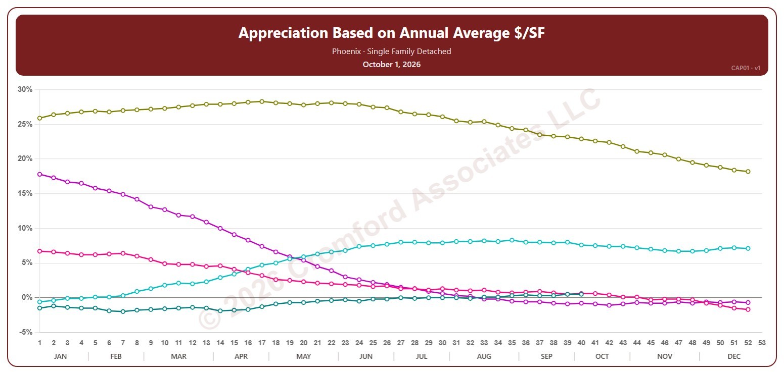
This chart shows annual appreciation for single-family detached homes in one city, measured every week on Thursdays: the change in the average sales price per square foot over the last 12 months compared with the 12 months to the same date a year earlier. Above zero, prices are higher than a year ago; below zero, they are lower.

Each year has its own line, laid out by week of the year, so you can compare this year with earlier years at the same point in the season. It opens on Phoenix and the last five years. Pick any of the 34 cities (18 major and 16 secondary) from the City list, and tick any year back to 2002 in the Year panel.

Hover over a line to see the exact figure for that week.

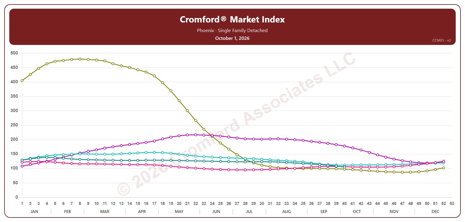
Cromford® Market Index by City – Weekly

About this chart

This chart shows the Cromford® Market Index for one city, measured every week on Thursdays, for single-family detached resale homes on ARMLS. A reading above 110 means the city’s market favors sellers, below 90 it favors buyers, and between 90 and 110 the market is balanced.

Each year has its own line, laid out by week of the year, so you can compare this year with earlier years at the same point in the season. It opens on Phoenix and the last five years. Pick any of the 34 cities (18 major and 16 secondary) from the City list, and tick any year back to 2001 in the Year panel. San Tan Valley starts in 2010, and Coolidge, Florence, Waddell, and Wickenburg in 2017.

Hover over a line to see the exact figure for that week.

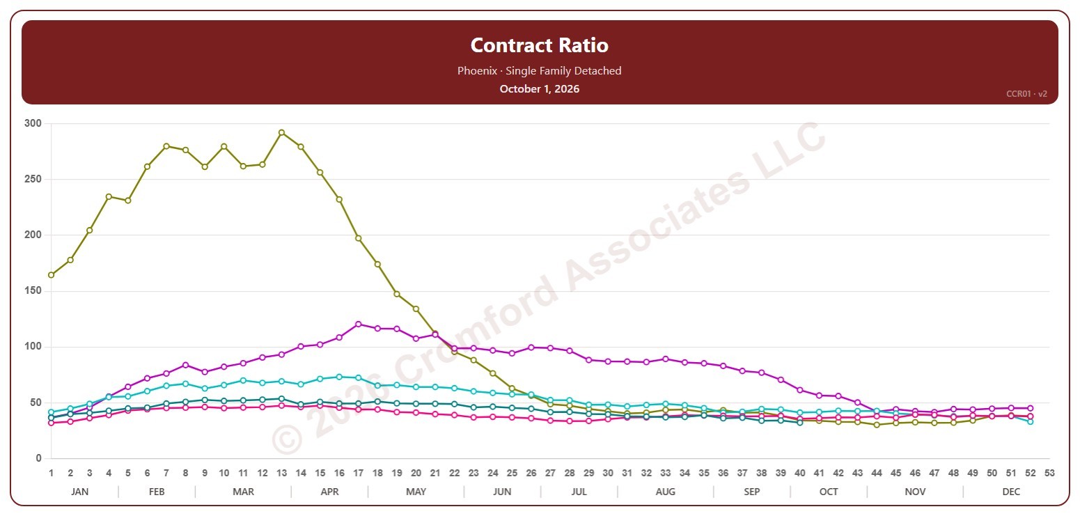
Contract Ratio by City – Weekly

About this chart

This chart shows the contract ratio for single-family detached homes on ARMLS in one city, measured every week on Thursdays. It compares the listings under contract (Pending plus UCB / CCBS) with the active listings available: the higher the ratio, the stronger buying activity is relative to supply, and in a very hot market it can go above 100.

Each year has its own line, laid out by week of the year, so you can compare this year with earlier years at the same point in the season. It opens on Phoenix and the last five years. Pick any of the 34 cities (18 major and 16 secondary) from the City list, and tick any year back to 2006 in the Year panel. Queen Creek and San Tan Valley start in 2010, and Coolidge, Florence, Waddell, and Wickenburg in 2011.

Hover over a line to see the exact figure for that week.

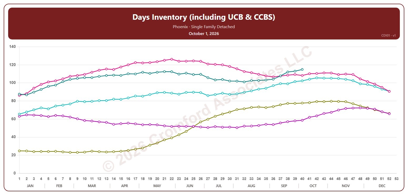
Days Inventory (including UCB & CCBS) by City – Weekly

About this chart

This chart shows days of inventory for single-family detached homes on ARMLS in one city, measured every week on Thursdays: how many days it would take to sell all the active listings (including UCB / CCBS) at the rate homes sold over the last 12 months, if no new listings came on. The lower the number, the tighter the supply.

Each year has its own line, laid out by week of the year, so you can compare this year with earlier years at the same point in the season. It opens on Phoenix and the last five years. Pick any of the 34 cities (18 major and 16 secondary) from the City list, and tick any year back to 2006 in the Year panel. Queen Creek and San Tan Valley start in 2010, and Coolidge, Florence, Waddell, and Wickenburg in 2011.

Hover over a line to see the exact figure for that week.

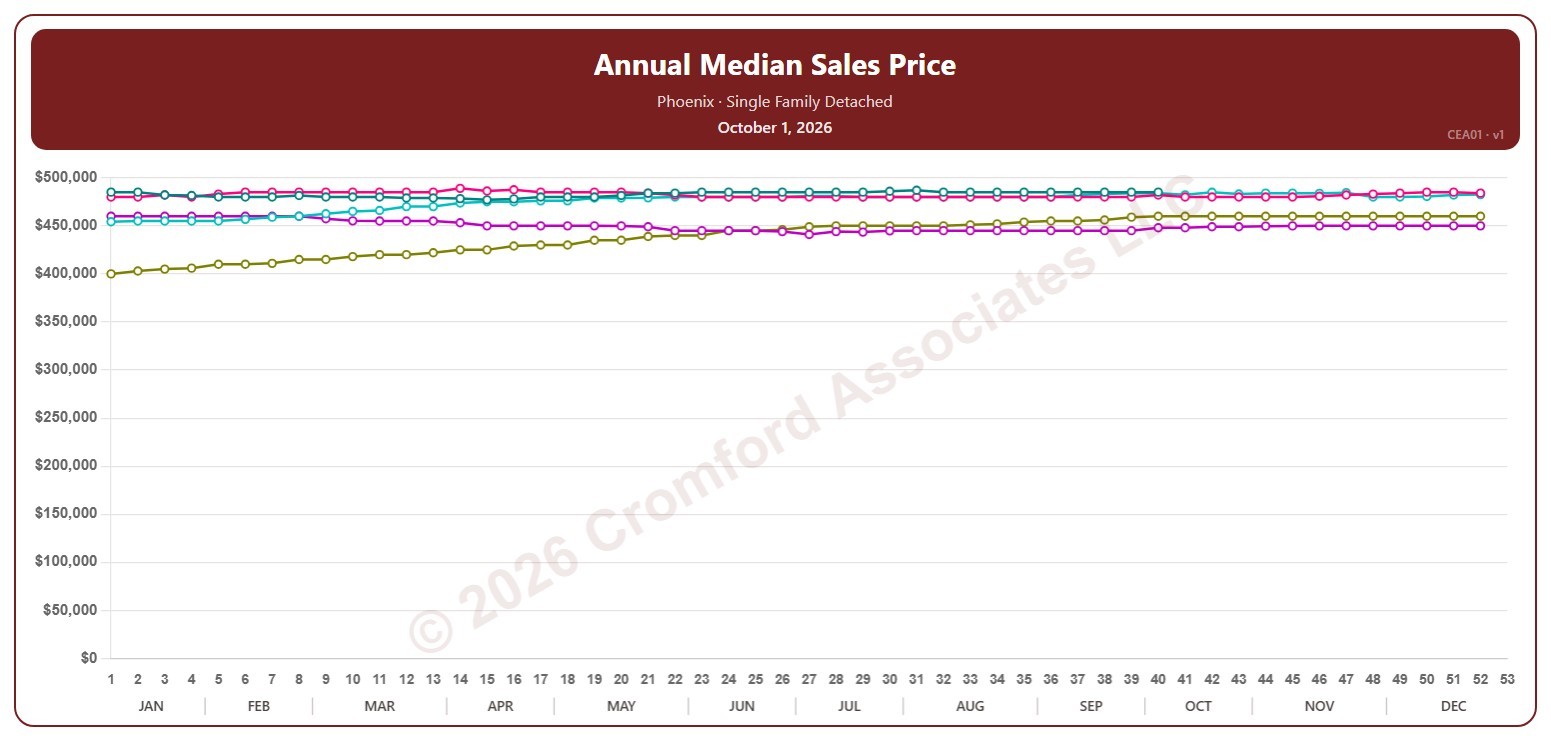
Annual Median Sales Price by City – Weekly

About this chart

This chart shows the median sales price of single-family detached homes that closed through ARMLS in one city, measured every week on Thursdays. Each point covers the closings in the 12 months up to that week; the median is the price in the middle, so half sold for more and half for less.

Each year has its own line, laid out by week of the year, so you can compare this year with earlier years at the same point in the season. It opens on Phoenix and the last five years. Pick any of the 34 cities (18 major and 16 secondary) from the City list, and tick any year back to 2001 in the Year panel.

Hover over a line to see the exact figure for that week.