Phoenix Urban Village Snapshot

About this chart

This table shows 38 measures of the market for single-family detached homes in each of 14 of the City of Phoenix’s urban villages, one village at a time. Pick the village from the box at the top. Rio Vista, the fifteenth village, has too few sales to include.

Each measure is shown today, a month ago, a quarter ago, a year ago, and two years ago, and earlier dates back to January 2018 can be chosen from the date box. The ST and LT marks compare today with last month and with last year, colored by whether the change favors sellers or buyers.

Urban villages are planning areas inside the City of Phoenix, so every home in them is also counted in Phoenix. Laveen Urban Village is not the same as the postal city of Laveen, and Paradise Valley Urban Village is not the Town of Paradise Valley.
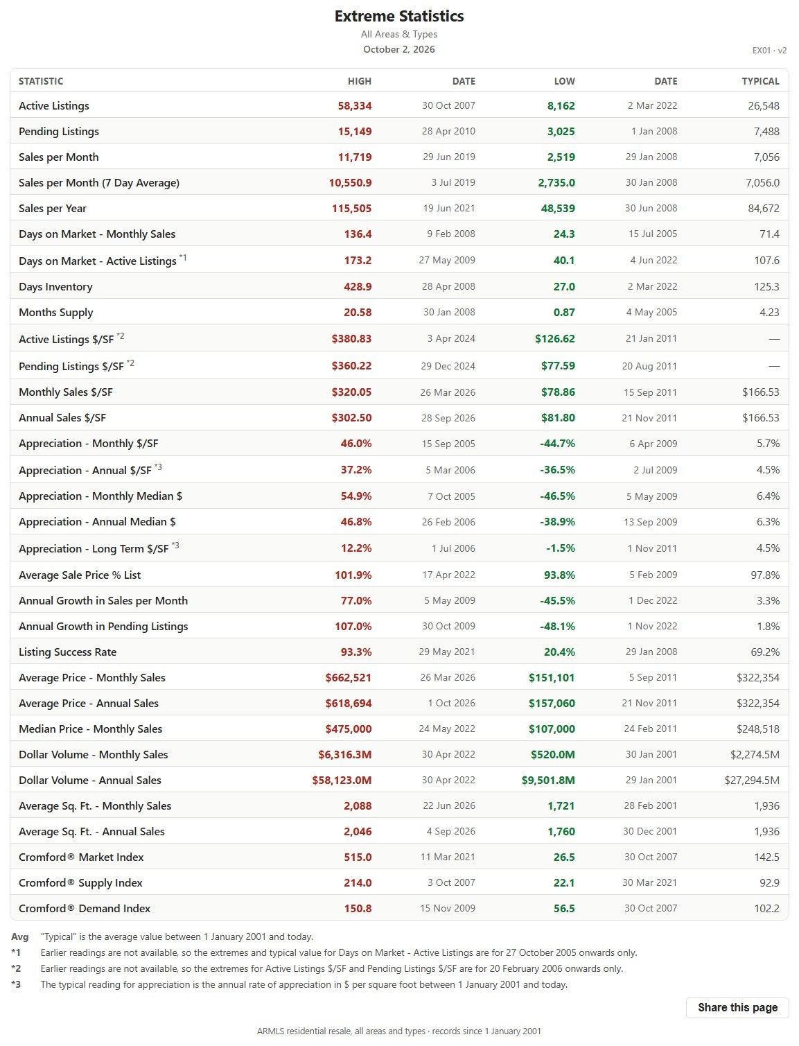
Extreme Statistics

About this chart

This table lists the record high and record low of more than 30 market measures for the whole ARMLS market, all areas and all dwelling types, each with the date it happened, since January 1, 2001, together with a typical value for comparison.

It shows how extreme past markets have been and what a typical reading looks like, a yardstick for the current figures on the other charts. The numbered notes under the table explain the few measures that are counted differently.

Price Range Market Snapshot

About this chart

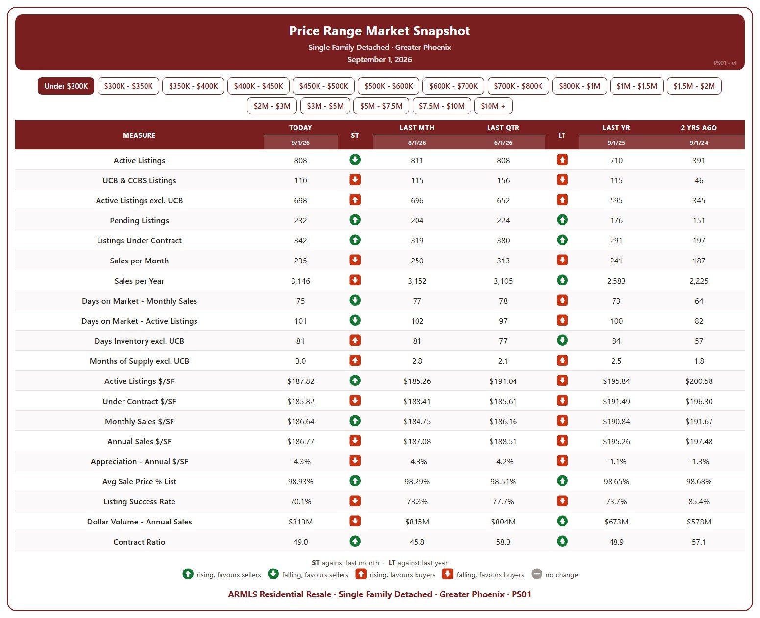
This table shows 20 measures of the market for single-family detached homes in Greater Phoenix, for one list price band at a time, from under $300K up to $10M and over. Pick the band with the buttons at the top.

Each measure is shown today (the 1st of the month), a month ago, a quarter ago, a year ago, and two years ago, so you can see how that part of the market has moved. The ST and LT marks compare today with last month and with last year, colored by whether the change favors sellers or buyers.

It covers supply (active listings, UCB / CCBS, pending, days inventory, months of supply), demand (sales per month and per year, days on market, listing success rate, contract ratio), and pricing ($/SF of active, under contract, and sold homes, appreciation, sale price as a percentage of list, and dollar volume).

Months of Supply (including UCB & CCBS) by City – Weekly

About this chart

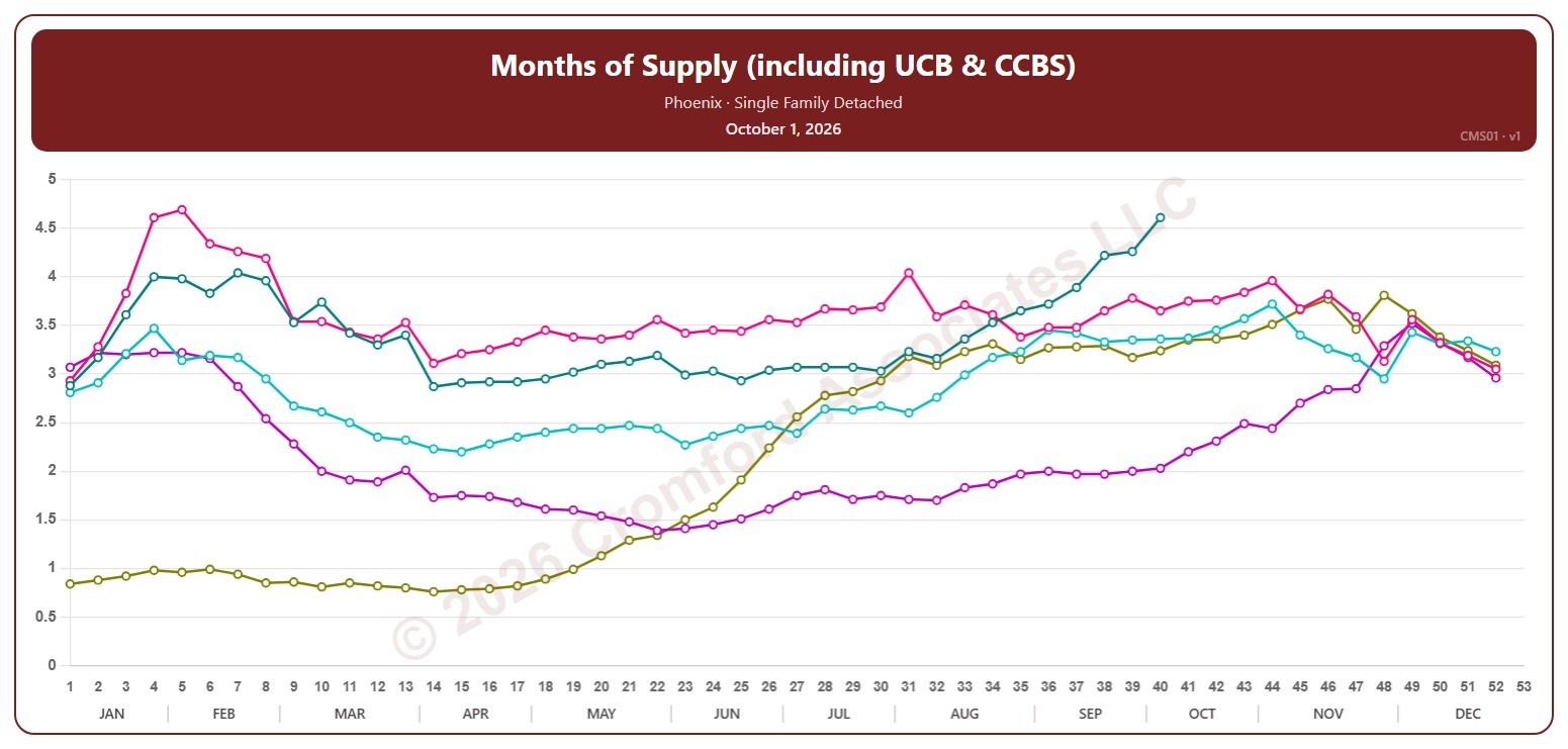
This chart shows months of supply for single-family detached homes on ARMLS in one city, measured every week on Thursdays: how many months it would take to sell all the active listings (including UCB / CCBS) at the rate homes sold over the last month, if no new listings came on. The lower the number, the tighter the supply.

Each year has its own line, laid out by week of the year, so you can compare this year with earlier years at the same point in the season. It opens on Phoenix and the last five years. Pick any of the 34 cities (18 major and 16 secondary) from the City list, and tick any year back to 2006 in the Year panel. Queen Creek and San Tan Valley start in 2010, and Coolidge, Florence, Waddell, and Wickenburg in 2011.

Hover over a line to see the exact figure for that week.

Months of Supply (including UCB & CCBS) by City – Long Term

About this chart

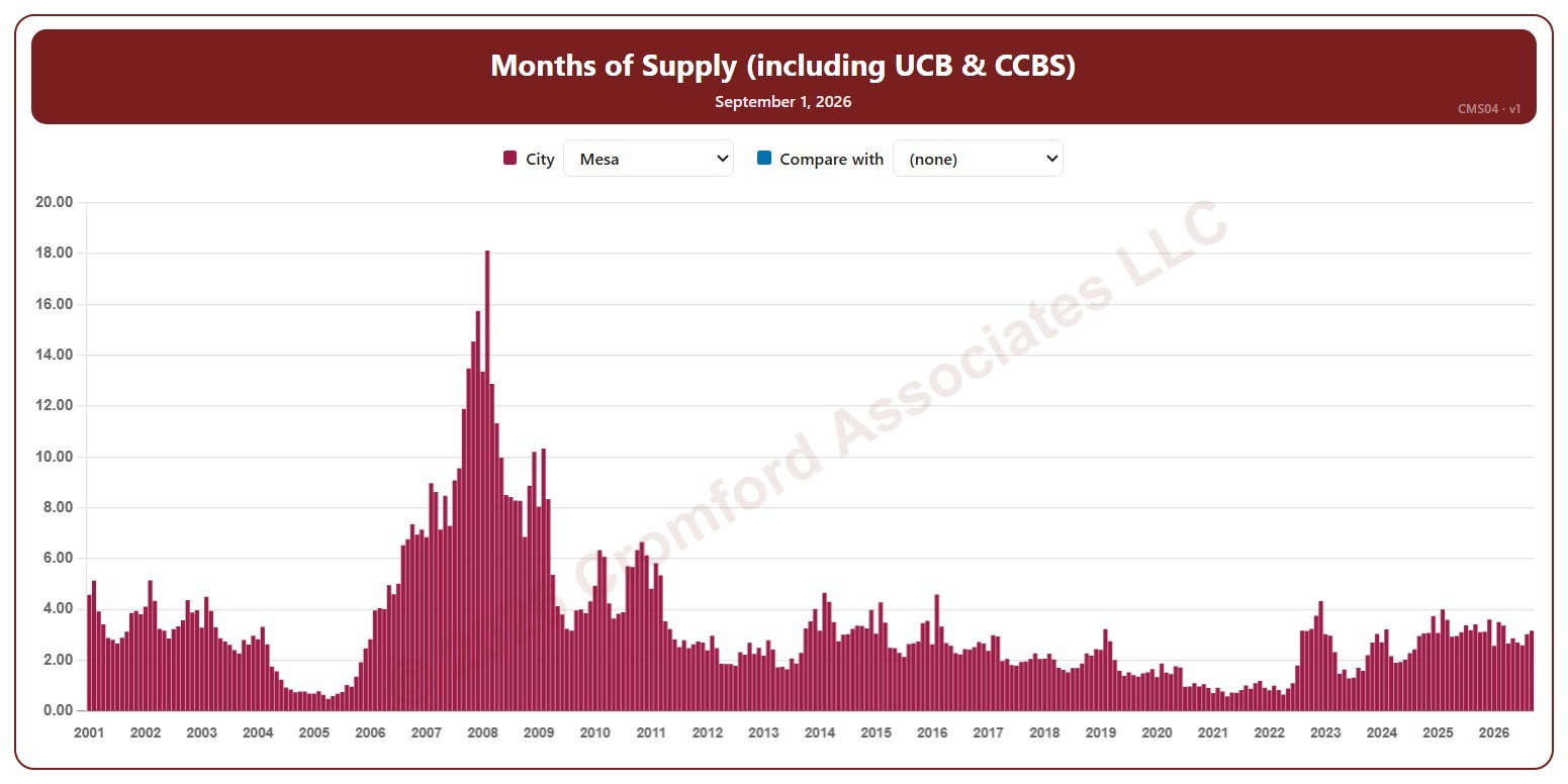
This chart shows months of supply for single-family detached homes on ARMLS in one city, as one bar per month since January 2001: how many months it would take to sell all the active listings (including UCB / CCBS) at the rate homes sold over the last month, if no new listings came on. Each bar is the reading on the 1st of the month. The lower the number, the tighter the supply.

It opens on Mesa. Pick any of 41 cities from the City list, and use Compare with to add a second city alongside it.

Hover over a bar to see the exact figure for that month.

Months Supply (including UCB & CCBS) – Long Term

About this chart

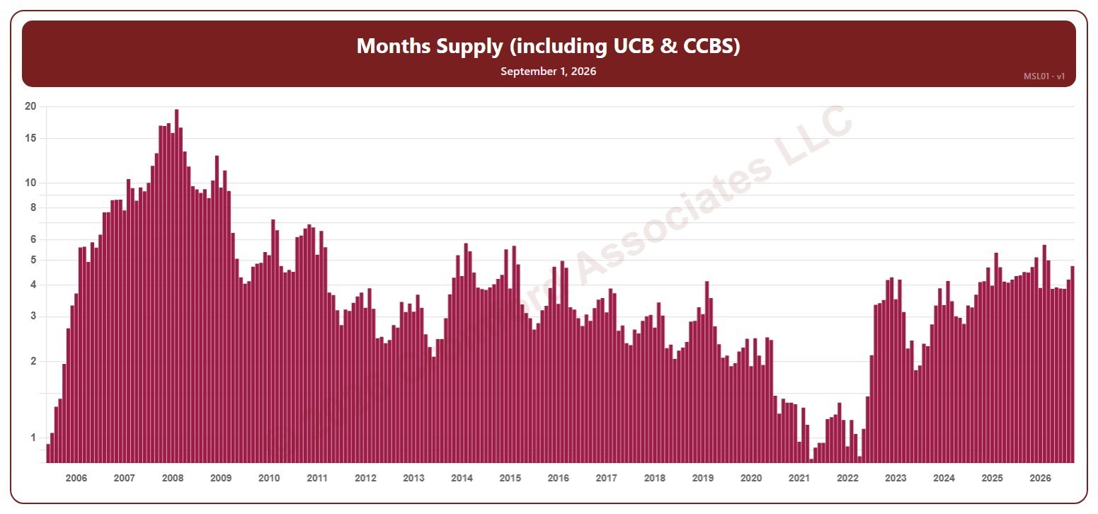
This chart shows months of supply, for the whole ARMLS market, all areas and all dwelling types, as one bar per month since June 2005, each the reading on the 1st of the month: how many months it would take to sell all the active listings (including UCB / CCBS) at the rate homes sold over the last month, if no new listings came on. The lower the number, the tighter the supply and the better for sellers. The value axis is logarithmic, so equal steps up the axis are equal percentage changes; this keeps both the extreme years and today readable.

Hover over a bar to see the exact figure for that month.

Months Supply (including UCB & CCBS) – Monthly

About this chart

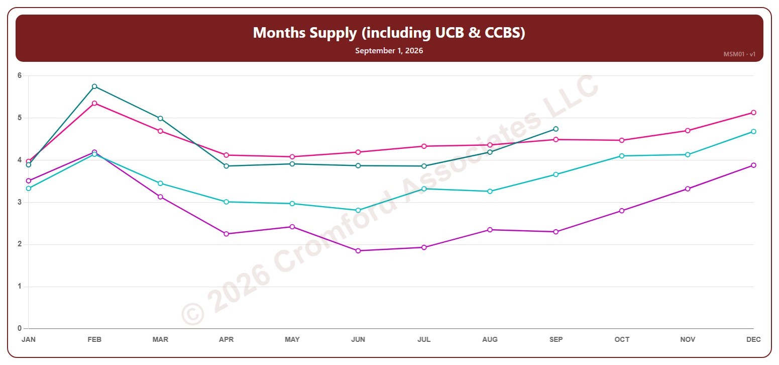
This chart shows months of supply, for the whole ARMLS market, all areas and all dwelling types, read on the 1st of each month: how many months it would take to sell all the active listings (including UCB / CCBS) at the rate homes sold over the last month, if no new listings came on. The lower the number, the tighter the supply and the better for sellers.

Each year has its own line, laid out by month, so you can compare this year with earlier years at the same point in the season. It opens on the last four years; tick any year back to 2005 in the Year panel.

Hover over a line to see the exact figure for that month.

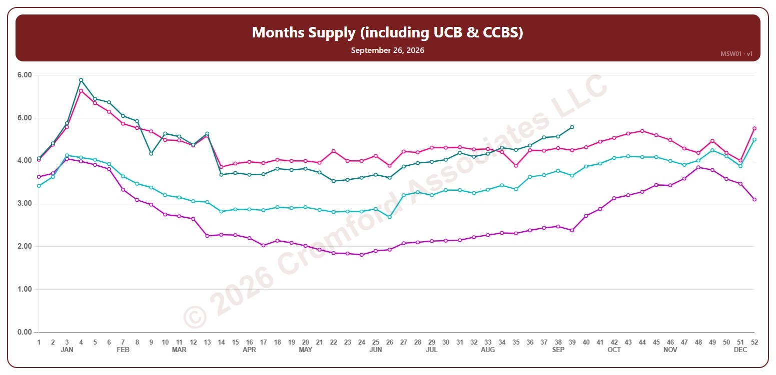
Months Supply (including UCB & CCBS) – Weekly

About this chart

This chart shows months of supply, for the whole ARMLS market, all areas and all dwelling types, counted every Saturday: how many months it would take to sell all the active listings (including UCB / CCBS) at the rate homes sold over the last month, if no new listings came on. The lower the number, the tighter the supply and the better for sellers.

Each year has its own line, laid out by week of the year (each Saturday), so you can compare this year with earlier years at the same point in the season. It opens on the last four years; tick any year back to 2001 in the Year panel.

Hover over a line to see the exact figure for that week.

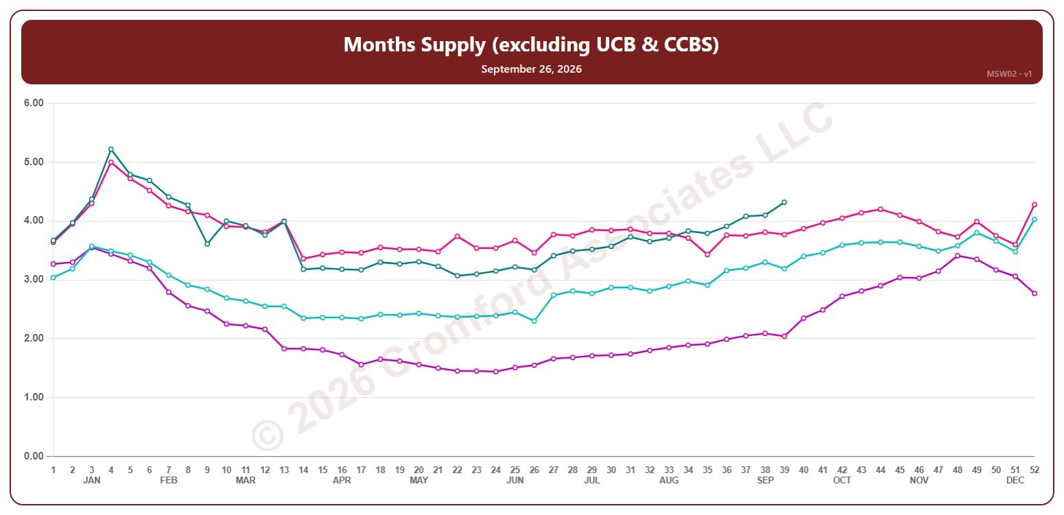
Months Supply (excluding UCB & CCBS) – Weekly

About this chart

This chart shows months of supply, for the whole ARMLS market, all areas and all dwelling types, counted every Saturday: how many months it would take to sell all the active listings (not counting UCB / CCBS) at the rate homes sold over the last month, if no new listings came on. The lower the number, the tighter the supply and the better for sellers.

Each year has its own line, laid out by week of the year (each Saturday), so you can compare this year with earlier years at the same point in the season. It opens on the last four years; tick any year back to 2005 in the Year panel.

Hover over a line to see the exact figure for that week.

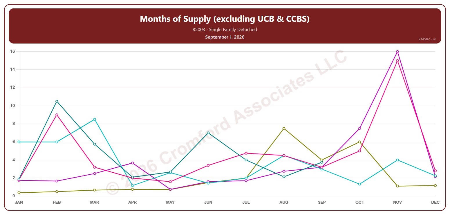
Months of Supply (excluding UCB & CCBS) by ZIP Code – Monthly

About this chart

This chart shows months of supply for single-family detached homes on ARMLS in one ZIP code: how many months it would take to sell all the active listings (not counting UCB / CCBS) at the rate homes sold over the last month, if no new listings came on. Each point is the reading on the 1st of the month. The lower the number, the tighter the supply.

Each year has its own line, laid out by month, so you can compare this year with earlier years at the same point in the season. Pick any of 149 ZIP codes from the ZIP Code list (it opens on 85003); the last three years are ticked to start with, and you can tick any year back to 2006.

Hover over a line to see the exact figure for that month.