About this chart
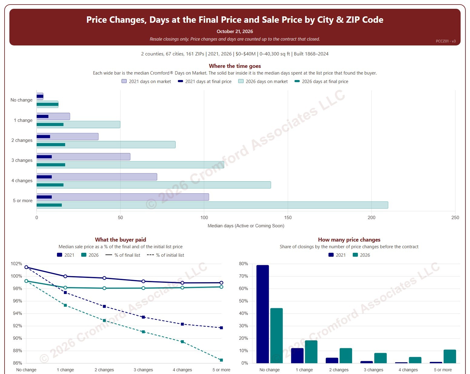
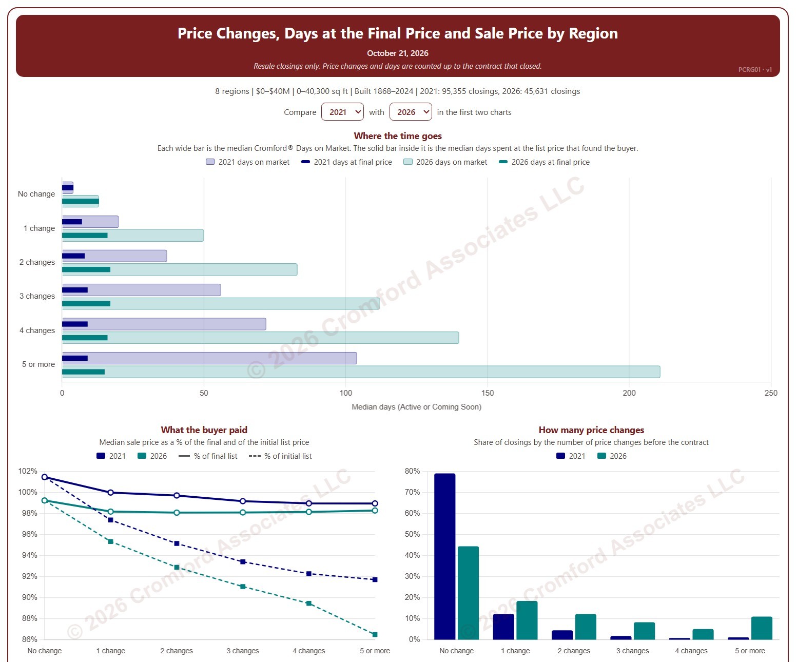
This chart shows how many times homes changed their list price before going under contract, and what that meant for how long they took to sell and the price they sold for, by region. Each closed resale is grouped by the number of list price changes before the contract that closed, from none to five or more. Price increases and price cuts both count as a change.
The top chart compares two figures for each group. The wide bar is the median Cromford® Days on Market. The solid bar inside it is the median number of days the home spent at its final list price, the price that found the buyer. However long a home was on the market, the time it spent at the price that sold it is usually much shorter.
The top two charts compare any two years from 2020 on, picked with the selectors above them. The lower left chart shows the median sale price as a percentage of the final list price (solid line) and of the initial list price (dashed line). The lower right chart shows the share of closings in each group for the years ticked in the Year panel.
The map shades every ZIP code with its region’s figure for one year at a time, chosen with the year selector above it, so each region reads as one block. A few ZIP codes lie in two regions; they are striped in both regions’ shades and their closings count in both. Regions not ticked in the Region panel are faded. Click a ZIP code to show its region alone in the charts.
Days count while the home was Active or Coming Soon, up to the contract that closed. A contract that fell through does not reset the count. New construction is excluded. Years are by closing date, and the current year is year to date. The chart opens on 2021 and the current year in the Greater Phoenix regions, with manufactured and modular homes left out.