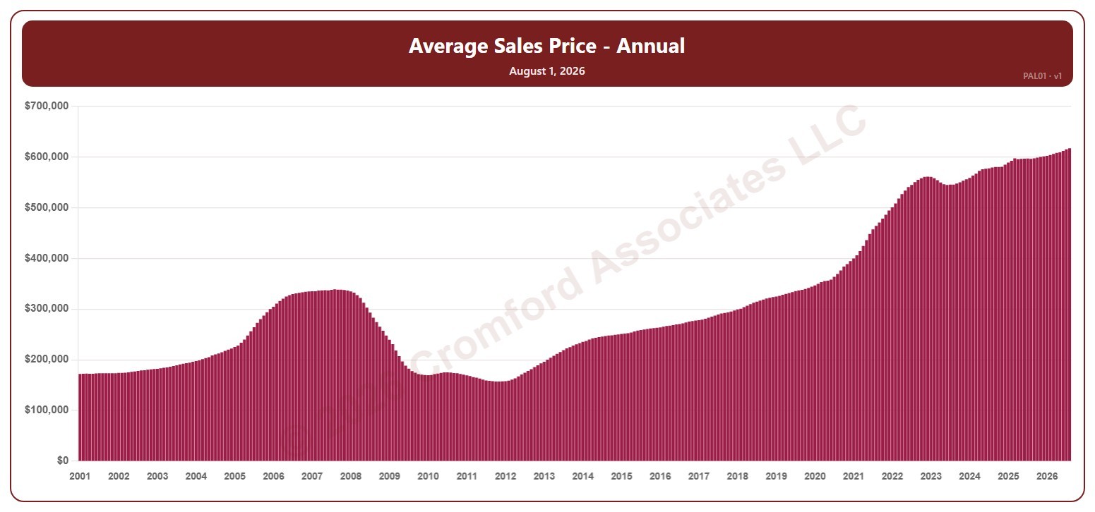
Average Sales Price – Annual – Long Term

About this chart

This chart shows the average sales price of the homes that closed over 12 months, for the whole ARMLS market, all areas and all dwelling types, as one bar per month since January 2001. Each bar covers the 12 months ending with the month it sits at, so the bar labeled June covers July 1 of the year before to June 30. Sales of large, expensive homes pull the average up more than the median.

Hover over a bar to see the exact figure for that month.
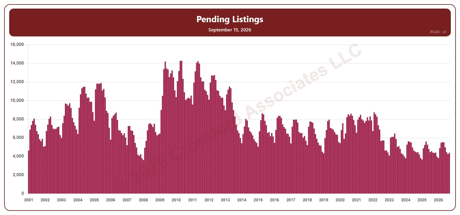
Pending Listings – Long Term

About this chart

This chart shows the number of Pending listings, for the whole ARMLS market, all areas and all dwelling types, as one bar per month since January 2001, each the reading on the 15th of the month: homes under contract that have not yet closed (UCB / CCBS listings are not included).

Hover over a bar to see the exact figure for that month.

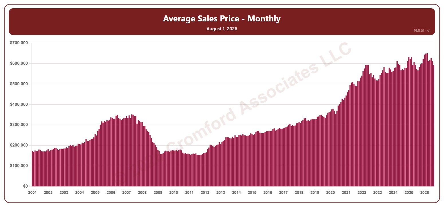
Average Sales Price – Monthly – Long Term

About this chart

This chart shows the average sales price of the homes that closed in a month, for the whole ARMLS market, all areas and all dwelling types, as one bar per month since January 2001. Each bar covers the closings in that calendar month. Sales of large, expensive homes pull the average up more than the median.

Hover over a bar to see the exact figure for that month.
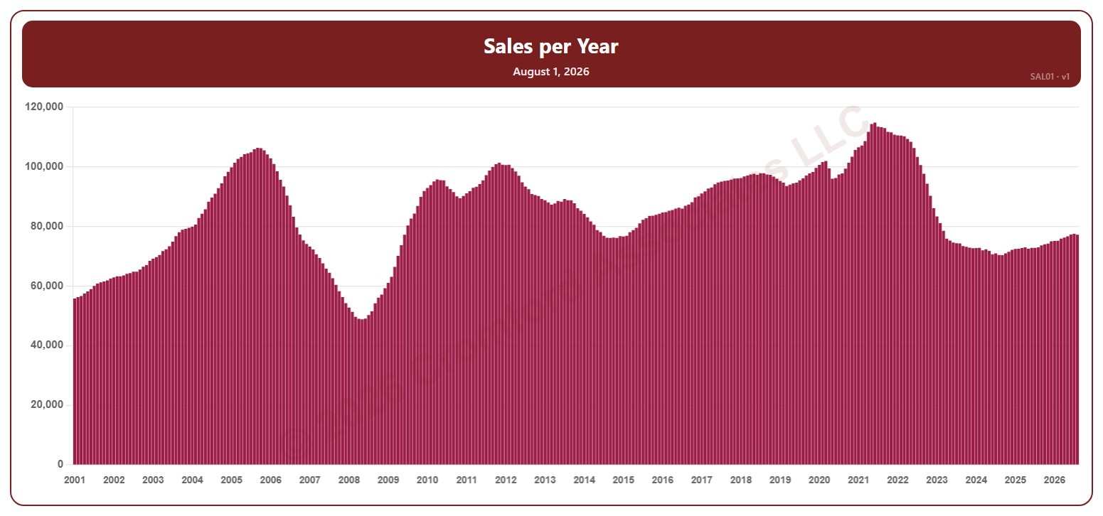
Sales per Year – Long Term

About this chart

This chart shows the number of homes that closed over 12 months (sales per year), for the whole ARMLS market, all areas and all dwelling types, as one bar per month since January 2001. Each bar covers the 12 months ending with the month it sits at, so the bar labeled June covers July 1 of the year before to June 30.

Hover over a bar to see the exact figure for that month.
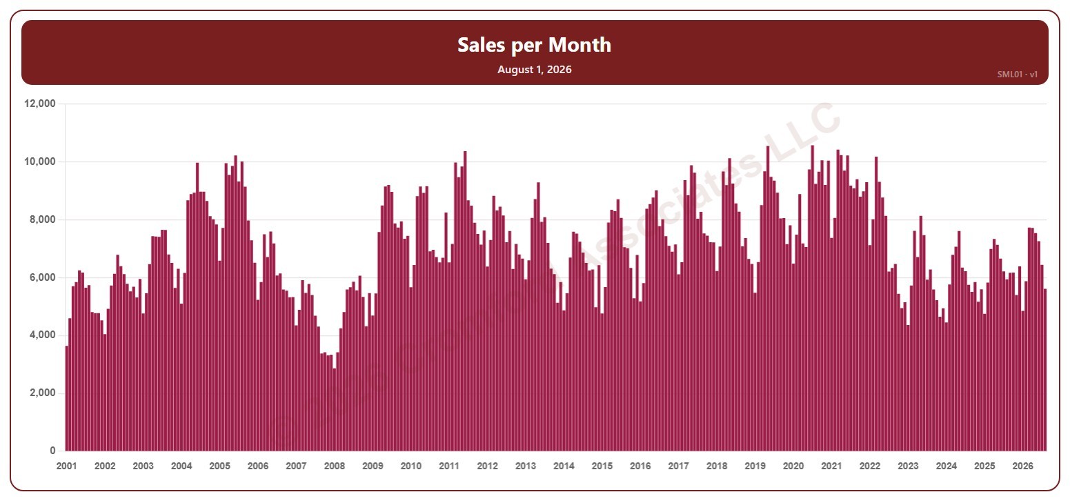
Sales per Month – Long Term

About this chart

This chart shows the number of homes that closed in a month (sales per month), for the whole ARMLS market, all areas and all dwelling types, as one bar per month since January 2001. Each bar covers the closings in that calendar month.

Hover over a bar to see the exact figure for that month.
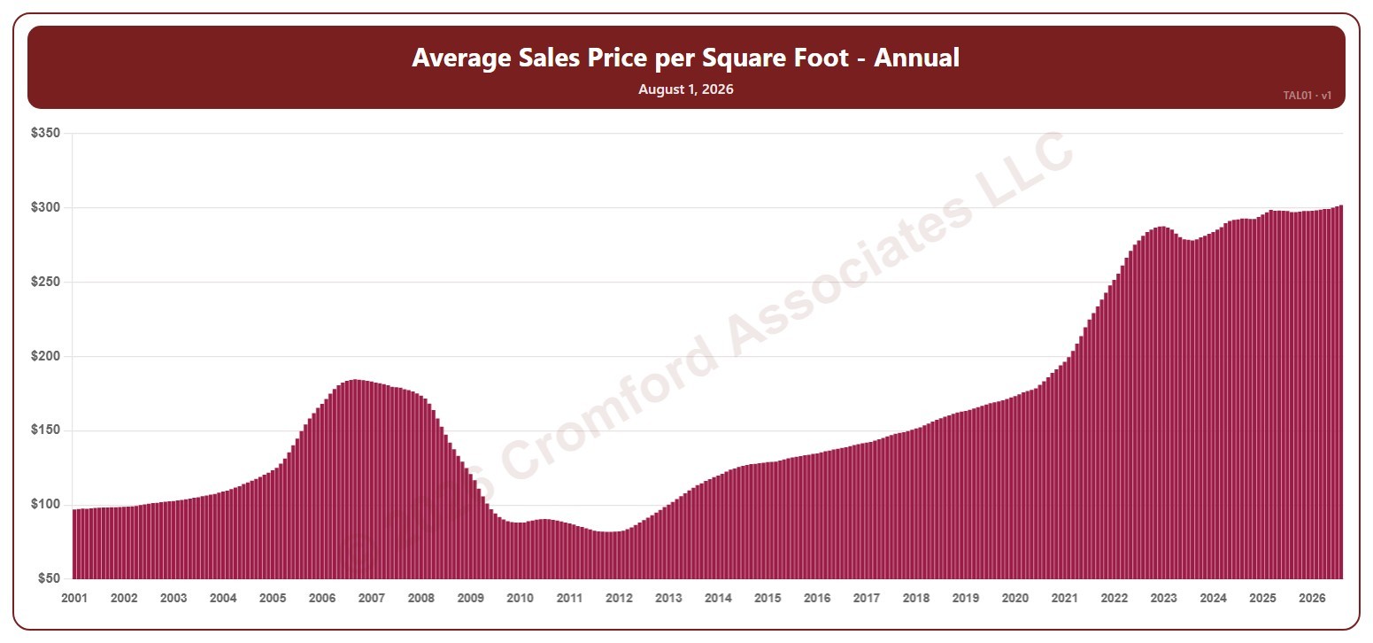
Average Sales Price per Square Foot – Annual – Long Term

About this chart

This chart shows the average sales price per square foot of the homes that closed over 12 months, for the whole ARMLS market, all areas and all dwelling types, as one bar per month since January 2001. Each bar covers the 12 months ending with the month it sits at, so the bar labeled June covers July 1 of the year before to June 30. Price per square foot lets you compare homes of different sizes; this is the true average across all the square feet sold.

Hover over a bar to see the exact figure for that month.
Average Sales Price per Square Foot – Monthly – Long Term

About this chart

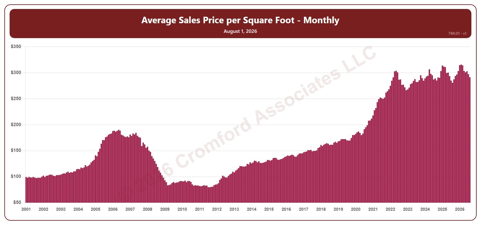
This chart shows the average sales price per square foot of the homes that closed in a month, for the whole ARMLS market, all areas and all dwelling types, as one bar per month since January 2001. Each bar covers the closings in that calendar month. Price per square foot lets you compare homes of different sizes; this is the true average across all the square feet sold.

Hover over a bar to see the exact figure for that month.
Monthly Trustee’s Deeds by Region

About this chart

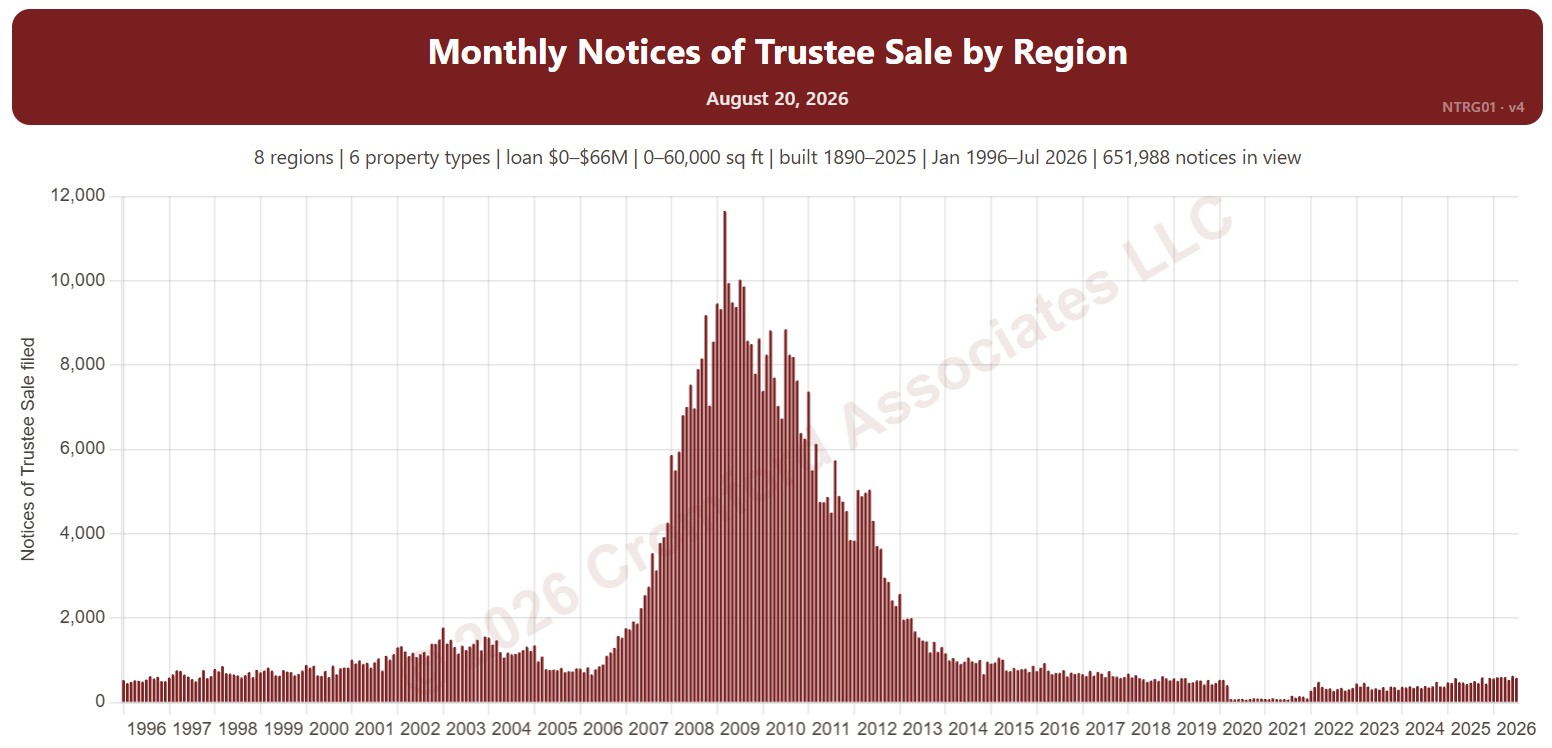
This chart counts the Trustee’s Deeds recorded each month: the deed recorded after a foreclosure auction. Each bar is split by what happened at the auction: the home reverted to the lender (beneficiary), sold to a third party, or the outcome was not recorded.

Records run from 2002. Vacant land and commercial property are left out by default.

Use the Region panel to focus on one region or a combination of them. Narrow it with the Outcome and Property Type boxes and the sale price, loan amount, home size, and year built sliders. Use the date slider, or Full range, to choose the stretch of history shown.

Hover over a bar to see the counts for that month.

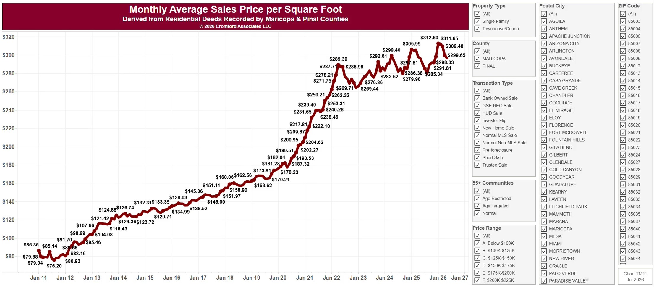
Monthly Average Sales Price per Square Foot

About this chart

This chart shows the average price per square foot of homes sold, one bar per calendar month since January 2011, from residential deeds recorded by Maricopa and Pinal Counties. It is the same series as TM11, drawn as bars. Price per square foot lets you compare homes of different sizes. Because it is built from recorded deeds, it covers every recorded sale, not just homes listed on ARMLS: new homes, private sales, and investor deals are all included.

It opens on Maricopa and Pinal Counties with everything included. Narrow it with the County, City, and ZIP panels, the Transaction Type, Property Type, and 55+ Communities boxes, and the sale price and home size sliders. Untick years in the Year panel to drop them from the chart.

The records run to the end of last month and are updated monthly. Hover over a bar to see the exact figure for that month.
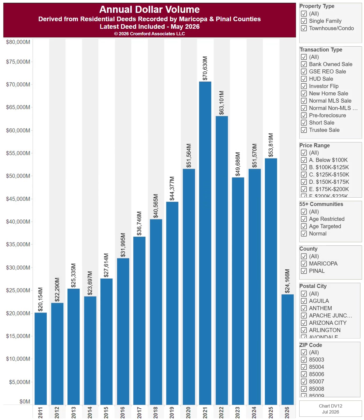
Year to Date Dollar Volume

About this chart

This chart shows dollar volume: the total value of the homes sold each year since 2011, from residential deeds recorded by Maricopa and Pinal Counties, with every year cut to the same months (January to the latest month recorded), so the current year can be compared fairly with earlier ones. Because it is built from recorded deeds, it covers every recorded sale, not just homes listed on ARMLS: new homes, private sales, and investor deals are all included.

It opens on Maricopa and Pinal Counties with everything included. Narrow it with the County, City, and ZIP panels, the Transaction Type, Property Type, and 55+ Communities boxes, and the sale price slider.

The records run to the end of last month and are updated monthly. Hover over a bar to see the exact figure for that year.