Sales per Year by ZIP Code – Monthly

About this chart

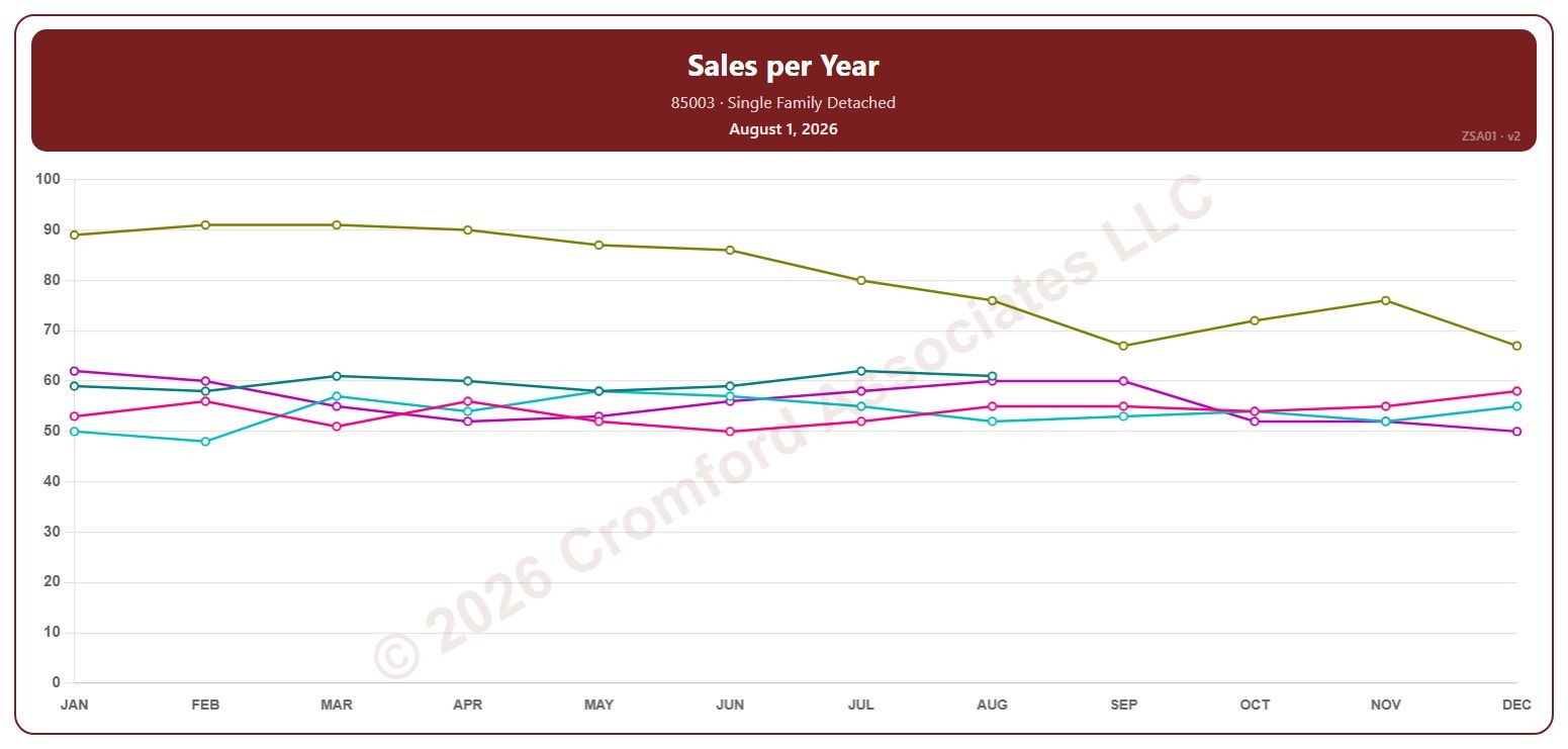
This chart counts the single-family detached homes that closed through ARMLS in one ZIP code over 12 months. Each point covers the 12 months ending with the month it sits at, so the point at August covers September 1 of the year before to August 31; the newest point is the last month that has finished.

Each year has its own line, laid out by month, so you can compare this year with earlier years at the same point in the season. Pick any of 149 ZIP codes from the ZIP Code list (it opens on 85003); the last three years are ticked to start with, and you can tick any year back to 2001.

Hover over a line to see the exact figure for that month.
Annual Median Sales Price by ZIP Code – Monthly

About this chart

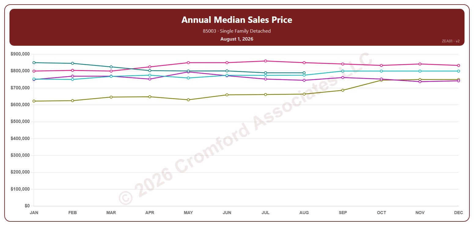
This chart shows the median sales price of single-family detached homes that closed through ARMLS in one ZIP code over 12 months. Each point covers the 12 months ending with the month it sits at, so the point at August covers September 1 of the year before to August 31; the newest point is the last month that has finished. The median is the price in the middle: half sold for more and half for less.

Each year has its own line, laid out by month, so you can compare this year with earlier years at the same point in the season. Pick any of 149 ZIP codes from the ZIP Code list (it opens on 85003); the last three years are ticked to start with, and you can tick any year back to 2001.

Hover over a line to see the exact figure for that month.
Annual Average Sales Price per Square Foot by ZIP Code – Monthly

About this chart

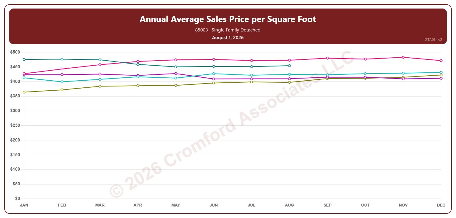
This chart shows the average sales price per square foot of single-family detached homes that closed through ARMLS in one ZIP code over 12 months. Each point covers the 12 months ending with the month it sits at, so the point at August covers September 1 of the year before to August 31; the newest point is the last month that has finished. Price per square foot lets you compare homes of different sizes.

Each year has its own line, laid out by month, so you can compare this year with earlier years at the same point in the season. Pick any of 149 ZIP codes from the ZIP Code list (it opens on 85003); the last three years are ticked to start with, and you can tick any year back to 2001.

Hover over a line to see the exact figure for that month.
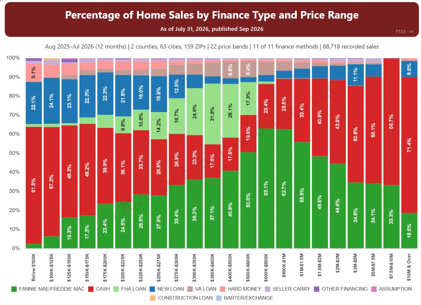
Percentage of Home Sales by Finance Type and Price Range

About this chart

This chart shows how homes were paid for in each of 22 price bands, from below $100K to $10M and over, from residential deeds recorded by Maricopa and Pinal Counties. Each bar adds up to 100% and is split by finance method, such as cash, Fannie Mae / Freddie Mac, FHA, and VA, so you can see how the way buyers pay changes with price.

It opens on the last 12 months of records; use the Recording Month slider to choose the months covered. It opens on Maricopa and Pinal Counties with everything included; narrow it with the County, City, and ZIP panels and the Property Type, 55+ Communities, Finance Method, Transaction Type, and Price Range boxes.

Hover over a bar to see each share for that price band.

Annual Appreciation by City – Based on Annual Median $/SF

About this chart

This chart compares annual appreciation across 34 cities in and around Greater Phoenix over the last 24 months, measured every week, for single-family detached resale homes on ARMLS. Appreciation here is the change in the median sales price per square foot over the last 12 months compared with a year earlier. Above zero, prices are higher than a year ago; below zero, they are lower.

The 18 major cities are drawn as solid lines and the 16 secondary cities as dashed lines. It opens on Mesa and Phoenix; use the city check boxes, or Select All and Clear All, to choose which cities are shown.

Hover over a line to see the exact figure for that week.

Annual Closed Listings by Region

About this chart

This chart counts the homes that closed through ARMLS over the last 12 months, measured on the 1st of every month, as one continuous series of bars back to 2000. It is the same measure as SARG11 laid out as a single timeline instead of one line per year.

It opens with every region included. Use the Region panel to focus on one region or compare a combination of them. Narrow it with the Dwelling Type, Transaction Type, and New / Resale boxes and the sales price, home size, and year built sliders. Use the date slider, or Full range, to choose the stretch of history shown.

Hover over a bar to see the exact figure for that month.
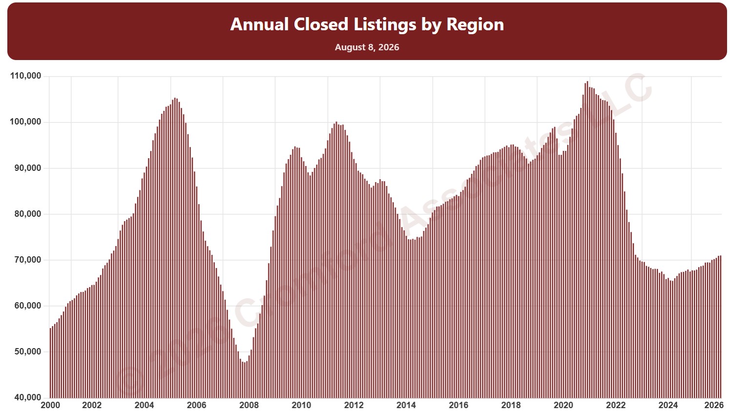
Annual Closed Listings by Region

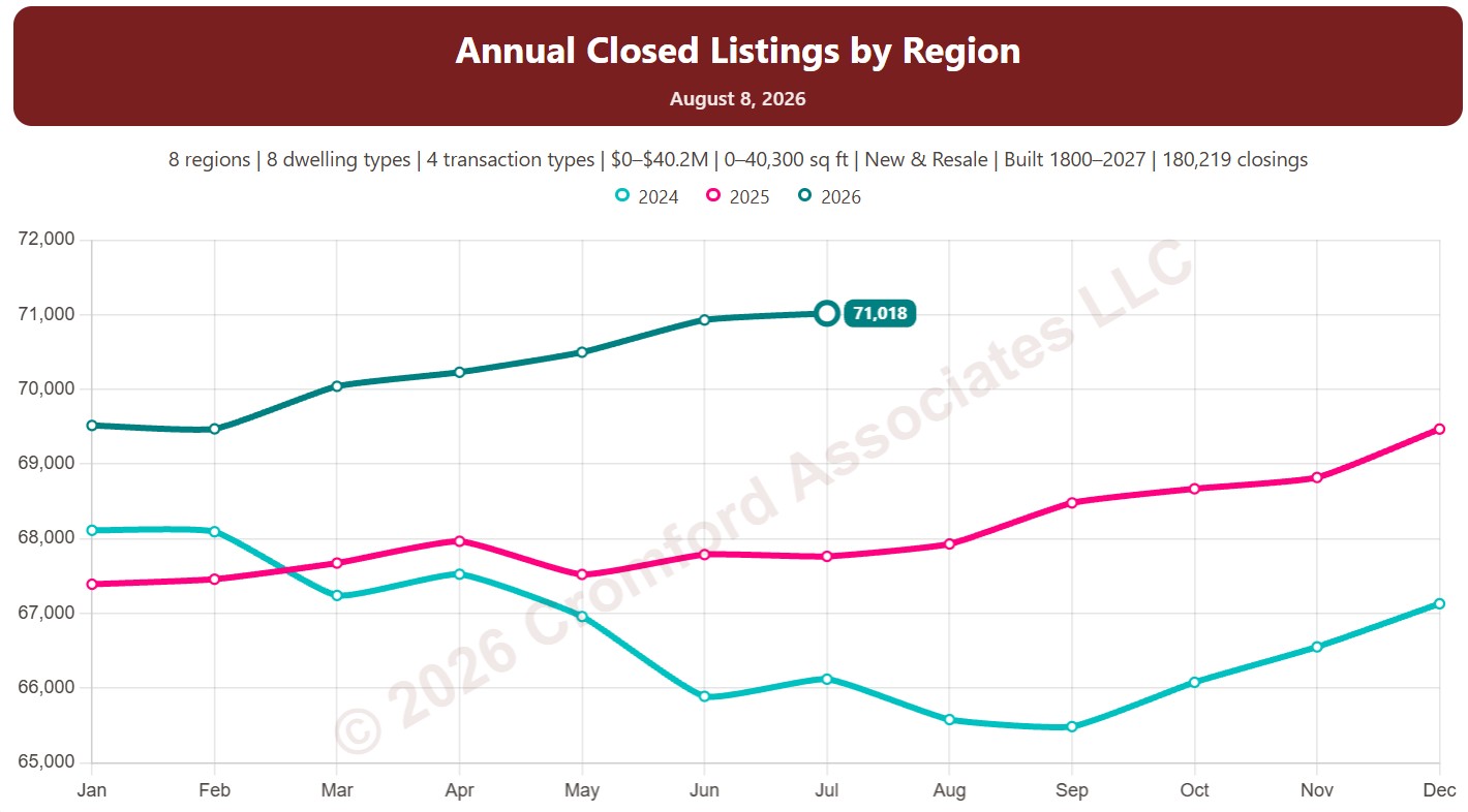
About this chart

This chart counts the homes that closed through ARMLS over the last 12 months, measured on the 1st of every month, which smooths out the seasonal swings.

Each year has its own line, laid out by month of the year, so you can compare this year with earlier years at the same point in the season. It opens on the last three years; tick any year back to 2001 in the Year panel.

It opens with every region included. Use the Region panel to focus on one region or compare a combination of them. Narrow it with the Dwelling Type, Transaction Type, and New / Resale boxes and the sales price, home size, and year built sliders.

Hover over a line to see the exact figure for that month.
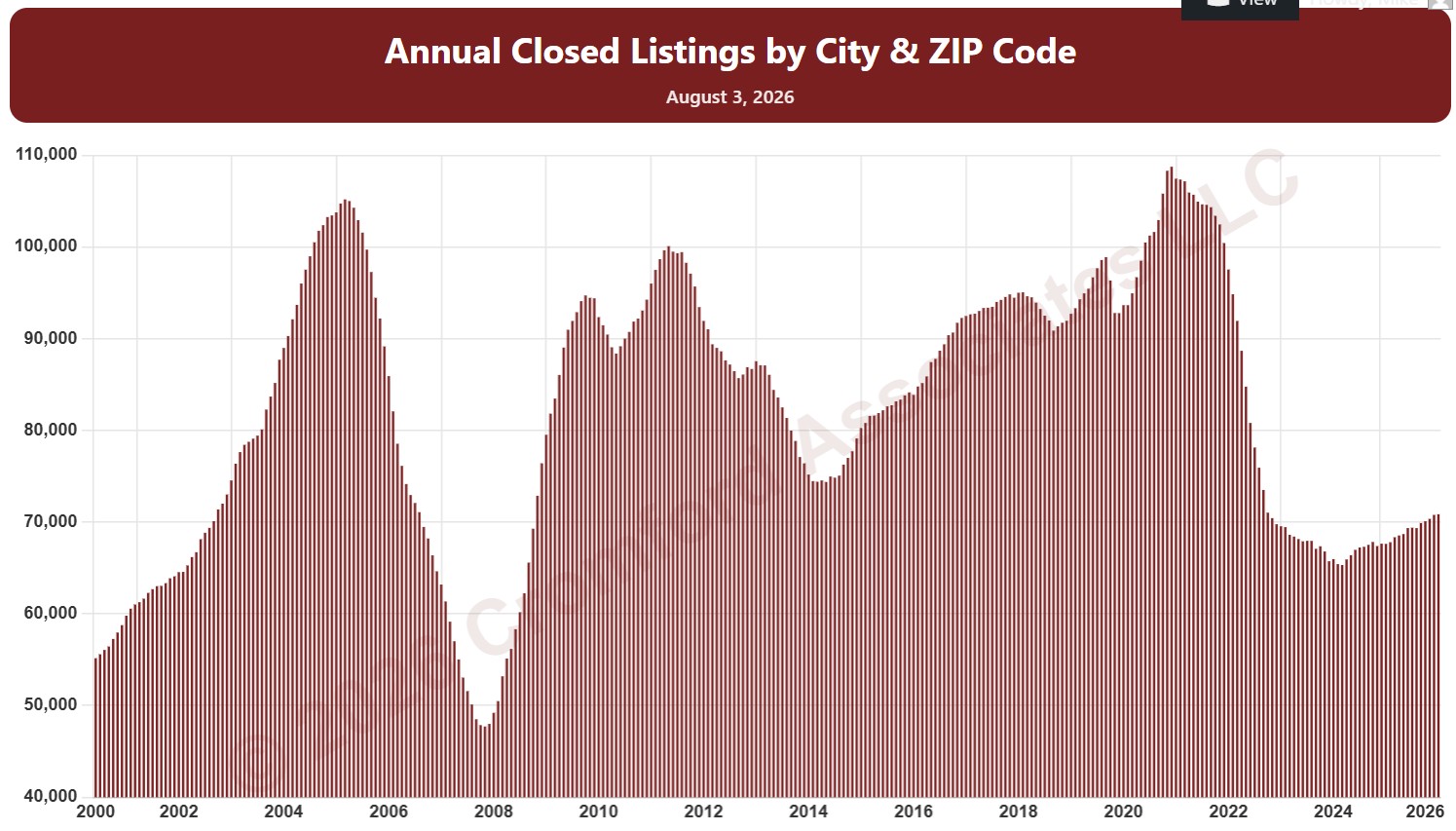
Annual Closed Sales by City and ZIP Code

About this chart

This chart counts the homes that closed through ARMLS over the last 12 months, measured on the 1st of every month, as one continuous series of bars back to 2000. It is the same measure as SACZ11 laid out as a single timeline instead of one line per year.

It opens on Maricopa and Pinal Counties with every city and ZIP code included. Use the County, City, and ZIP panels to focus on any area, from a whole county down to a single ZIP code. Narrow it with the Dwelling Type, Transaction Type, and New / Resale boxes and the sales price, home size, and year built sliders. Use the date slider, or Full range, to choose the stretch of history shown.

Hover over a bar to see the exact figure for that month.
Annual Closed Sales by City and ZIP Code

About this chart

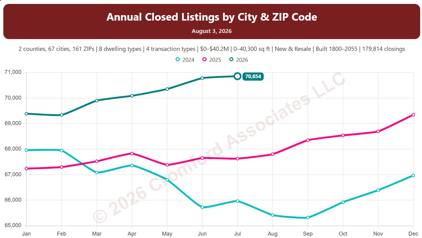
This chart counts the homes that closed through ARMLS over the last 12 months, measured on the 1st of every month, which smooths out the seasonal swings.

Each year has its own line, laid out by month of the year, so you can compare this year with earlier years at the same point in the season. It opens on the last three years; tick any year back to 2001 in the Year panel.

It opens on Maricopa and Pinal Counties with every city and ZIP code included. Use the County, City, and ZIP panels to focus on any area, from a whole county down to a single ZIP code. Narrow it with the Dwelling Type, Transaction Type, and New / Resale boxes and the sales price, home size, and year built sliders.

Hover over a line to see the exact figure for that month.
Annual Median Sales Price per Square Foot by Region

About this chart

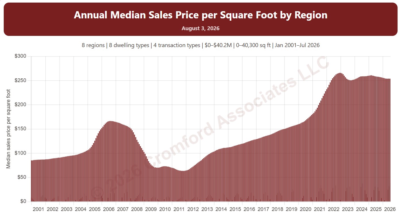
This chart shows the median sales price per square foot over the 12 months up to each month, as one bar per month from January 2001. Price per square foot lets you compare homes of different sizes; the median is the figure in the middle, so a few unusual sales move it less than an average.

It opens with every region included. Use the Region panel to focus on one region or compare a combination of them. Narrow it with the Dwelling Type, Transaction Type, and New / Resale boxes and the sale price, home size, and year built sliders. The Inflation (CPI) option restates prices in today’s dollars using national or Phoenix inflation. Use the date slider, or Full range, to choose the stretch of history shown.

Hover over a bar to see the exact figure for that month.