12 Month Moving Average Sales Price per Square Foot

About this chart

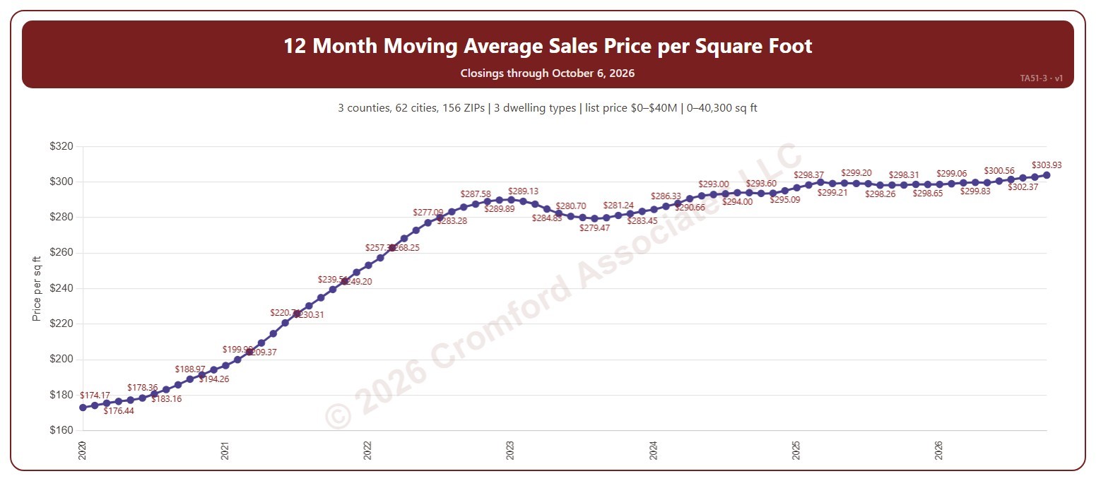
This chart shows the average sales price per square foot of the homes that closed through ARMLS over the 12 months ending with each calendar month: a 12-month moving average, across all the square feet sold. Price per square foot lets you compare homes of different sizes. The 12-month average smooths out the seasonal swings.

It opens on the years since 2020; tick any year back to 2000 in the Year panel. The newest month is the month so far.

It opens on the Greater Phoenix area: the counties, cities, and ZIP codes that make it up are ticked to start with. Tick or untick any of them to change the area, including counties beyond Greater Phoenix. Narrow it further with the Dwelling Type (condo, mobile, single family), Transaction Type, and New / Resale boxes and the list price, home size, and year built sliders.

Hover over the chart to see the figures for that month.
Annual Closed Listings by Region

About this chart

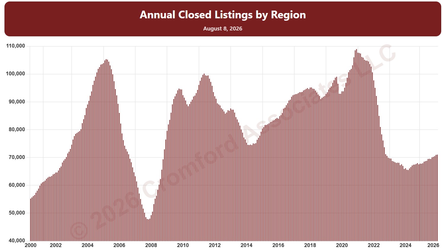
This chart counts the homes that closed through ARMLS over the last 12 months, measured on the 1st of every month, as one continuous series of bars back to 2000. It is the same measure as SARG11 laid out as a single timeline instead of one line per year.

It opens with every region included. Use the Region panel to focus on one region or compare a combination of them. Narrow it with the Dwelling Type, Transaction Type, and New / Resale boxes and the sales price, home size, and year built sliders. Use the date slider, or Full range, to choose the stretch of history shown.

Hover over a bar to see the exact figure for that month.

Cromford® Demand Index and Cromford® Supply Index

About this chart

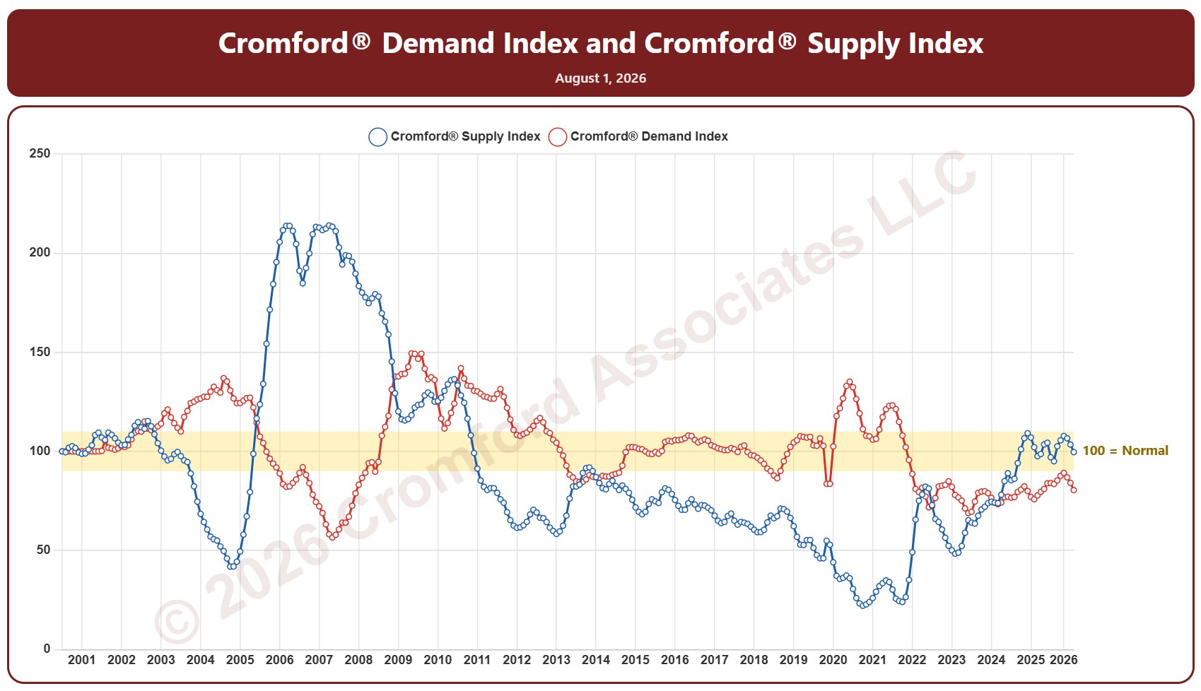
This chart plots the Cromford® Supply Index and Demand Index together for the whole ARMLS market, all areas and all dwelling types, one reading on the 1st of each month since January 2001. Above 100 means more supply or demand than usual and below 100 less than usual; between 90 and 110 counts as within the normal range.

The options add the Market Index as a third line, switch to a logarithmic axis, mark each year at July or January, and label the minimum, maximum, and latest values. Use the date slider, or Full range, to choose the stretch of history shown.

Hover over the chart to see the readings for that month.

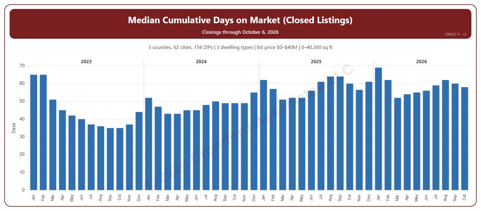
Median Cumulative Days on Market for Closed Listings

About this chart

This chart shows the median cumulative days on market of the homes that closed through ARMLS, one bar per calendar month of closing: half took longer to sell and half less. Cumulative days on market is ARMLS’s own count of the days a home was on the market. The median is less affected than the average by a few homes that sat on the market for a very long time.

It opens on the last four years; tick any year back to 2000 in the Year panel. The newest month is the month so far.

It opens on the Greater Phoenix area: the counties, cities, and ZIP codes that make it up are ticked to start with. Tick or untick any of them to change the area, including counties beyond Greater Phoenix. Narrow it further with the Dwelling Type (condo, mobile, single family), Transaction Type, and New / Resale boxes and the list price, home size, and year built sliders.

Hover over the chart to see the figures for that month.
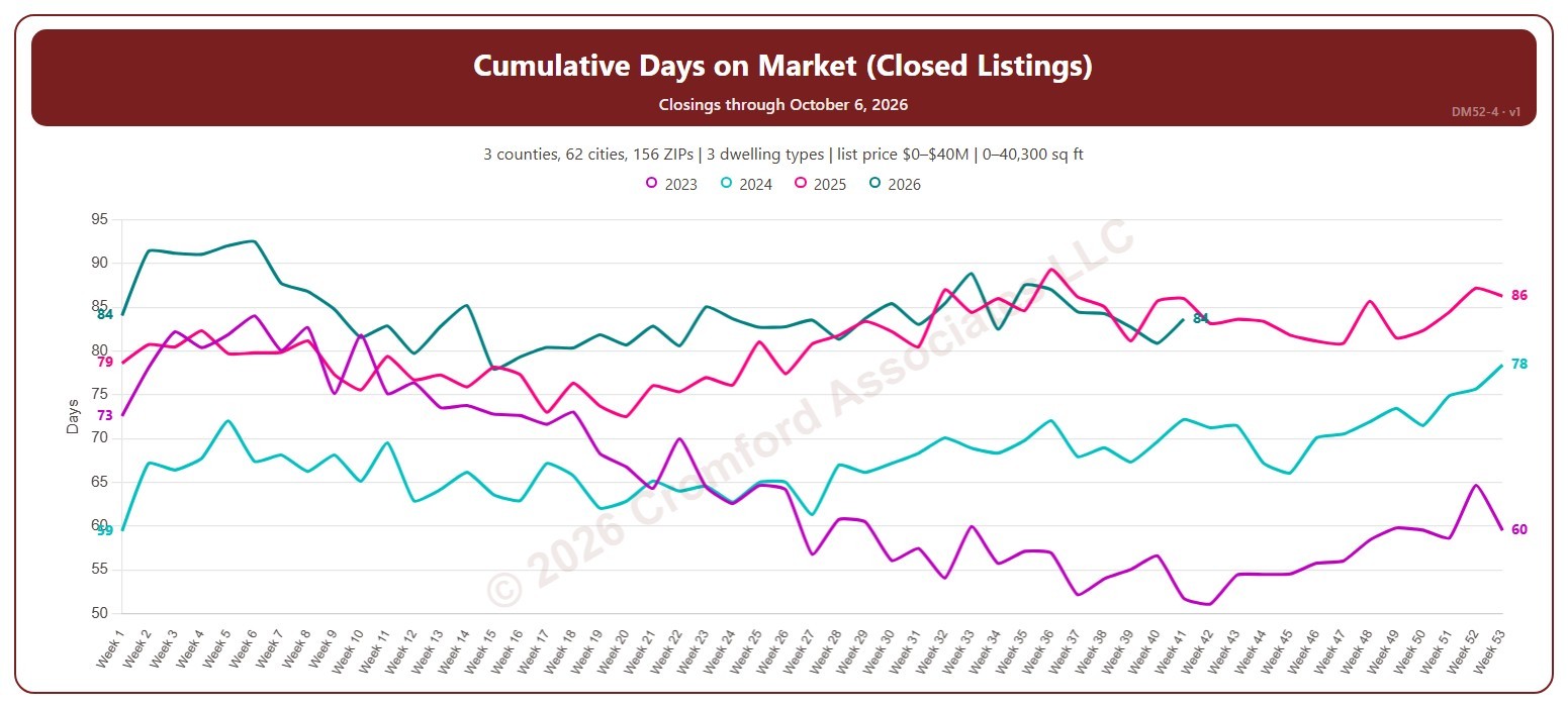
Weekly Cumulative Days on Market for Closed Listings

About this chart

This chart shows the average cumulative days on market of the homes that closed through ARMLS, by week of closing, with one line per year so you can compare the same point in the season. Cumulative days on market is ARMLS’s own count of the days a home was on the market. Weeks start on Sunday, with week 1 being the week that includes January 1.

It opens on the last four years; tick any year back to 2000 in the Year panel. The newest week is the week so far.

It opens on the Greater Phoenix area: the counties, cities, and ZIP codes that make it up are ticked to start with. Tick or untick any of them to change the area, including counties beyond Greater Phoenix. Narrow it further with the Dwelling Type (condo, mobile, single family), Transaction Type, and New / Resale boxes and the list price, home size, and year built sliders.

Hover over the chart to see the figures for that week.

Year-over-Year Change in Average Days on Market for Closed Listings

About this chart

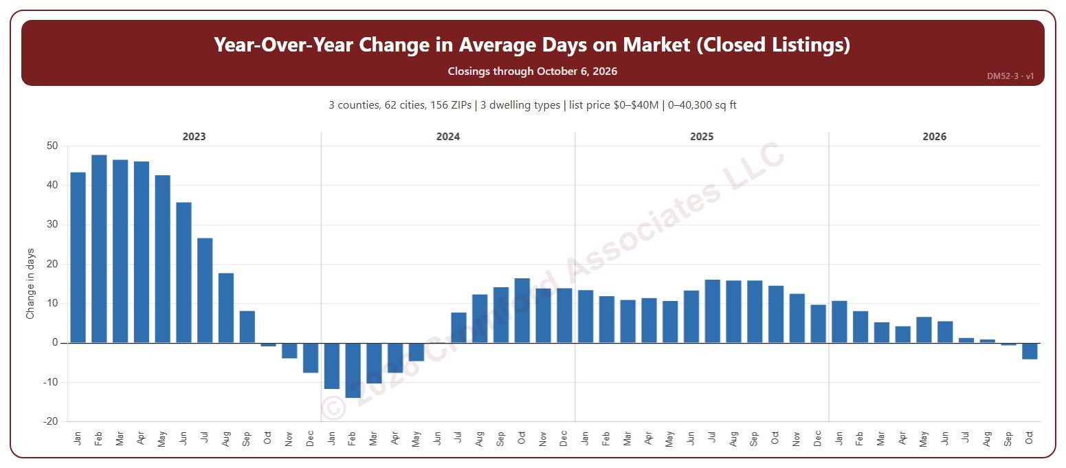
This chart shows the year-over-year change in the average cumulative days on market of the homes that closed through ARMLS: each month’s average compared with the same month a year earlier, in days. Cumulative days on market is ARMLS’s own count of the days a home was on the market. Above zero, homes are taking longer to sell than a year ago; below zero, they are selling faster.

It opens on the last four years; tick any year back to 2000 in the Year panel. The newest month is the month so far.

It opens on the Greater Phoenix area: the counties, cities, and ZIP codes that make it up are ticked to start with. Tick or untick any of them to change the area, including counties beyond Greater Phoenix. Narrow it further with the Dwelling Type (condo, mobile, single family), Transaction Type, and New / Resale boxes and the list price, home size, and year built sliders.

Hover over the chart to see the figures for that month.
Average Cumulative Days on Market for Closed Listings

About this chart

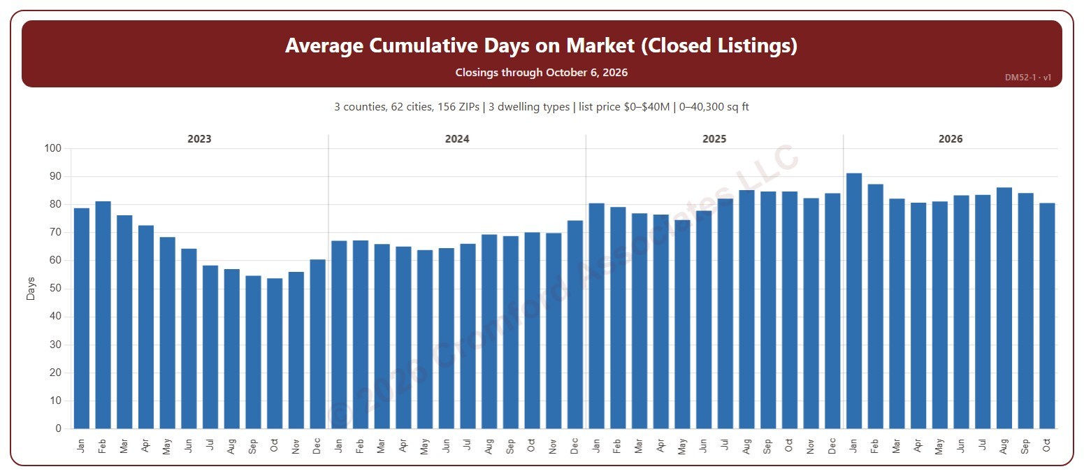
This chart shows the average cumulative days on market of the homes that closed through ARMLS, one bar per calendar month of closing. Cumulative days on market is ARMLS’s own count of the days a home was on the market. Fewer days means homes are selling faster.

It opens on the last four years; tick any year back to 2000 in the Year panel. The newest month is the month so far.

It opens on the Greater Phoenix area: the counties, cities, and ZIP codes that make it up are ticked to start with. Tick or untick any of them to change the area, including counties beyond Greater Phoenix. Narrow it further with the Dwelling Type (condo, mobile, single family), Transaction Type, and New / Resale boxes and the list price, home size, and year built sliders.

Hover over the chart to see the figures for that month.
Annual Change in Median Sales Price

About this chart

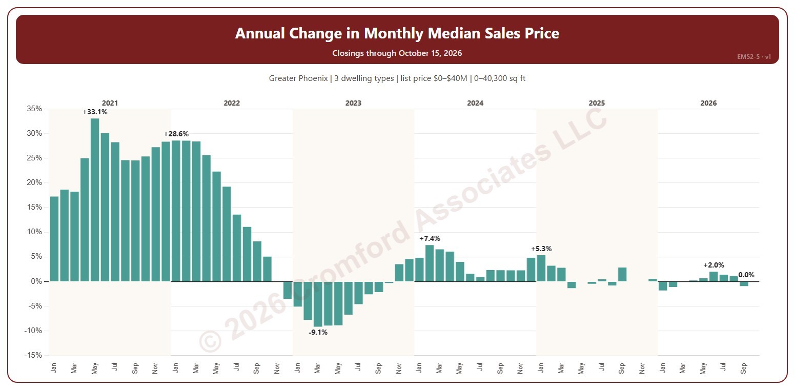
This chart shows the change in the median sales price from the same month a year earlier, as a percentage: above zero, prices were higher than a year before; below zero, lower. Each year’s largest change and the newest month are labeled. The median sales price is the middle sale price of the homes that closed on ARMLS in the period: half sold for more and half for less. New homes are included.

It opens on January 2021 to date; drag the handles of the date slider under the chart to choose the months shown, as far back as January 2001. The newest month is the month so far. The chart is updated every day.

It opens on the Greater Phoenix area: the counties, cities, and ZIP codes that make it up are ticked to start with. Tick or untick any of them to change the area, including counties beyond Greater Phoenix. Narrow it further with the Dwelling Type, Transaction Type, and New / Resale boxes and the list price, home size, and year built sliders.

Hover over a bar to see the change and both months’ medians.

Annual Median Sales Price

About this chart

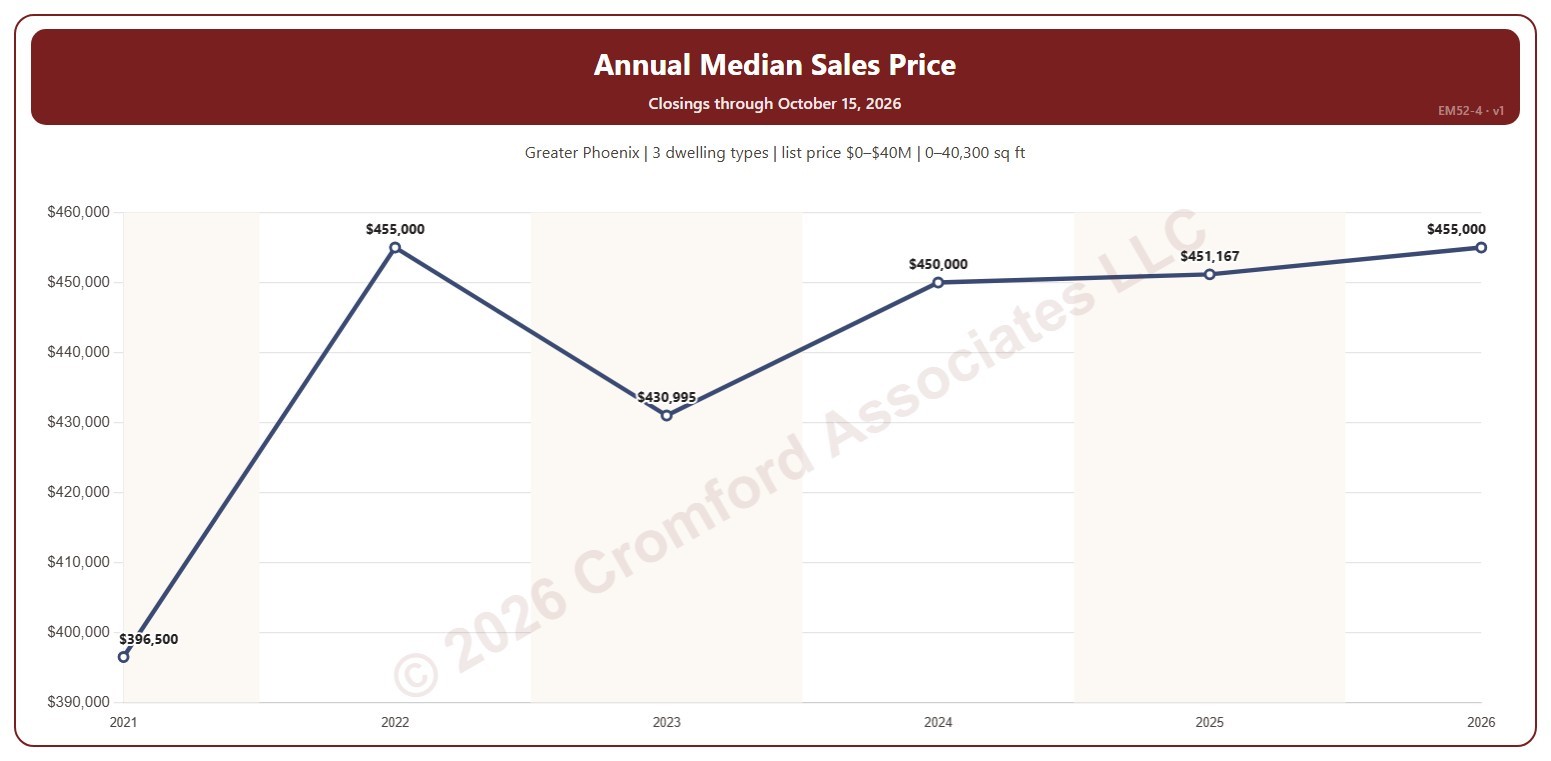
This chart shows the median sales price each year, every year labeled. The median sales price is the middle sale price of the homes that closed on ARMLS in the period: half sold for more and half for less. New homes are included.

It opens on 2021 to date; drag the handles of the date slider under the chart to choose the years shown, as far back as 2000. The newest year is the year so far. The chart is updated every day.

It opens on the Greater Phoenix area: the counties, cities, and ZIP codes that make it up are ticked to start with. Tick or untick any of them to change the area, including counties beyond Greater Phoenix. Narrow it further with the Dwelling Type, Transaction Type, and New / Resale boxes and the list price, home size, and year built sliders.

Hover over the line to see the median, the lowest and highest sale, and the number of closings that year.

Quarterly Median Sales Price

About this chart

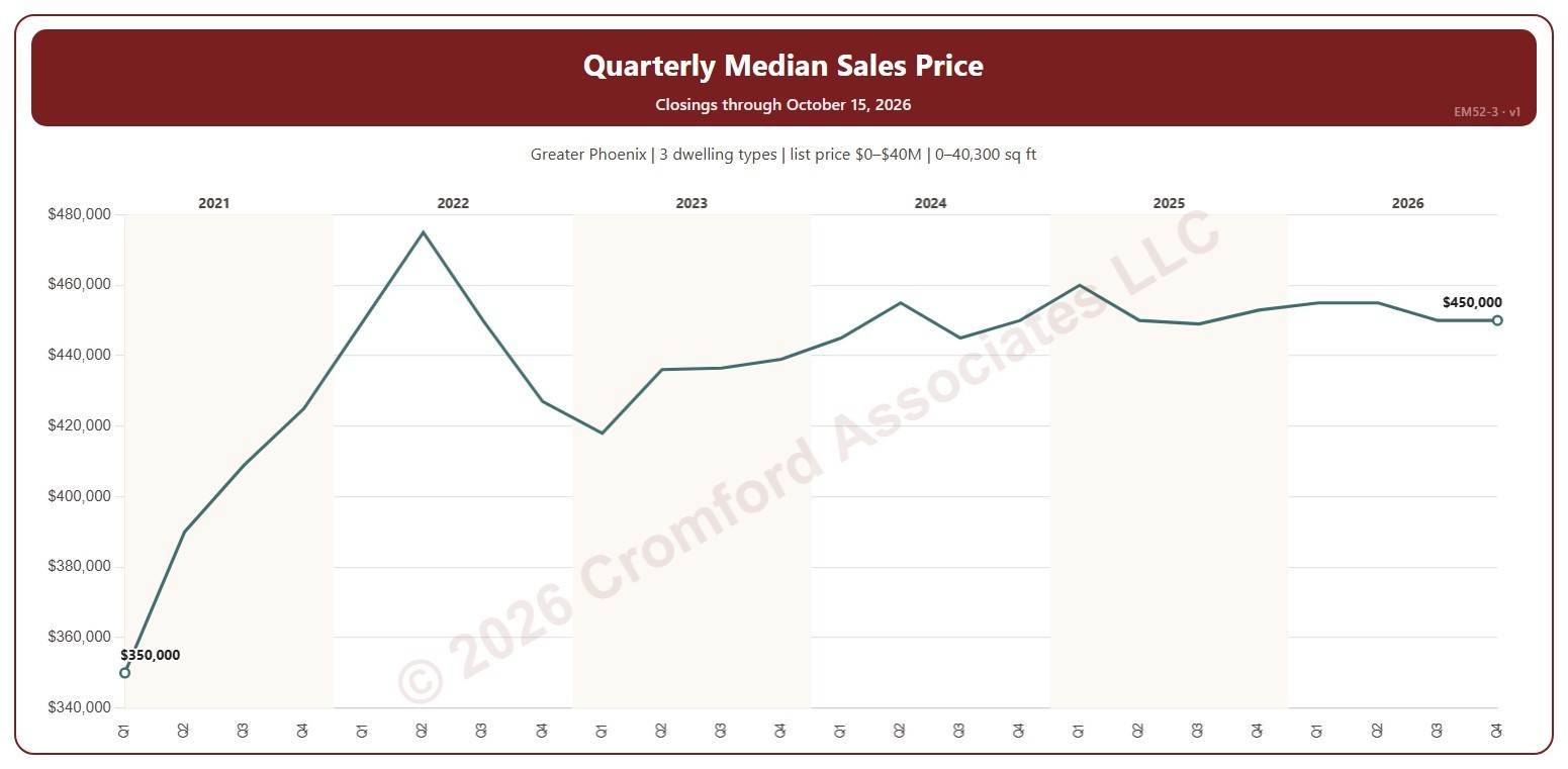
This chart shows the median sales price each quarter. The median sales price is the middle sale price of the homes that closed on ARMLS in the period: half sold for more and half for less. New homes are included.

It opens on the first quarter of 2021 to date; drag the handles of the date slider under the chart to choose the quarters shown, as far back as 2000. The newest quarter is the quarter so far. The chart is updated every day.

It opens on the Greater Phoenix area: the counties, cities, and ZIP codes that make it up are ticked to start with. Tick or untick any of them to change the area, including counties beyond Greater Phoenix. Narrow it further with the Dwelling Type, Transaction Type, and New / Resale boxes and the list price, home size, and year built sliders.

Hover over the line to see the median, the lowest and highest sale, and the number of closings that quarter.