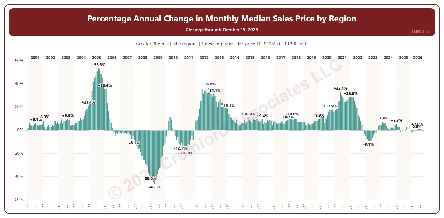
Percentage Annual Change in Monthly Median Sales Price by Region

About this chart

This chart shows the change in the median sales price from the same month a year earlier, as a percentage: above zero, prices were higher than a year before; below zero, lower. Each year’s largest change and the newest month are labeled. The median sales price is the middle sale price of the homes that closed on ARMLS in the period: half sold for more and half for less.

It opens on January 2001 to date; drag the handles of the date slider under the chart to choose the months shown. The newest month is the month so far. The chart is updated every day.

It opens on the Greater Phoenix area: the counties, cities, and ZIP codes that make it up are ticked to start with. Tick or untick any of them to change the area, including counties beyond Greater Phoenix. Use the Region boxes to pick any of the nine Greater Phoenix regions; Other areas (unticked to start with) adds ZIP codes outside them, needed if you widen the area beyond Greater Phoenix. Narrow it further with the Dwelling Type, Transaction Type, and New / Resale boxes and the list price, home size, and year built sliders.

Hover over a bar to see the change and both months’ medians.
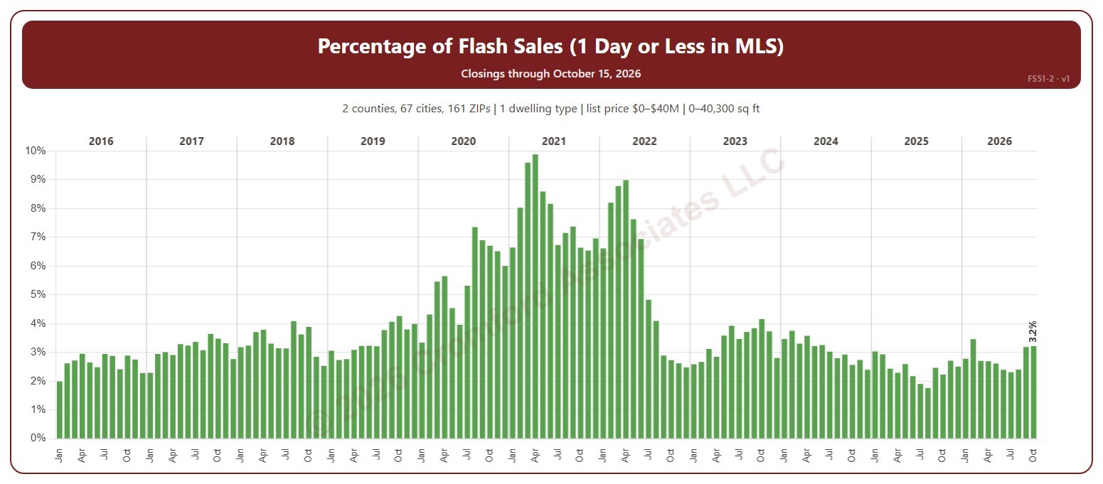
Percentage of Flash Sales

About this chart

This chart shows flash sales as a percentage of all closings each month. A flash sale is a closing that spent 1 day or less in the MLS (0 or 1 days on market, cumulative), usually a home that sold as soon as it was listed or was listed only to record a sale already agreed.

It opens on 2016 to date; tick other years in the Year box to go back as far as 2001, and use the Month box to count only some months of the year. The chart is updated every day.

It opens on Maricopa and Pinal counties and single-family detached homes, as the original chart did. Use the County, City, and ZIP Code boxes to change the area, and narrow it further with the Dwelling Type and New / Resale boxes and the list price, home size, and year built sliders.

Hover over a bar to see the flash sales, all closings, and the percentage for the month.

Flash Sales – Closings with 1 Day or Less in MLS

About this chart

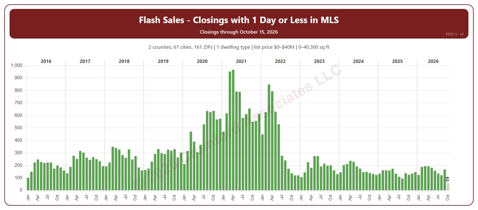
This chart shows the number of flash sales each month. A flash sale is a closing that spent 1 day or less in the MLS (0 or 1 days on market, cumulative), usually a home that sold as soon as it was listed or was listed only to record a sale already agreed.

It opens on 2016 to date; tick other years in the Year box to go back as far as 2001, and use the Month box to count only some months of the year. The chart is updated every day. The current month is the month so far and is drawn lighter.

It opens on Maricopa and Pinal counties and single-family detached homes, as the original chart did. Use the County, City, and ZIP Code boxes to change the area, and narrow it further with the Dwelling Type and New / Resale boxes and the list price, home size, and year built sliders.

Hover over a bar to see the flash sales, all closings, and the percentage for the month.

Listing Success by Price Range

About this chart

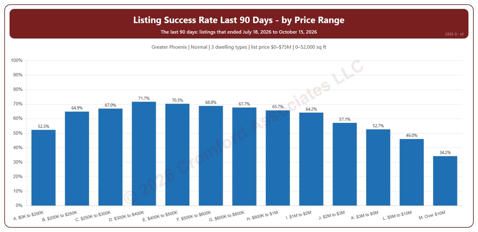
This chart shows the listing success rate over the last 90 days in each list price range, from $200K and under to over $10M. The listing success rate is the share of listings that closed, out of all the listings that ended: closed, expired, or cancelled. Each listing counts once, in the month (or window) its listing ended: the closing date for a closing, the expiration for an expired listing, the cancellation for a cancelled one.

It covers the 90 days of listings that ended up to the newest one; the heading shows the exact dates. The chart is updated every day.

It opens on the Greater Phoenix area: the counties, cities, and ZIP codes that make it up are ticked to start with. Tick or untick any of them to change the area, including counties beyond Greater Phoenix. It opens on normal sales; tick other transaction types to add them. Narrow it further with the Dwelling Type and New / Resale boxes and the list price, home size, and year built sliders.

Hover over a bar to see the rate, the listings that closed, and those that expired or were cancelled.

Months of Supply – Excluding UCB and CCBS Listings

About this chart

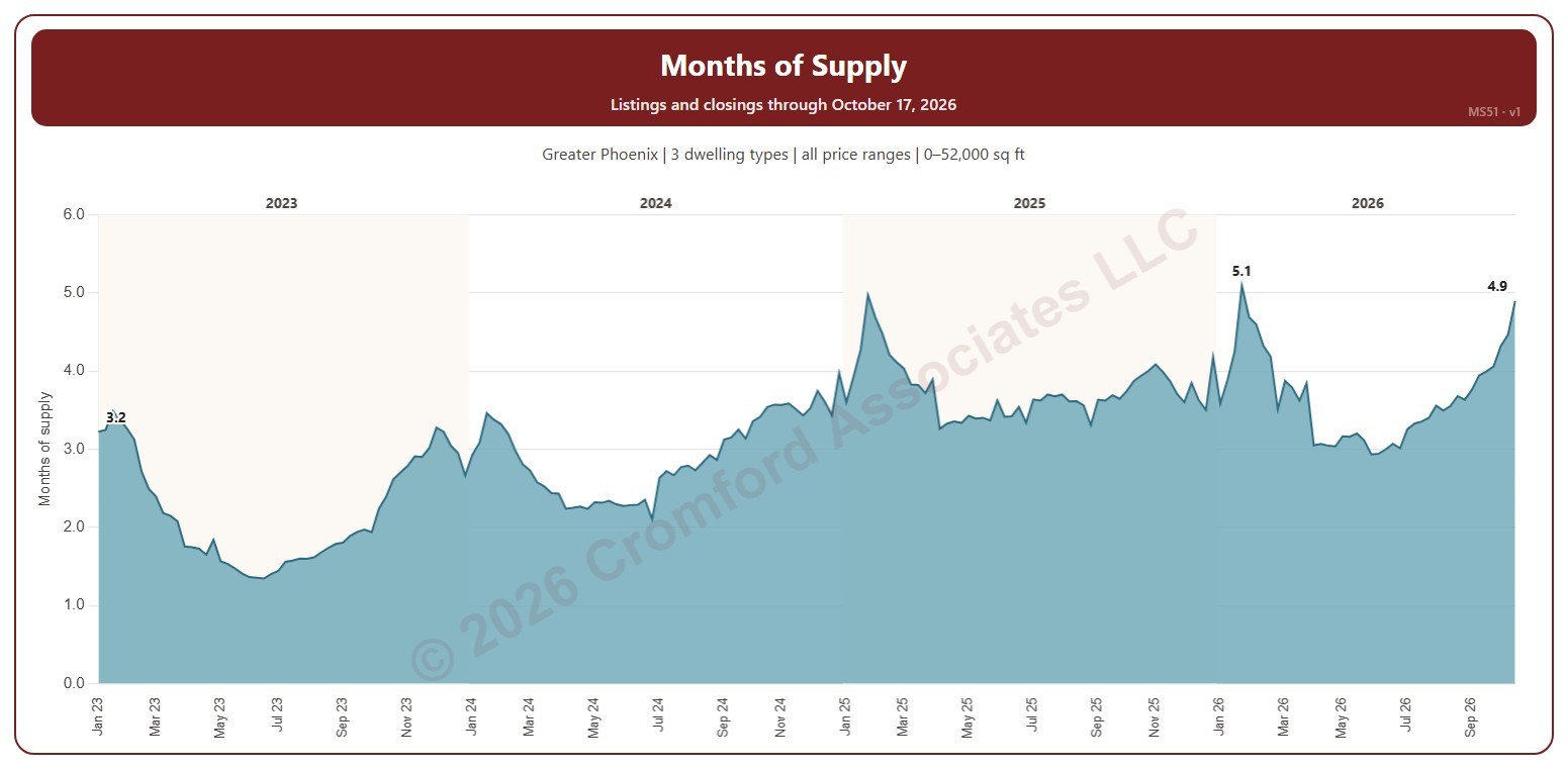
This chart shows months of supply each Saturday: the active listings on ARMLS that day divided by the homes that closed in the month up to the day before, so it says how many months the listings for sale would last at the current pace of sales. Listings under contract that are still taking backup offers (UCB / CCBS) are not counted as supply.

It opens on January three years back to date; drag the handles of the date slider under the chart to choose the weeks shown, as far back as January 2011. The chart is updated every day.

It opens on the Greater Phoenix area: the counties, cities, and ZIP codes that make it up are ticked to start with. Tick or untick any of them to change the area, including counties beyond Greater Phoenix. Narrow it further with the Price Range boxes, the Dwelling Type, Transaction Type, and New / Resale boxes, and the home size and year built sliders; the listings and the closings are narrowed the same way (a listing by its list price that day, a closing by its list price).

Hover over the chart to see the week’s months of supply, the active listings, and the closings in its month.

Months of Supply – including UCB/CCBS Listings

About this chart

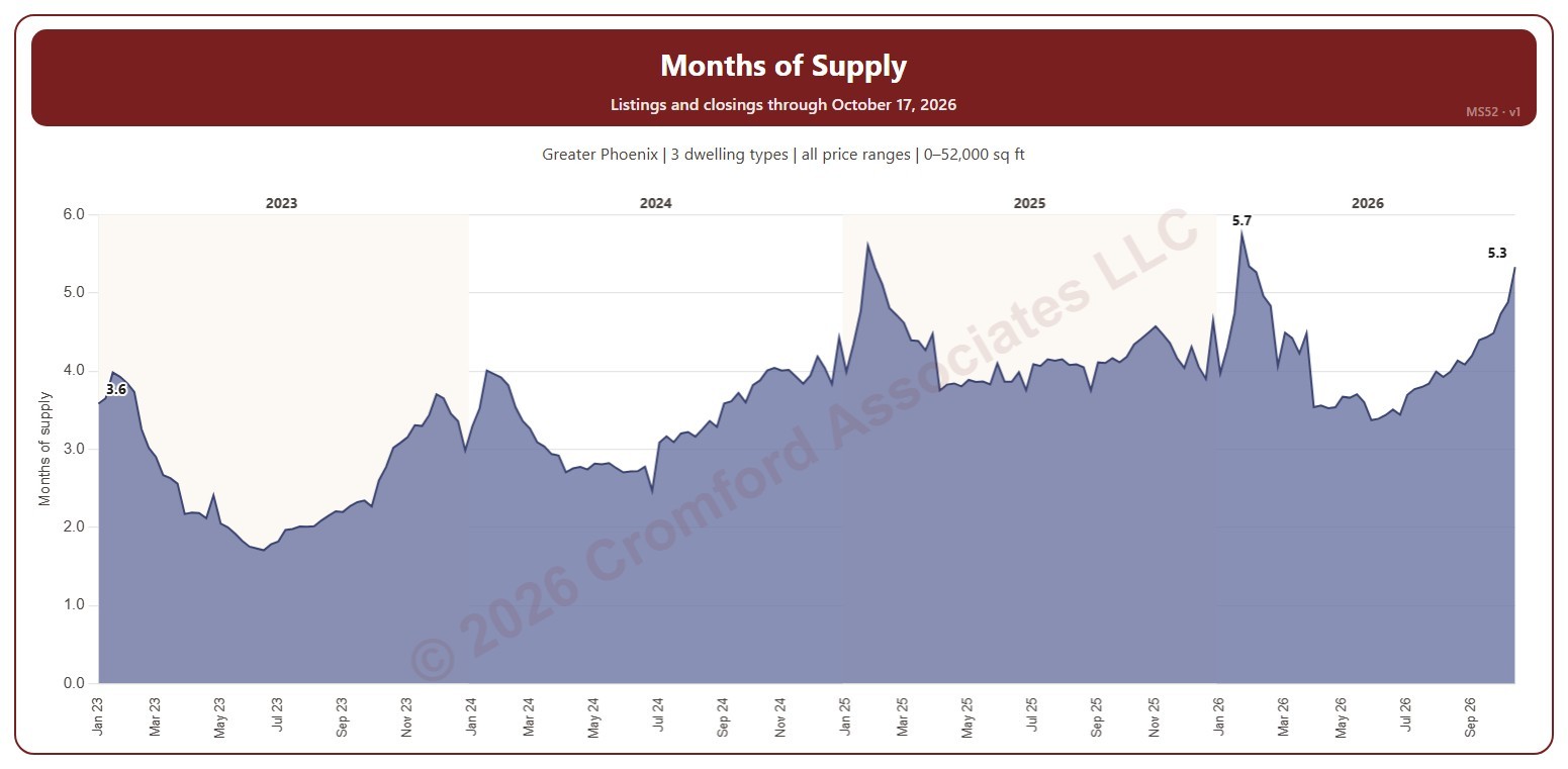
This chart shows months of supply each Saturday: the listings on ARMLS that day that are active or under contract but still taking backup offers (UCB / CCBS), divided by the homes that closed in the month up to the day before, so it says how many months that supply would last at the current pace of sales. MS51 is the same measure without the UCB / CCBS listings.

It opens on January three years back to date; drag the handles of the date slider under the chart to choose the weeks shown, as far back as January 2011. The chart is updated every day.

It opens on the Greater Phoenix area: the counties, cities, and ZIP codes that make it up are ticked to start with. Tick or untick any of them to change the area, including counties beyond Greater Phoenix. Narrow it further with the Price Range boxes, the Dwelling Type, Transaction Type, and New / Resale boxes, and the home size and year built sliders; the listings and the closings are narrowed the same way (a listing by its list price that day, a closing by its list price).

Hover over the chart to see the week’s months of supply, the listings, and the closings in its month.

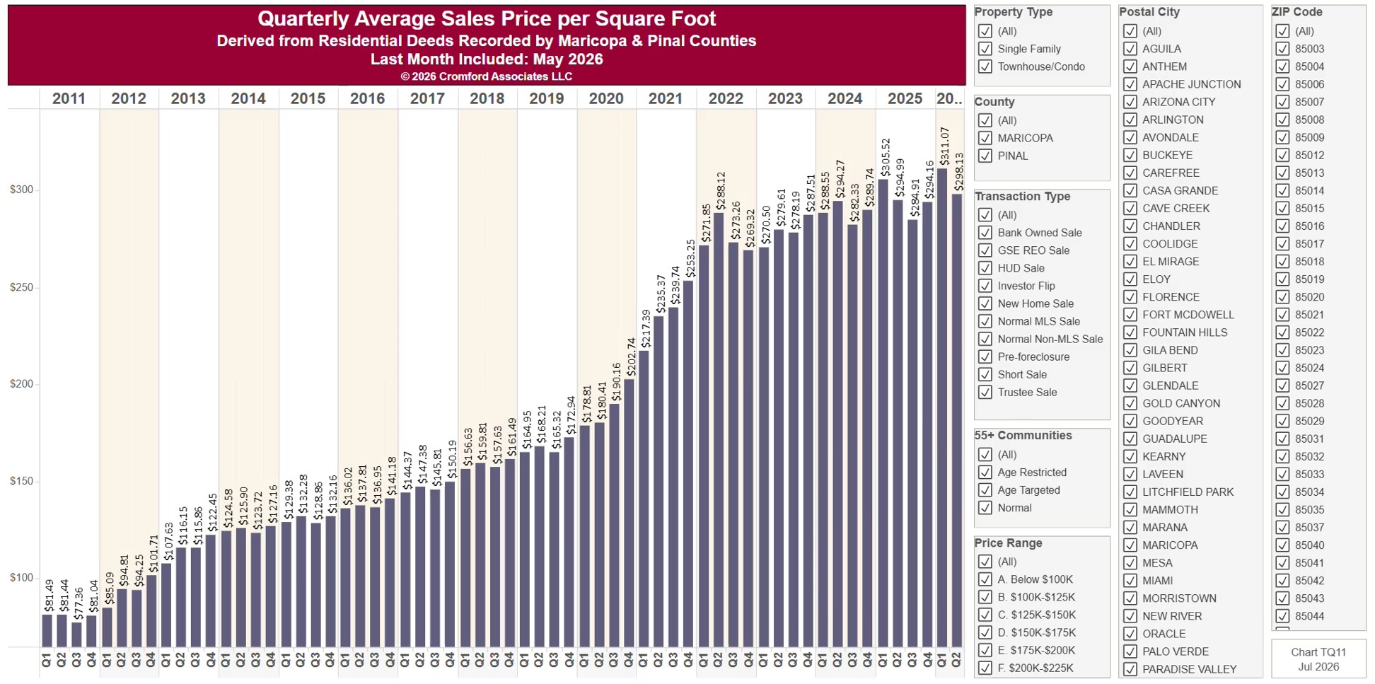
Quarterly Average Price per Square Foot

About this chart

This chart shows the average price per square foot of homes sold, one bar per calendar quarter since 2011, from residential deeds recorded by Maricopa and Pinal Counties. Price per square foot lets you compare homes of different sizes. Because it is built from recorded deeds, it covers every recorded sale, not just homes listed on ARMLS: new homes, private sales, and investor deals are all included.

It opens on Maricopa and Pinal Counties with everything included. Narrow it with the County, City, and ZIP panels, the Transaction Type, Property Type, and 55+ Communities boxes, and the sale price and home size sliders. Untick years in the Year panel to drop them from the chart.

The newest quarter is usually only part of a quarter, because the records run to the end of last month. Hover over a bar to see the exact figure for that quarter.

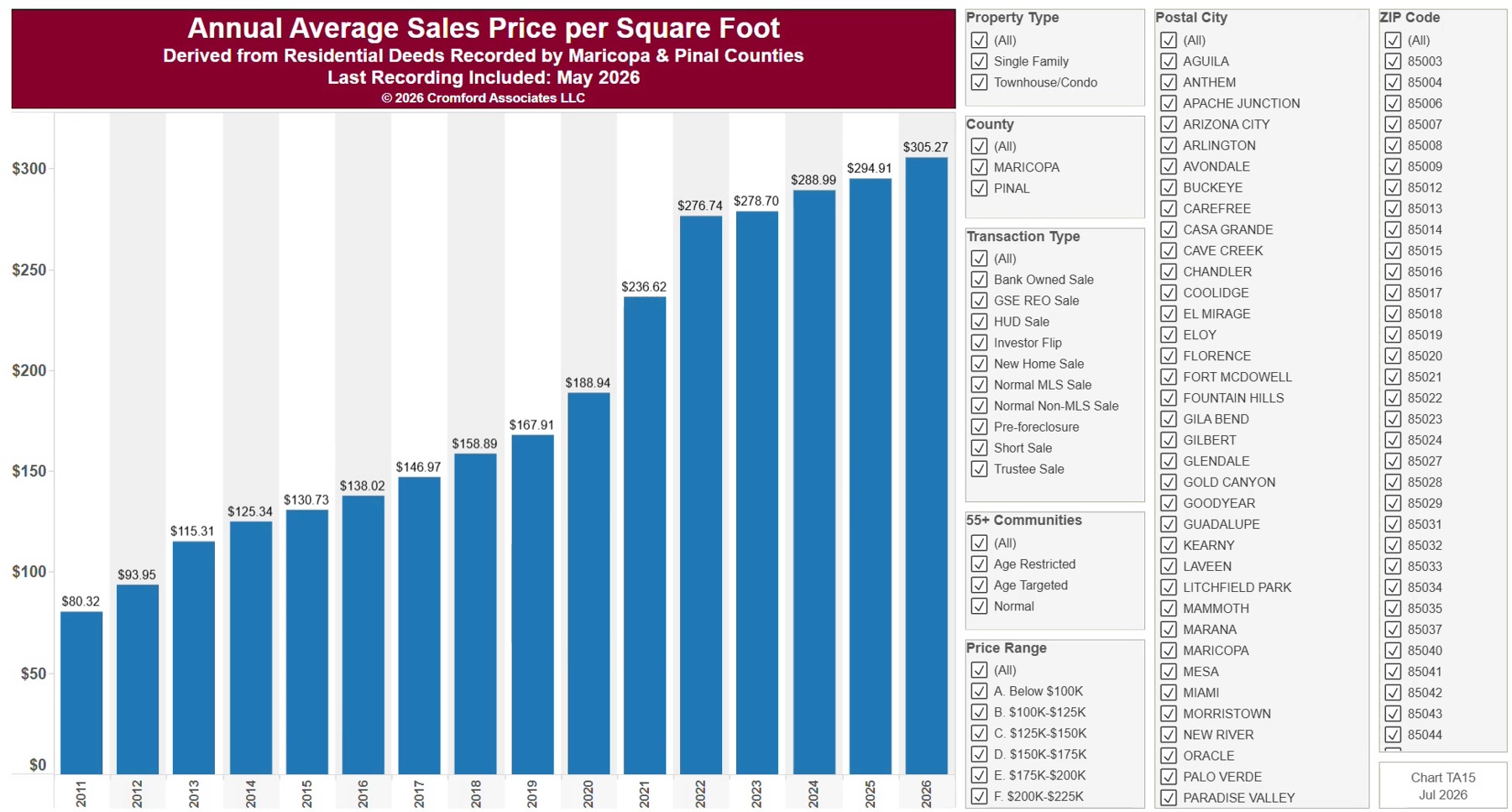
Annual Average Sales Price per Square Foot

About this chart

This chart shows the average price per square foot of homes sold, one bar per calendar year since 2011, from residential deeds recorded by Maricopa and Pinal Counties. Price per square foot lets you compare homes of different sizes. Because it is built from recorded deeds, it covers every recorded sale, not just homes listed on ARMLS: new homes, private sales, and investor deals are all included.

It opens on Maricopa and Pinal Counties with everything included. Narrow it with the County, City, and ZIP panels, the Transaction Type, Property Type, and 55+ Communities boxes, and the sale price and home size sliders.

The current year’s bar covers only the months recorded so far. Hover over a bar to see the exact figure for that year.

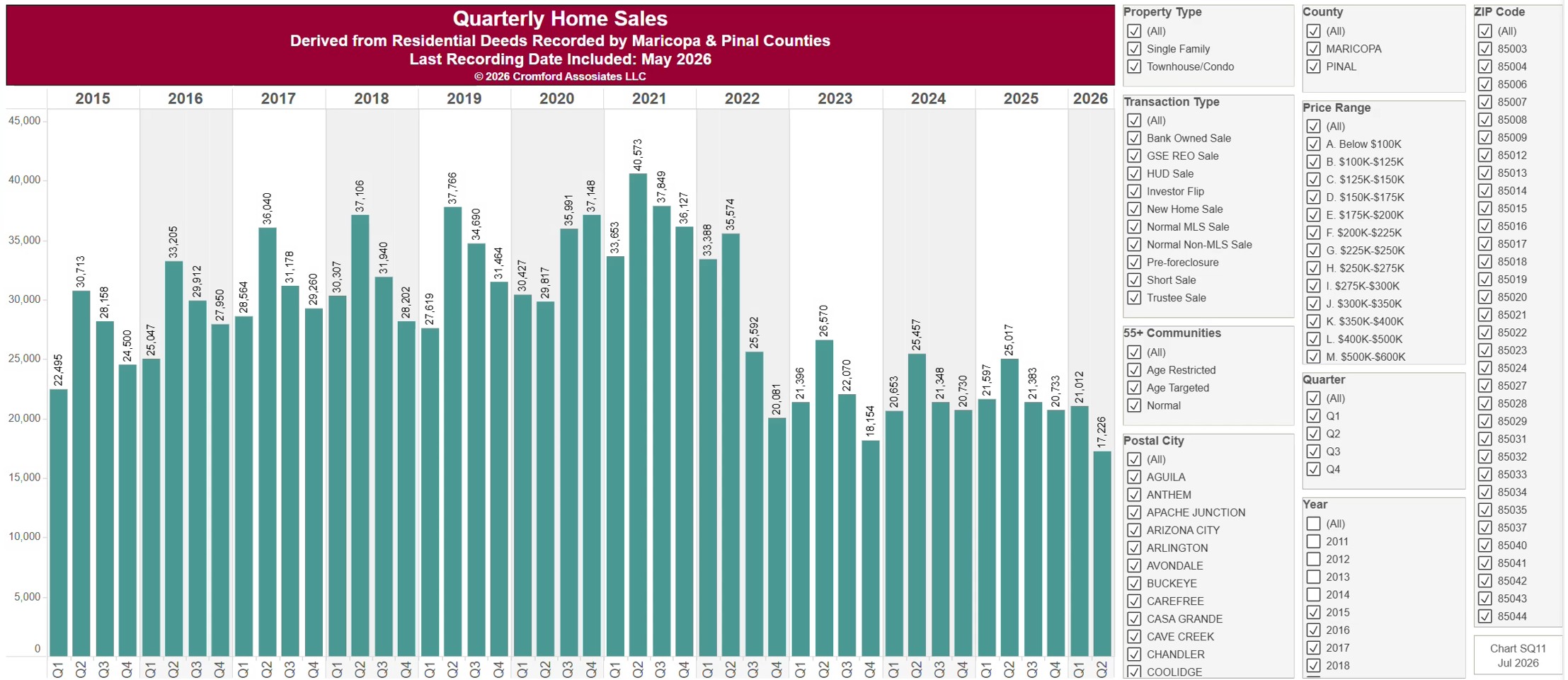
Quarterly Closed Home Sales

About this chart

This chart counts the homes sold each calendar quarter since 2011, from residential deeds recorded by Maricopa and Pinal Counties. Because it is built from recorded deeds, it covers every recorded sale, not just homes listed on ARMLS: new homes, private sales, and investor deals are all included.

It opens on Maricopa and Pinal Counties with everything included. Narrow it with the County, City, and ZIP panels, the Transaction Type, Property Type, and 55+ Communities boxes, and the sale price and home size sliders. Untick years in the Year panel to drop them from the chart.

The newest quarter is usually only part of a quarter, because the records run to the end of last month. A part quarter’s bar is short, so compare it with the same months of earlier years. Hover over a bar to see the exact figure for that quarter.

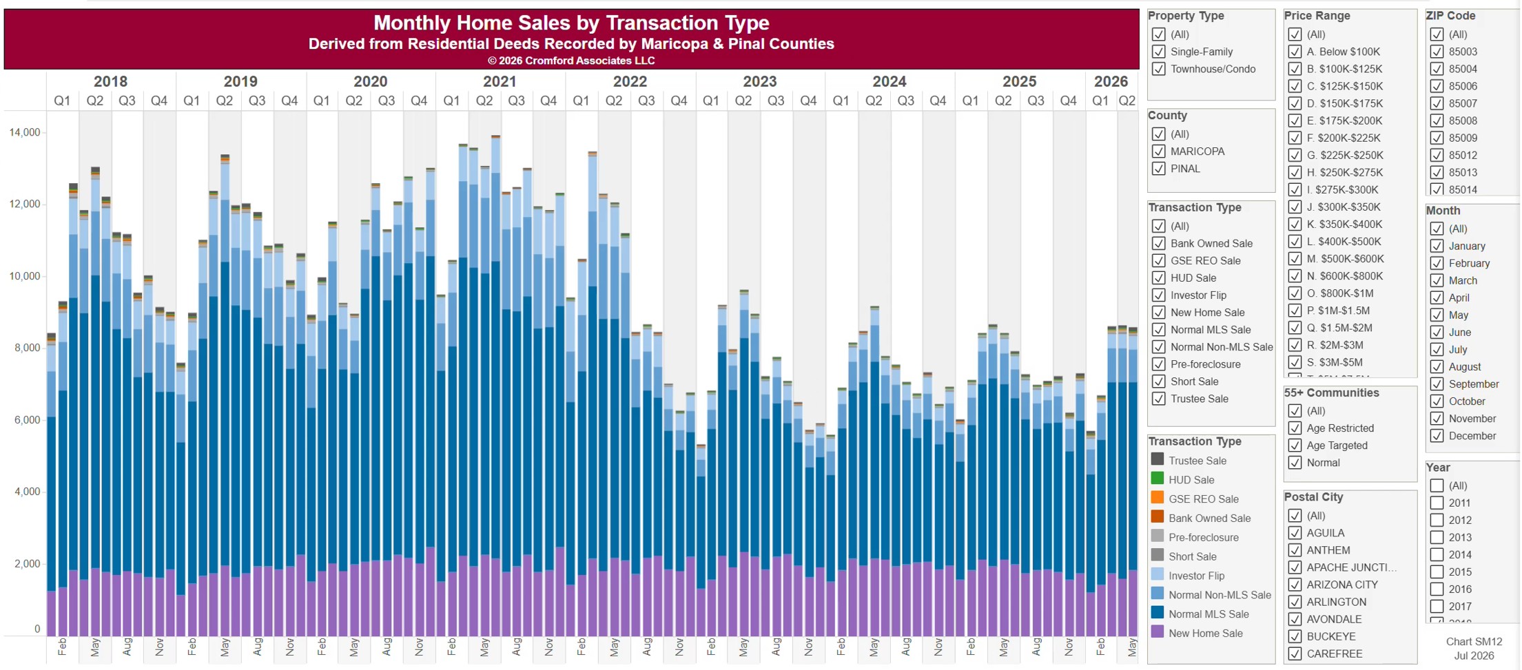
Monthly Closed Sales by Transaction Type

About this chart

This chart counts the homes sold each calendar month since January 2011, from residential deeds recorded by Maricopa and Pinal Counties, with each bar split by transaction type: normal MLS and non-MLS sales, new home sales, investor flips, short sales and pre-foreclosures, trustee sales, and lender-owned and HUD sales. It shows how the mix of the market changes over time. Because it is built from recorded deeds, it covers every recorded sale, not just homes listed on ARMLS: new homes, private sales, and investor deals are all included.

It opens on Maricopa and Pinal Counties with everything included. Narrow it with the County, City, and ZIP panels, the Transaction Type, Property Type, and 55+ Communities boxes, and the sale price and home size sliders. Untick years in the Year panel to drop them from the chart.

The records run to the end of last month and are updated monthly. Hover over a bar to see the counts for that month.